
Latest Dispatches

The Moody Kitchen Cabinet Color High-End Designers Are Obsessively Hoarding
I spend a lot of time analyzing how homes in the Southeast process natural light. Atlanta presents a highly specific lighting scenario. You have intense Southern sun, a heavy canopy of mature oaks and pines, and thick summer humidity that diffuses light before it ever hits the window glass.

Sherwin Williams Agreeable Gray (SW 7029): The Unflinching Truth for Phoenix Homes
Let’s get one thing straight. Phoenix isn’t some gentle, forgiving landscape where any color can just show up and look good. The light here is a character. It's a force. It’s a relentless, high-noon blast of honesty that can strip a weak color down to its bones and leave it looking washed-out, pathetic, and cheap. I’ve seen it a thousand times in homes from Arcadia to Pinnacle Peak. People pick a color from a tiny chip under the fluorescent hum of a hardware store, and then wonder why their living room suddenly has all the charm of a doctor's waiting room.

The Rubber Paint Mistake That Is Destroying Historic Brick Walls
I look at a lot of old houses, and I see the exact same structural failure repeatedly. You buy a beautiful historic home in an area like Woodruff Place or Fletcher Place in Indianapolis. The dining room features an incredible exposed brick wall—perhaps an old exterior wall now enclosed by an addition, or a prominent masonry chimney breast. You sit down for dinner, and you notice red dust and heavy flakes of paint collecting on the baseboards.

Sherwin Williams Repose Gray (SW 7015) Review: The Perfect Versatile Neutral for Bloomington, IN Homes
Look, I’ve seen enough tragic paint jobs in this town to know that picking a neutral is a high-stakes game. People treat gray like it’s a cop-out—a safe, pedestrian choice for folks who are afraid of a little commitment. But they’re wrong. Bad gray is a cop-out. The right gray requires a visceral understanding of light, space, and architectural weight.

The Warm Cream Paint Color Fixing Stark Living Rooms Everywhere
Analyzing Southern California homes from my studio, I notice a recurring architectural dilemma. San Diego possesses a brilliant, almost unrelenting coastal light. To capitalize on this, homeowners instinctively drench their interiors in stark, pure whites. The result is often a highly clinical space that bounces harsh glare around the room, leaving the social center of the house—the living room hearth—feeling entirely uninviting.
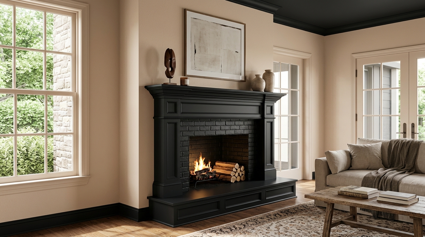
Why High-End Designers Are Painting Living Room Hearths Pitch Dark (And The One Sherwin-Williams Color They Trust)
Color is not merely a decorative afterthought applied to drywall. It is an architectural dimension. It dictates the visual weight of a room, governs the flow of spatial energy, and acts as a sophisticated filter for natural light. Nowhere is this truer than at the living room hearth. As the undisputed social and structural center of the household, the hearth represents a convergence of firelight, ambient window exposure, and raw human gravity.

Sherwin Williams Accessible Beige (SW 7036) Review: The Perfect Warm Neutral for Indianapolis Homes
Let’s get one thing straight. The cold, sterile, hospital-ward grays of the last decade are dead. And the blinding, gallery-white walls of the Instagram era? They’re on life support. You live in a home, not a contemporary art museum or an operating room. Your space needs a pulse. It needs blood, warmth, and a sense of place.
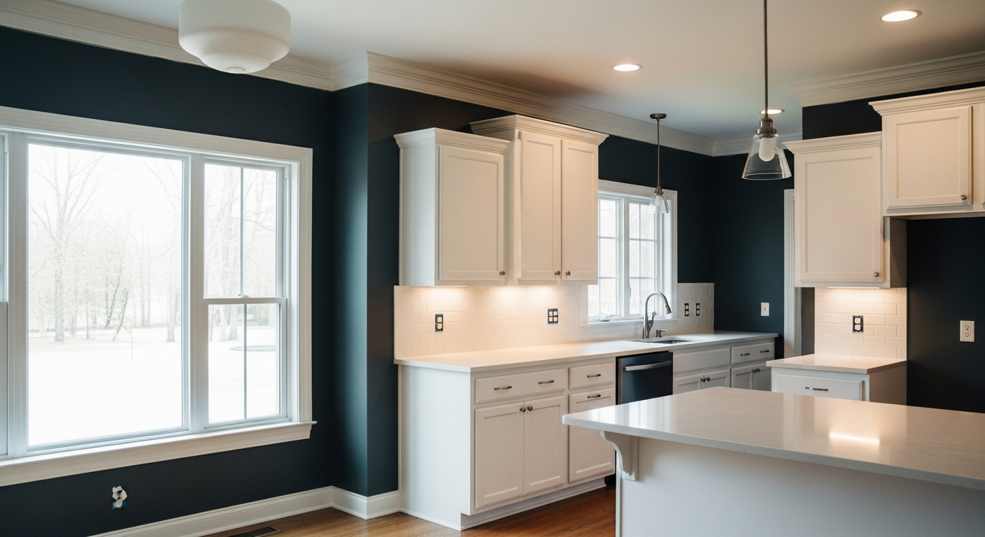
The Exact Paint Color Transforming Drab Midwestern Kitchens Into High-End Culinary Hearths
The kitchen is not a pristine gallery. It is an operational center, a high-heat culinary hearth where stone, steel, and human labor collide. When designing the visual hierarchy of this space, the background color must do the heavy lifting. It must absorb the chaotic energy of daily preparation, ground the cabinetry, and harmonize with the shifting natural light of the surrounding environment.

Why High-End Designers Are Painting Entire Mudrooms This Exact Shade of Charcoal
When consulting on residential projects across the Southeast, particularly in the dense, tree-heavy neighborhoods of Atlanta, I constantly analyze the way regional light affects transitional spaces. The mudroom serves as a critical utility gateway. It handles the heavy lifting of daily life, managing supply chains, muddy gear, and the immediate home-work handoff. Because this space handles so much physical chaos, it requires absolute visual stability.
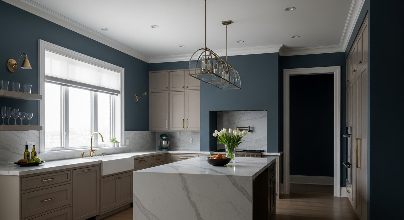
The Unapologetic Kitchen Paint Color Quietly Dominating High-End Indianapolis Homes
Indianapolis winters deliver a very specific brand of atmospheric gloom. From November through March, the Midwestern sky flattens into a persistent, chalky limestone gray. Inside the home, this diffuse, low-angle light ruthlessly exposes the sterile, clinical nature of the modern kitchen. When the culinary operational center—the heavy-duty preparation hearth where stone, steel, and storage converge—is drenched in white, the space feels less like a gathering point and more like an operating room.
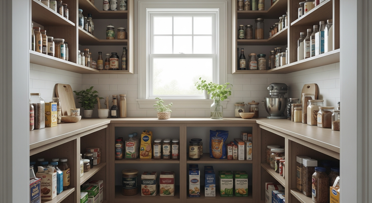
Architecting the Bloomington FIFO Pantry: First-In, First-Out Grocery Supply Chain Logistics for High-Volume Midwestern Kitchens
The dining room is frequently misunderstood as a static environment reserved solely for consumption. In a highly optimized household, it operates as the terminal node of the domestic food supply chain—the final distribution point where resources, staging, and spatial entertainment systems converge. In Bloomington, Indiana, local agricultural cycles and stark seasonal shifts dictate the influx of provisions. Managing this fluctuating inventory requires a structured approach to grocery flow, culminating in the dining area where food, conversation, and evening light intersect.

Why the Siding Outside Your Mudroom Keeps Peeling (And the 1 Prep Mistake Causing It)
Every house has a workhorse zone. The mudroom transition serves as the absolute gateway of the home, managing muddy boots, heavy winter gear, and the daily supply chain of family life. As a building restoration expert, I look closely at these transition zones. I study the friction points where the controlled interior environment collides with the chaotic exterior elements.
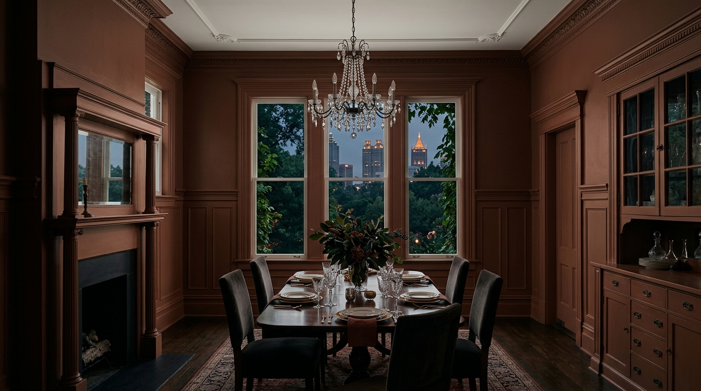
The Brooding, Muddy Paint Color Swallowing Atlanta’s Best Dining Rooms Whole
There is a specific quality of light in Atlanta that decorators either respect or spend a lifetime fighting. It is filtered through dense, ancient oak and pine canopies, dragged through intense subtropical humidity, and cast into residential windows with a distinct, heavy green shift. Paint a dining room pure white in Buckhead or Decatur, and by three in the afternoon, the walls will look vaguely aquatic, starved of warmth, and utterly devoid of hospitality.

The Moody Dark Paint Color Tampa Designers Are Secretly Obsessed With
Designing for the Florida climate usually forces a specific aesthetic. From my desk, analyzing floor plans and lighting models for homes in Tampa, I see a constant pattern. The intense, near-equatorial light hits the Gulf Coast, and the immediate homeowner reaction is to wash everything in stark white to bounce the glare away. You want the living spaces to feel airy and light. But the dining room serves a completely different architectural purpose. You do not want high-glare energy where you eat dinner. You want depth, shadow, and visual gravity.

Why Designers Are Quietly Ditching White Kitchens for This Specific Desert Sand
Walk into any west-facing kitchen in Scottsdale at three in the afternoon, and you’ll understand immediately why the stark white kitchen is dead. The Sonoran sun is not polite. It doesn’t gently filter through the glass; it interrogates the room. If your kitchen operational center—that critical zone where the prep sink, the cutting boards, and the range converge—is painted in a brilliant, highly reflective white, you aren't cooking in a hearth. You’re cooking in a flashbang.