


That is where a deep, steadfast shade like Benjamin Moore Chrome Green (None) proves its worth. With a Light Reflectance Value (LRV) of 5.32, this color sits very low on the light-reflecting scale. In plain English, an LRV of 5.32 means the shade absorbs nearly all the direct light hitting it, bouncing back only a tiny fraction. Instead of washing out when summer daylight streams through your windows, Chrome Green holds its ground, deepening into a rich, velvety forest canopy.
What makes Chrome Green particularly intriguing for modern living spaces is its undertone profile. Underneath its deep forest identity lies a subtle blue-gray undertone. In morning daylight, those blue-gray notes give the space a crisp, architectural cool. As the sun moves high overhead and warm afternoon light fills the room, the color settles into a classic, organic dark green that feels rooted and tranquil.

To visualize how this color palette behaves in a representative Japandi-style home in Bloomington, consider how contrast keeps deep greens from feeling heavy. Rather than painting an entire room in dark tones from floor to ceiling, the secret lies in crisp, intentional architectural framing.

Work Directly with Torlando Hakes
Skip the color choice stress. Work directly with me as your personal Color Designer to select the perfect architectural palette for your home, and get a Complementary Color Consultation when you purchase paint through us.
For window frames, door casings, and baseboards, Benjamin Moore Chantilly Lace OC-65 acts as the ultimate palette anchor. Chantilly Lace is a clean, bright neutral white without heavy yellow or blue leaning. When applied to sharp trim lines against a Chrome Green wall, Chantilly Lace creates a high-contrast outline that lifts the entire space. The bright trim acts like a picture frame, drawing your eye to the depth of the green while reflecting daylight back into the center of the room.

How a deep paint color behaves throughout the day is often what homeowners love most about working with moody palettes. During early morning hours in Bloomington, when light is still soft and low, Chrome Green presents its coolest, blue-gray qualities. As bright noon sunlight fills the space, the undertones soften, allowing the lush forest green to take center stage. By evening, when warm interior lamp light takes over, the walls pull inward, creating an intimate, cozy retreat that feels completely separate from the outside world.

To build a cohesive flow from room to room, you need an accent color that provides structure without competing for attention. Benjamin Moore Kendall Charcoal HC-166 serves as an ideal grounding contrast. This rich, earthy charcoal works brilliantly on lower kitchen cabinetry, built-in shelving, or interior doors. Paired alongside Chrome Green and blonde oak accents, Kendall Charcoal offers a solid, stone-like weight that reinforces the minimalist Japandi feel.

For adjoining spaces—such as a primary bathroom suite, a hallway, or a quiet home office—stepping down the contrast creates a soothing spatial transition. Benjamin Moore Quiet Moments 1563 acts as a light, airy bridge between the intensity of Chrome Green and the crisp white of Chantilly Lace. Quiet Moments is a soft, mid-tone sea-foam shade with gentle gray-blue undertones. When used in a bathroom sanctuary, it echoes the cool undertones of Chrome Green while keeping smaller spaces bright, quiet, and expansive.

When bringing this color palette into your own home, paint sheen selection is just as critical as color choice. For deep shades like Chrome Green, I always recommend a Flat or Matte finish on main wall surfaces. A matte finish eliminates unwanted surface reflection, allowing the deep pigment to absorb light evenly and creating a smooth, suede-like wall surface.
For trim, door casings, and baseboards in Chantilly Lace, opt for a Satin or Semi-Gloss finish. The slight gloss contrast makes the trim easy to clean while emphasizing the clean architectural lines of your home. On built-in cabinetry painted in Kendall Charcoal, a Satin sheen offers durability with a soft, durable luster.
Pair these colors with natural interior elements to complete the look: light blonde oak flooring, raw matte ceramic decor, unbleached linen drapery, and slender black metal light fixtures. The result is a quiet, grounded interior that feels effortlessly tailored to high-sunlight summer months.
Complementary Color Consultation
Planning a project? Work with Torlando Hakes directly as your personal Color Designer and get a Complementary Consultation when purchasing paint through us.
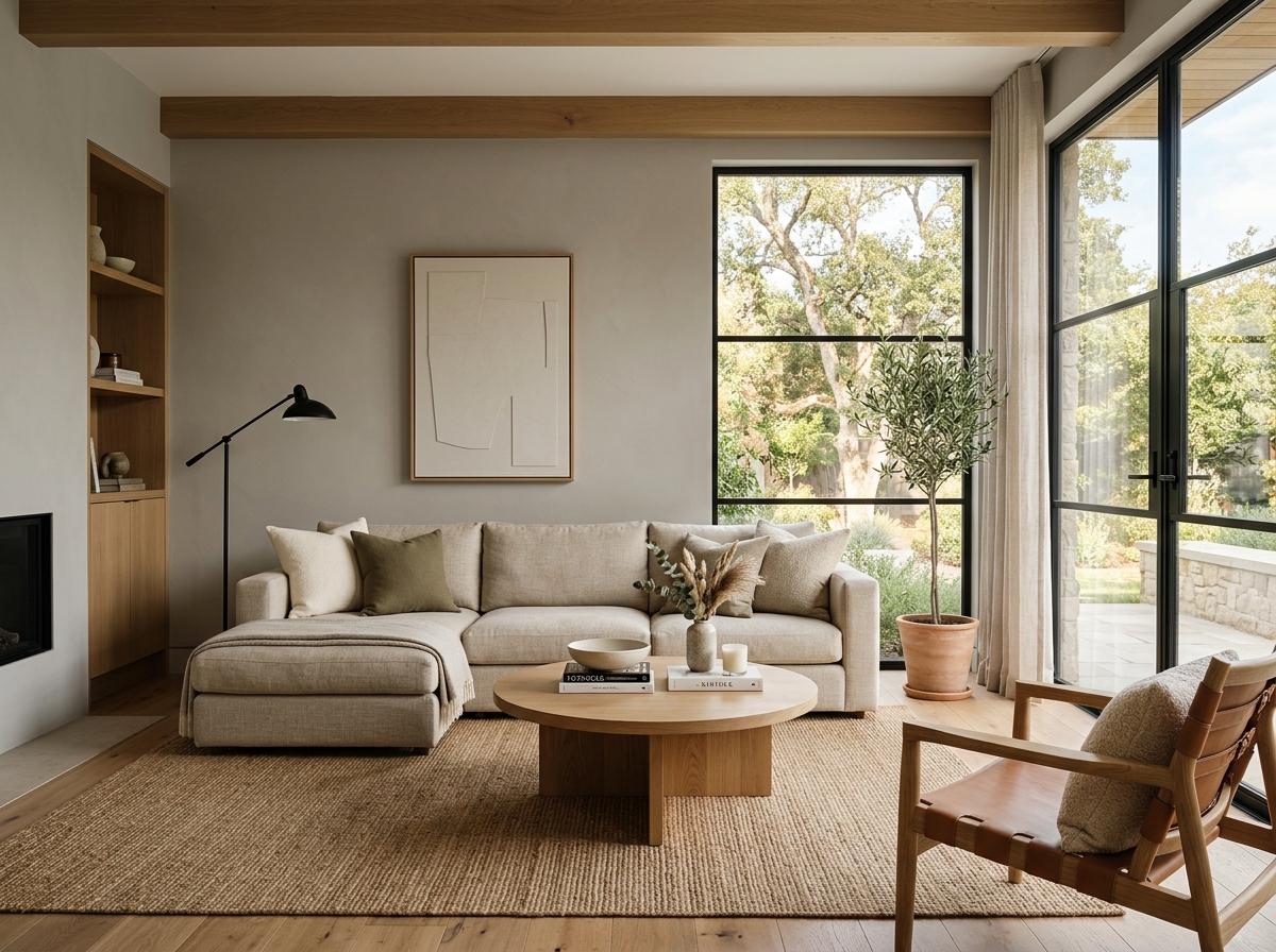 After
After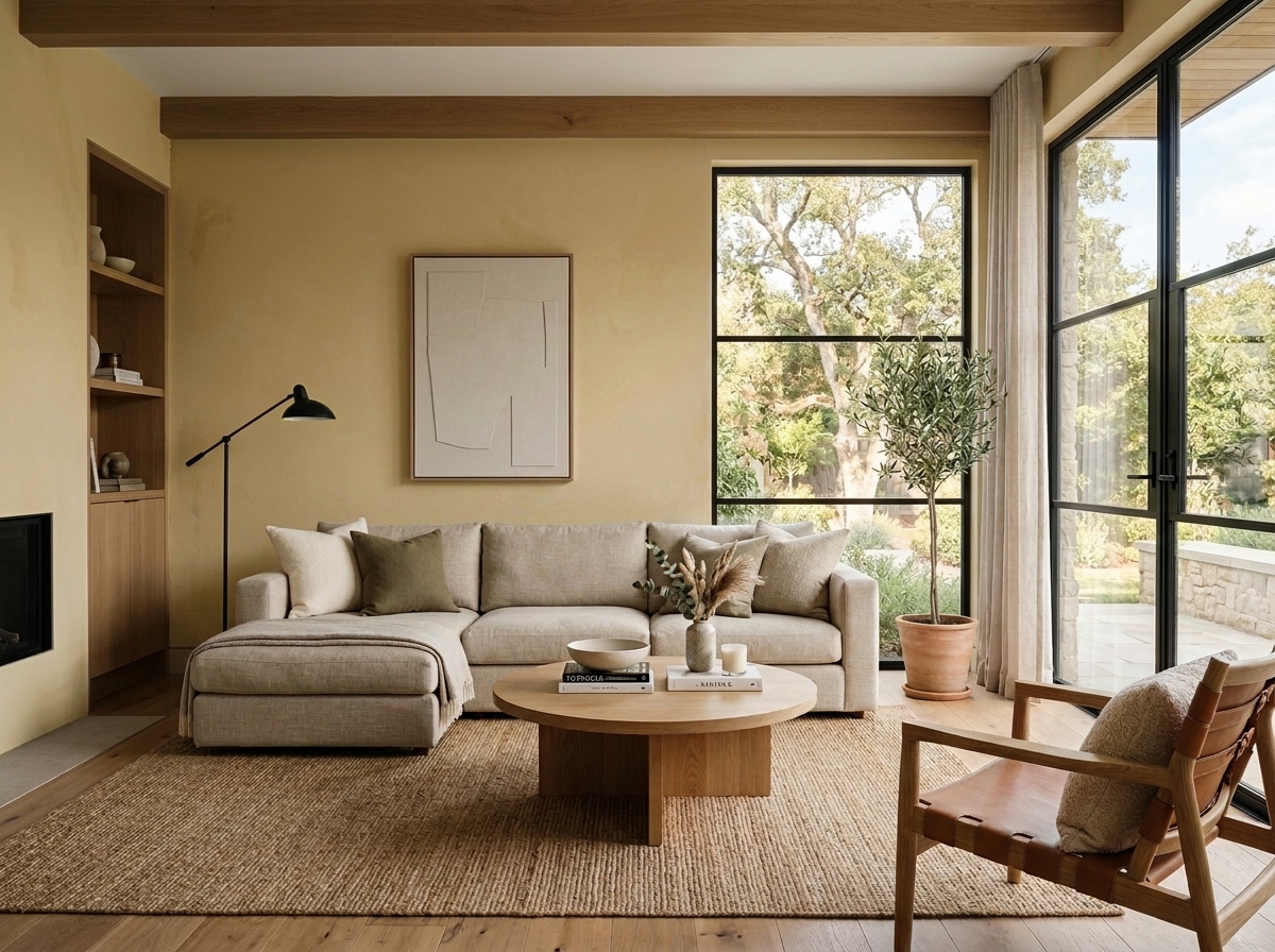 Before
Visualize Your Space with Color Studio AI
Planning a project? Skip the paint chip guesswork. Use our Color Studio AI to instantly visualize these paint colors on your own walls, or take advantage of our aligned contractor pricing matching current Sherwin-Williams retail promotions.
Book Your Upcoming Paint Project
Craftsman Painter is now scheduling premium transformations. Secure your spot and elevate your property value.
Get an EstimateHelp Others Find Professional Color Insights
Share this story directly to your networks or copy the link to share with friends.