
Latest Dispatches
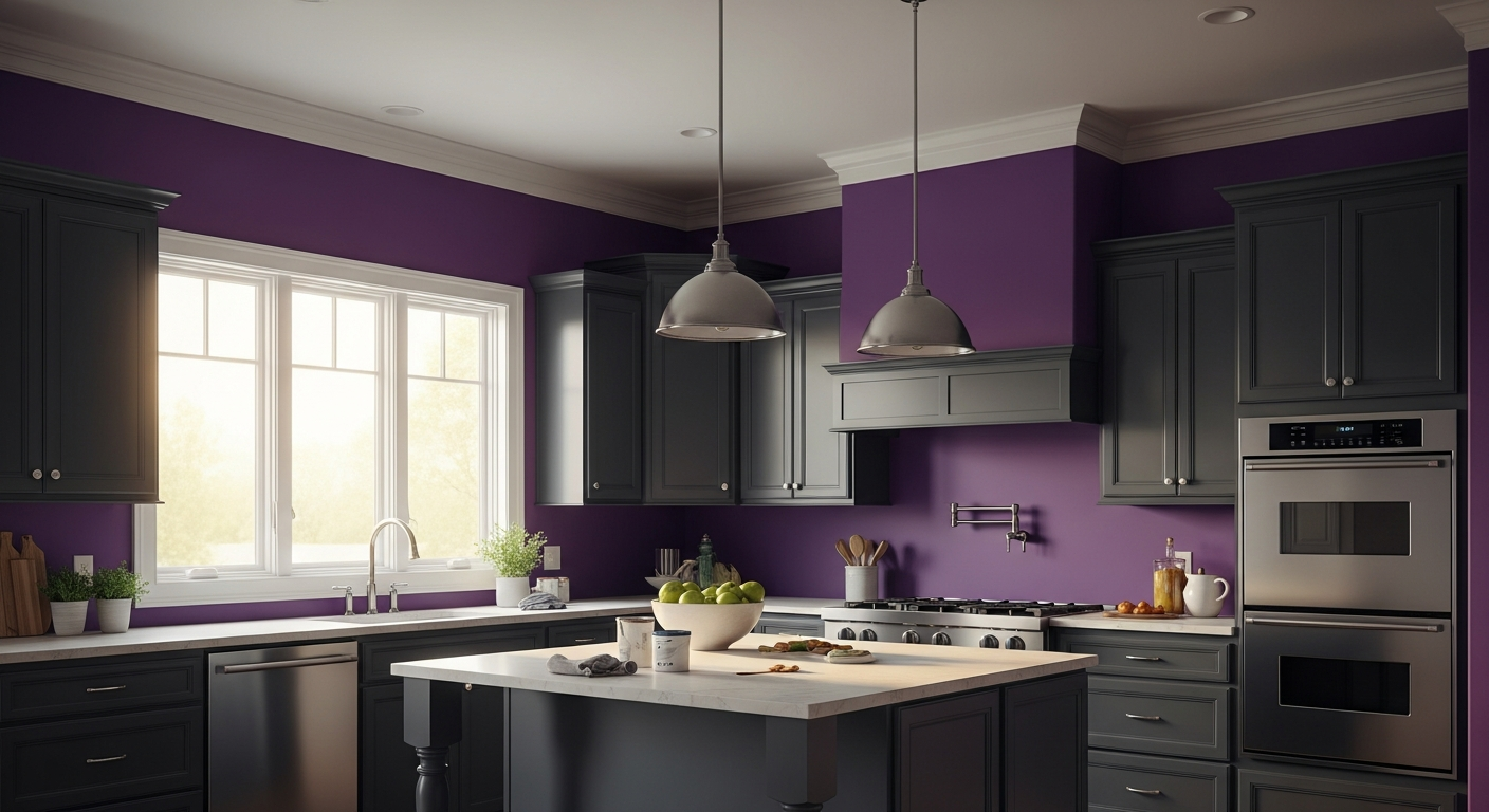
Stop Painting Your Kitchen White And Try This Daring Violet Instead
San Diego’s natural light is a ruthless interrogator. It strips the pretense from weak colors, washing out passive neutrals and turning uncalibrated grays to absolute ash. In the kitchen operational center—the undisputed culinary hearth where raw ingredients, heavy stone, and sharp steel converge—playing it safe with a sterile palette is a profound missed opportunity. The modern prep zone demands architectural weight. It demands a visual anchor that can stand up to the relentless, brilliant Pacific sun.

Decoding the Sun-Baked Magic of Benjamin Moore Countryside Pink
When evaluating architectural coatings for high-end residential interiors, certain pigments possess a unique ability to manipulate natural light. Benjamin Moore Countryside Pink is exactly that kind of color. Sitting at a Light Reflectance Value (LRV) of 79.1, it is highly reflective, bouncing a significant amount of illumination back into the room. Yet, it avoids the harsh, icy glare that often plagues off-whites and high-LRV pastels. The secret lies in its undertones: a distinct wash of pale pink heavily grounded by a warm, earthy yellow.
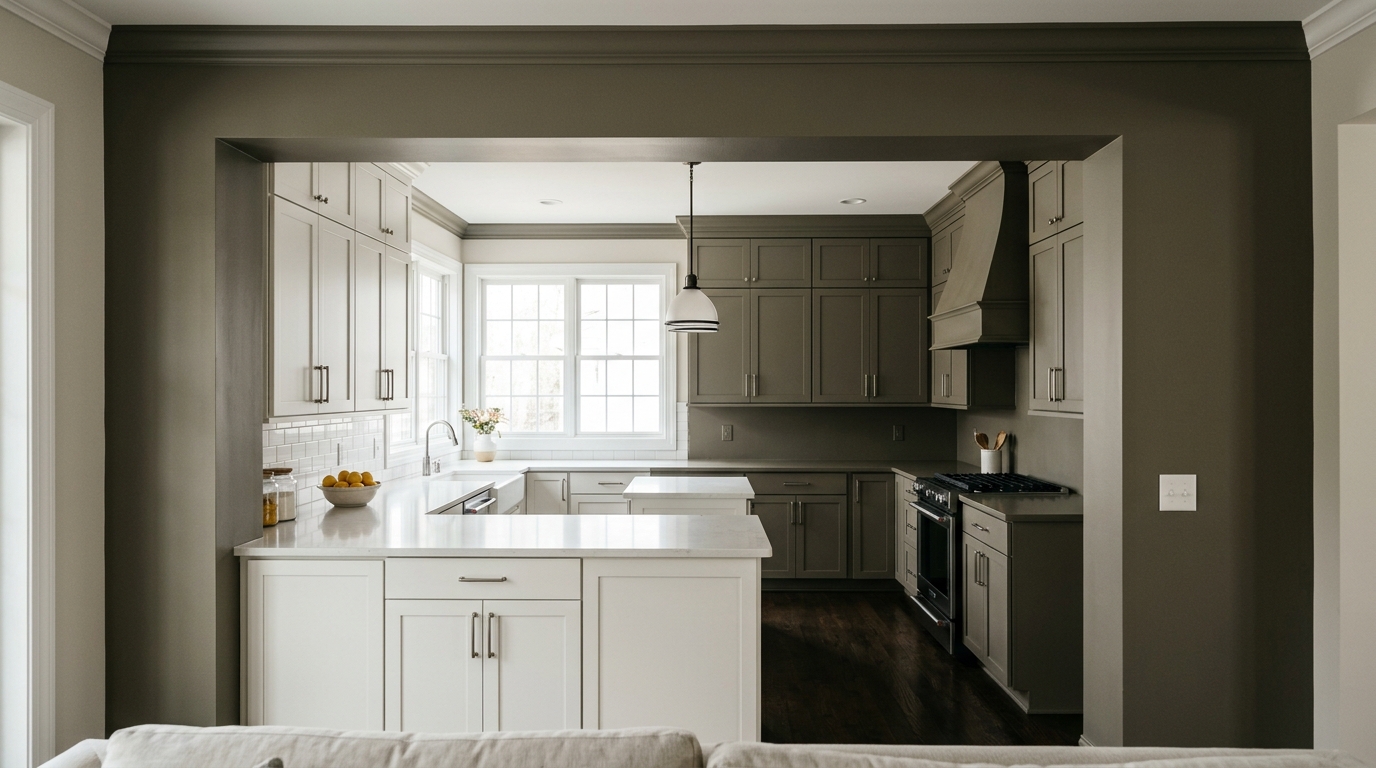
The Heavyweight Earth Tone Swallowing the All-White Kitchen Whole
The modern kitchen operational center—that frantic, blade-wielding, flour-dusted prep zone—has spent the last decade masquerading as a sterile surgical suite. Blinding whites and slick grays reflect every harsh lumen, bouncing chaotic light across marble surfaces and turning the act of preparing a meal into a clinical, exhausting endeavor.

Benjamin Moore White Dove (OC-17) Review: The Best Classic White for Bloomington, IN Homes
People think white is the easy way out. A surrender. A blank canvas for those too timid to make a real choice. As someone who spent years grinding through color theory and architectural design at the Eskenazi School right here in town, let me tell you: that’s dead wrong. White is the most unforgiving color on the wheel. It is a mirror, reflecting every architectural flaw, every lighting anomaly, and every piece of foliage outside your window. Pick the wrong white, and your high-end remodel suddenly feels like a sterile dental clinic or a dingy landlord-special apartment.
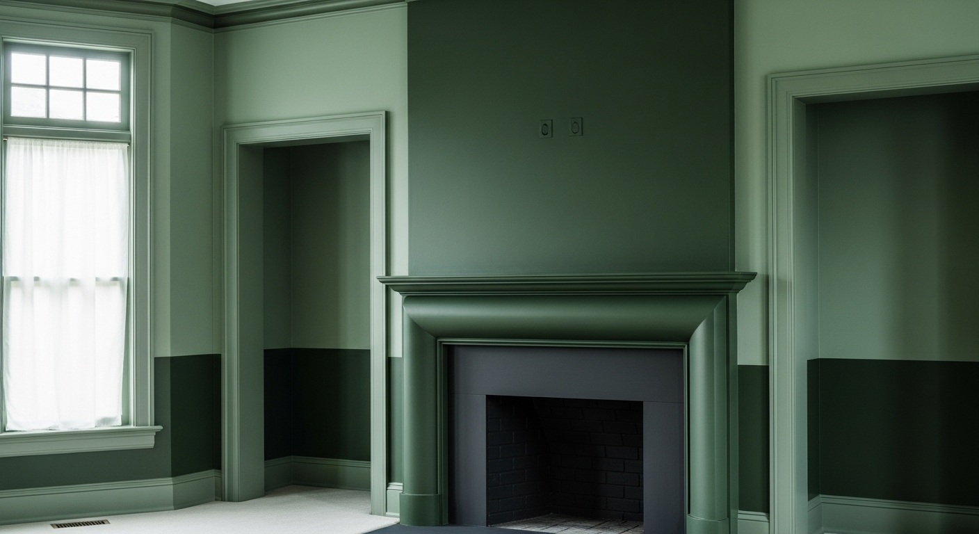
Why Designers Are Painting Entire Fireplaces This Exact Shade of Blackened Green
The living room hearth is the undeniable gravitational center of a home. It is where ambient light converges, where spatial energy settles, and where the eye naturally rests when the brutal reality of a Northeast Ohio winter sets in. In Akron, where historic Tudor revivals and stately brick colonials line the avenues of Highland Square, the architecture demands respect. But more importantly, the climate demands strategic, calculated color theory.
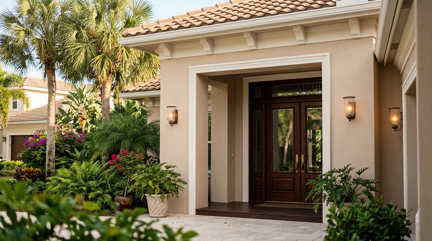
The Paint Color High-End Designers Are Secretly Hoarding For Florida Entryways
The entryway is not merely a room. It is a psychological airlock. It is the critical architectural boundary where the blinding, humid chaos of the outside world is stripped away, leaving only the curated sanctuary of the domestic interior. In a region like Ocala, Florida—where the sun is an absolute anvil and the landscape is dominated by the dense, heavy greens of ancient live oaks and sprawling equestrian pastures—managing the visual transition across this threshold requires profound chromatic discipline.

The Flagstaff Living Room Secret Designers Keep Under Wraps
Imagine a Flagstaff living room, nestled among the soaring ponderosa pines. The air is crisp, the silence profound, occasionally broken by the breeze through the needles. This particular space faces east, meaning it greets the rising sun each morning, but as the day progresses, the dense tree canopy can cast long, cool shadows, creating a unique lighting challenge. For a designer like me, this scenario is less a challenge and more an invitation to discover the perfect visual relationship between the interior and its remarkable exterior.
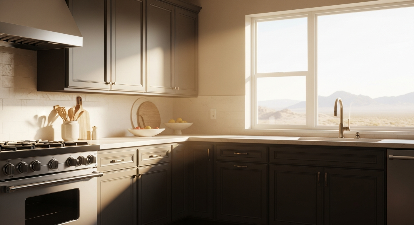
The Desert-Defying Cabinet Color That Instantly Anchors a Sun-Scorched Kitchen
Let the record show that the stark, blindingly white kitchen has run its course. In the relentless, flattening glare of the Sonoran Desert, a purely white culinary space does not look crisp—it looks entirely overexposed. The operational center of the home, that high-friction hearth where storage, ergonomics, and daily ritual converge, demands visual gravity. It requires a palette that can absorb the punishing Phoenix light and translate it into something resembling sophisticated warmth.
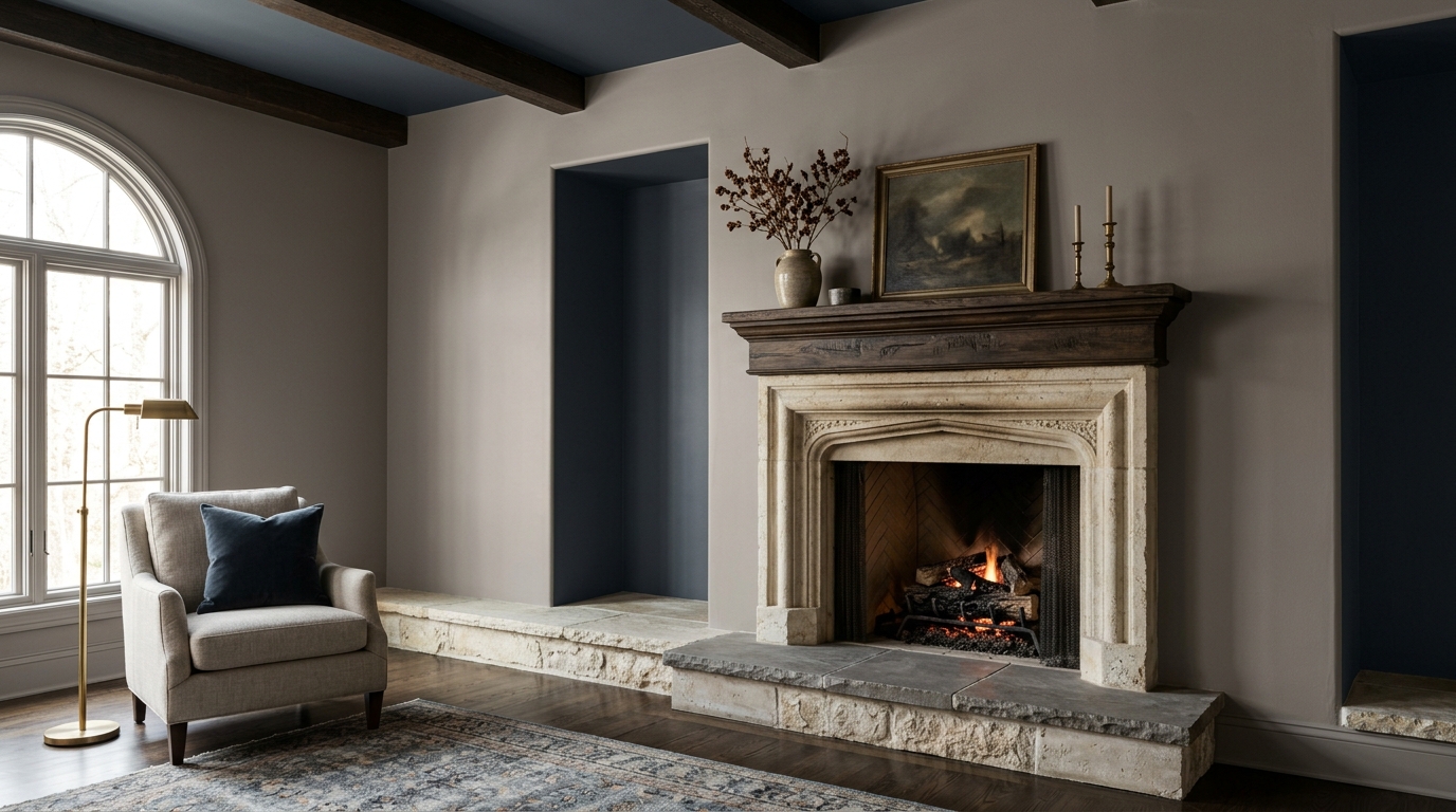
Why Designers Keep Secretly Slathering This Complex Historic Stone Color Around the Hearth
The living room hearth is the psychological anchor of a home. It is where raw masonry meets drywall, where spatial energy converges, and where the eye naturally rests when the temperature drops. In Akron, Ohio, the hearth takes on a heavier, almost survivalist weight. When the Cuyahoga Valley locks into its legendary six-month stretch of slate-gray overcast skies, the light entering a living room becomes diffuse, cool, and notoriously unforgiving. Flat, uninspired wall colors simply die in this environment. They turn to concrete. They turn to ash.

What is the Best Temperature to Paint the Exterior of a House in Akron, OH?
Hey folks! If there’s one thing I’ve learned managing premium exterior painting projects around here, it’s that Akron weather has a mind of its own. One minute you’re enjoying a beautiful, crisp morning in Summit County, and by lunchtime, you’re sweating right through your favorite flannel.

The Secret Weapon Paint Color Designers Use to Fix Gloomy Porches
I look at a lot of exteriors from the curb, analyzing how a home sits on its lot. The garden porch serves as the architectural handshake. It negotiates the heavy transition between the untamed, organic outdoors and the heavily controlled interior of your house.
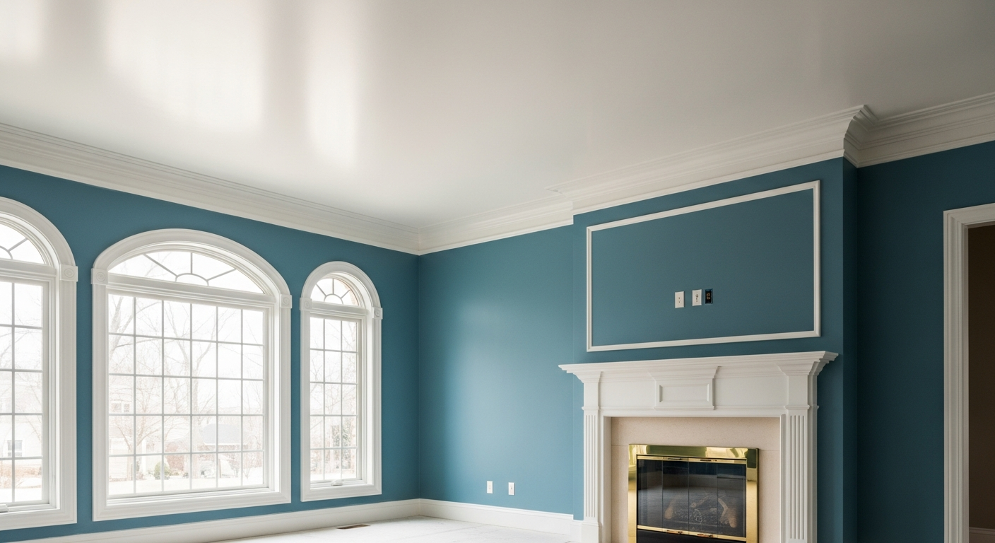
The Historic Blue-Green Quietly Hijacking High-End Midwestern Living Rooms
Forget the anemic grays and the timid, builder-grade beiges that have plagued residential interiors for a decade. The living room hearth is the psychological anchor of the home, the epicenter where ambient light and spatial energy inevitably converge. In a place like Bloomington, Indiana—where the native architectural vernacular is heavy with timber and indigenous limestone, and the climate dictates a schizophrenic relationship with natural light—that anchor demands gravity. It requires a hue that does not simply coat the drywall, but actively wrestles with the environment.

Why Charleston Designers Are Secretly Drenching Kitchens In This Exact Shade Of Blue
Let’s get one thing straight about the Lowcountry: the light here doesn't just shine. It suffocates. When the July humidity rolls off the Ashley River and settles into the streets of Charleston, the atmosphere acts like a massive, thick diffuser. It scatters the coastal sunlight, turning it into a heavy, blinding glare that can instantly wash out a room.

Why Your Living Room Feels Cold (And The One Earthy Green That Fixes It)
I spend a lot of time studying how regional weather patterns dictate interior color choices. If you are designing a home in Akron, Ohio, you have to confront a very specific atmospheric reality. The natural light in Northeast Ohio, heavily influenced by Lake Erie's cloud cover, leans cool, flat, and diffused for roughly half the year.
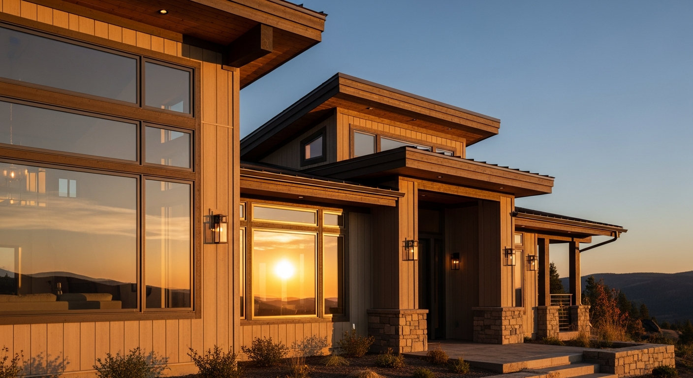
Why Your Sunday Ragu Smells Dangerously Better Above 7,000 Feet
There is a visceral, almost alchemical threshold crossed when stepping out of a biting Flagstaff winter and into a home where a slow braise has been commanding the stove for hours. The heavy, weather-stripped timber door shuts against the freezing winds of the Ponderosa pine forest, sealing off the rugged elements. Suddenly, the pristine, ozone-heavy mountain air clinging to heavy wool coats collides with the dense, fat-laced atmosphere of the kitchen.