


Sherwin-Williams Browse Brown SW 6012 is a remarkably deep shade with a Light Reflectance Value (LRV) of 14. In simple terms, an LRV of 14 means this paint absorbs 86% of the light hitting its surface rather than bouncing it around the room. It sits comfortably in the dark espresso family, but what makes Browse Brown truly special is what happens when natural daylight hits it head-on. Unlike flat, muddy browns, Browse Brown carries complex purple and violet undertones. In bright morning sunlight, those violet notes soften the brown into a sleek, dark plum hue, while evening lamplight brings out a rich velvet espresso.

Balancing Steel, Glass, and Rich Soil Tones
Browse Brown
Sherwin-Williams SW 6012
Alabaster
Sherwin-Williams SW 7008
Silver Fox
Benjamin Moore 2108-50
Narragansett Green
Benjamin Moore HC-157
In a modern home defined by exposed steel I-beams, polished concrete floors, and floor-to-ceiling glass walls, cold materials need a warm, grounding balance. Browse Brown acts as a anchor against all that smooth glass and cool concrete. Because the shade naturally absorbs intense midday summer sun, it prevents the blinding glare that often bounces off modern floor slabs.
To keep a shade as deep as Browse Brown from feeling like an overwhelming black hole in your living space, architectural trim choices become critically important. For window casings, baseboards, and structural metal seams, Sherwin-Williams Alabaster SW 7008 provides the ideal neutral counterweight. Alabaster is a creamy, warm off-white that creates a soft, sophisticated transition against Browse Brown. Applying Alabaster in a semi-gloss sheen on baseboards and door frames sharpens the edge of the dark walls, creating clean lines that frame the natural greenery outside your windows.

Work Directly with Torlando Hakes
Skip the color choice stress. Work directly with me as your personal Color Designer to select the perfect architectural palette for your home, and get a Complementary Color Consultation when you purchase paint through us.

Managing the Shift from Daylight to Evening Spotlight
One of the most fascinating aspects of Browse Brown SW 6012 is how dramatically its mood evolves across a single summer day. During peak daylight, bright light penetrating glass facades lifts the dark brown, letting you clearly see those rich violet undertones. As the sun sets and minimal recessed track lighting takes over, the violet fades back into a deep, moody dark chocolate that feels intimate and calm.
To transition smoothly from a high-impact Browse Brown accent wall into adjacent spaces—like open hallways or adjoining bedrooms—a mid-tone bridge color is essential. Benjamin Moore Silver Fox 2108-50 fits this role seamlessly. Silver Fox is a warm greyish-taupe with subtle mauve undertones that mirror the violet notes in Browse Brown. Painting an adjoining corridor in Silver Fox allows light to step down gracefully from bright off-white areas into the deep brown heart of the home, keeping the visual flow continuous and polished.

Unexpected Accent Pairings: Bring in Deep Jewel Tones
When working with a dark, violet-infused brown like Browse Brown SW 6012, pairing it with standard tan or beige can feel predictable. Instead, introducing a deep, jewel-toned contrast elevates the entire room into something designed by a true professional.
Benjamin Moore Narragansett Green HC-157 serves as a striking contrast accent for custom cabinetry, kitchen islands, or interior doors. Narragansett Green is a dark, moody blue-green that sits directly across the color wheel from the violet-brown tones of Browse Brown. In a modern kitchen nook, placing satin-finished Narragansett Green lower cabinets against a Browse Brown wall creates a rich visual pairing that feels anchored, modern, and completely custom.

Sheen Selection and Practical Room Applications
To get the best performance out of Browse Brown SW 6012 in your own home, sheen selection is everything. Dark paint colors show surface imperfections and light reflections far more easily than light colors do.
- Primary Walls (Living Rooms, Dens, Bedrooms): Always opt for a Flat or Matte finish. A flat finish removes unwanted reflection from high-overhead summer daylight, allowing the true violet-espresso color depth to show without a shiny glare.
- Trim, Doors, & Baseboards (Sherwin-Williams Alabaster): Use a Satin or Semi-Gloss finish to create a durable, wipeable surface that highlights crisp architectural trim lines.
- Custom Cabinetry & Accents (Benjamin Moore Narragansett Green): A Satin finish gives lower cabinets a soft, furniture-grade luster that holds up well to daily touch.
For room applications, Browse Brown excels on feature walls in living rooms flooded with natural light, cozy media dens, or as a dark backdrop in a modern powder room paired with warm oak woodwork and anodized aluminum hardware.

Embracing a paint shade as rich and dark as Sherwin-Williams Browse Brown SW 6012 takes confidence, but when balanced with crisp cream trim, greige transition walls, and deep green accents, it delivers an architectural depth that light neutrals simply cannot replicate.
Complementary Color Consultation
Planning a project? Work with Torlando Hakes directly as your personal Color Designer and get a Complementary Consultation when purchasing paint through us.
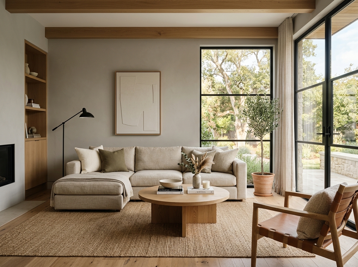 After
After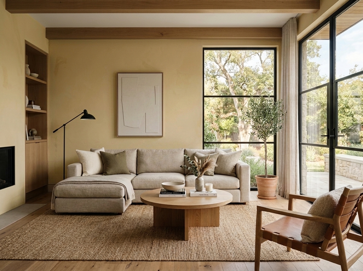 Before
Visualize Your Space with Color Studio AI
Planning a project? Skip the paint chip guesswork. Use our Color Studio AI to instantly visualize these paint colors on your own walls, or take advantage of our aligned contractor pricing matching current Sherwin-Williams retail promotions.
Book Your Upcoming Paint Project
Craftsman Painter is now scheduling premium transformations. Secure your spot and elevate your property value.
Get an EstimateHelp Others Find Professional Color Insights
Share this story directly to your networks or copy the link to share with friends.