


In simple terms, LRV runs on a scale from 0 to 100, where 0 is absolute black and 100 is pure white. At 73, Mountain Air brightens shadowed spaces like a soft breath of fresh air. What makes it special is its balanced undertone profile: it carries a distinct cool ice-blue base grounded by a subtle gray shadow. Instead of feeling stark or juvenile, it behaves like an atmospheric mist, changing personality seamlessly as the natural sunlight shifts across your walls throughout the day.
To visualize how this paint color behaves in a representative mid-century modern space in Indianapolis, consider how our sharp Midwestern autumn sunlight interacts with cool-toned walls. During crisp October afternoons, the low-angled golden sun pours through large glass windows, bringing intense warm amber and red hues into the house. When that fiery orange light hits Mountain Air, the blue undertones gently counteract the brassy heat of the sun, softening the atmosphere into a balanced, calming mist gray. In shaded corners or under cool morning skies, the paint retreats into its true identity—a serene, clear sky-blue that feels airy and expansive.
To keep a cool pale shade like Mountain Air from floating away, you need a grounded architectural framework. That starts with your trim, doors, and baseboards. I always recommend pairing Mountain Air with Sherwin-Williams Pure White SW 7005. Pure White is an exceptional anchor because it contains just a tiny drop of warmth, preventing your casing and moldings from looking glaringly bright or clinical.

Work Directly with Torlando Hakes
Skip the color choice stress. Work directly with me as your personal Color Designer to select the perfect architectural palette for your home, and get a Complementary Color Consultation when you purchase paint through us.

When applied in a semi-gloss finish against eggshell walls, Pure White defines the edges of the room, creating a clean frame that lets the subtle blue-gray of Mountain Air pop with quiet confidence.
While Mountain Air handles the primary wall surfaces, building a cohesive palette requires mid-tone bridge colors and rich accents to bring depth to surrounding spaces and millwork. For adjoining hallways, accent walls, or paneling, Sherwin-Williams Evergreen Fog SW 9130 serves as a bridge. This gentle sage green with gray undertones pulls the organic outdoor landscape indoors, mirroring the changing hues of fall trees.
For high-impact architectural elements—such as a kitchen island, built-in walnut bookcases, or interior doors—Sherwin-Williams In the Navy SW 9178 supplies grounded contrast. The deep, rich navy anchors the light, airy volume of Mountain Air, giving the eye a solid place to rest.

In mid-century modern design, wood tones do a lot of the heavy lifting when it comes to warmth. Mountain Air loves rich wood species. The cool blue-gray tones in the paint act as a natural complementary backdrop to warm walnut wall panels, teak hardwood flooring, and molded plywood furniture. Brushed brass light fixtures and hardware add a touch of warm metallic shine, picking up the golden rays of autumn light coming through clerestory windows.

If you are considering bringing this color palette into a bathroom or primary bedroom suite, Mountain Air shines particularly bright. Bathrooms can often feel enclosed or dark, but an LRV of 73 lifts the ceiling visually and expands small footprints.
When selecting finishes for your project, sheen selection makes all the difference in how Mountain Air performs:
- Walls: Opt for an Eggshell or Velvet finish in living rooms and bedrooms. It provides a soft, touchable glow that diffuses light beautifully without creating harsh reflections.
- Bathrooms & Kitchens: Use a Paint-grade Satin to protect the walls against moisture and allow for easy wiping while maintaining a subtle luster.
- Trim, Baseboards & Doors: Stick with Semi-Gloss in Sherwin-Williams Pure White SW 7005 for durability and clean visual contrast against the walls.
Sherwin-Williams Mountain Air SW 6224 offers a timeless solution for homeowners wanting color without overwhelming their space. It delivers clean atmosphere, balances warm daylight with cool serenity, and provides a backdrop for rich woods and classic architectural details.
Complementary Color Consultation
Planning a project? Work with Torlando Hakes directly as your personal Color Designer and get a Complementary Consultation when purchasing paint through us.
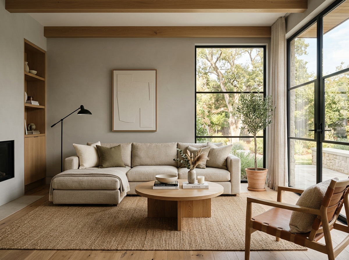 After
After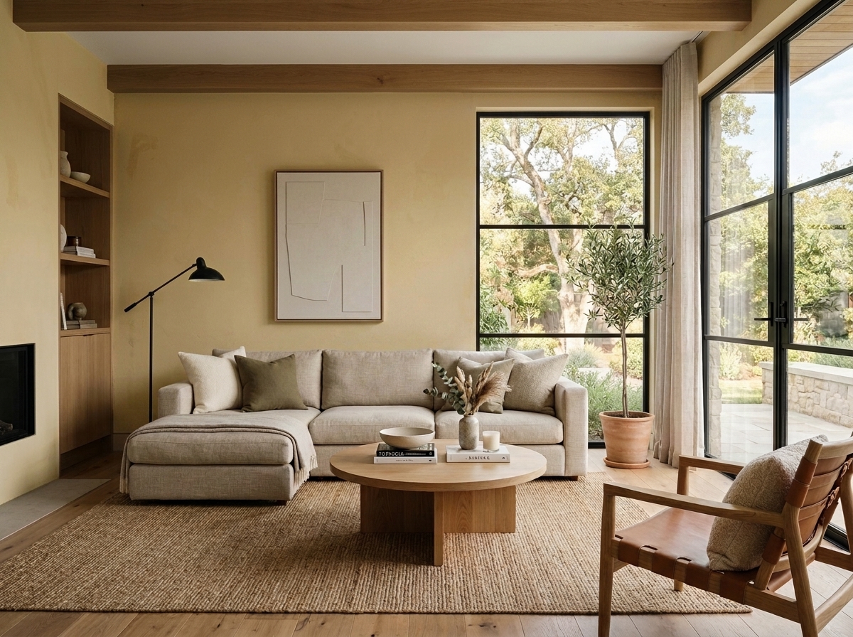 Before
Visualize Your Space with Color Studio AI
Planning a project? Skip the paint chip guesswork. Use our Color Studio AI to instantly visualize these paint colors on your own walls, or take advantage of our aligned contractor pricing matching current Sherwin-Williams retail promotions.
Book Your Upcoming Paint Project
Craftsman Painter is now scheduling premium transformations. Secure your spot and elevate your property value.
Get an EstimateHelp Others Find Professional Color Insights
Share this story directly to your networks or copy the link to share with friends.