


What sets this hue apart are its true undertones. Bathe Blue sits right at the intersection of crisp aqua and soft blue-green. To visualize how this palette behaves in a representative craftsman home in Bloomington, Indiana during high summer, imagine how bright, overhead sunlight shifts through the trees. In strong morning light, the aqua notes lean refreshing and cool. As afternoon arrives and warm sunlight fills the space, the soft green underneath comes forward, wrapping the room in a calm, earthy tone that feels entirely grounded.

To bring out the full character of Bathe Blue without letting the room feel overly chilly, the choice of white trim is critical. I always look for a white that brings brightness without harshness. Sherwin-Williams Pure White SW 7005 is the perfect partner here. It is a soft, balanced white that lacks cold blue cast or heavy yellow buildup. When applied to baseboards, door casings, and window trim, Pure White creates a clean, architectural frame that allows the light-reflecting aqua walls to stand out gracefully.

During mid-summer in the Midwest, the natural light outdoors is bright, warm, and constant. High overhead sun bounces off dense green foliage, casting a warm light into south- and west-facing rooms. Under these conditions, a pure blue wall can sometimes feel stark. This is where a mid-tone earth shade becomes essential to bridge the cool walls with the warm sunlight. Sherwin-Williams Balanced Beige SW 7037 functions beautifully as a warm anchor in adjoining spaces or low accent walls. It brings a grounded, clay-like warmth that absorbs excess summer glare, balancing the cool aquatic feel of Bathe Blue and keeping your floor plan unified.

Work Directly with Torlando Hakes
Skip the color choice stress. Work directly with me as your personal Color Designer to select the perfect architectural palette for your home, and get a Complementary Color Consultation when you purchase paint through us.

For areas where you want a punch of deep contrast—like a kitchen island, a built-in bookshelf, or front entryway doors—you need a deep color that shares the same chromatic DNA. Sherwin-Williams Mount Etna SW 7625 is a deep, moody slate green-blue that grounds the airy quality of Bathe Blue. When painted on low cabinetry or structural woodwork, Mount Etna anchors the room, pulling out the subtle teal depth hidden inside Bathe Blue while creating a dramatic focal point.

When applying this color scheme to an organic, Wabi-Sabi inspired interior, texture plays as big a role as color choice. I always recommend opting for a Flat or Matte sheen on your Bathe Blue walls. A flat finish diffuses strong summer sunlight, softening reflection and letting the blue-green undertones create an inviting, velvety surface. Save Satin or Semi-Gloss sheens for your Pure White trim and Mount Etna cabinetry—the subtle gloss contrast makes architectural details look crisp and deliberate. Pair these paint colors with raw white oak, hand-thrown clay pottery, unbleached linen textiles, and aged brass hardware to let the weathered beauty of natural materials shine.

Choosing paint is ultimately about curating how light and life move through your living space. Sherwin-Williams Bathe Blue offers a rare combination: it delivers the peaceful, refreshing mood of water without ever feeling thin or cold. When framed with a soft neutral white, balanced by natural earth shades, and grounded with deep slate accents, it creates a retreat that feels cool, calm, and effortlessly connected to nature all summer long.
Complementary Color Consultation
Planning a project? Work with Torlando Hakes directly as your personal Color Designer and get a Complementary Consultation when purchasing paint through us.
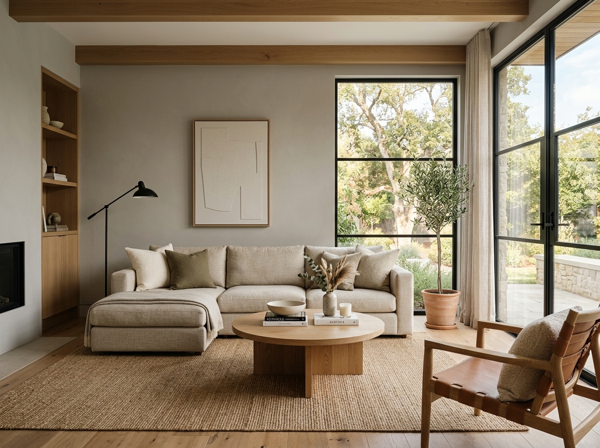 After
After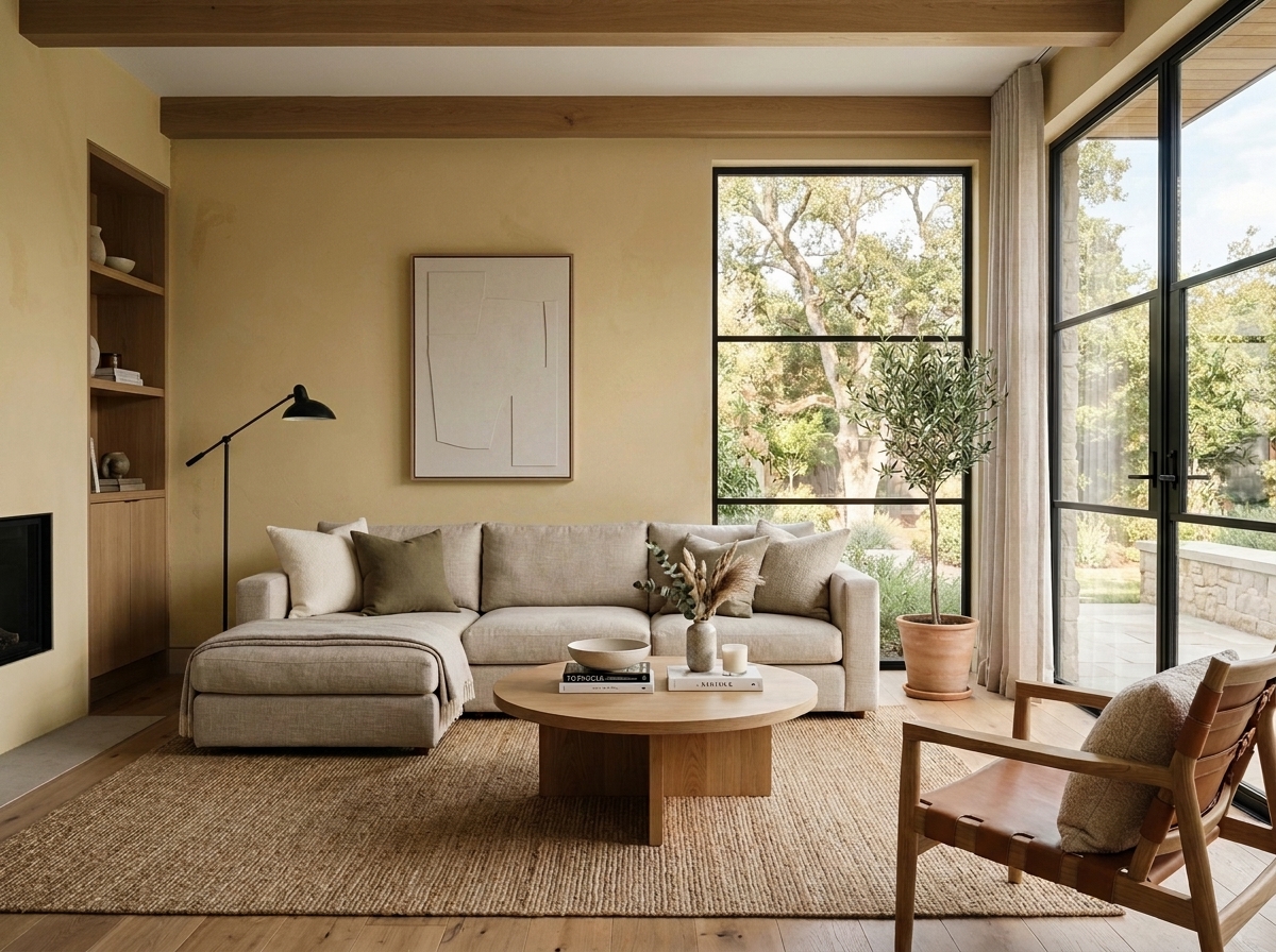 Before
Visualize Your Space with Color Studio AI
Planning a project? Skip the paint chip guesswork. Use our Color Studio AI to instantly visualize these paint colors on your own walls, or take advantage of our aligned contractor pricing matching current Sherwin-Williams retail promotions.
Book Your Upcoming Paint Project
Craftsman Painter is now scheduling premium transformations. Secure your spot and elevate your property value.
Get an EstimateHelp Others Find Professional Color Insights
Share this story directly to your networks or copy the link to share with friends.