


Sensitive Tint is a nuanced cool purple-gray with an LRV (Light Reflectance Value) of 60. In simple homeowner terms, an LRV of 60 sits right in the sweet spot of the light spectrum: it bounces back 60 percent of the light entering a room, keeping spaces bright and breathable, while absorbing just enough excess glare to stay calm under intense sun. Instead of reading as a simple stark gray, Sensitive Tint carries a delicate lavender undertone that blooms softly when hit with bright natural light. To visualize how this color palette behaves, let’s explore a visual design study of a representative Modern Prairie home in Bloomington, Indiana, where deep roof eaves frame views of vibrant summer greenery outdoors.

In a Modern Prairie design layout, architectural emphasis relies heavily on grounding horizontal lines, rich natural woodwork, and continuous window bands. When natural light filters through leaded glass grids during a warm Bloomington afternoon, Sensitive Tint on the main walls works like a atmospheric filter. The cool purple-gray pigments neutralize the intense brassy tones of direct midsummer sun, turning intense glare into a soothing, muted lilac-slate hue that pairs naturally with warm quarter-sawn white oak trim and linear concrete brick.
To keep the cool violet undertones of Sensitive Tint grounded, the surrounding trim requires a clean, soft white anchor. I recommend Sherwin-Williams Pure White SW 7005 for baseboards, horizontal ceiling beams, and window casings. Pure White contains just a tiny drop of warm pigment, preventing it from looking icy or harsh next to Sensitive Tint. Applied in a smooth satin finish, Pure White frames the cool matte walls in clean, crisp architectural outlines without creating a stark contrast.

Work Directly with Torlando Hakes
Skip the color choice stress. Work directly with me as your personal Color Designer to select the perfect architectural palette for your home, and get a Complementary Color Consultation when you purchase paint through us.

As daylight shifts from high overhead afternoon light to late-day golden hour, Sensitive Tint demonstrates its remarkable visual flexibility. In shadow, the wall color deepens into a rich, sophisticated gray-slate, while illuminated surfaces show off a subtle lavender mist. To bridge these light shifts between open rooms and adjoining hallways, I like to introduce Benjamin Moore Fieldstone 1558. Fieldstone is an earthy, organic mid-tone greige with subtle green-gray undertones. When painted on an adjoining hallway wall or a plaster fireplace surround, Fieldstone serves as a grounding visual balance, counteracting the cool violet notes of Sensitive Tint with subtle, stone-like warmth.

Every successful color palette needs a grounding point of high contrast to anchor the eyes. For built-in cabinetry, kitchen islands, or focal architectural nooks, Benjamin Moore Shadow 2117-30 provides a stunning finish. Shadow is a deep, velvety charcoal-plum that shares the underlying violet heritage of Sensitive Tint, but dials up the depth and drama significantly. Applied to custom kitchen base cabinets or a built-in library wall, Shadow pulls out the rich grain of quarter-sawn oak and accents brushed bronze hardware perfectly.

In smaller, intimate spaces like a primary bathroom sanctuary, Sensitive Tint creates a spa-like atmosphere. When paired with large-format stone floor tiles, brushed bronze fixtures, and a natural oak vanity, the cool wall tone softens the room’s hard surfaces. For wall surfaces, stick to a washable matte sheen to diffuse summer light smoothly; reserve satin or semi-gloss sheens for baseboards, door trim, and vanity millwork to keep surfaces easy to clean.

If your home receives abundant direct summer sunlight and you want a sophisticated wall color that feels atmospheric, tailored, and calm, Sherwin-Williams Sensitive Tint SW 6267 delivers exceptional depth without overwhelming your space.
Complementary Color Consultation
Planning a project? Work with Torlando Hakes directly as your personal Color Designer and get a Complementary Consultation when purchasing paint through us.
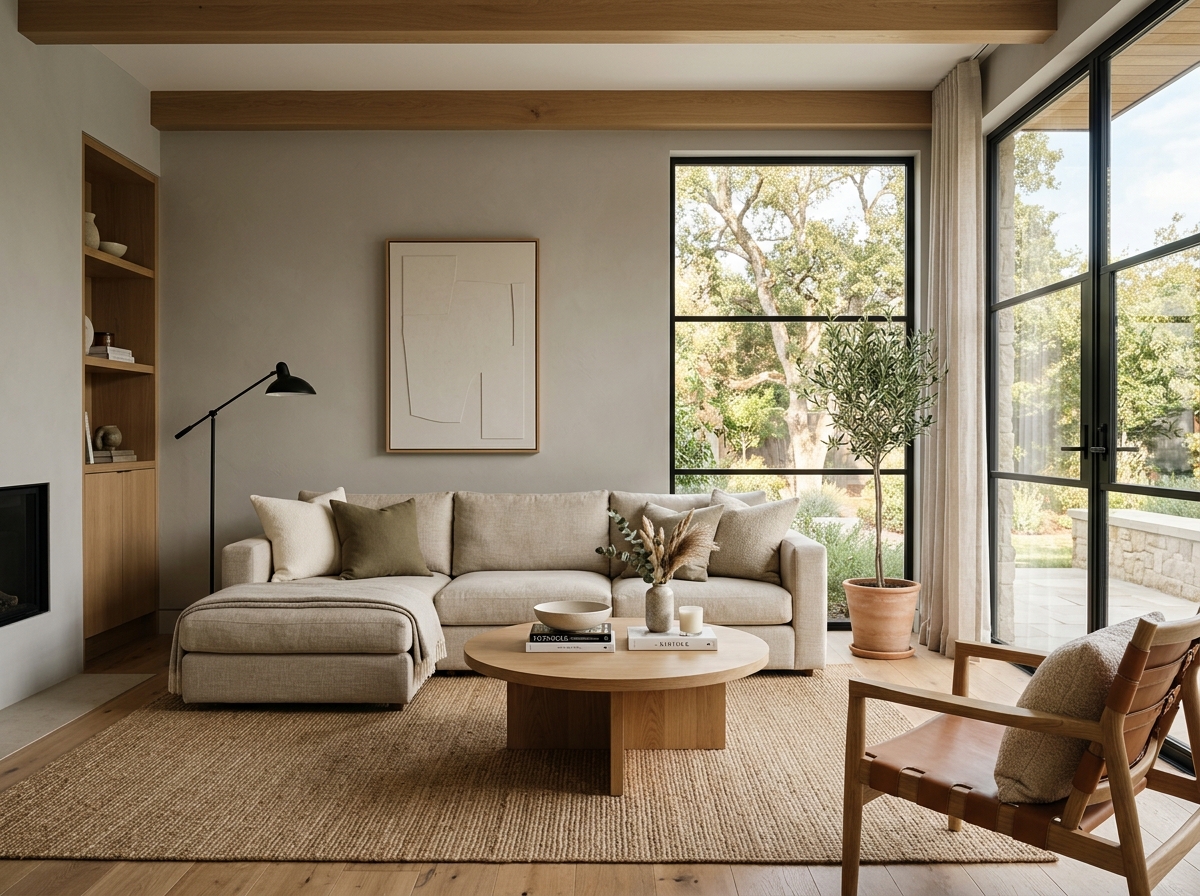 After
After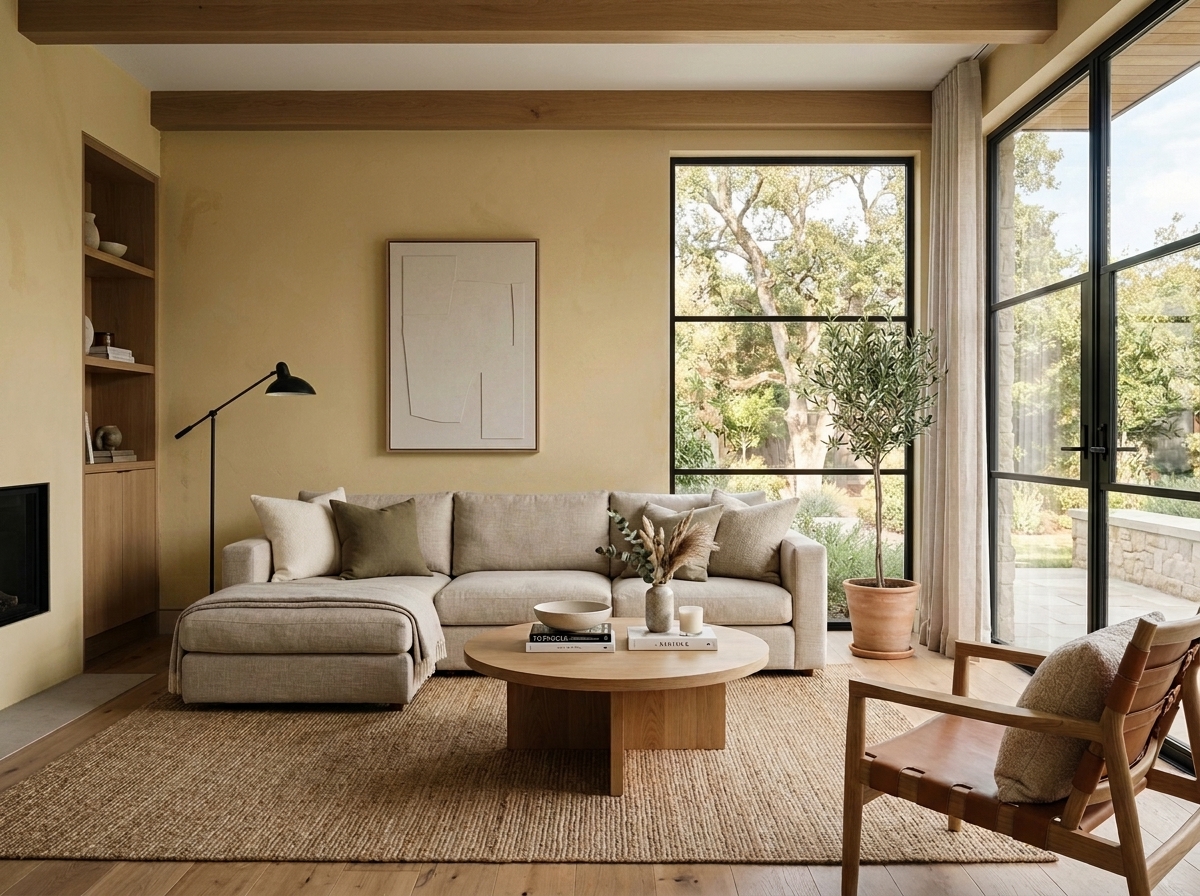 Before
Visualize Your Space with Color Studio AI
Planning a project? Skip the paint chip guesswork. Use our Color Studio AI to instantly visualize these paint colors on your own walls, or take advantage of our aligned contractor pricing matching current Sherwin-Williams retail promotions.
Book Your Upcoming Paint Project
Craftsman Painter is now scheduling premium transformations. Secure your spot and elevate your property value.
Get an EstimateHelp Others Find Professional Color Insights
Share this story directly to your networks or copy the link to share with friends.