


Cooled Blue sits at a Light Reflectance Value (LRV) of 64. In practical homeowner terms, LRV is a simple scale from 0 (pure black) to 100 (pure white) that tells you how much light a color reflects back into the room. Sitting comfortably at 64, Cooled Blue reflects a healthy amount of light—it brightens up darker corners easily, yet carries enough body so it never washes out into a generic off-white. What makes this color particularly special is its undertone balance: it is a true, refreshing blue stabilized by a subtle slate-gray foundation. That gray undertone keeps the color sophisticated, preventing it from feeling like a child's nursery shade.
To visualize how this color palette behaves in a representative Cleveland home during the crisp autumn months, imagine entering a living space surrounded by warm golden afternoon light. Outside the windows, rich orange and red leaves create a striking contrast against the walls. Indoors, Cooled Blue catches that low-angle sunlight, softening the fiery exterior tones and creating an immediate sense of peaceful balance.

Framing the Palette with Crisp Trim and Earthy Transitions
Cooled Blue
Sherwin-Williams SW 6759
Pure White
Sherwin-Williams SW 7005
Mindful Gray
Sherwin-Williams SW 7016
Black Fox
Sherwin-Williams SW 7020
A cool, airy wall color needs strong architectural framing to keep a home feeling grounded and intentional. To achieve a seamless balance, I pair Cooled Blue with Sherwin-Williams Pure White SW 7005 on all trim, door casings, and baseboards. Pure White is a remarkably bright, clear white that lacks any heavy yellow or harsh blue undertones. When painted along window frames and baseboards, it forms a clean border that highlights the subtle gray-blue depth of the walls without creating an overwhelming contrast.

Work Directly with Torlando Hakes
Skip the color choice stress. Work directly with me as your personal Color Designer to select the perfect architectural palette for your home, and get a Complementary Color Consultation when you purchase paint through us.

As you move through open floor plans, jumping directly from a cool blue wall to another cool tone can feel monotonous. That is where Sherwin-Williams Mindful Gray SW 7016 serves as an ideal mid-tone bridge. Mindful Gray is a warm, versatile greige that works exceptionally well in adjoining hallways, entry foyers, or open transitions. In our Cleveland design study, using Mindful Gray in the connecting hallway creates an inviting shift between spaces. It complements the natural blonde birch furniture and light cork panels, keeping the home cozy during chilly Midwestern afternoons.

Adding Depth and Drama with Dark Grounding Accents
While Cooled Blue and Mindful Gray establish an airy, modern Scandinavian background, every well-designed room needs a touch of grounding weight to anchor the eyes. For built-in cabinetry, kitchen islands, or interior doors, Sherwin-Williams Black Fox SW 7020 provides the perfect deep contrast.
Black Fox is not a stark, flat black; it is a rich, dark bronze-black with warm charcoal undertones. When applied to lower kitchen cabinets or a focal fireplace surround, Black Fox pulls out the cool slate notes in Cooled Blue while echoing the earthy organic textures of woven wool and dark plant pottery. The contrast gives the entire room an elevated, tailored structure.

Bringing the Look Home: Sheens and Styling
To get the most out of this palette, selecting the right paint sheens is just as important as picking the colors themselves:
- Walls (Sherwin-Williams Cooled Blue SW 6759 & Mindful Gray SW 7016): Use a Matte or Flat finish in bedrooms and living rooms to absorb excess sheen and showcase the creamy slate undertones. For high-traffic hallways or bathrooms, opt for an Satin finish to allow for easy cleaning without losing depth.
- Trim & Baseboards (Sherwin-Williams Pure White SW 7005): Stick to a Semi-Gloss or Satin finish. This gives your moldings a durable, smooth coat that reflects light softly along architectural edges.
- Cabinetry & Accent Feature Doors (Sherwin-Williams Black Fox SW 7020): A Satin finish brings out the rich charcoal-bronze depth of Black Fox while standing up to daily touch points and scuffs.
To complete the Scandinavian aesthetic, pair these paint shades with honest, tactile materials. Layer blonde birch coffee tables with soft sheepskin throws, textured wool blankets, and natural cork wall tiles. Scatter potted ferns and fiddle-leaf figs near your windows where the warm autumn light can bounce off the Cooled Blue backdrop.

When balanced with grounded neutrals and warm natural materials, Sherwin-Williams Cooled Blue proves that a cool paint color can create an extraordinarily warm, cozy sanctuary.
Complementary Color Consultation
Planning a project? Work with Torlando Hakes directly as your personal Color Designer and get a Complementary Consultation when purchasing paint through us.
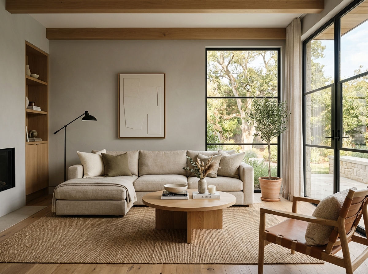 After
After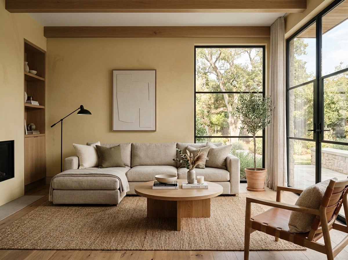 Before
Visualize Your Space with Color Studio AI
Planning a project? Skip the paint chip guesswork. Use our Color Studio AI to instantly visualize these paint colors on your own walls, or take advantage of our aligned contractor pricing matching current Sherwin-Williams retail promotions.
Book Your Upcoming Paint Project
Craftsman Painter is now scheduling premium transformations. Secure your spot and elevate your property value.
Get an EstimateHelp Others Find Professional Color Insights
Share this story directly to your networks or copy the link to share with friends.