
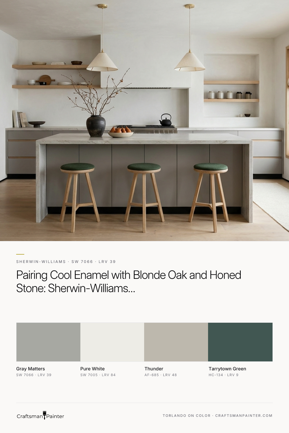


Many people default to warm taupes or beige-grays when working with blonde natural oak and plaster, assuming a cool gray will feel sterile. Actually, stacking warm paint on top of warm wood and warm evening bulbs often turns a kitchen muddy. This design study explores why Sherwin-Williams Gray Matters (SW 7066) works so well on frameless, flat-panel cabinetry and a centerpiece island, providing the cool architectural counterpoint that blonde oak and natural stone need to look their best.
How a Cool Mid-Tone Gray Anchors a Japandi Kitchen
Real-paint peel-and-stick samples ship via Samplize. Craftsman Painter may earn a small commission on sample orders at no extra cost to you.
Sherwin-Williams Gray Matters has a Light Reflectance Value (LRV) of 39. On a scale from zero to one hundred, 39 sits firmly in the mid-to-deep range. It has enough weight to ground a large kitchen island without swallowing the ambient light the way charcoal or black enamel can. Underneath its neutral surface, Gray Matters carries a distinct cool gray base with a subtle blue-green undertone.
In the visualization of the Japandi kitchen below, we placed Gray Matters in a durable satin cabinet enamel across the centerpiece island and the lower perimeter run, pairing it with upper frameless cabinets in blonde natural oak. The surrounding smooth plaster walls are finished in Sherwin-Williams Pure White (SW 7005). Pure White has just enough softness to keep the plaster from glaring in daylight, while its clean edge lets the blue-green note in Gray Matters look deliberate and tailored rather than accidental. Notice how the cool satin enamel acts as a visual foil to the warm grain of the oak and the wide-plank wood flooring.
Sheen, Joinery, and the Tactile Contrast of Stone and Metal
Painting flat-panel cabinetry is a completely different discipline than painting drywall. When you apply a satin or semi-gloss cabinet enamel to millwork, the tighter resin structure of the coating reflects light across the flat planes and sharp edges of the doors. Even on frameless cabinets with concealed finger pulls, light catches the top bevel of the drawer fronts and the vertical shadow lines between doors. Because Gray Matters sits at an LRV of 39, a satin sheen gives the slab doors a velvety, stone-like presence that shifts gently as you move through the room.
Looking at the close-up rendering of the island joinery and countertop edge below, you can see how the cool blue-green undertone interacts with natural stone and hardware. When paired with honed quartzite or marble that carries cool gray veining, Gray Matters pulls those mineral streaks forward. To keep the cool gray from feeling clinical during an Indiana winter, you need warmth in your tactile details. Here, slender matte black metal accents and unlacquered brass faucet fixtures bridge the gap between the cool enamel and the blonde oak drawer interiors. Under low-angle late-autumn afternoon sun, the satin finish absorbs the glare while the brass and oak supply the warmth.

Deepening the Palette in the Butler’s Pantry
A great cabinet color should also know how to share the stage with adjoining rooms. As afternoon light fades around 4:30 PM in November and you flip on the 2700K amber dining chandelier and under-cabinet LEDs, Gray Matters takes on a deeper, slate-like quality. The yellow cast of warm indoor bulbs neutralizes some of the blue-green coolness, leaving a quiet, grounded gray.
In the color study of the butler’s pantry below, we explored how Gray Matters transitions into a tighter, jewel-box millwork zone right off the main kitchen. The lower frameless cabinets remain in Gray Matters, while the recessed plaster alcove and upper vertical paneling introduce Benjamin Moore Tarrytown Green (HC-134). Because Gray Matters already holds a quiet green-blue undertone, placing it next to a rich, heritage pine green like Tarrytown Green feels completely cohesive. Floating shelves in thick blonde oak and raw matte ceramic vessels break up the dark green, creating a warm, shadowed prep space for holiday hosting.

Transitioning into Mudroom Lockers and Adjoining Living Zones
In an open-concept Japandi floor plan, sightlines often run straight from the kitchen island into a mudroom corridor or a family study. If every wall is painted crisp white, the transition between rooms can feel abrupt. To soften that shift, we brought in Benjamin Moore Thunder (AF-685) on the adjoining plaster walls leading into the mudroom and study zone.
Thunder is a warm, complex greige that acts as a bridge between the Sherwin-Williams Pure White walls of the main kitchen and the cooler Gray Matters millwork. In the visualization of the built-in mudroom lockers and bookcase wall below, you can see how the cool gray cabinetry stands out cleanly against the warmer Thunder walls. The built-in bench uses solid blonde oak slats to echo the kitchen island details, while the tall, flat-panel storage lockers in Gray Matters hide everyday clutter behind smooth, uninterrupted satin doors.

Carrying the Millwork Study into a Primary Bath Vanity
When a homeowner falls in love with how a cabinet enamel performs in the kitchen, they often ask if they can carry it into a secondary space like a powder room or primary bath suite. Gray Matters is a smart choice for bathroom millwork because its blue-green undertone naturally complements water, stone, and porcelain without looking like a literal "bathroom blue."
In this final rendering of a Japandi bathroom vanity, the frameless cabinetry is finished in Gray Matters satin enamel and topped with a thick slab of honed limestone. The walls are painted in Benjamin Moore Thunder, while warm 2700K sconce lighting casts gentle shadows across the smooth plaster and slatted oak privacy screen. Even in a windowless or low-light bath environment, the LRV of 39 keeps the vanity looking substantial and clean, proving how versatile a cool, mid-tone gray can be when surrounded by natural wood and warm ambient light.

When you are pairing painted millwork with blonde oak, plaster, and natural stone, resist the urge to match every surface in the same warm temperature family. Giving your cabinetry a cool, composed anchor like Sherwin-Williams Gray Matters creates the visual tension that makes warm woods and amber evening light feel truly inviting.

Trading Bold Blue for the Grounded, Restorative Calm of Sherwin-Williams Smoky Beige SW 9090 in an Older Bloomington Home

Warm Mid-Century Woods Meet Their Organic Counterpart in Sherwin-Williams Sensible Hue SW 6198
