


To visualize how this color palette functions in a representative Cleveland home layout during autumn, consider the way low-angle daylight filters through trees shedding their leaves. Poised Taupe has a Light Reflectance Value (LRV) of 16. On a scale where 0 absorbs all light and 100 reflects it all, an LRV of 16 places this color firmly in the deep mid-tone territory. It does not bounce sunlight around a room like a soft off-white; instead, it absorbs excess glare and anchors the space with a calm, velvet-like presence.

What makes Poised Taupe endlessly interesting is its underlying color composition. At its foundation, it is an earthy, weathered wood tone. However, Sherwin-Williams infused it with a cool gray undertone and a tiny splash of violet. In practical homeowner terms, this means the paint behaves like a chameleon throughout the day. In direct morning sun, the warm brown elements shine, giving your room an organic, stone-like quality. As evening approaches and warm lamps flicker on, those violet and gray notes emerge, adding a layer of moody depth that makes living rooms and bedrooms feel sheltered and serene.
To keep a shade as complex as Poised Taupe from feeling heavy, architectural framing is critical. For trim, baseboards, and window casings, I always direct homeowners toward Sherwin-Williams Pure White SW 7005. Pure White contains just a drop of warm yellow and a micro-touch of gray, making it a soft, clean white that avoids looking clinical or blue. When paired against Poised Taupe walls, Pure White provides a crisp, tailored outline that defines the architectural lines of door frames and crown molding without creating a harsh contrast.

Work Directly with Torlando Hakes
Skip the color choice stress. Work directly with me as your personal Color Designer to select the perfect architectural palette for your home, and get a Complementary Color Consultation when you purchase paint through us.

In northern climates like Ohio, where fall natural light transitions from golden afternoon sun to cool, overcast gray within an hour, Poised Taupe adapts remarkably well. In a open-plan room, you can watch the color shift across corners. On the wall directly receiving light from outdoor trees wrapped in yellow and amber leaves, the paint appears as a rich, warm clay-gray. On the adjacent wall cast in shadow, the cool violet-gray undertones take over, creating natural depth without requiring a second paint color.
To maintain a serene Japandi aesthetic, stick to flat or matte sheens for wall surfaces. A matte finish absorbs light across Poised Taupe’s complex pigment mix, eliminating unwanted sheen glare and allowing the wall surface to look like authentic, lime-washed plaster. Save satin or semi-gloss finishes exclusively for your Pure White trim and doors to handle daily wear and tear.

When expanding this palette into neighboring spaces—such as an adjoining dining room, a home office, or custom built-in cabinetry—introducing complementary muted tones creates a cohesive narrative. A brilliant mid-tone partner for Poised Taupe is Sherwin-Williams Clary Sage SW 6178. Green sits opposite violet on the color wheel, making this dusty, organic sage green a natural counterpart. Used in an adjoining hallway or on lower kitchen cabinets, Clary Sage draws out the earthy, mineral quality of Poised Taupe.
For targeted focal points, such as a bar nook, an entry door, or accent joinery, Benjamin Moore Black Raspberry 2114-10 introduces a captivating dark element. This deep, blackened plum shade taps directly into the hidden violet notes inside Poised Taupe, bringing an instant sense of tailored luxury to built-ins or dark accent woodwork.

When dressing a space painted in Poised Taupe, material selection is everything. The Japandi philosophy relies on honest, natural textures rather than loud patterns. Opt for pale blonde oak furniture to provide a light, clean contrast against the depth of the walls. Bring in woven linen textiles in oat, stone, and bone shades, and anchor the furniture layout with slim, matte-black metal lighting fixtures or table legs. The black metal elements sharpen the room’s profile, keeping the soft, earthy background from feeling too diffuse.

Sherwin-Williams Poised Taupe SW 6039 remains an exceptional choice for anyone seeking a modern neutral that offers rich atmospheric depth without surrendering warmth.
Complementary Color Consultation
Planning a project? Work with Torlando Hakes directly as your personal Color Designer and get a Complementary Consultation when purchasing paint through us.
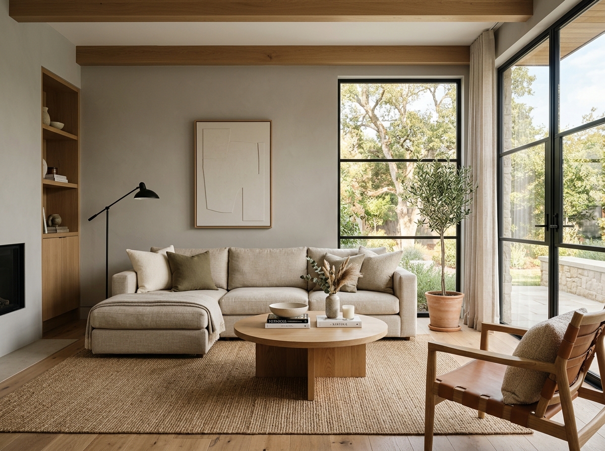 After
After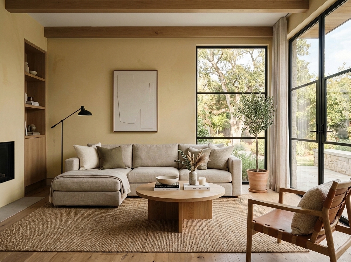 Before
Visualize Your Space with Color Studio AI
Planning a project? Skip the paint chip guesswork. Use our Color Studio AI to instantly visualize these paint colors on your own walls, or take advantage of our aligned contractor pricing matching current Sherwin-Williams retail promotions.
Book Your Upcoming Paint Project
Craftsman Painter is now scheduling premium transformations. Secure your spot and elevate your property value.
Get an EstimateHelp Others Find Professional Color Insights
Share this story directly to your networks or copy the link to share with friends.