
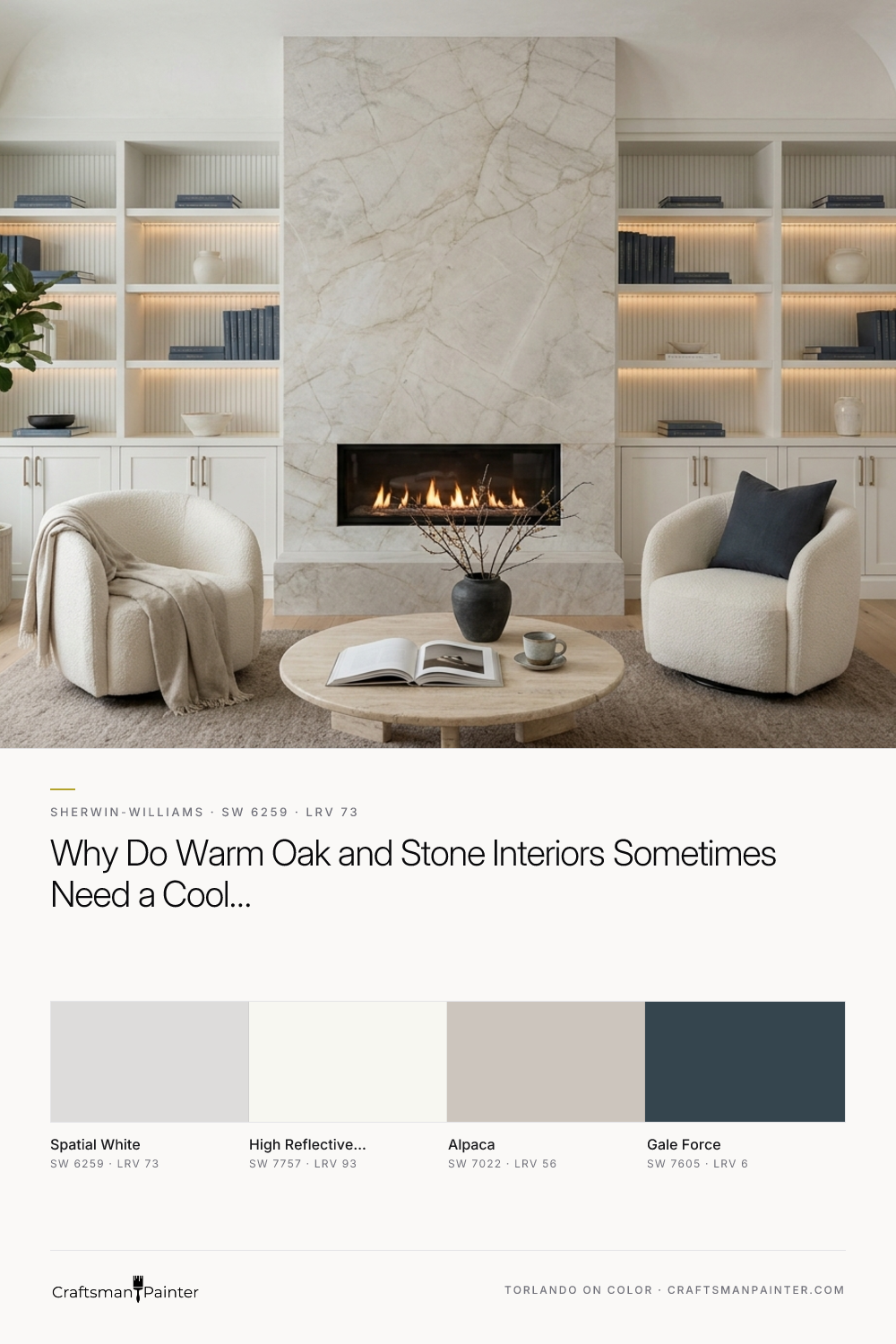


With a Light Reflectance Value (LRV) of 73, Spatial White sits comfortably below stark gallery whites while retaining an airy, expansive presence. It is a cool off-white carrying a deliberate violet-gray undertone. On a small paper swatch, that subtle lavender-gray lean might seem unexpected for an organic interior. Spread across architectural woodwork in a satin cabinet enamel, however, it acts as an optical cleanser. During the low-angle late-autumn and early-winter afternoons we experience here in Columbus, Indiana—when daylight fades early and interior 2700K sconces and chandeliers take over for evening hosting—that cool violet-gray backbone keeps the woodwork from turning sallow or overly amber.
Setting the Tone in the Kitchen Before Entering the Study
To understand how Spatial White performs across a whole-home millwork package, it helps to start where the natural stone and cabinetry meet in high volume. In this first visualization of an adjoining kitchen, the perimeter slim-stiled micro-Shaker cabinetry and vertical-fluted island panels are finished in a smooth satin enamel of Spatial White. Surrounding the woodwork, the plaster walls and coved ceiling are painted in Sherwin-Williams High Reflective White (SW 7757), which provides a bright, clean boundary so the softer 73 LRV of the cabinetry reads as an intentional, tailored neutral rather than an off-match white.
Real-paint peel-and-stick samples ship via Samplize. Craftsman Painter may earn a small commission on sample orders at no extra cost to you.
Notice how the satin sheen behaves across the narrow rails, stiles, and fluted grooves compared to the flat drywall above. Flat wall paint absorbs light and flattens out color; cabinet enamel bends light across every sharp millwork profile. Those crisp shadow lines draw out the cool gray clarity of Spatial White, allowing the creamy golden taupe veins of the honed Taj Mahal quartzite to stand out with real definition.
The Tactile Marriage of Cool Enamel, Quartzite, and Champagne Bronze
When you move in close to the joinery, the relationship between undertone and hardware becomes clear. Warm metals like brushed champagne bronze can sometimes disappear against buttery cream cabinets, losing their silhouette. Against the cool, violet-gray composure of Spatial White, brushed champagne bronze gains crisp edges and a rich tonal contrast.

In the close-up rendering above, you can see how the cool mineral quality of the enamel bridges the gap between the warm stone and the rift-cut white oak floors. The violet-gray undertone quietly pulls out the cooler taupe and pewter mineral deposits hidden inside the quartzite slab, making the stone look layered and grounding the woodwork.
Deepening the Palette in the Arched Butler's Pantry
Moving from the main living spine toward the library, transitional millwork zones benefit from a dramatic shift in contrast while holding onto the same core enamel. In this design study of an arched butler's pantry alcove, the lower micro-Shaker cabinets remain in Spatial White, while the interior alcove backing and upper vertical paneling step down into Sherwin-Williams Gale Force (SW 7605)—a deep, stormy naval blue with a subtle slate cast.

To bridge the transition between the crisp kitchen walls and the moodier study ahead, the exterior plaster framing the pantry arch is painted in Sherwin-Williams Alpaca (SW 7022). Alpaca is a warm greige that carries its own quiet violet-taupe undertone, making it a natural cousin to Spatial White. Together with the thick rift-cut white oak floating shelves and warm under-shelf lighting, the combination proves that a cool off-white cabinet finish can feel remarkably cozy when tucked beside deep slate blue and warm wood grain.
The Centerpiece: Library Bookcases and Architectural Fireplace Built-Ins
The true test of this palette happens in the study, where floor-to-ceiling bookcases and paneled lower cabinets flank a monumental stone fireplace. In a room dedicated to quiet reading and evening fireside conversation during the November and December hosting season, painting an entire wall of built-ins in a stark, high-LRV white would feel clinical. Painting them in Spatial White gives the architecture weight and composure.

In this library visualization, observe how the satin enamel on the bookcase stiles and architectural mantel interacts with the tumbled travertine fireplace surround. Travertine is porous, matte, and unapologetically warm. The smooth, cool surface of Spatial White creates both a textural and temperature counterbalance. As the low autumn sun drops and the warm 2700K picture lights wash downward across the shelves, the violet-gray undertone softens into a velvety silver-pearl. Flanking plaster walls in Alpaca wrap the room in warmth, while a subtle reveal of Gale Force at the back of the lower display niches anchors the dark spines of books and bronze objects.
Continuity in the Primary Bath Vanity
Carrying a single millwork color throughout a home creates the kind of effortless visual rhythm that defines quiet luxury. In this final rendering of the primary bath vanity, Spatial White returns on a floating-style tailored oak-and-enamel vanity anchored firmly by recessed plinth feet on a tumbled travertine floor.

Under the warm glow of bathroom sconces—where homeowners are most sensitive to strange yellow or green color casts around a mirror—Spatial White remains calm, clean, and true. Paired with Alpaca walls and Taj Mahal stone, it proves that when your natural materials bring the warmth, a cool, thoughtfully balanced off-white enamel is often the smartest way to let them shine.

Crisp Trim and Warm Timber Find Their Quiet Counterpart in Sherwin-Williams Nonchalant White SW 6161

Candlelit Gatherings and Early Dusk Find a Quiet Anchor in Sherwin-Williams Individual White (SW 6008)
