
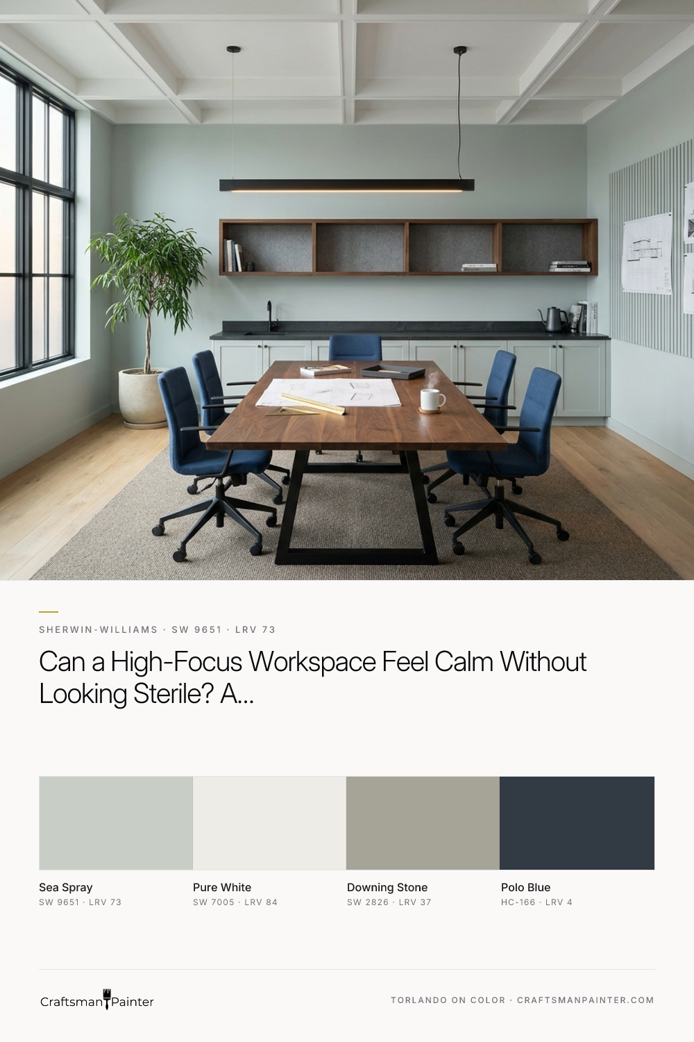


Sherwin-Williams Sea Spray (SW 9651) resolves that tension with remarkable poise. With a Light Reflectance Value (LRV) of 73, it sits safely below the blinding threshold of pure white while still bouncing plenty of ambient light deep into an interior floor plan. On the wall, it reads as a hushed, atmospheric off-white underpinned by soft green and gray undertones. That subtle green-gray foundation is doing real ergonomic work: it absorbs the sharp edge of overhead fixtures and computer screens, giving the human eye a restful mid-distance focal point while keeping the architecture crisp and tailored.
In the wide architectural visualization below, you can see how Sea Spray establishes the primary envelope of a modern creative studio and executive suite. Paired with Sherwin-Williams Pure White (SW 7005) along the ceiling coffers and crisp perimeter trim, Sea Spray reveals its quiet botanical composure without ever reading like a pastel bedroom color. The dark steel frames of the glass-walled boardroom cut a clean graphic line against the soft walls, while the warm oak floors and woven commercial carpet tiles ground the space in tactile warmth.
Real-paint peel-and-stick samples ship via Samplize. Craftsman Painter may earn a small commission on sample orders at no extra cost to you.
First Impressions and Client Hospitality at the Reception Desk
When a client steps off the elevator into an architectural firm, financial group, or design studio, the reception zone sets the psychological pace for the entire meeting. You want visitors to feel both the authority of the practice and an immediate sense of hospitality. High-contrast corporate lobbies can feel cold and transactional, whereas spaces with balanced tonal grounding encourage guests to slow down, take a breath, and settle into the conversation.
To anchor the arrival zone in our next color rendering, we paired Sea Spray on the surrounding plaster and acoustic wall panels with custom reception millwork and a hospitality coffee bar finished in Benjamin Moore Polo Blue (HC-166). Polo Blue is a deep, classic navy with enough blackened depth to stand shoulder-to-shoulder with dark architectural steel and walnut. Because Sea Spray carries that quiet gray-green undertone, it bridges the gap between the rich navy cabinetry and the natural wood grain, preventing the dark millwork from looking isolated or overly nautical.

Managing Late-Autumn Daylight and Screen Glare in the Boardroom
From November through December, Indiana light has a distinct dual personality. Midday brings a cool, low-angle silver cast that rakes sideways across glass partitions, and by late afternoon, the sky dims early, handing the room over to warm interior illumination. A workspace paint color has to handle that daily transition smoothly so staff aren't jolted by a sudden shift in mood at 4:30 p.m.
Look at how Sea Spray behaves in the boardroom visualization below as low-angle afternoon daylight filters through the exterior glazing and meets the warm linear pendant fixtures over the table. A stark white wall would catch that low winter sun and throw a blinding hot spot across every laptop screen in the room. At LRV 73, Sea Spray diffuses that grazing light into a velvety, low-glare wash. As the afternoon fades and the warm interior fixtures take over, the gray-green undertones warm up into a calm, organic parchment tone that complements the built-in walnut credenzas and keeps evening client presentations feeling composed and inviting.

Cognitive Comfort in the Executive Focus Offices
While open studio zones and boardrooms thrive on airy light reflectance, private focus offices and consultation suites benefit from a slightly weightier tonal partner. When employees are reviewing complex blueprints, financial models, or creative briefs for hours on end, introducing a grounded mid-tone in adjoining alcoves helps compartmentalize the floor plan and signals a quieter acoustic zone.
In the rendering of the paneled executive focus suite below, we brought in Sherwin-Williams Downing Stone (SW 2826) on the interior architectural paneling and secondary alcove walls, looking back into the main Sea Spray studio corridor. Downing Stone is a sturdy, earthen warm gray that shares the same quiet mineral DNA as Sea Spray. Together, they create a gentle step down in brightness that reduces peripheral visual fatigue around dual-monitor setups while keeping the sightlines through the glass partitions completely cohesive.

Material Pairings and Built-In Millwork Details
The real measure of a commercial wall color is how generously it treats the permanent materials around it. In an executive office or creative studio, you are rarely looking at paint in isolation; you are looking at paint against quarter-sawn walnut, matte black steel, textural acoustic felt, brushed brass, and commercial-grade flooring.
In this final detail study of the studio's custom conference credenza and material junctions, you can see how the full palette locks together. Sea Spray sits on the upper plaster wall, offering just enough herbal-gray tint to make the Sherwin-Williams Pure White baseboard and casing read intentional and tailored. On the lower storage cabinetry, a grounding coat of Polo Blue repeats the authority of the reception desk, while an adjacent structural column in Downing Stone bridges the warm oak planks and the cool steel framing. Every surface feels distinct, glare is kept strictly in check, and the room supports both deep daily concentration and effortless client hosting.

When you choose a high-LRV neutral with a disciplined green-gray undertone like Sherwin-Williams Sea Spray, you give your team a workspace that respects their visual stamina from the first morning briefing through the early winter dusk.

Decoding the Brilliant Alchemy of Sherwin-Williams Sea Salt in High Summer

Keeping Classic Dark Wood Trim? How Sherwin-Williams Agreeable Gray SW 7029 Bridges Past and Present
