

The Space & Craftsman's Brief
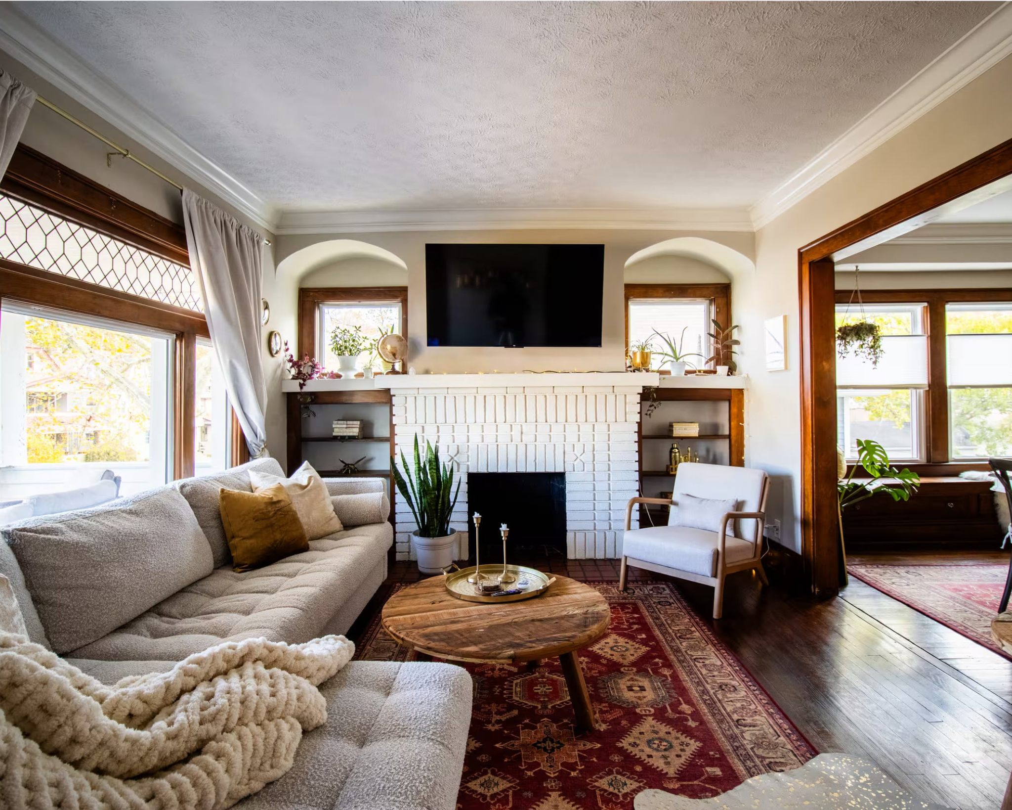
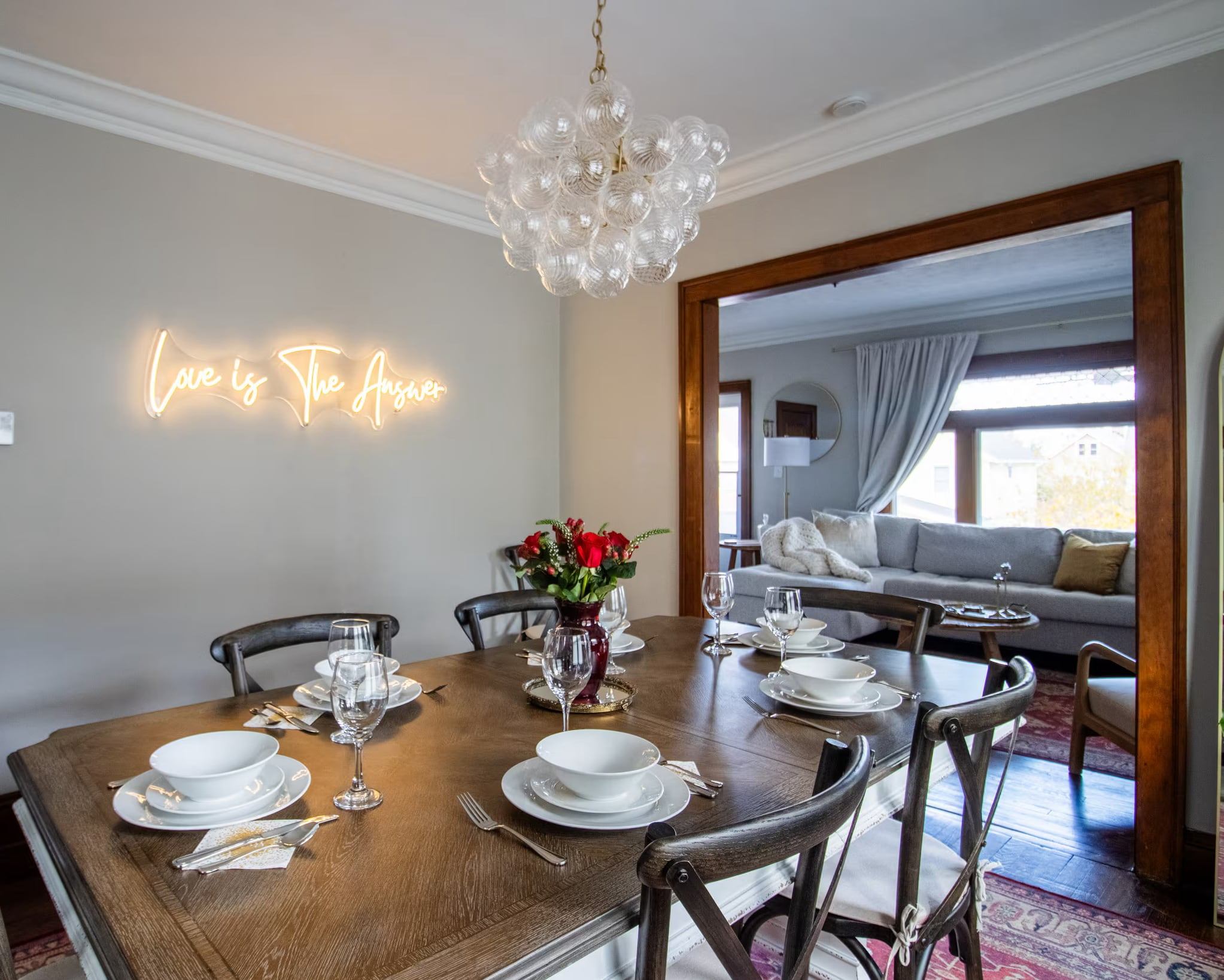
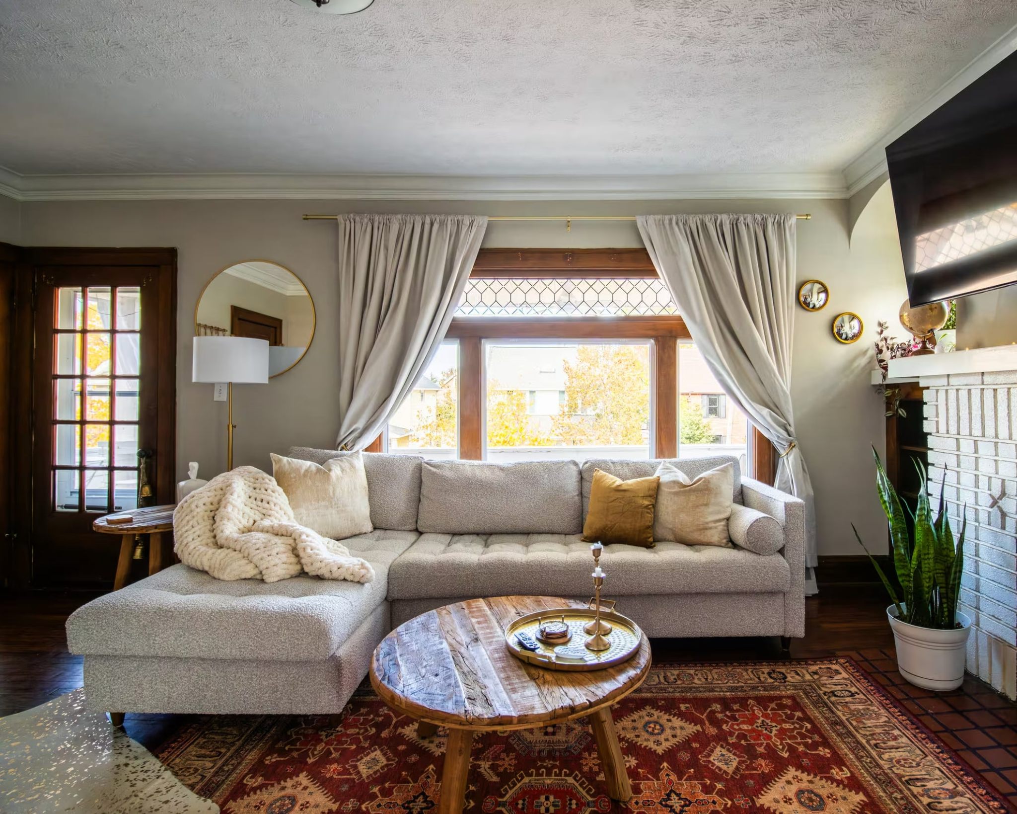
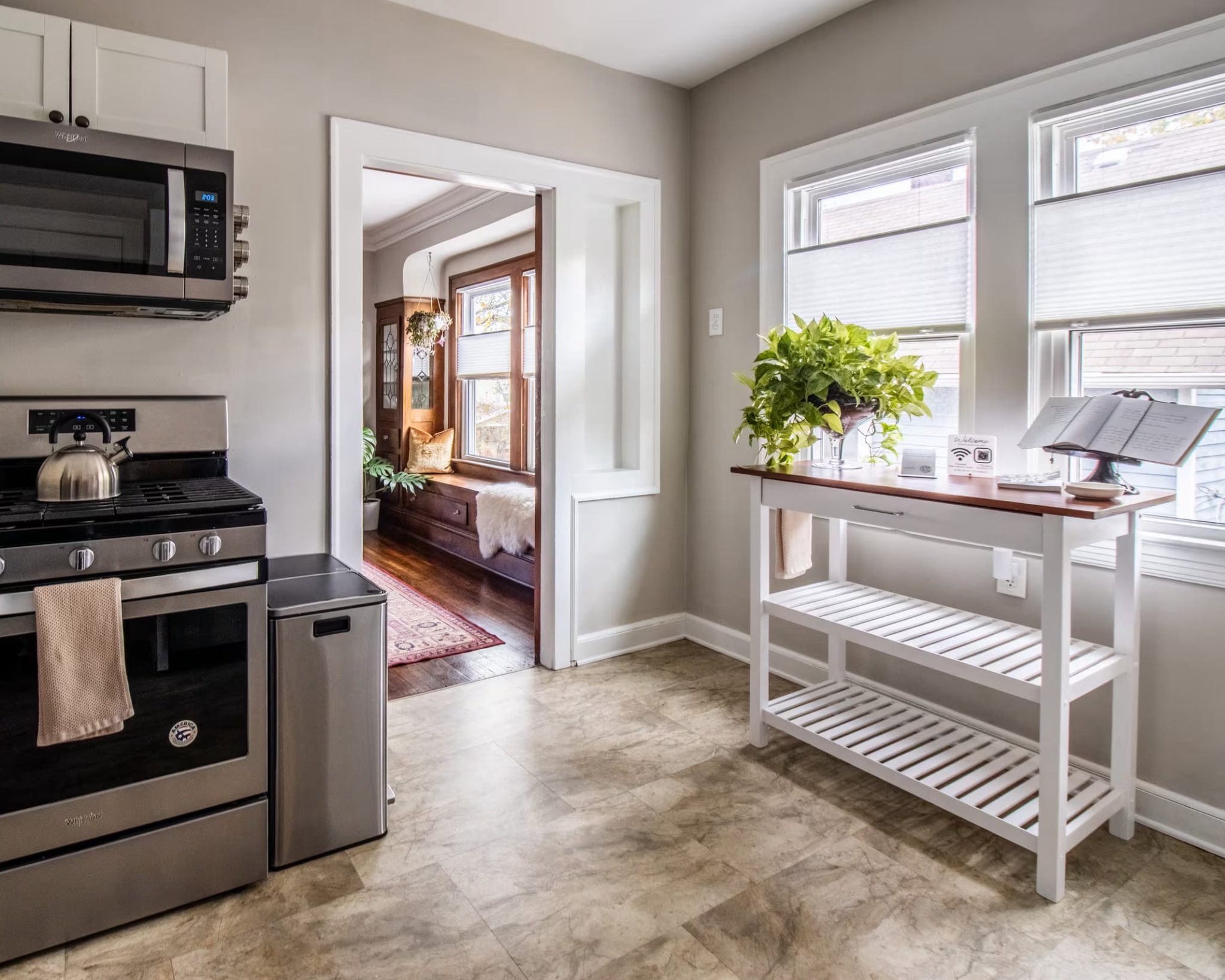
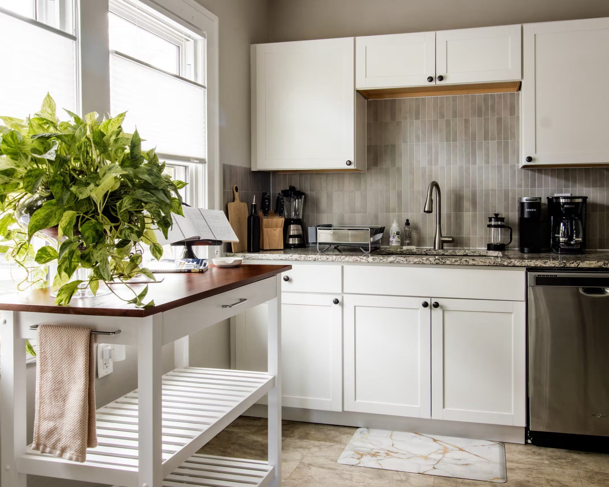
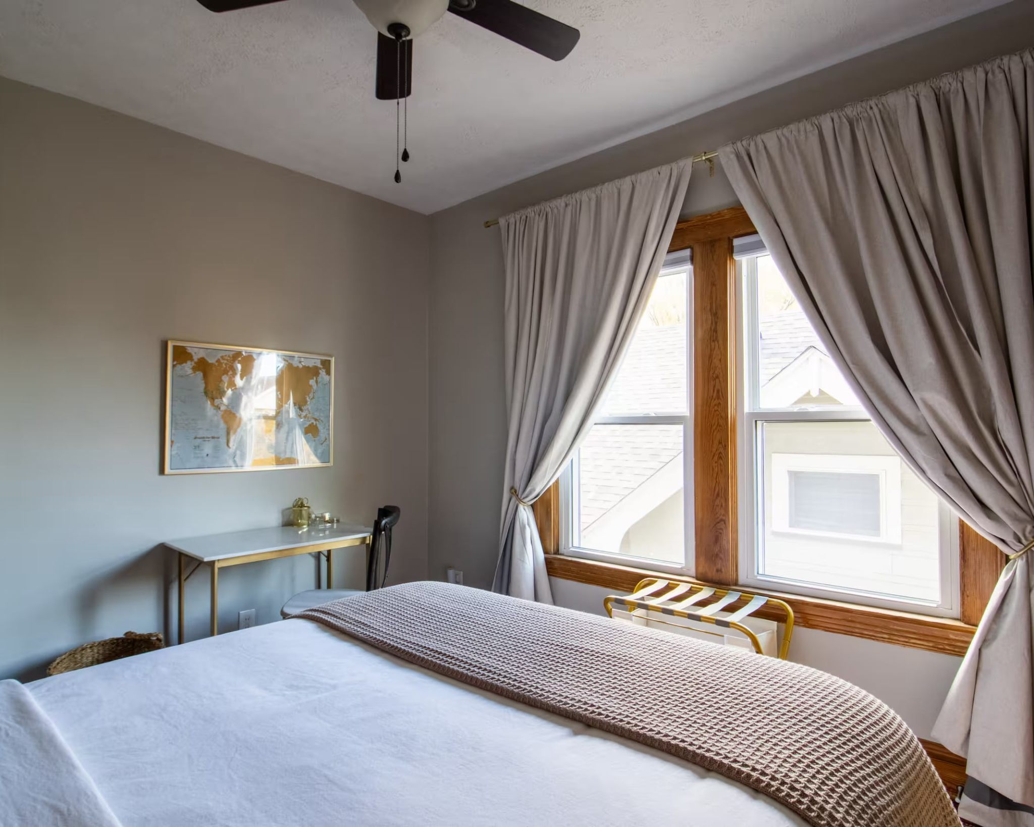
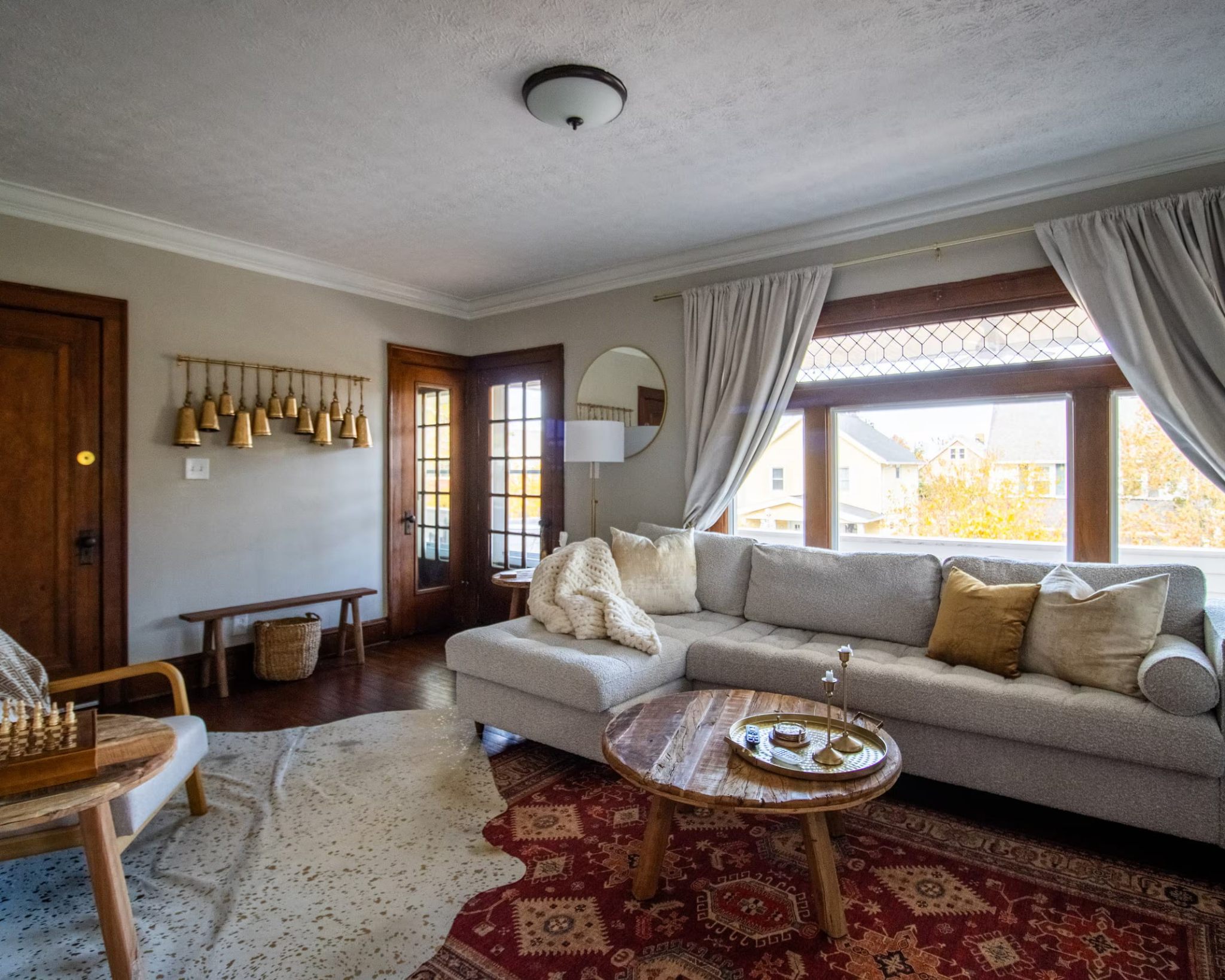
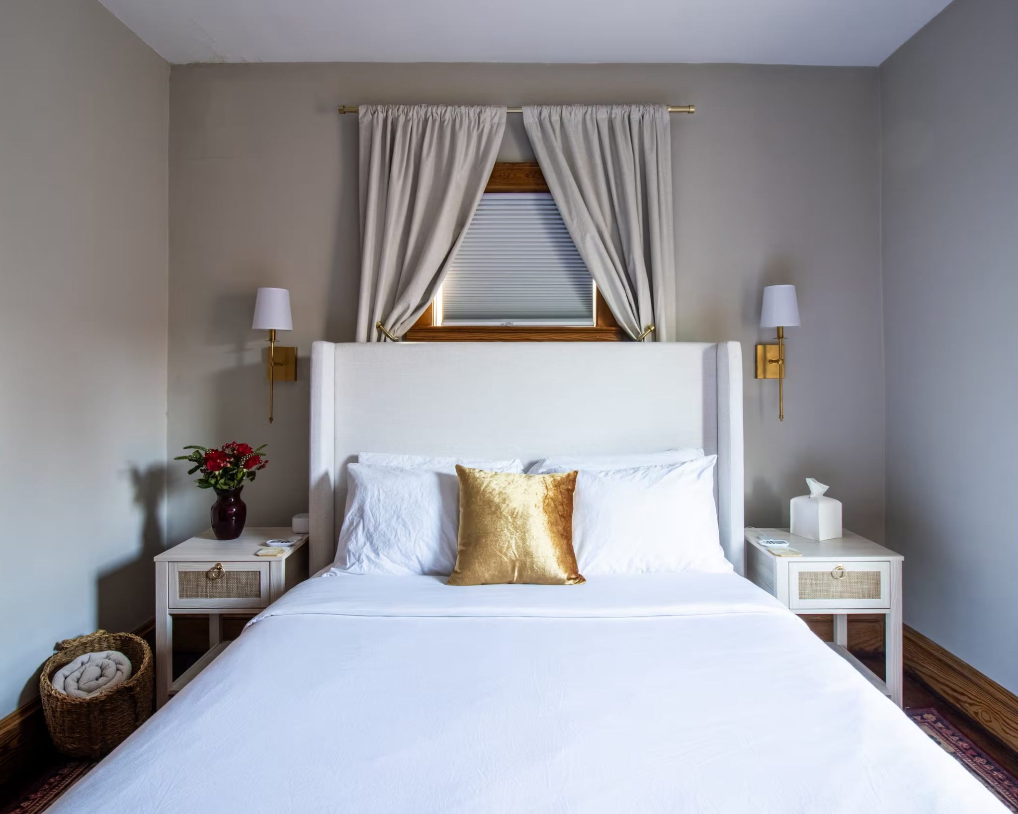
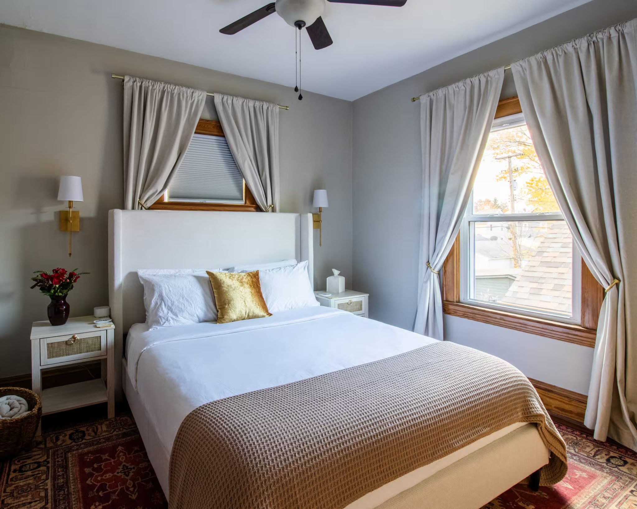
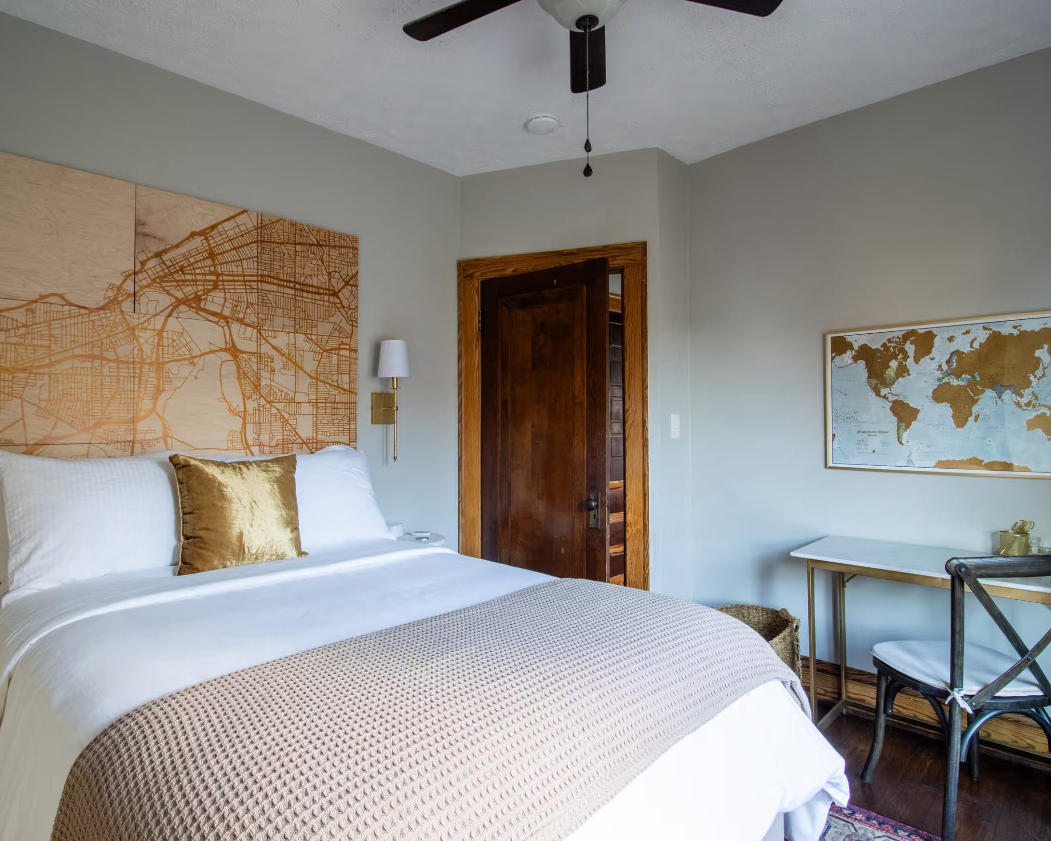
I recently had the pleasure of checking into this upstairs loft in a peaceful, classic Lakewood neighborhood, just a stone's throw from Lake Erie. It’s a two-bed, two-bath space that manages to blend traditional details with a clean, Scandinavian sensibility – a combination that immediately feels both comfortable and current. The interior architecture features original wood trim around windows and doorways, which always presents an interesting challenge when selecting wall colors. You see, wood trim, especially older, darker varieties, doesn't give you a lot of wiggle room. You’re often guided toward a warm neutral to avoid clashing or making the wood look out of place. This is precisely where Sherwin-Williams Agreeable Gray (SW 7029) steps in.
As a craftsman painter, I understand the weight these details carry. The choice here reflects a deep understanding of how color interacts with existing architectural elements. Agreeable Gray is the quintessential neutral; it's the gray that holds its own without going out of style, making it a reliable foundation.
Color Theory Deep-Dive: Agreeable Gray
Let’s talk about Agreeable Gray (SW 7029). Its LRV (Light Reflectance Value) of 60 means it reflects a good amount of light without feeling stark, which is crucial in a space that needs to feel airy yet grounded. The magic of this particular greige is in its undertones: warm beige and taupe. These aren't just minor notes; they are the architectural anchors that allow it to harmonize so effortlessly with natural wood.

Work Directly with Torlando Hakes
Skip the color choice stress. Work directly with me as your personal Color Designer to select the perfect architectural palette for your home, and get a Complementary Color Consultation when you purchase paint through us.
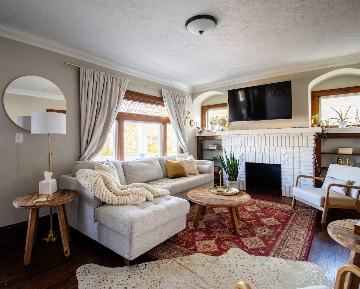
Under morning light, the gray element in Agreeable Gray might become more prominent, offering a crisp, clean feel that brightens the room. As the day progresses into the warmer hues of afternoon sun, the beige and taupe undertones deepen. This creates a cozy, inviting atmosphere that never feels too cold. When interior lighting, typically around 3000K, comes into play, those warm undertones are further enhanced, wrapping the room in a gentle, welcoming glow. This color prevents the wood trim from appearing heavy or dominating the space; instead, it provides a soft, warm backdrop that allows the wood’s natural richness to be appreciated.
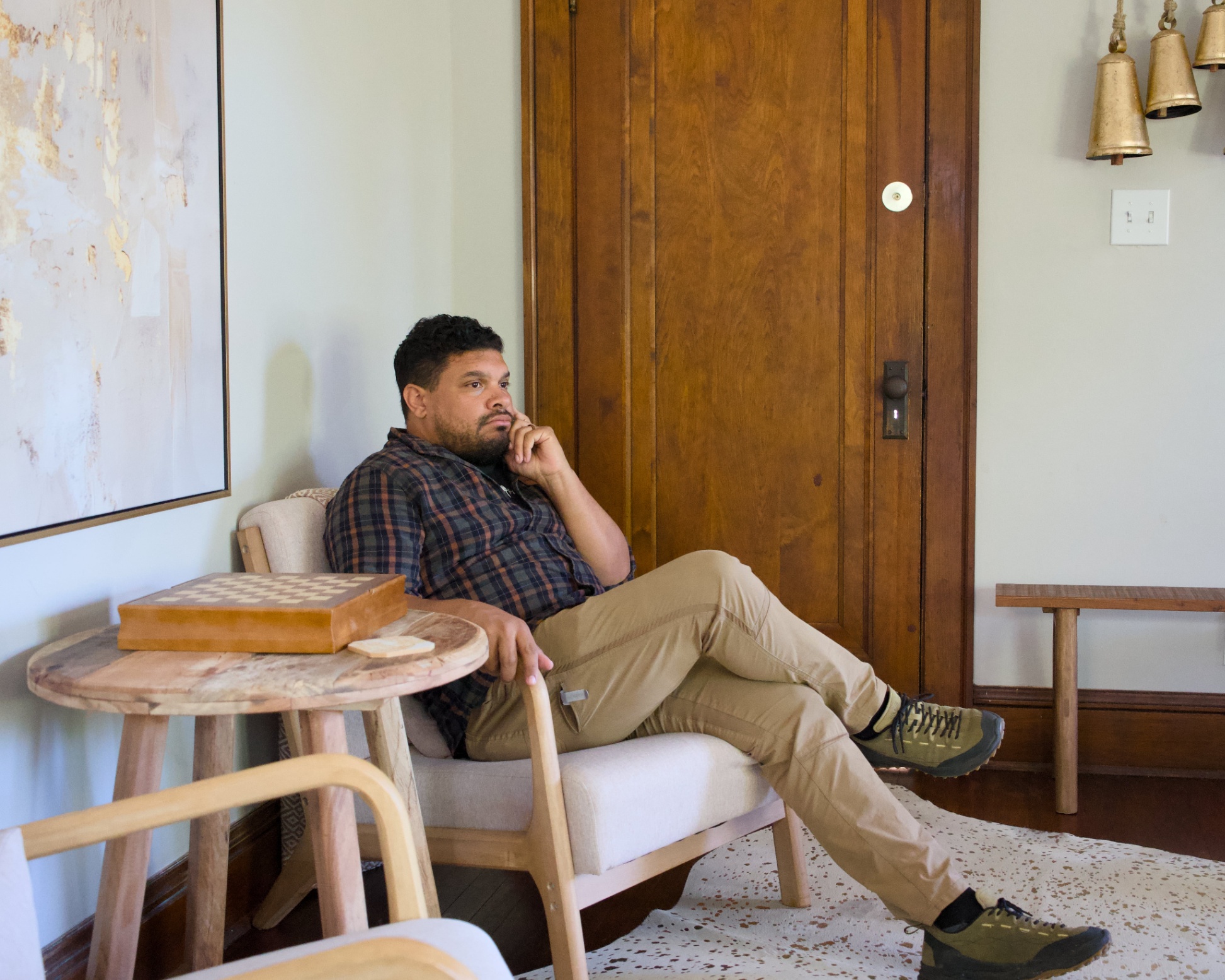
This considered approach to color ensures that the room feels balanced. The lighter wall color draws the eye up, but the warmth keeps it from feeling detached from the dark floors and window frames.
Coordinating Palettes
The strength of a good neutral lies in its ability to carry other colors. Here, the choice of Sherwin-Williams Pure White (#EDECE6) for the trim is a classic move. It provides a sharp, clean contrast to the Agreeable Gray, defining the architectural lines without fighting the existing dark wood. The Pure White ensures the trim feels fresh and intentional, rather than an afterthought.
For a transitional "mid-tone bridge," Sherwin-Williams Contented (#BDC0B3) is a natural fit. It’s a slightly cooler, muted green-gray that could work beautifully in an adjacent space, like a hallway or dining area, tying the palette together without demanding attention. And for a grounding element or accent, Benjamin Moore Salamander (#2F3E3E) provides a deep, sophisticated contrast. Imagine it on a built-in bookshelf or an accent piece, its rich green-black depth complementing the warmth of the wood and the softness of the walls.

(This decor detail speaks to the blend of traditional and subtle global influences at play in this space.)
Craftsman Field Notes
From a craftsman’s perspective, the success of this project starts long before the brush touches the wall. When working with older homes and original wood trim, preparation is paramount. This is how we would have approached this project.
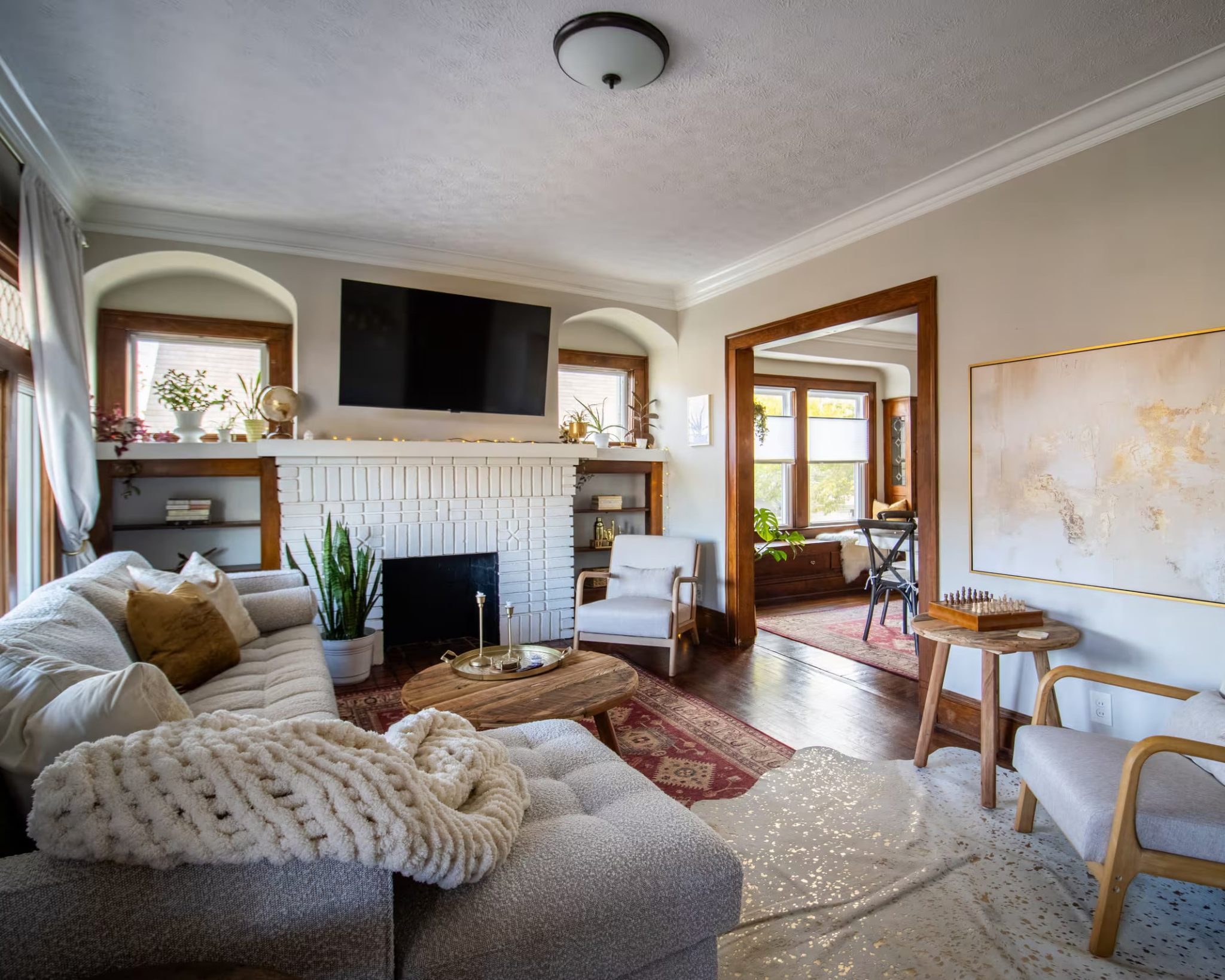
- Surface Preparation: The existing walls needed thorough cleaning, light sanding to ensure proper adhesion, and meticulous patching of any imperfections. Any old nail holes, cracks, or dings would stand out against such a clean, uniform color. The fireplace, painted white, also required careful cleaning and prep to ensure the finish was smooth and consistent.
- Primer Selection: For consistent color and superior adhesion, a high-quality primer should applied as needed over repairs. This ensures the Agreeable Gray appears true to its swatch, without any flashing affecting its final appearance. It also creates a uniform surface for two topcoats. Two coats will improve the blending of subsequent touch-ups often required in the maintenance of a short term rental.

- Sheen Guidance: For the walls, a flat or matte sheen are nice options for Agreeable Gray. This absorbs light beautifully, creating a soft, sophisticated look that helps hide minor wall imperfections. For the trim in Pure White, a satin or semi-gloss finish was selected. This provides durability against wear and tear and offers a subtle contrast in sheen, making the trim pop just enough against the matte walls. This intentional layering of sheen contributes significantly to the perceived quality of the finish.
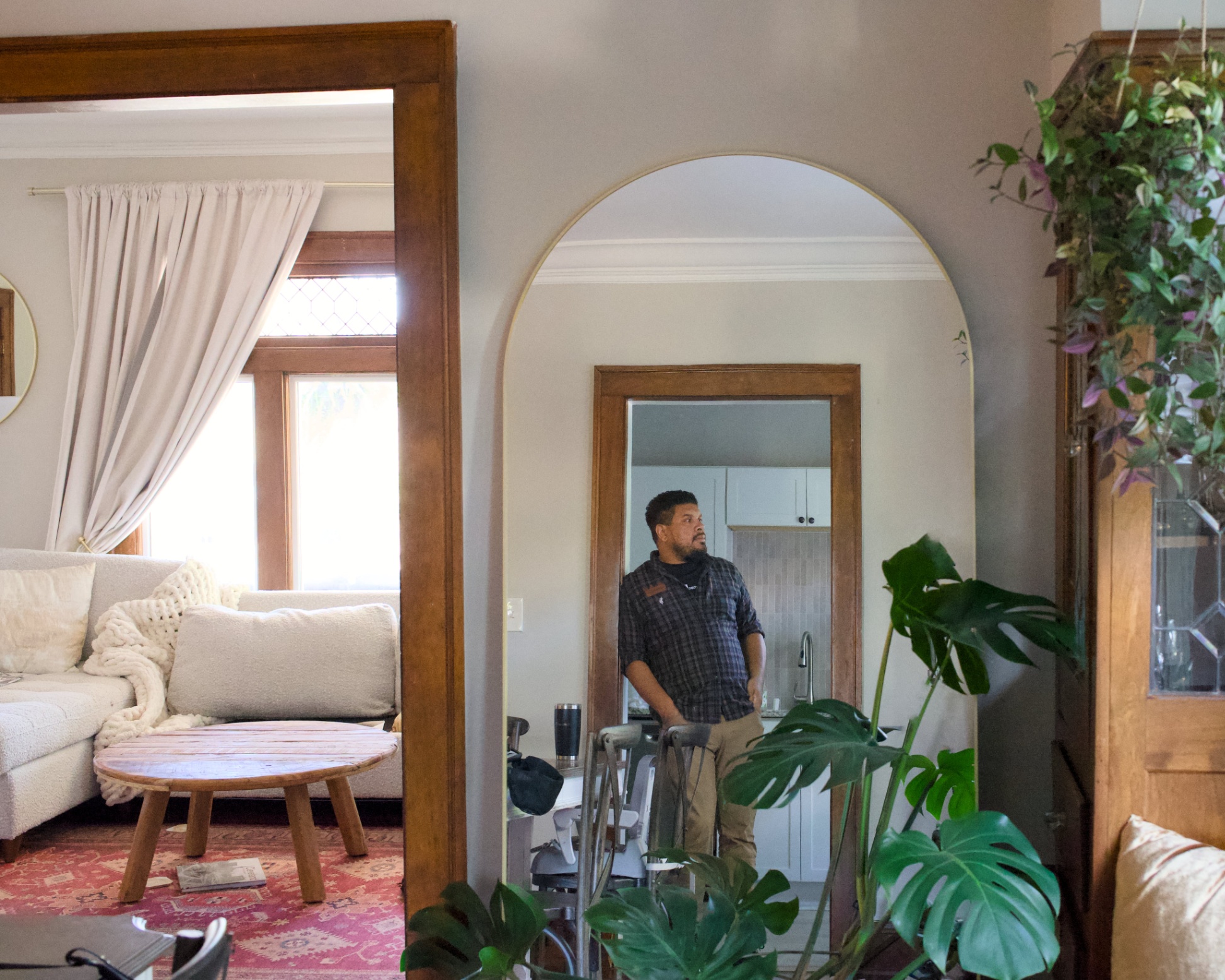
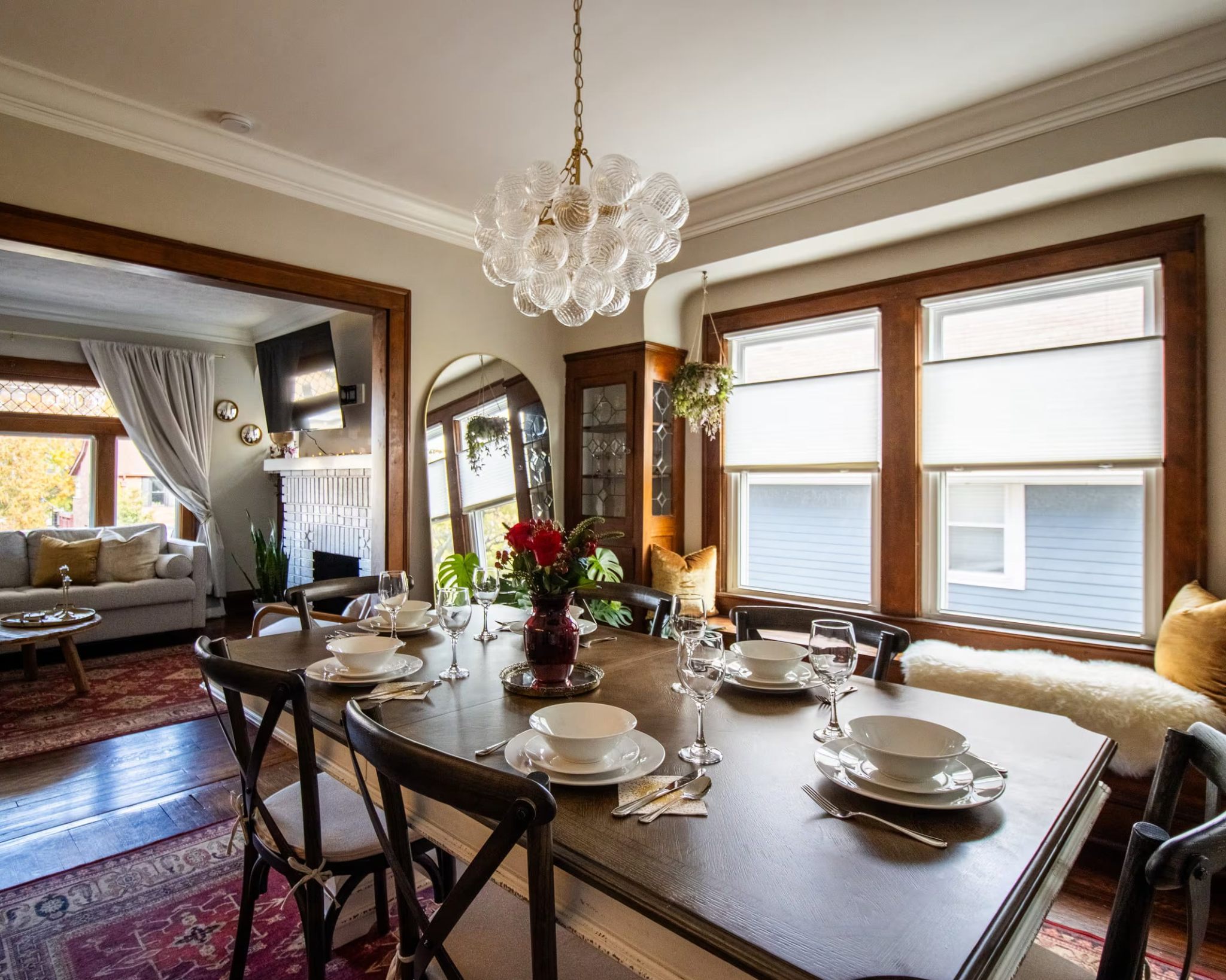
This space in Lakewood is a testament to how careful color consideration, combined with meticulous craftsmanship, can transform a room. It respects the home's original character while delivering a fresh, contemporary appeal that feels both relaxed and refined.

Complementary Color Consultation
Planning a project? Work with Torlando Hakes directly as your personal Color Designer and get a Complementary Consultation when purchasing paint through us.
 After
After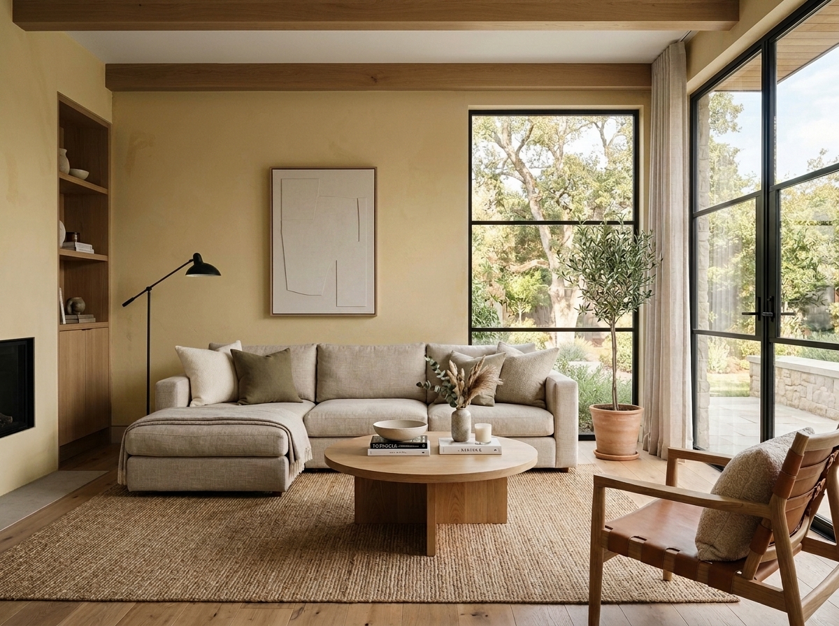 Before
Visualize Your Space with Color Studio AI
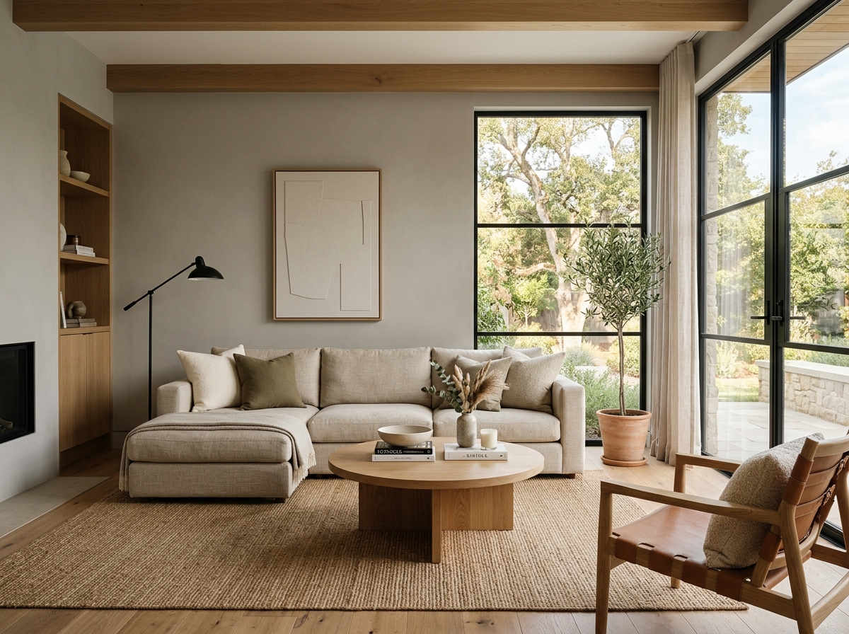
Planning a project? Skip the paint chip guesswork. Use our Color Studio AI to instantly visualize these paint colors on your own walls, or take advantage of our aligned contractor pricing matching current Sherwin-Williams retail promotions.
Book Your Upcoming Paint Project
Craftsman Painter is now scheduling premium transformations. Secure your spot and elevate your property value.
Get an EstimateHelp Others Find Professional Color Insights
Share this story directly to your networks or copy the link to share with friends.