


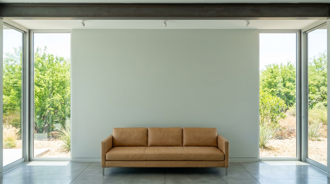
Sea Salt registers a Light Reflectance Value (LRV) of 63. It sits right in the pocket of mid-level reflectance—it bounces enough vibrant, bright natural daylight around a room to maintain a sense of volumetric expansion, yet it possesses enough depth to avoid washing out into a clinical white. The undertones are a highly reactive blend of green, gray, and blue. In the dry, warm air of an Indiana summer, with lush green foliage crowding the exterior glass walls, Sea Salt leans heavily into its organic green-gray side. The dense exterior vegetation acts as a massive natural color filter, pulling the chlorophyll notes to the surface of the paint film while the subtle blue undertones recede into the shadows.
The Exact Coordinating Palette for Sea Salt
Sea Salt SW 6204
Sherwin-Williams
Pure White
Sherwin-Williams SW 7005
Edgecomb Gray
Benjamin Moore HC-173
Cyberspace
Sherwin-Williams SW 7076
A master painter knows a color is only as strong as the architecture that frames it. To ground Sea Salt within a hard-edged modern envelope, you must execute strict palette discipline. Here is the exact specification I use to build out this scheme:
- Tier 1 (Trim/Anchor Neutral): Sherwin-Williams Pure White SW 7005
- Application: Baseboards, window casings, and structural ceiling drops. Pure White brings an LRV of 84 and just enough warmth to bridge the gap between stark concrete and the muted gray-green walls. Apply this in a durable satin finish on the baseboards to create a razor-sharp, geometric boundary between the floor plane and the vertical walls.
- Tier 2 (Mid-Tone Bridge): Benjamin Moore Edgecomb Gray HC-173
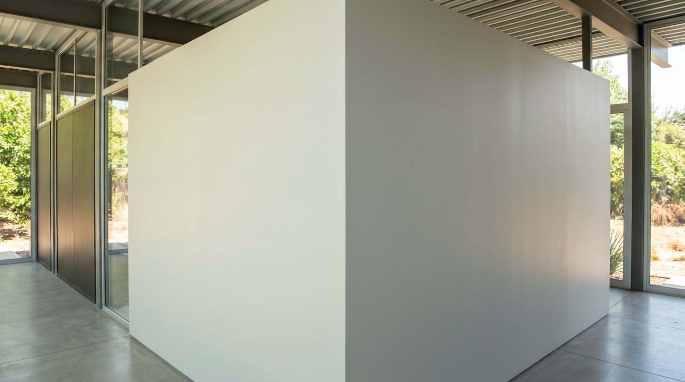
- Application: Freestanding architectural elements and central casework. Edgecomb Gray acts as the crucial neutral mediator. Apply this to sprawling kitchen island bases or large-scale built-in media cabinetry. Its earthy, gray-beige composition warms up the steel framing of the house and provides a visual resting place between the cooler Sea Salt walls and the stark glass panes.
- Tier 3 (Contrast/Accent): Sherwin-Williams Cyberspace SW 7076
- Application: Interior steel slab doors and select window mullions. Cyberspace is a deep, saturated charcoal-navy. Use it to anchor the room. By painting interior flush-mount doors or an isolated structural steel I-beam in this dark tone, you establish a firm visual weight that cuts through the flooding daylight.

Engineering the Space: A Modern Walkthrough
Let’s map out a residential interior where these coatings are put to work. Imagine a sprawling, single-story modernist structure framed in heavy steel, heavily reliant on floor-to-ceiling glass facades that flood the interior with direct, blinding midday daylight.

Work Directly with Torlando Hakes
Skip the color choice stress. Work directly with me as your personal Color Designer to select the perfect architectural palette for your home, and get a Complementary Color Consultation when you purchase paint through us.
In a typical Case Study Modern layout, the space relies on open spatial flow. By keeping furniture arrangements and seating configurations pulled cleanly away from the massive floor-to-ceiling glass walls, you allow the Indiana summer sunlight to flood across the polished concrete floor slabs, eventually striking the Sea Salt walls uninterrupted.

Where the drywall meets the concrete, a flat, six-inch modern baseboard coated in Sherwin-Williams Pure White provides the ideal frame. The transition should be surgically precise—clean caulking, no broken moldings. The crisp white line essentially frames the Sea Salt, forcing its gray-green pigment to read as an intentional, saturated architectural feature rather than a shadow on the wall.
In the center of the open-plan space, custom flat-panel cabinetry coated in Benjamin Moore Edgecomb Gray spans the length of the kitchen zone. By matching the cabinet faces with heavy, knurled steel hardware, you anchor the space. The beige-gray warmth of Edgecomb Gray plays off the cooler, shifting nature of the surrounding Sea Salt walls, balancing the thermal feel of the room despite the massive panes of surrounding glass.
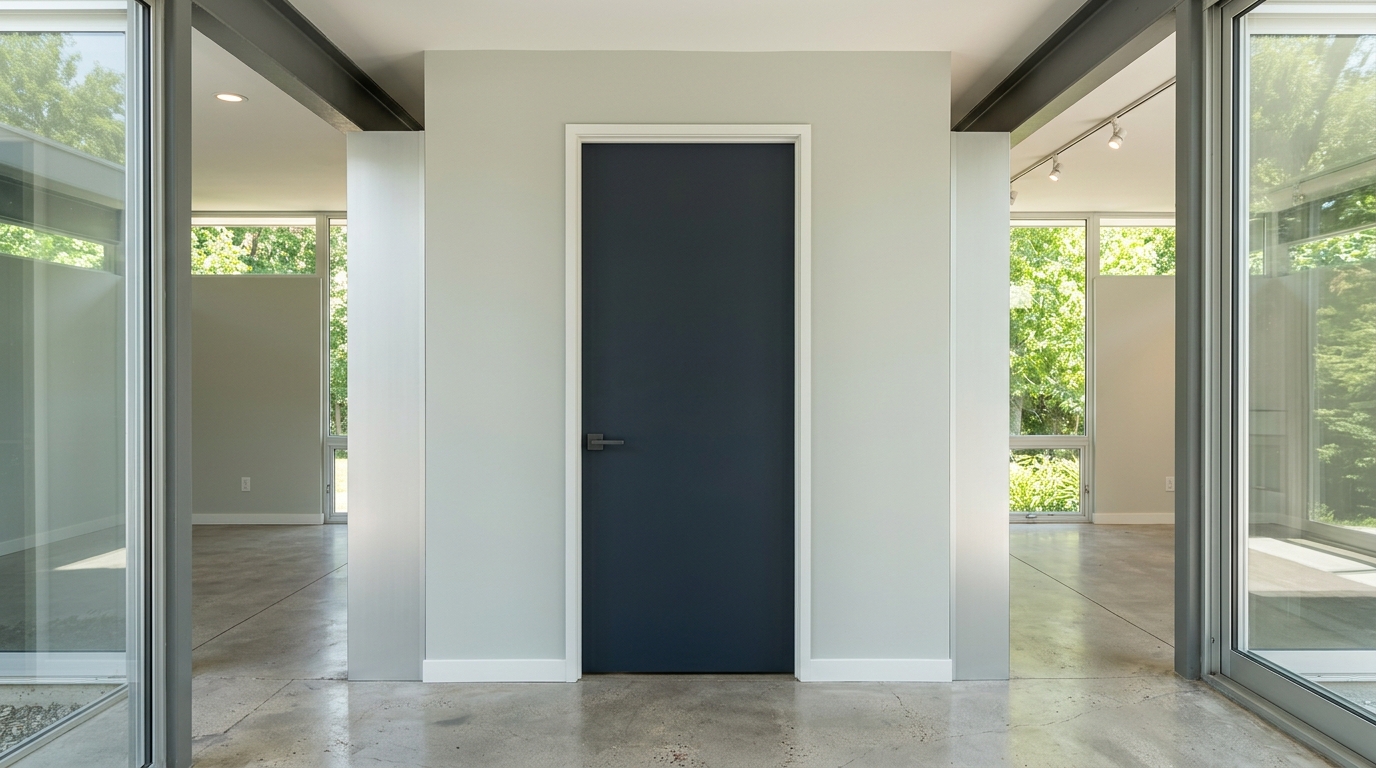
To prevent the space from feeling too airy or detached, Sherwin-Williams Cyberspace is the perfect anchor. A solid, flush-mounted interior door off the main corridor is painted in this dense charcoal-navy. Set directly into a perfectly flat Sea Salt wall, the dark door functions like an anchor. It commands attention and highlights the strict geometric alignment of the room. Every hinge is mortised perfectly flush; every line is plumb.
As the Indianapolis afternoon pushes toward evening, the bright external glare begins to soften. The interior climate shifts. The minimal recessed spot track-lighting in the ceiling grid kicks on automatically. Under this targeted artificial light, Sea Salt undergoes its daily chemical reaction. The green notes recede into the drywall, and the gray-blue undertones step forward, cooling the room down just as the heat of the day reaches its peak.

Selecting a paint color for high-end modern architecture requires moving past superficial color swatches. You have to understand LRV, regional light variables, and how pigment responds to industrial materials. Sea Salt succeeds because it refuses to be static. When applied correctly alongside Pure White, Edgecomb Gray, and Cyberspace, it bridges the gap between cold steel engineering and human habitation. Paint is a structural material—treat it like one.
 After
After Before
Visualize Your Space with Color Studio AI
Planning a project? Skip the paint chip guesswork. Use our Color Studio AI to instantly visualize these paint colors on your own walls, or take advantage of our aligned contractor pricing matching current Sherwin-Williams retail promotions.
Book Your Upcoming Paint Project
Craftsman Painter is now scheduling premium transformations. Secure your spot and elevate your property value.
Get an EstimateHelp Others Find Professional Color Insights
Share this story directly to your networks or copy the link to share with friends.