


With a Light Reflectance Value (LRV) of 26.54, this shade sits firmly in the mid-to-dark category. What does that mean for your home? Simply put, it absorbs light rather than bouncing it around the room. Instead of flooding a space with artificial brightness, it wraps a room in a grounded, comfortable tone that feels tailored and intentional.
To visualize how this color palette behaves in a representative mid-century modern home in Bloomington, Indiana during the autumn months, we can look at how low-angle golden light changes the wall color. When that amber afternoon light shines through high clerestory windows, Duxbury Gray reveals warm, mossy-green undertones. In shadowy corners, it settles into a calm, stormy slate.

Framing the Hue: Soft Trim and Bridge Neutrals
Duxbury Gray
Benjamin Moore HC-163
White Dove
Benjamin Moore OC-17
Collingwood
Benjamin Moore OC-28
Charcoal Slate
Benjamin Moore HC-178
A color with as much personality as Duxbury Gray needs thoughtful room partners. If you pair it with a stark, cold white trim, the contrast can feel jarring and break up the flow of your walls. Instead, I always recommend Benjamin Moore White Dove OC-17 for door casings, window frames, and baseboards. White Dove carries a touch of warm creaminess that softens the transition between the dark walls and trim, acting as a clean, polished frame around the muted green-gray backdrop.

Work Directly with Torlando Hakes
Skip the color choice stress. Work directly with me as your personal Color Designer to select the perfect architectural palette for your home, and get a Complementary Color Consultation when you purchase paint through us.

As you move from a cozy living room into open hallways or adjoining spaces, painting every wall in a dark shade like Duxbury Gray can feel overwhelming. To maintain a smooth flow through the home, bring in Benjamin Moore Collingwood OC-28 on adjacent walls. Collingwood is a soft, mid-tone greige that balances the cooler green tones of Duxbury Gray. It brightens hallways while keeping the relaxed, natural mood of the home completely intact.

Grounding the Design with High-Contrast Accents
To give a mid-century space a modern edge, you need a deeper grounding color for focal points. Benjamin Moore Charcoal Slate HC-178 works brilliantly here. Applying Charcoal Slate to a kitchen island, a built-in walnut bookcase, or an entry door creates a striking point of contrast. Because Charcoal Slate shares the same cool, stormy roots as Duxbury Gray, the two shades sit side by side effortlessly without competing for attention.

Practical Homeowner Tips and Material Pairings
When applying Benjamin Moore Duxbury Gray in your own home, the sheen you select makes a world of difference:
- Walls: Choose a matte or flat finish. A low sheen eliminates harsh surface light reflections and allows the complex green-gray undertones to look smooth and rich.
- Trim & Casing: Apply White Dove in a satin finish to provide a subtle, durable contrast against matte walls.
- Cabinetry & Built-ins: Spray Charcoal Slate in a semi-gloss or satin sheen for a durable, easy-to-clean finish that holds up to daily touch.
In terms of furnishings and textures, Duxbury Gray sits naturally alongside warm organic materials. Pair it with mid-century walnut paneling, cognac leather seating, brushed brass light fixtures, and woven linen upholstery. The warmth of natural wood and brass balances the cool slate qualities of the paint, creating a space that feels deeply comfortable and refined.

Choosing a deep neutral is all about balance, and Duxbury Gray offers just the right mix of character and quiet comfort for a home.
Complementary Color Consultation
Planning a project? Work with Torlando Hakes directly as your personal Color Designer and get a Complementary Consultation when purchasing paint through us.
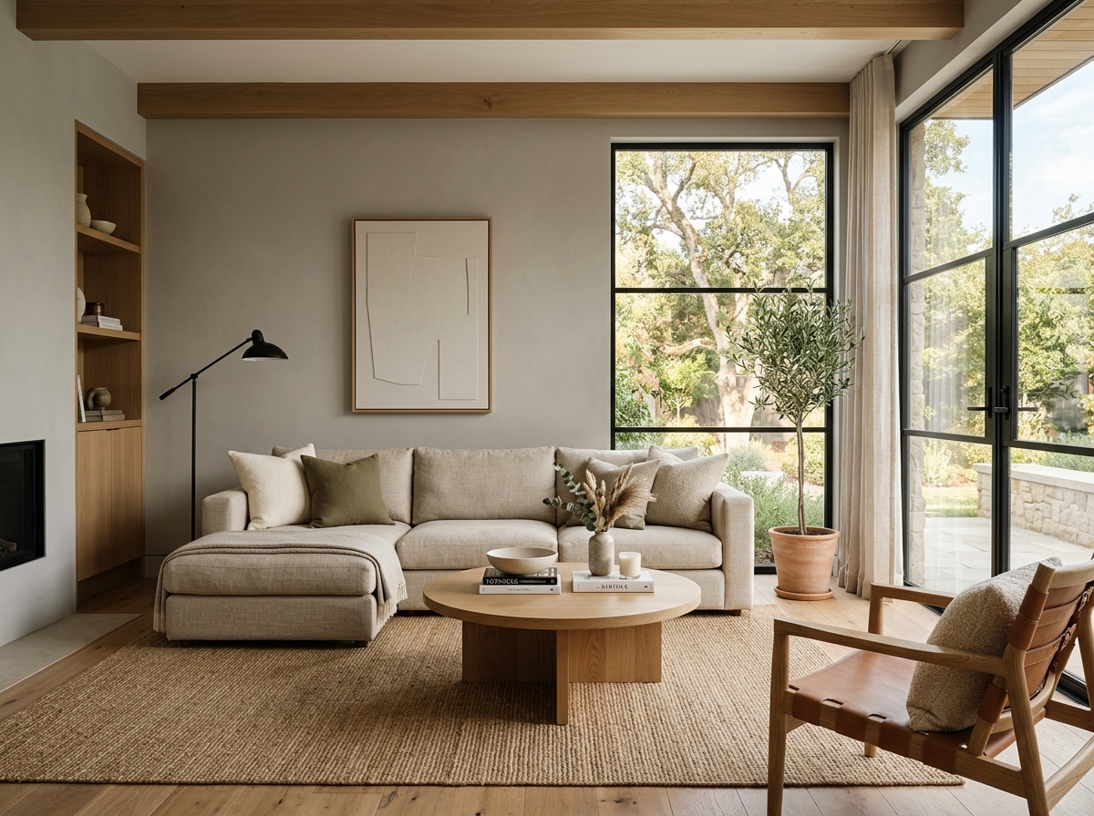 After
After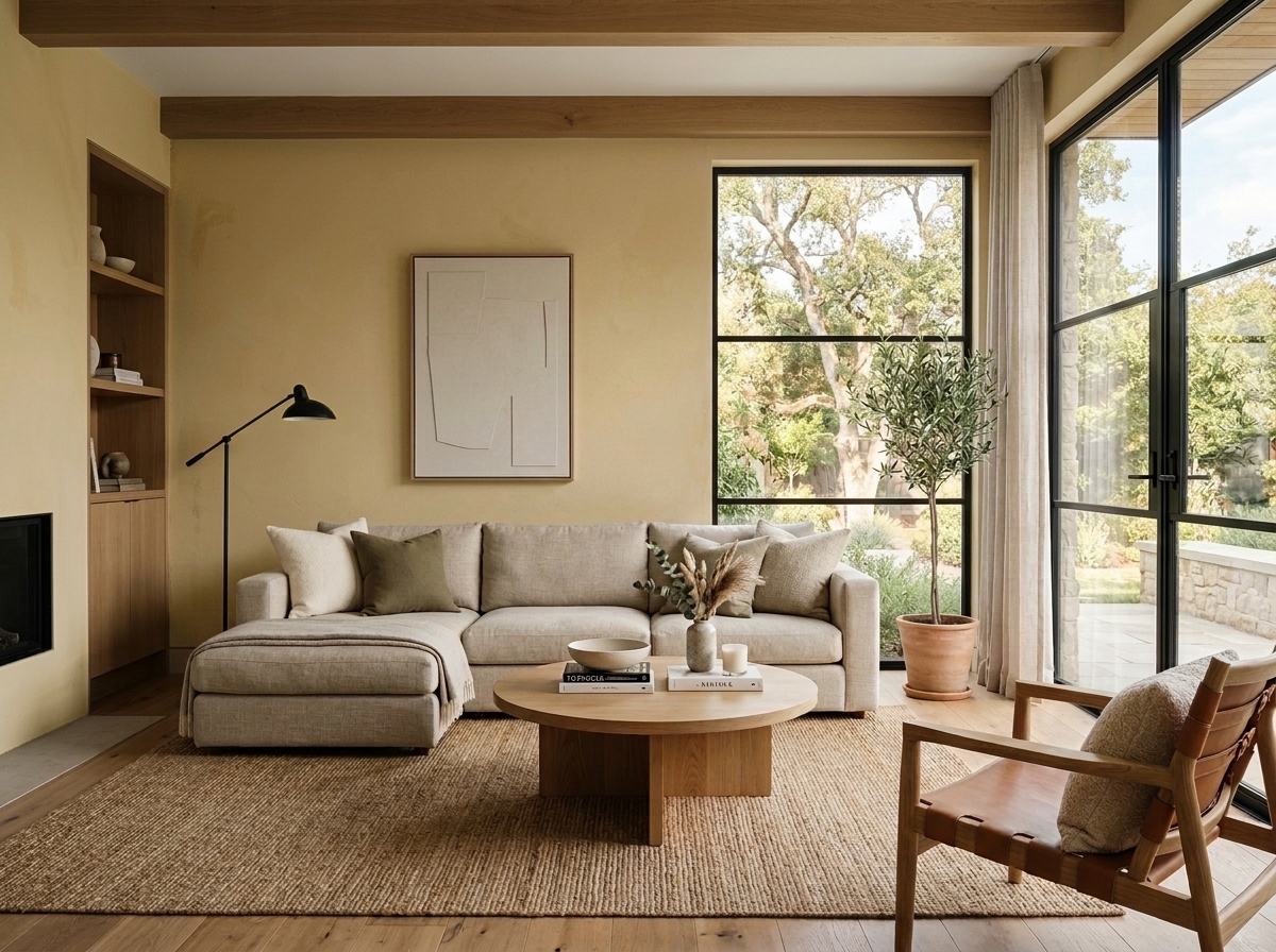 Before
Visualize Your Space with Color Studio AI
Planning a project? Skip the paint chip guesswork. Use our Color Studio AI to instantly visualize these paint colors on your own walls, or take advantage of our aligned contractor pricing matching current Sherwin-Williams retail promotions.
Book Your Upcoming Paint Project
Craftsman Painter is now scheduling premium transformations. Secure your spot and elevate your property value.
Get an EstimateHelp Others Find Professional Color Insights
Share this story directly to your networks or copy the link to share with friends.