


To understand how Sensible Hue will behave on your walls, it helps to look at its Light Reflectance Value, or LRV. On a scale from zero to one hundred, Sensible Hue sits right near the middle with an LRV of 46. In plain homeowner terms, this means it has enough depth to clearly read as a distinct color on the wall rather than washing out into a pale off-white, yet it still bounces a comfortable amount of light back into the room. You won't feel like you are sitting in a dark cave, even on overcast days.
Reading the Green-Gray Undertones in a Bedroom Sanctuary
Sensible Hue
Sherwin-Williams SW 6198
Pure White
Sherwin-Williams SW 7005
Naturel
Sherwin-Williams SW 7542
Rock Bottom
Sherwin-Williams SW 7062
Because Sensible Hue is built on a soft green-gray base, its personality shifts gently depending on what you pair it with and where you put it. Consider how this palette functions in a representative Mid-Century Modern layout in Carmel, Indiana. In a primary bedroom featuring rich walnut accents and teak flooring, the green undertones in Sensible Hue naturally step forward to complement the warm reddish-brown tones of the wood, keeping the gray side of the color from ever feeling cold or metallic.

For a bedroom sanctuary or a main living room wall, I always recommend applying Sensible Hue in a matte or flat finish—such as Sherwin-Williams Cashmere Flat or Emerald Interior Matte. A lower-sheen finish softens the way light hits the wall, hiding minor drywall imperfections and giving the green-gray pigment a velvety, relaxed look that suits organic mid-century spaces.
See Sensible Hue on Your Own Walls in 15 Seconds
Sherwin-Williams SW 6198 • LRV 46 • #B6B5AB
Framing the View with Clean White Trim
Every great mid-tone wall color needs a reliable white to give the eye a crisp resting place, though choosing a white that is too stark can make an organic green-gray look dusty by comparison. When working with Sensible Hue, Sherwin-Williams Pure White (SW 7005) is my go-to choice for window casings, door frames, and baseboards. Pure White has just a tiny drop of warmth that keeps it from glaring blue in daylight, allowing it to frame Sensible Hue cleanly while respecting the natural warmth of teak and walnut finishes.

For all of your trim, baseboards, and interior doors, step up to a satin or semi-gloss sheen in Pure White. Not only does a satin finish hold up much better against vacuum bumps and everyday handprints, the subtle difference in sheen between your matte walls and satin trim creates a quiet, tailored contrast that highlights the home's carpentry.
How Autumn Light Shapes the Flow Between Rooms
During autumn in Carmel, the sun drops lower in the sky and filters through changing tree canopies, sending a soft, even, diffused daylight through clerestory and picture windows. In this gentle seasonal light, Sensible Hue settles into a soothing eucalyptus-gray. Because it doesn't have heavy yellow undertones, it won't turn sour when the autumn sun hits it, nor will it turn icy in the shaded corners of the room.
To create an effortless transition from a living room painted in Sensible Hue into an adjoining hallway or open dining area, pair it with Sherwin-Williams Naturel (SW 7542). Naturel is a soft, earthy greige that acts as a natural bridge between rooms. Where Sensible Hue leans into cool botanical sage, Naturel brings a grounded, stone-like warmth that keeps an open floor plan feeling cohesive and connected without painting every single wall the exact same shade.

Grounding the Palette with Deep Accent Cabinetry
While Sensible Hue provides a gentle, mid-tone backdrop for primary walls, Mid-Century Modern interiors thrive on strong tonal contrast. If you want to anchor a kitchen island, a built-in dining buffet, or a mudroom bench, Sherwin-Williams Rock Bottom (SW 7062) is an exceptional heavy hitter. Rock Bottom is a dark, moody grizzle-green with deep charcoal roots that shares the same herbal DNA as Sensible Hue, just dialed down to a rich, dramatic depth.

When painting cabinetry, islands, or interior accent doors in Rock Bottom, use a specialized cabinet enamel like Sherwin-Williams Emerald Urethane Trim Enamel in a satin sheen. It levels out smoothly so you don't see brush marks on the dark pigment, and it cures to a rock-hard shell that resists chipping and moisture. Pair those deep green-gray cabinets with brushed brass hardware and walnut countertops for an unmistakable mid-century look.
Bringing the Palette into Smaller Spaces
This same combination translates effortlessly into a bathroom or powder room. Using Sensible Hue on the walls above walnut wainscoting or tile gives the room a spa-like calm, while a vanity painted in Rock Bottom or framed in natural wood keeps the footprint feeling substantial and well-proportioned.

When you pair Sherwin-Williams Sensible Hue with warm wood tones, crisp white trim, and a deep grounding accent, you get a home that feels relaxed, intentional, and comfortable in every season.
Complementary Color Consultation
Planning a project? Work with Torlando Hakes directly as your personal Color Designer and get a Complementary Consultation when purchasing paint through us.
Sensible Hue (SW 6198) — Key Questions Answered
What is the LRV and undertone of Sherwin-Williams Sensible Hue (SW 6198)?
Sherwin-Williams Sensible Hue (SW 6198) has a Light Reflectance Value (LRV) of 46 and hex code #B6B5AB. Always evaluate it under both north-facing and warm afternoon light before final application.
What trim and coordinating colors pair best with Sensible Hue?
Our recommended architectural pairings for Sensible Hue include Pure White (SW 7005), Naturel (SW 7542), Rock Bottom (SW 7062) to balance wall depth, trim contrast, and adjoining room transitions.
How can I test Sensible Hue on my own walls before painting?
You can upload a photo of your room to Craftsman Painter's Color Studio AI to preview Sensible Hue on your walls immediately, or schedule an on-site or video consultation with our team.
Getting Sensible Hue Right Under Your Home's Light
Join 1,300+ homeowners, designers, and architects receiving our curated 1st & 15th dispatches on LRV, undertones, trim pairings, and substrate chemistry.
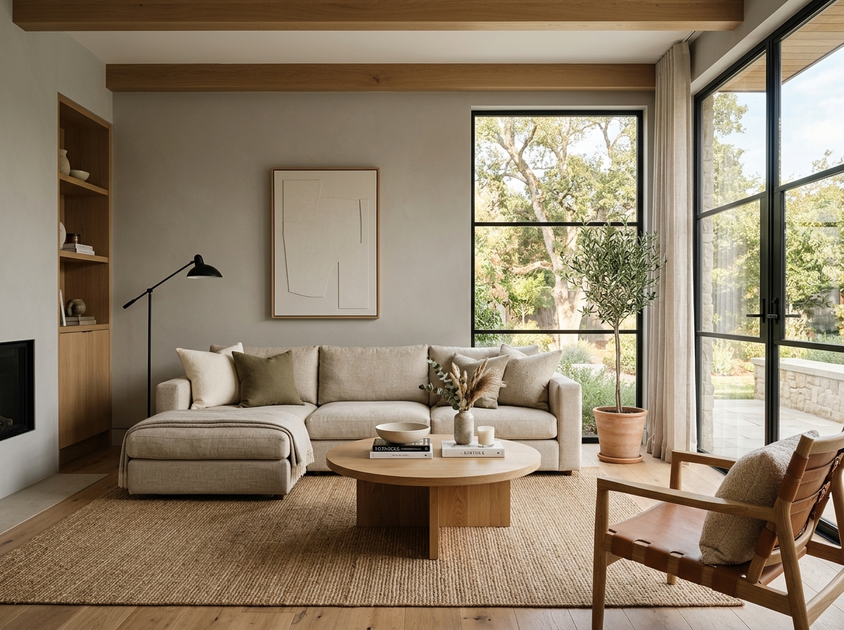 After
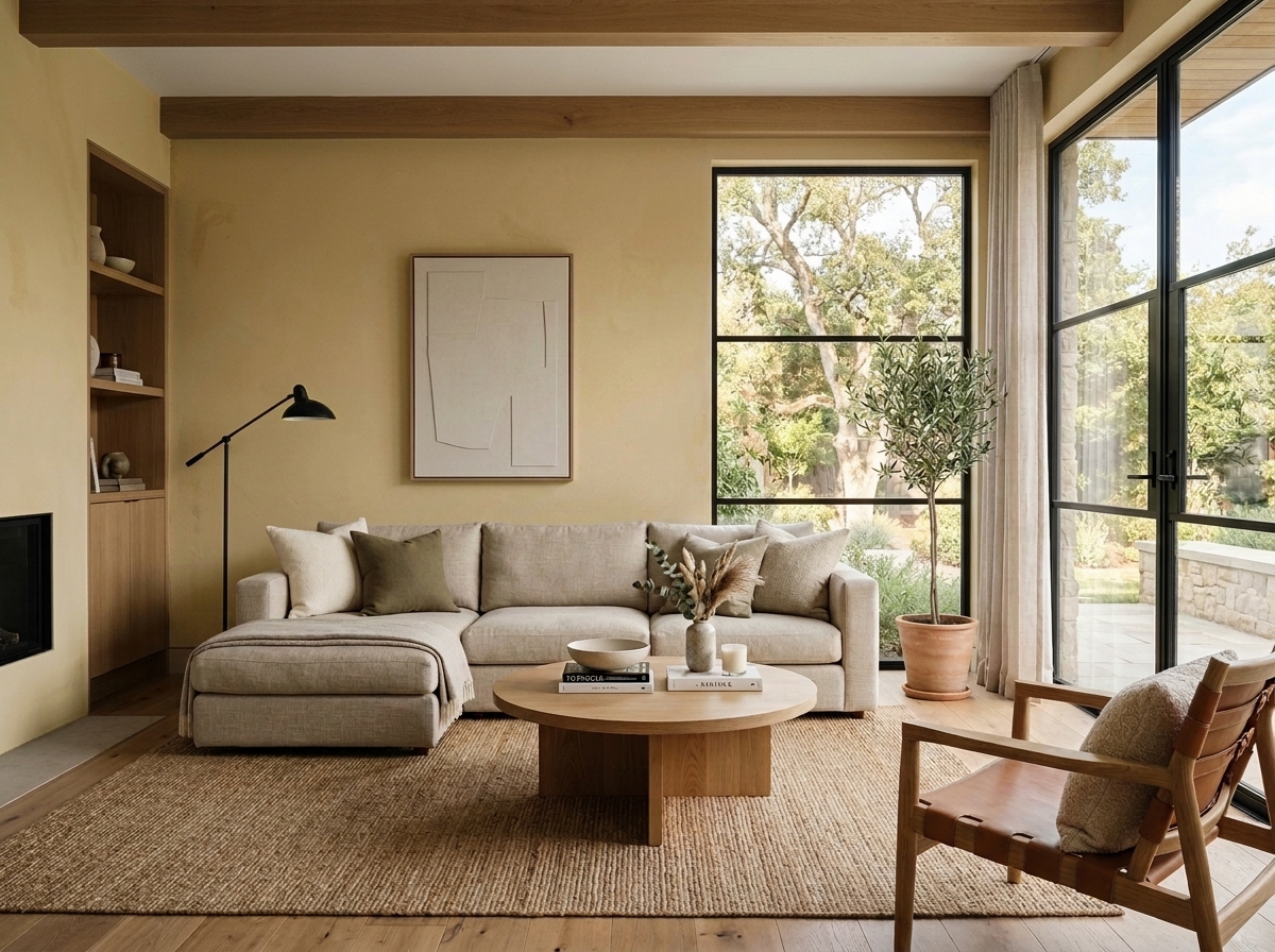 Before
Visualize Your Space with Color Studio AI
Planning a project? Skip the paint chip guesswork. Use our Color Studio AI to instantly visualize these paint colors on your own walls, or take advantage of our aligned contractor pricing matching current Sherwin-Williams retail promotions.
Book Your Upcoming Paint Project
Craftsman Painter is now scheduling premium transformations. Reserve an on-site consultation or instant video walkthrough.
Get an Estimate →Related Color & Design Studies

Why Sherwin-Williams Languid Blue SW 6226 Creates the Quietest Atmosphere in Summer Sunlight
The Muddy, Magnificent Paint Color Designers Keep Secretly Hoarding to Tame the Brutal Bloomington Sun

Why Sherwin-Williams North Star SW 6246 Delivers the Cool Crisp Air of a High-Summer Day
Help Others Find Professional Color Insights
Share this story directly to your networks or copy the link to share with friends.