

But the tide is turning back to the earth, and the correction is heavy, dark, and utterly unapologetic.
Nowhere is this shift more necessary than in Indianapolis. The Midwest climate is notoriously demanding on residential interiors. The light here oscillates brutally. An Indiana winter delivers months of stark, flat, blue-gray light that turns a white kitchen into a visual freezer. Conversely, July brings heavy humidity and an amber, scorching western sun. To survive this dynamic lighting environment, the kitchen’s working core requires a color with immense architectural gravity.
Enter Sherwin-Williams Woodsy Brown (SW 2924).
Book Your Upcoming Paint Project
Craftsman Painter is now scheduling premium transformations. Secure your spot and elevate your property value.
Get an EstimateThe Architectural Heft of the Working Hearth
Applying a deeply saturated, low-light-reflecting paint to the operational center of a kitchen fundamentally alters the room's center of gravity. When Woodsy Brown is applied to the foundational elements—the expansive prep island, the lower heavy-drawer banks, the primary sink station—it pulls the eye downward.
This creates a stable, grounding horizon line. The kitchen ceases to feel like a floating, ethereal laboratory and immediately regains its historical context as a hearth. Woodsy Brown is a rich, complex umber. It carries enough visual weight to anchor massive slabs of countertop stone while absorbing the visual clutter of a working space.
Ergonomically, this deep saturation is a relief. A low Light Reflectance Value (LRV) means the cabinetry acts as a visual sponge. It sucks in ambient glare rather than firing it back into the eyes of the person wielding a chef's knife. The inevitable scuffs, flour dustings, and organic debris of a high-traffic prep zone are absorbed by the murky, forgiving depth of the hue.
Light Interplay and the Mastery of Undertones
To understand Woodsy Brown is to understand the mastery of undertones under shifting atmospheric conditions. Many browns fail miserably because they harbor aggressive, cheap red or purple bases that emerge like a bad bruise the moment the sun hits them.
Woodsy Brown avoids this trap entirely. Its coordinates lean into the ash and olive spectrum. In the dead of an Indianapolis December, when natural light is scarce and brittle, the color reads as an impenetrable, sophisticated charcoal-brown. It creates a cavernous sense of warmth against the freezing temperatures outside.
When the seasons turn and the low-angle, humid sunlight of an Indiana late-summer afternoon floods the kitchen, the hue softens. The green-ash undertones neutralize the aggressive warmth of the western sun, preventing the cabinetry from baking into a cloying, dated rust color. Instead, it radiates the quiet, stoic warmth of aged walnut bark.
Executing Visual Relationships and Complements
A color this dense cannot exist in a vacuum. It demands calculated visual relationships, or the space will collapse inward and feel oppressive.
The greatest mistake made in high-contrast design is pairing a heavy, earth-toned base with a stark, untinted builder-grade white on the upper architecture. That approach creates a jarring, jagged transition that destroys the room's harmony. Woodsy Brown requires a complex, muddy cream to ease the transition from the heavy operational zone to the airy ceilings above.

Sherwin-Williams Shoji White (SW 7042) is the exact coordinate required here. Applied to upper walls, ceiling planes, and surrounding trim, Shoji White possesses enough greige warmth to reach down and shake hands with the deep brown below. It mimics the texture of aged plaster, providing a soft, diffused canopy over the heavy, dark prep zone.
To complete the visual relationship, the operational center requires organic metallic offsets. High-polished chrome will look inexpensive and thin against the density of SW 2924. Instead, unlacquered brass hardware or burnished bronze fixtures provide the necessary tactile warmth. These living finishes will patina over time, perfectly mirroring the organic, grounded nature of the paint.
Paint is not simply a decorative afterthought applied at the end of a build. It is a behavioral tool. By deploying a hue with profound depth in the kitchen’s working core, the environment transforms entirely, respecting the grit, the heat, and the reality of culinary work.
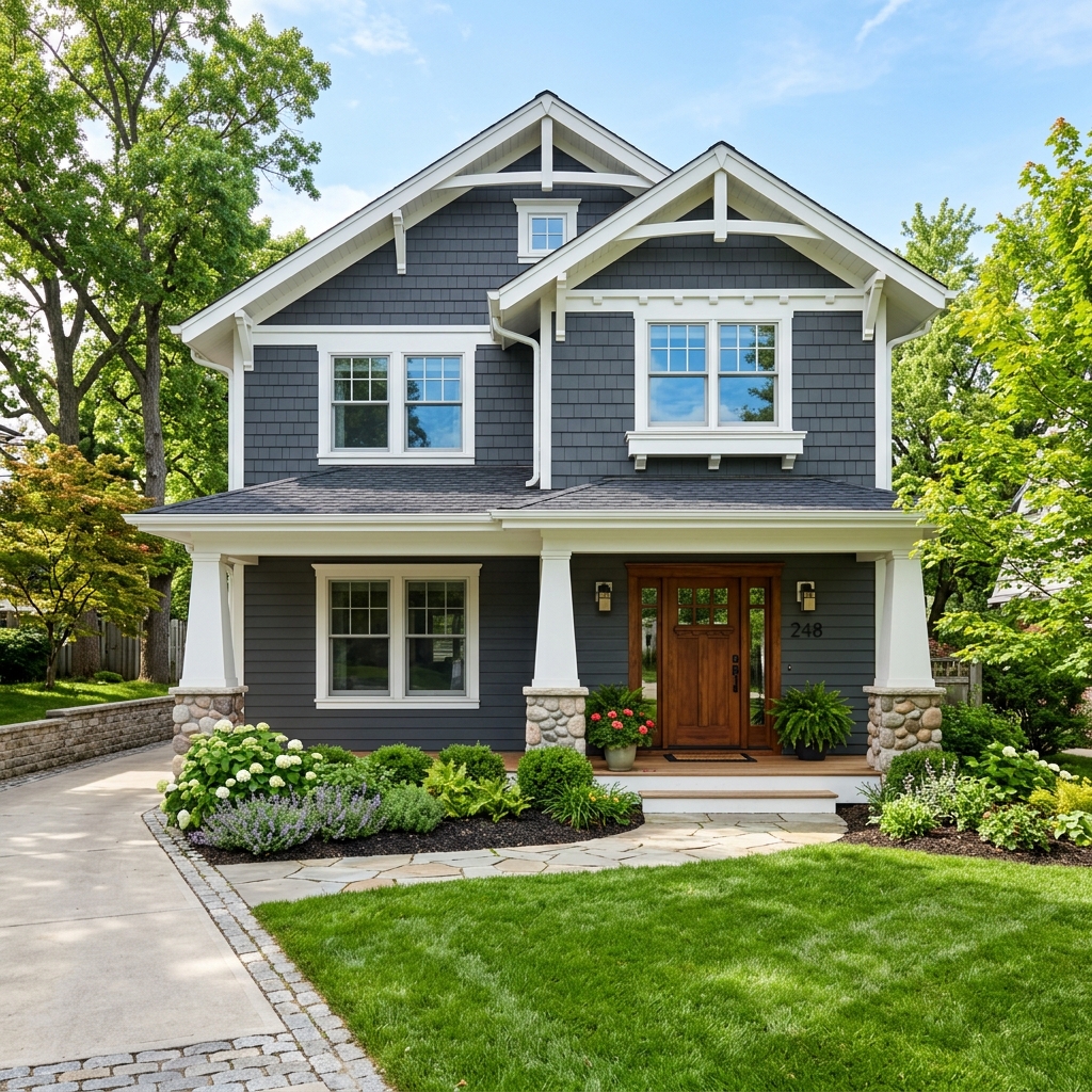 After
After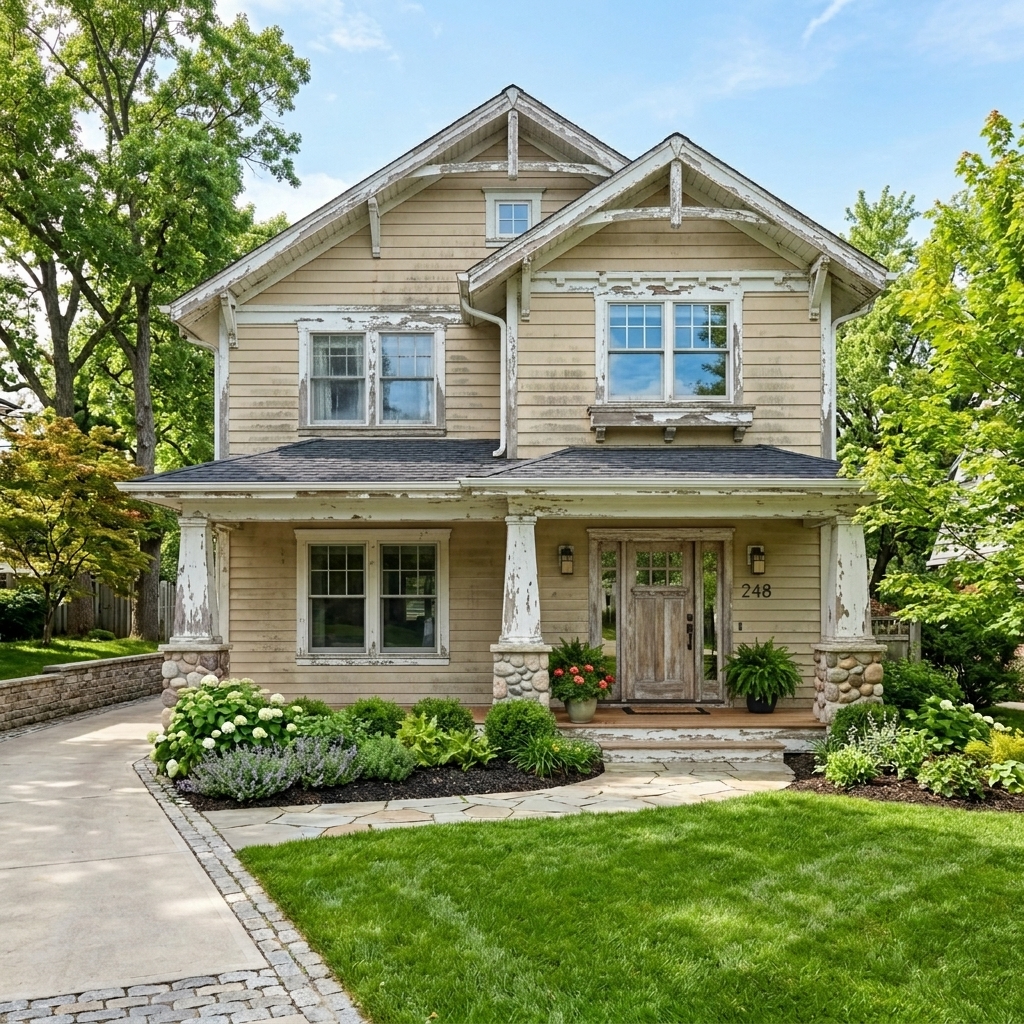 Before
Visualize Your Space with Color Studio AI
Planning a project? Skip the paint chip guesswork. Use our Color Studio AI to instantly visualize these paint colors on your own walls, or take advantage of our aligned contractor pricing matching current Sherwin-Williams retail promotions.
Help Others Find Professional Color Insights
Share this story directly to your networks, or download the clean Markdown and images to publish on Substack or Medium.