


From a coatings perspective, colors in this low-LRV range require careful consideration of both substrate and sheen. Quarry Rock is not a simple slate or a basic lamp black; it carries a dense color load built on dark charcoal gray, grounded by subtle green and warm brown undertones. In high-overhead bright summer sunlight—particularly in regions like San Diego, where intense sunlight cuts through dry air—the paint’s resin and colorants perform a subtle optical shift. The harsh sunlight softens what might otherwise feel like a cold dark shadow, pulling forward its organic olive-green and earthen brown undertones. Under overcast conditions or in ambient shade, the color compresses back into a sleek, sophisticated graphite gray.
When specifying a color with this level of pigment density, sheen choice dictates how the hue reads across large surfaces. On exterior wood or fiber cement siding, a low-lustre or matte finish—such as Benjamin Moore Aura Exterior Matte—prevents blinding glare while allowing the rich, muted depth of the pigment to absorb light evenly across the architectural plane.
The Coordinating Palette: Creating Earthy Contrast
Quarry Rock
Benjamin Moore 1568
White Dove
Benjamin Moore OC-17
Paris Rain
Benjamin Moore 1501
Vintage Wine
Benjamin Moore 2116-20
To balance the depth of Quarry Rock 1568, the supporting colors must provide intentional contrast without overwhelming the subtle undertones of the main body.

Work Directly with Torlando Hakes
Skip the color choice stress. Work directly with me as your personal Color Designer to select the perfect architectural palette for your home, and get a Complementary Color Consultation when you purchase paint through us.
- Benjamin Moore White Dove OC-17 (Trim / Anchor Neutral): Apply to exterior window casings, fascia boards, soffits, and architectural trim. White Dove provides a creamy, soft off-white contrast that reads clean and crisp against Quarry Rock without creating the stark, jarring glare of a pure bright white.
- Benjamin Moore Paris Rain 1501 (Mid-Tone Bridge): Ideal for porch ceilings, secondary exterior paneling, or adjacent masonry walls. This muted sage-gray bridges the deep body color with natural garden foliage, softening transitions between built structures and landscaped environments.
- Benjamin Moore Vintage Wine 2116-20 (Contrast / Accent): Best utilized on the main entry door, architectural shutters, or specialized metal gates. A rich, moody plum with deep red undertones, it creates a striking, sophisticated focal point that complements the subtle warmth hidden within Quarry Rock.

How Light and Sheen Redefine Benjamin Moore Quarry Rock
Understanding how light hits a surface is essential when applying dark, complex colors. Exterior surfaces receive direct solar exposure that shifts dramatically throughout the day. In a representative design study of a San Diego coastal home, the high summer sun strikes vertical siding at sharp angles, diffusing light across textured surfaces.

Because Quarry Rock has an LRV of 13.84, it strikes a rare balance between dramatic shadow and readable color. In morning light, the gray element dominates, anchoring the exterior structure firmly into its plot. By mid-afternoon, as warm sunlight reflects off dry surrounding hardscapes and bright summer foliage, the green-brown undertones become more apparent, giving the building an organic, stone-like warmth.

The application of high-quality exterior formulations like Benjamin Moore's Gennex colorant system ensures these deep pigments stay true over time, resisting the fading often associated with dark, green-influenced charcoal hues exposed to intense UV rays.
Design Study: Applying the Palette to Modern Architecture
In a Japandi-inspired architectural design study, color is used to accentuate raw materials, straight lines, and functional minimalism. Quarry Rock 1568 serves as the dominant anchor, enveloping the primary siding to create a moody, grounded structure that settles naturally into its environment.

Pairing Quarry Rock with natural accents—such as blonde oak entry doors, textured concrete steps, and slender black metal hardware—enhances its tactile quality. The crisp, clean trim painted in White Dove OC-17 outlines the structural window openings, defining the building's geometry against the sky.

For secondary surfaces, applying Paris Rain 1501 to shaded porch ceilings reflects a soft, organic green glow downward, connecting the exterior architecture to lush summer landscaping. Meanwhile, a single focal accent—such as a front door dipped in Vintage Wine 2116-20—adds a layer of calculated luxury that elevates the entire exterior color story.
Before committing to a full exterior application, test large brush-out samples on gray-tinted primer boards directly against your home’s existing materials and foliage to observe how the undertones react throughout the full cycle of daylight.
Complementary Color Consultation
Planning a project? Work with Torlando Hakes directly as your personal Color Designer and get a Complementary Consultation when purchasing paint through us.
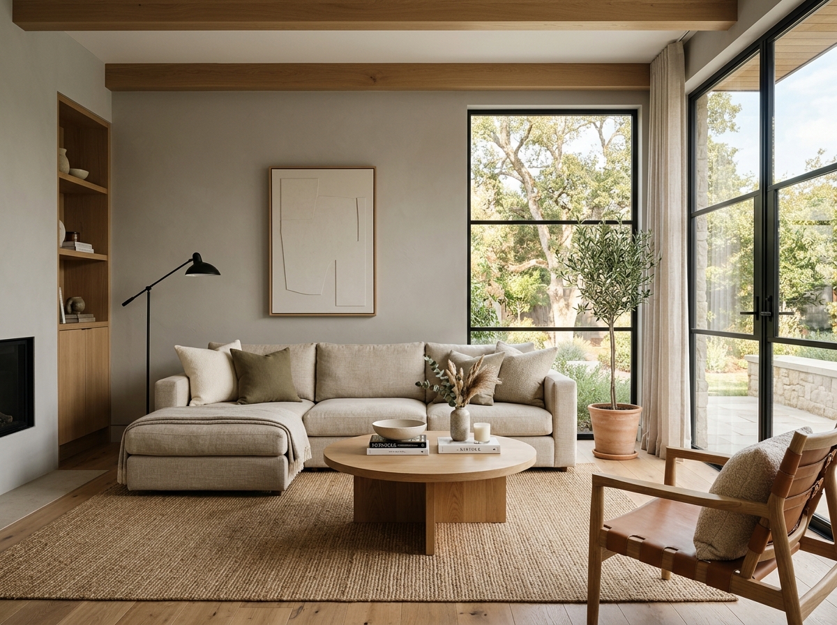 After
After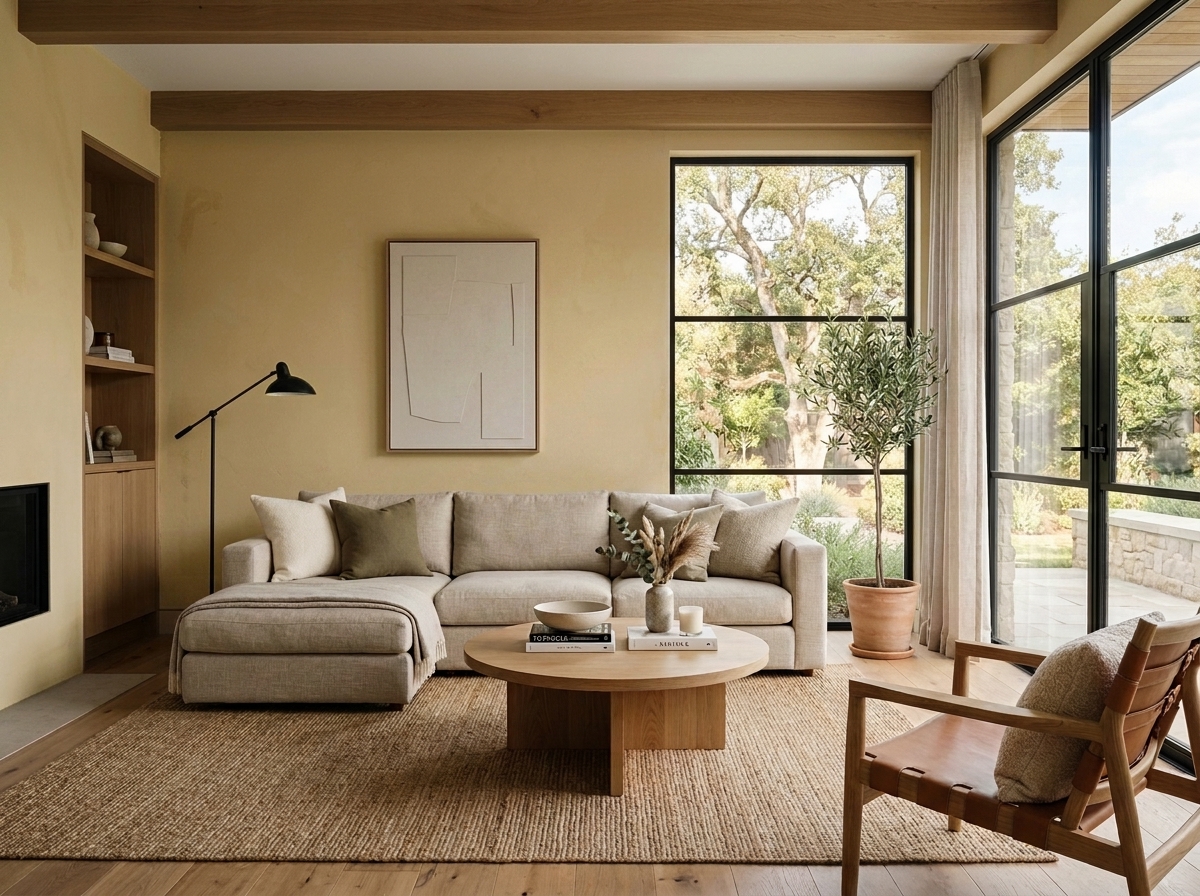 Before
Visualize Your Space with Color Studio AI
Planning a project? Skip the paint chip guesswork. Use our Color Studio AI to instantly visualize these paint colors on your own walls, or take advantage of our aligned contractor pricing matching current Sherwin-Williams retail promotions.
Book Your Upcoming Paint Project
Craftsman Painter is now scheduling premium transformations. Secure your spot and elevate your property value.
Get an EstimateHelp Others Find Professional Color Insights
Share this story directly to your networks or copy the link to share with friends.