


Grapy sits at a Light Reflectance Value (LRV) of 14. At this level, the paint film absorbs 86% of the light that hits it, placing it firmly in the dark-toned category. What makes Grapy fascinating is its underlying pigment structure: it is a deeply muted gray heavily influenced by a purple undertone. In a region like Cleveland, Ohio, where the vibrant, high-overhead summer sun dominates the season, natural light filtering through lush, green deciduous foliage interacts directly with this purple base. Because green and purple are complementary on the color wheel, that filtered summer light pulls the plum notes forward, preventing the color from falling flat or reading as a cold, industrial concrete.

To make an LRV of 14 work without overwhelming a space, you need a disciplined, intentional approach to contrast and transitions.
The Coordinating Palette Strategy
Grapy
Sherwin-Williams SW 7629
Pure White
Sherwin-Williams SW 7005
Versatile Gray
Sherwin-Williams SW 6072
Inkwell
Sherwin-Williams SW 6992
When designing with a heavy, gray-purple neutral, the surrounding coatings must bridge the gap between deep moodiness and bright architectural relief. Here is the exact palette structure I use to support SW Grapy:

Work Directly with Torlando Hakes
Skip the color choice stress. Work directly with me as your personal Color Designer to select the perfect architectural palette for your home, and get a Complementary Color Consultation when you purchase paint through us.
- Tier 1 (Trim & Anchor Neutral): Sherwin-Williams Pure White (SW 7005)
- Application: Window casings, doors, baseboards, and ceilings. I specify Pure White in a satin or semi-gloss finish for the millwork, and a dead-flat finish for the ceilings. Its LRV of 84 provides a crisp, clean break against Grapy, while its drop of yellow warmth prevents the stark, clinical contrast that a pure untinted white would create.
- Tier 2 (Mid-Tone Bridge): Sherwin-Williams Versatile Gray (SW 6072)
- Application: Connecting hallways, open-plan transitional walls, or large expansive living areas adjacent to Grapy rooms. Versatile Gray (LRV 48) shares a subtle taupe-purple lineage with Grapy, making it the perfect step-down color to maintain visual flow without jarring the eye. Use a washable matte or low-sheen eggshell here.
- Tier 3 (Contrast/Accent): Sherwin-Williams Inkwell (SW 6992)
- Application: Interior architectural accents like flat-panel kitchen cabinetry, built-in library shelving, or a kitchen island. Inkwell is a blackened blue-black (LRV 4) that grounds the lighter wood textures in the room. I highly recommend a urethane enamel in a satin finish for cabinetry to ensure durability and a rich, subtle luster.

Spatial Walkthrough: A Cleveland Design Study
Let's explore a design study of how this palette behaves in a representative Cleveland home during the height of summer. We are styling this space through a Biophilic Scandinavian (Hygge) lens. This aesthetic relies heavily on organic materials—blonde birch wood, soft sheepskin layers, and natural cork panels—which perfectly counterbalance the weighty, absorbing nature of SW Grapy on the walls.
Stepping into the primary living space, the walls are coated in Grapy using a high-quality acrylic latex in an eggshell finish. The slight angular sheen of the eggshell allows the bright, vibrant natural lighting of the mid-western summer to skip lightly across the surface. Because the ambient summer air outside is warm and dry, we want the interior to feel like a cozy, shaded retreat. Against the Grapy walls, potted fiddle-leaf figs and lush indoor ferns bring vibrant organic greens into the room. The botanical green acts as a color-wheel foil to the subtle purple undertones of the walls, making the entire room feel dynamic rather than heavy.

Notice how the millwork behaves. By utilizing SW Pure White on the baseboards and window casings, we establish a strict boundary line. The satin finish on the trim reflects the high-overhead daylight directly back into the room, sharply defining the blonde wood furniture and the natural woven wool blankets draped across the seating. When evening approaches and the intense summer sun fades, the lighting strategy shifts. Warm, fireplace-like dim ambient lighting from floor lamps and localized candle-glow effects activate the red and purple pigments deep within Grapy's formula, turning a previously cool, gray room into an intimate, enveloping space.
Moving toward the kitchen and dining zones, we deploy our accent color, SW Inkwell.

Applying Inkwell to flat-panel cabinetry against a backdrop of Versatile Gray walls creates an anchor point in the floor plan. The blackened blue undertone of Inkwell contrasts beautifully with the blonde birch surfaces and light natural cork panels. Because we specified a urethane enamel for the cabinets, the surface is incredibly smooth. The under-cabinet lighting casts a warm, soft light scatter down onto the counters, emphasizing the crispness of the surrounding Pure White ceilings and trim.
Finally, we observe Grapy in a smaller footprint: the primary bathroom.

In compact spaces, people often fear dark colors will shrink the room. As a coatings professional, I find the opposite is true if your sheen and lighting are controlled. Coating a bathroom in an LRV 14 eggshell blurs the corners of the room. Flanked by a raw blonde wood vanity and warmly lit wall sconces, Grapy recedes into the background. The dim, hygge-inspired ambient lighting bouncing off the mirror creates a sophisticated, spa-like atmosphere that feels entirely isolated from the bright summer heat outside.
Choosing a deep, undertone-heavy color like Grapy requires commitment to the entire palette. Always match your trim sheen to your lighting conditions, keep your ceilings a dead-flat white to maximize light bounce, and trust that dark, moody walls provide the best possible canvas for natural wood grains and bright indoor botanicals.
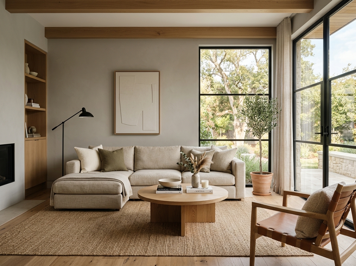 After
After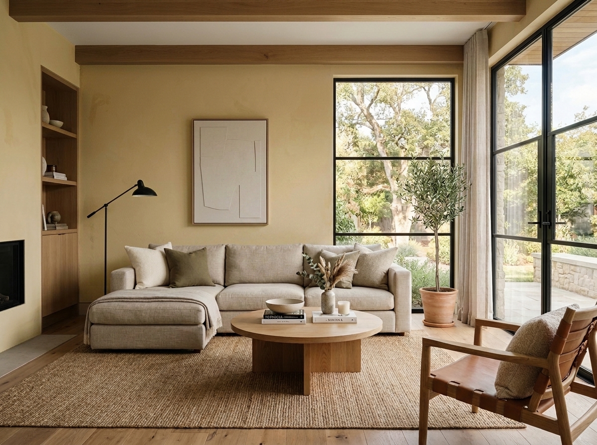 Before
Visualize Your Space with Color Studio AI
Planning a project? Skip the paint chip guesswork. Use our Color Studio AI to instantly visualize these paint colors on your own walls, or take advantage of our aligned contractor pricing matching current Sherwin-Williams retail promotions.
Book Your Upcoming Paint Project
Craftsman Painter is now scheduling premium transformations. Secure your spot and elevate your property value.
Get an EstimateHelp Others Find Professional Color Insights
Share this story directly to your networks or copy the link to share with friends.