


In a design study set against the vibrant, dry, warm air of a San Diego summer, the behavior of Dark Burgundy becomes highly dynamic. The high-overhead, bright summer sunlight beats down on exterior cladding, causing those dormant black-cherry undertones to flash vividly. Where a generic dark brown or black might fall flat and look chalky under intense UV exposure, the heavy red and purple base of Dark Burgundy catches the bright natural lighting, giving the finish a resonant, architectural depth.

The Coordinating Palette: Balancing High-Contrast Architecture
Dark Burgundy
Benjamin Moore
White Dove
Benjamin Moore OC-17
Nantucket Gray
Benjamin Moore HC-111
Raccoon Fur
Benjamin Moore 2126-20
A color with an LRV of 4.1 requires a highly disciplined palette to prevent the exterior from feeling visually oppressive. For a high-end Japandi-inspired aesthetic—relying on organic simplicity, raw textures, and mindful color blocking—these exact pairings anchor the design:
- Tier 1 (Trim/Anchor Neutral): Benjamin Moore White Dove OC-17. Apply this soft, shaded white to deep fascia boards, soffits, and primary exterior window casings. It provides a crisp architectural boundary without the blinding, clinical glare of a pure titanium white under the summer sun.
- Tier 2 (Mid-Tone Bridge): Benjamin Moore Nantucket Gray HC-111. Specify this earthy, sage-leaning gray on secondary exterior volumes, retaining stucco walls, or perimeter privacy fencing. It acts as an organic transition between the stark Dark Burgundy siding and the lush green summer foliage surrounding the property.
- Tier 3 (Contrast/Accent): Benjamin Moore Raccoon Fur 2126-20. A muted, inky charcoal with a subtle blue-violet undertone. Specify this in a satin or semi-gloss finish for the front door, slender black metal architectural columns, or exterior window mullions to introduce a softer, layered darkness against the main burgundy volume.

Executing the Japandi Aesthetic in Southern California
Visualizing a typical modern build in San Diego allows us to see how premium coatings interact with Japandi design principles—a fusion of Japanese minimalism and Scandinavian warmth. The goal is to highlight raw textures, blonde natural oak, and uncluttered surfaces while managing the intense summer lighting.

Work Directly with Torlando Hakes
Skip the color choice stress. Work directly with me as your personal Color Designer to select the perfect architectural palette for your home, and get a Complementary Color Consultation when you purchase paint through us.
When specifying Dark Burgundy on primary exterior cladding, the sheen choice is critical. A flat or low-lustre finish minimizes surface glare from the bright sky, allowing the black-cherry pigment to read as a deep, velvety matte surface. Smooth, troweled exterior stucco or clean vertical wood cladding coated in this deep hue creates an immediate, grounding visual weight.

Notice how Benjamin Moore White Dove functions at the rooflines and window casings. In the sharp summer sun, White Dove holds its warmth. It frames the Dark Burgundy cleanly, ensuring the architectural lines remain sharp and deliberate. There is no bleeding of aesthetic intent; the boundaries are strictly defined.
Integrating Benjamin Moore Nantucket Gray into the surrounding landscape walls provides a necessary visual step-down. The dry, warm air of Southern California demands exterior color profiles that converse with the environment. Nantucket Gray bridges the stark gap between the heavy burgundy siding and the bright, manicured summer greenery visible across the hardscaping.

Moving toward the primary entrance, the contrast accent comes into play. A solid entryway painted in Benjamin Moore Raccoon Fur provides a sophisticated tonal shift. The charcoal finish offers a cooler, muted contrast to the warm, red-heavy Dark Burgundy. Paired with slender black metal sconces and a heavy blonde natural oak threshold, the entryway feels intentionally restrained and highly functional.
Light, Shadow, and Tactile Restraint
The success of a deeply saturated exterior relies entirely on how it handles the shifting sun. Under the direct midday glare, Dark Burgundy reads as a vibrant, deeply bruised plum. As the afternoon progresses and shadows lengthen across the facade, it recedes into a near-black void. This movement is the hallmark of a high-quality, complex color formulation.

Designing an outdoor living space against this backdrop requires tactile restraint. Uncluttered porches featuring raw matte ceramics, slender black metal seating frames, and textured neutral linen cushions pop brilliantly against the dark siding. The key is allowing the negative space to breathe. Paint acts as an architectural material that dictates how we perceive the volume and temperature of a structure. By anchoring a dark, highly pigmented coating with warm whites, earthy greens, and organic materials, you create an exterior environment that feels completely intentional and structurally grounded.
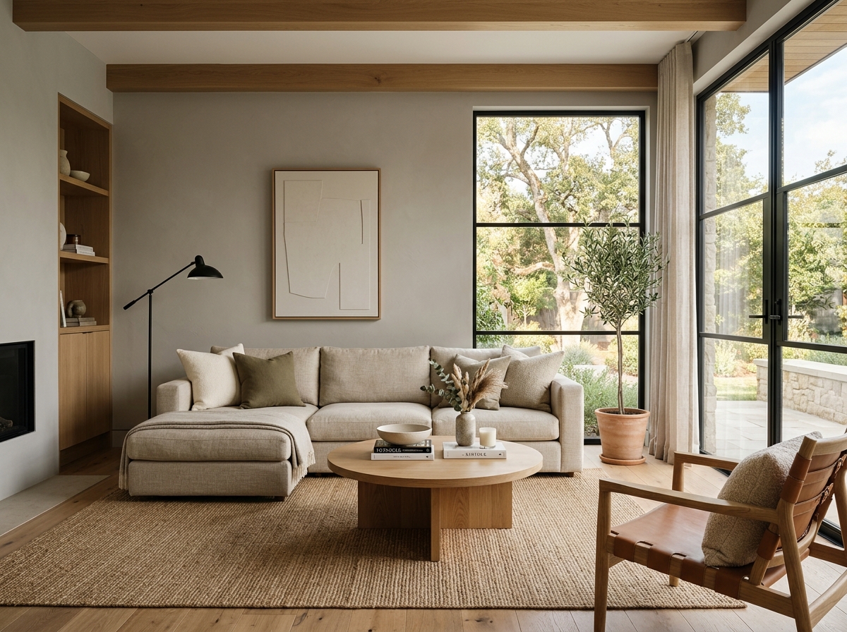 After
After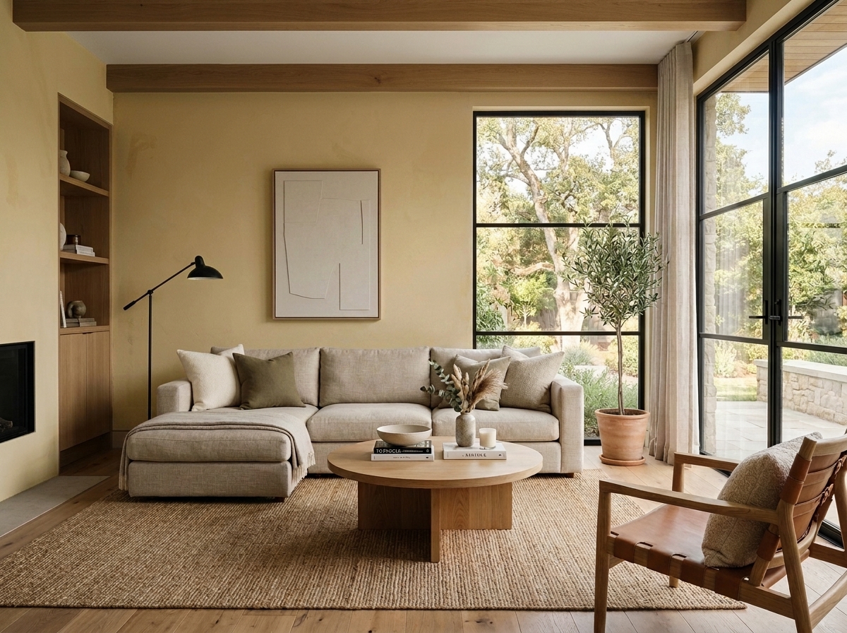 Before
Visualize Your Space with Color Studio AI
Planning a project? Skip the paint chip guesswork. Use our Color Studio AI to instantly visualize these paint colors on your own walls, or take advantage of our aligned contractor pricing matching current Sherwin-Williams retail promotions.
Book Your Upcoming Paint Project
Craftsman Painter is now scheduling premium transformations. Secure your spot and elevate your property value.
Get an EstimateHelp Others Find Professional Color Insights
Share this story directly to your networks or copy the link to share with friends.