


Mystical Shade is a complex purple-gray that lives in the subtle space between slate gray, charcoal, and dusty plum. With a Light Reflectance Value (LRV) of 30, it sits squarely in the mid-to-deep tonal range. In plain terms, an LRV of 30 means this paint absorbs a solid amount of light rather than reflecting it back into the room. It does not feel dark or claustrophobic, but it brings an undeniable atmosphere of cozy sophistication. Rather than reading as a simple "purple," its gray base keeps the color grounded, mature, and remarkably versatile.

Bringing the Palette Together: Architectural Trim and Wall Transitions
Mystical Shade
Sherwin-Williams SW 6276
Pure White
Sherwin-Williams SW 7005
Thunder
Benjamin Moore AF-685
Eclipse
Benjamin Moore 2119-20
To keep a complex color like Mystical Shade looking crisp and intentional, the supporting trim color is critical. I recommend pairing it with Sherwin-Williams Pure White SW 7005 for baseboards, crown molding, and window casings. Pure White has just a drop of warmth, preventing the harsh optical glare of a pure ceiling white while providing a high-contrast border that sets off the smoky violet tone of the walls.
In classic French-inspired interiors—where high ceilings, elaborate plasterwork, and white Carrara marble fireplaces dominate—this sharp break between trim and wall accentuates the architectural craftsmanship. Applying Pure White in a semi-gloss sheen alongside Mystical Shade in a matte or velvet finish highlights every detail of the decorative millwork.

Work Directly with Torlando Hakes
Skip the color choice stress. Work directly with me as your personal Color Designer to select the perfect architectural palette for your home, and get a Complementary Color Consultation when you purchase paint through us.

For adjacent spaces—like an entryway, hallway, or connecting parlor—stepping directly from a rich focal shade into a stark white can feel jarring. To create a natural visual bridge, Benjamin Moore Thunder AF-685 works wonderfully on connecting walls. Thunder is a medium greige with subtle warm undertones that balances the cool purple-gray notes of Mystical Shade. When transitioning from room to room, it keeps the overall palette feeling cohesive and warm during cool Midwestern autumns.

Light Shifts and Deep Accent Colors
How you experience Mystical Shade changes dramatically throughout the day. In bright morning sun, the slate-gray pigments come forward, giving walls a clean, tailored finish. As the sun dips lower in the late afternoon and warm golden light fills the room, the dusty violet undertones awaken, casting soft, rich shadows across the space. By evening, under warm chandelier or lamp light, the room feels wrapped in a velvety, quiet atmosphere.
To complete the interior scheme, introduce Benjamin Moore Eclipse 2119-20 as a high-contrast accent color. Eclipse is a deep, shadowed charcoal with subtle plum undertones that echo Mystical Shade without matching it exactly. It is the perfect choice for an accent piece—think kitchen cabinetry, a built-in library bookshelf, or heavy solid wood interior doors.

Practical Decor and Material Pairings
When bringing this palette into your home, lean into rich, tactile materials that balance the cool tones of the paint:
- Wood Flooring: Medium-to-dark honey oak or walnut herringbone parquet floors bring natural warmth that grounds the purple-gray walls.
- Metals: Warm metals like unlacquered brass, burnished gold, or soft copper act as natural jewelry against Mystical Shade walls.
- Textiles: Pair these moody walls with warm cognac leather, cream velvet, or natural linen upholstery to introduce texture and comfort.
- Stone Accents: White Carrara or Calacatta marble fireplaces and countertops create a bright, classic anchor against dark painted surfaces.

For sheen selection, stick with a matte or flat finish on living room and bedroom walls to maximize the velvety depth of Mystical Shade SW 6276. Use a durable satin or semi-gloss finish for Pure White SW 7005 on trim and doors, and keep Benjamin Moore Eclipse 2119-20 in a sleek satin finish when painting built-ins or cabinetry.
When applied with intention, this smoky, elegant purple-gray brings an unmatched sense of modern luxury to traditional architecture.
Complementary Color Consultation
Planning a project? Work with Torlando Hakes directly as your personal Color Designer and get a Complementary Consultation when purchasing paint through us.
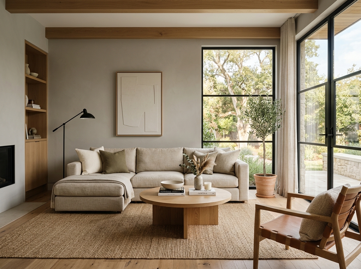 After
After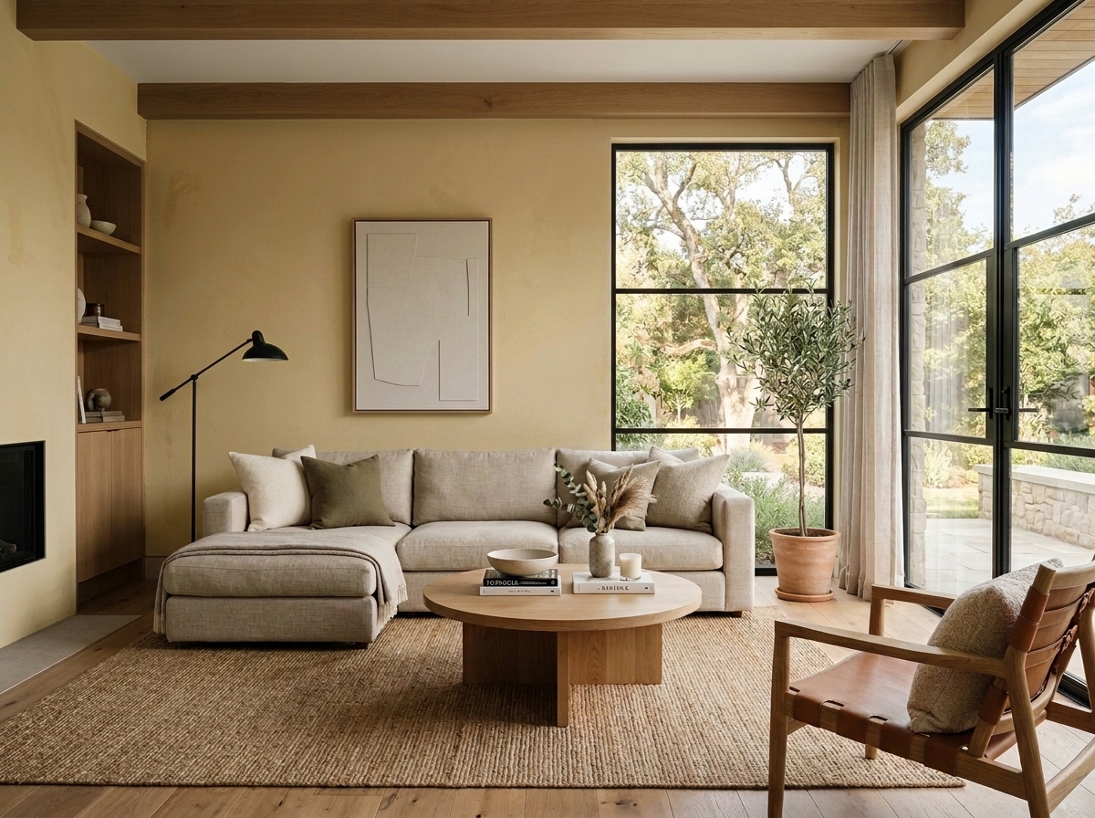 Before
Visualize Your Space with Color Studio AI
Planning a project? Skip the paint chip guesswork. Use our Color Studio AI to instantly visualize these paint colors on your own walls, or take advantage of our aligned contractor pricing matching current Sherwin-Williams retail promotions.
Book Your Upcoming Paint Project
Craftsman Painter is now scheduling premium transformations. Secure your spot and elevate your property value.
Get an EstimateHelp Others Find Professional Color Insights
Share this story directly to your networks or copy the link to share with friends.