


Consider how a room behaves when wrapped in Sherwin-Williams Gray Clouds SW 7658. Sitting at a Light Reflectance Value (LRV) of 47, Gray Clouds rests just below the exact midpoint of the light reflection scale. In plain English, an LRV of 47 means this paint absorbed just enough light to feel grounded and intimate without plunging the room into shadow. It does not bounce light around like a stark bright white, but rather cradles daylight, giving walls a soft, physical presence.
What makes Gray Clouds particularly remarkable is its true undertone profile. It is a crisp, cool gray infused with a distinct slate-blue secondary note. In the direct golden glare of a late Midwest autumn afternoon, those cool blue undertones do something wonderful: they cool down the intense amber sunlight, creating a tranquil, clean, and balanced atmosphere across your main living walls or primary bedroom sanctuary.

To make a cool-toned gray like Gray Clouds feel warm and inviting rather than chilly, we look to the biophilic Scandinavian style—often celebrated as hygge. By layering natural materials like blonde birch wood furniture, tactile woven wool blankets, natural cork wall accents, and healthy potted fiddle-leaf figs, the blue-gray background transforms into a soothing backdrop for organic living.

Work Directly with Torlando Hakes
Skip the color choice stress. Work directly with me as your personal Color Designer to select the perfect architectural palette for your home, and get a Complementary Color Consultation when you purchase paint through us.
Architectural details require an intentional trim pairing to crisp up the edges of Gray Clouds. I always recommend framing this cool gray wall tone with Sherwin-Williams Pure White SW 7005 on baseboards, window casings, and ceiling moldings. Pure White offers just a hint of warmth without any heavy yellow cast, creating a clean, tailored transition that defines the perimeter of the room without visually jarring the eye.

As you move through an open home floor plan, holding one paint color across every single wall can make a residence feel flat. To bridge cool walls with warmer architectural features or adjacent hallways, introduce Benjamin Moore Revere Pewter HC-172 in neighboring corridors or open built-in display nooks. Revere Pewter brings a classic greige warmth that connects blonde birch millwork and natural wool fibers directly to the slate-blue balance of Gray Clouds, creating a harmonious room-to-room progression.
Daylight shifts constantly throughout the day, and Gray Clouds responds to these subtle environment changes with remarkable beauty. In early morning light from north-facing windows, the blue undertones come forward, feeling fresh, clean, and crisp. By late afternoon, as warm lamp light and flickering fireplace glows take over, the wall surface softens into a muted violet-tinted slate hue that encourages instant relaxation.

When planning your kitchen, dining room, or bathroom vanity anchors, every great neutral backdrop benefits from a grounding contrast point. Enter Sherwin-Williams Gale Force SW 7605. Gale Force is a deep, moody, stormy navy blue that shares the cool slate DNA of Gray Clouds. Coating a central kitchen island or lower vanity cabinets in Gale Force grounds the lower third of the room, allowing the lighter Gray Clouds walls to feel airy and expanded above.
To ensure your paint application looks professional, matching the correct sheen to each architectural surface is vital. For walls painted in Gray Clouds, opt for a Flat or Matte sheen. Matte finishes absorb stray glare from autumn light, giving the wall a velvet-like depth that hides minor drywall imperfections. For trim and baseboards finished in Pure White, and cabinetry painted in Gale Force, select a Satin or Semi-Gloss finish. These higher sheens provide durability, moisture resistance, and a subtle reflective crispness that keeps millwork looking sharp.

In smaller, intimate spaces like a Scandinavian-inspired spa bathroom or powder room, this color combination shines with quiet sophistication. Picture Gray Clouds on the main walls, highlighted by Pure White baseboards, with a floating blonde wood or Gale Force vanity sitting firmly on stone tile floors. Potted ferns sitting on cork shelving catch the soft scatter of warm amber vanity lighting, proving that cool-toned paint can produce an immensely cozy home retreat.

Choosing paint is ultimately about managing how light moves through your home across changing seasons. Sherwin-Williams Gray Clouds SW 7658 offers a steady, storm-cool elegance that anchors natural light, turning high-contrast autumn sun into pure interior harmony.
Complementary Color Consultation
Planning a project? Work with Torlando Hakes directly as your personal Color Designer and get a Complementary Consultation when purchasing paint through us.
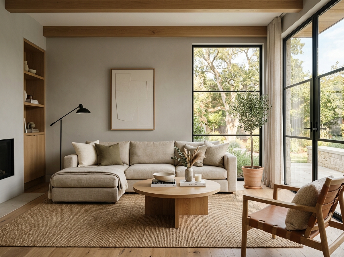 After
After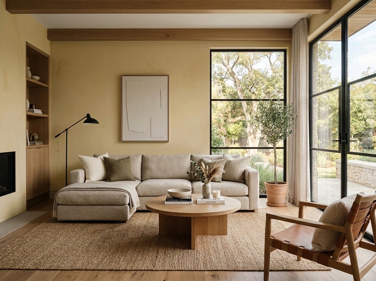 Before
Visualize Your Space with Color Studio AI
Planning a project? Skip the paint chip guesswork. Use our Color Studio AI to instantly visualize these paint colors on your own walls, or take advantage of our aligned contractor pricing matching current Sherwin-Williams retail promotions.
Book Your Upcoming Paint Project
Craftsman Painter is now scheduling premium transformations. Secure your spot and elevate your property value.
Get an EstimateHelp Others Find Professional Color Insights
Share this story directly to your networks or copy the link to share with friends.