
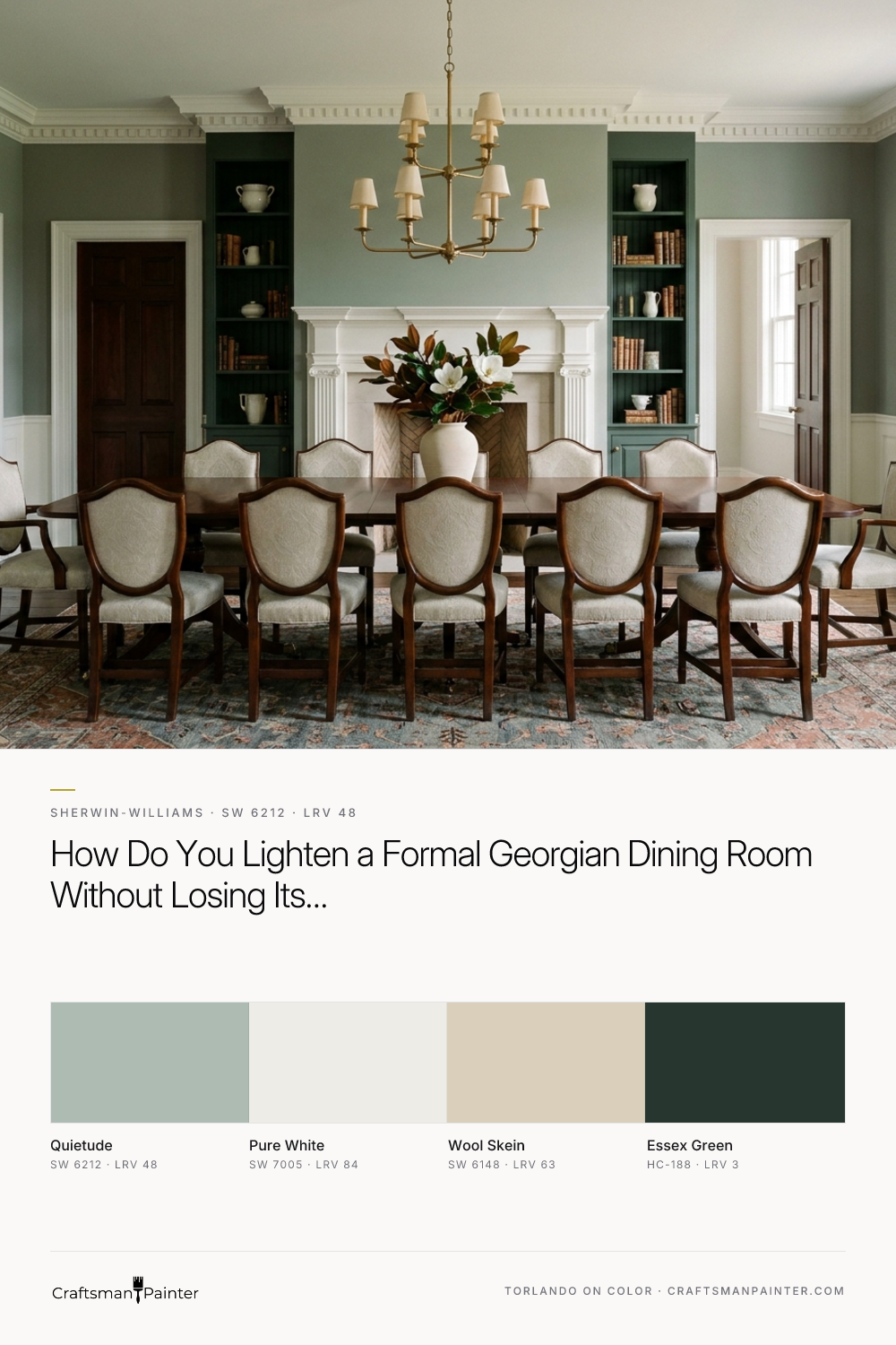


Sherwin-Williams Quietude (SW 6212) solves this dilemma by introducing a measured, green-gray calm with a gentle aqua undertone that lifts the heavy woodwork without washing out the room. Now that we are in November and December—prime season for refreshing dining rooms and interior millwork ahead of holiday hosting—we have to pay close attention to how early-winter light behaves. In central Indiana, the low-angle afternoon sun drops quickly, handing the room over to warm 2700K chandelier light before dinner even begins.
In the architectural visualization below, you can see how Quietude anchors a Georgian dining room across the upper plaster walls while Sherwin-Williams Pure White (SW 7005) defines the lower paneled wainscoting and dentil crown molding.
Real-paint peel-and-stick samples ship via Samplize. Craftsman Painter may earn a small commission on sample orders at no extra cost to you.
Reading the Light: LRV 48 and the Green-Gray Balance
To understand why Quietude behaves so reliably in a formal dining room, look at its Light Reflectance Value (LRV) of 48. On a scale from 0 to 100, an LRV of 48 sits right near the middle of the light-to-dark spectrum. It has enough pigment and body to create unmistakable separation against white wainscoting, yet it reflects nearly half the light that hits it.
Because Quietude carries green-gray and soft aqua undertones, it has a natural affinity for the warm red and orange tones found in dark walnut floors, mahogany dining furniture, and the traditional red and buff masonry brick visible just outside the windows. On the color wheel, soft blue-greens sit opposite warm reds and ambers. Instead of clashing with warm wood tones or brass fixtures, Quietude gives the eye a cool, steady counterpoint that actually makes the walnut floors and unlacquered brass hardware look richer.
Millwork, Sash Windows, and Crisp Trim Pairing
Georgian and Colonial Revival rooms rely on architectural symmetry and crisp shadow lines. When you have raised-panel fireplace surrounds, multi-pane double-hung sash windows, and layered crown profiles, your trim color needs to stay clean without turning blue or stark against a muted wall color.
I pair Quietude with Sherwin-Williams Pure White (SW 7005) on all the trim, shutters, and wainscoting. Pure White has just enough warmth to keep traditional millwork looking grounded, avoiding the sterile glare of an un-tinted base white. In the color rendering below, notice how the soft natural daylight entering through the tall symmetrical sash windows catches the edges of the Pure White raised-panel fireplace surround and pleated linen drapery, while Quietude holds a velvety, composed depth on the surrounding walls.

Bridging into Adjoining Rooms through Central Hall Archways
A Georgian floor plan is defined by sightlines. Wide central hall archways typically connect the formal dining room to the entry foyer, a central hall, or a paneled library. Because Quietude has a distinct green-gray presence, transitioning abruptly into a cold gray or a yellow-beige hallway can throw off the visual rhythm of the first floor.
To create a smooth transition through those wide cased openings, I use Sherwin-Williams Wool Skein (SW 6148) as the adjoining bridge shade. Wool Skein is a relaxed, khaki-leaning neutral with a subtle green-beige undertone that speaks the same quiet language as Quietude. Looking at the design study below, looking from the Quietude dining room through a Pure White central hall archway into an adjoining living space painted in Wool Skein, you can see how the two shades settle together without fighting for attention.

Grounding the Palette with Built-In Cabinetry and Deep Green Accents
Many classic Meridian-Kessler and Carmel dining rooms include a built-in china hutch, a butler's pantry pass-through, or traditional beaded inset cabinetry with stepped crown molding. When the main walls are dressed in a mid-tone like Quietude, introducing a deep, historic dark green on the cabinetry or interior architectural doors gives the room an anchor.
Benjamin Moore Essex Green (HC-188) is an exceptionally deep, near-black forest green that pairs naturally with Quietude. Because both colors share a green foundation, Essex Green reads like a concentrated, scholarly version of the wall color rather than a disconnected accent. In the rendering of the built-in buffet below, painting the beaded inset cabinetry in Essex Green makes the unlacquered brass knobs and bin pulls stand out with real authority, while the surrounding Quietude walls keep the alcove from feeling heavy.

How Quietude Shifts Under Warm 2700K Evening Hosting Light
Since dining rooms do most of their work after sunset—especially during the late-autumn and winter holiday season—it is critical to evaluate how Quietude responds when daylight fades and the brass chandelier and recessed evening lights take over.
Under cool morning light, the aqua note in Quietude is more noticeable, giving the room a crisp, airy posture. As late afternoon gives way to evening and 2700K warm amber bulbs illuminate the room, the yellow wavelengths in the interior lighting temper that cool aqua edge. The gray and green undertones step forward, turning Quietude into a soft, muted sage-celadon. In this final evening visualization, notice how the color holds its poise alongside the crisp Pure White wainscoting and warm brass fixtures, creating an inviting atmosphere for a long dinner at home.

When you respect the bones of a Georgian or Colonial Revival home, you don't need loud pigment to make a formal dining room memorable; a balanced mid-tone like Quietude gives classic white millwork and dark walnut floors the breathing room they deserve.

Sherwin-Williams Gray Clouds SW 7658 Delivers Storm-Cool Composure to Sun-Drenched Rooms

Softened Green by Sherwin Williams (SW 6177)
