


With a Light Reflectance Value (LRV) of 71, Nonchalant White sits in a sweet spot. On a practical level, LRV measures how much light a paint color bounces back into the room on a scale from 0 (pure black) to 100 (pure white). At 71, this color reflects plenty of natural light to make rooms feel open and airy, but it carries just enough pigment to keep your walls from feeling stark or clinical.
What makes Nonchalant White special is its subtle mix of undertones: a soft balance of cool green, pale blue, and quiet gray. In a design study of a light-filled home here in Cleveland, where low autumn sunlight filters through windows framed by burning orange and amber leaves, these cool undertones do something wonderful. Warm afternoon sunlight normally pushes basic off-whites into a heavy yellow territory. Because Nonchalant White holds a cool green-gray core, that golden daylight simply balances the paint, turning it into a soothing, atmospheric cream that feels fresh and grounded.

To keep a shade like Nonchalant White looking intentional rather than washed out, structural framing is key. I like to outline the architectural bones of the space—the baseboards, door frames, and window casings—in Sherwin-Williams High Reflective White SW 7757. High Reflective White is a clean, bright neutral white without any strong warm or cool bias. When applied to sharp trim moldings, it gives Nonchalant White’s pale sage-and-gray personality something crisp to lean against, making the walls look softer and more sophisticated by contrast.

Work Directly with Torlando Hakes
Skip the color choice stress. Work directly with me as your personal Color Designer to select the perfect architectural palette for your home, and get a Complementary Color Consultation when you purchase paint through us.

As you move through a home, color should tell a continuous story rather than jumping abruptly from room to room. In adjoining spaces—like a hallway leading off the main living area or a quiet home office—I recommend shifting to Sherwin-Williams Comfort Gray SW 6205. Comfort Gray acts as a natural mid-tone partner because it shares the exact same blue-green-gray undertone DNA as Nonchalant White, just deeper on the paint card. Moving between these two shades feels effortless; it gives the eye a satisfying sense of rhythm as the lighter main walls transition into a slightly darker, cocooning accent space.

Every light background needs a strong anchor to give a room balance. For focal points like kitchen islands, built-in library cabinets, or lower vanity drawers, I bring in Sherwin-Williams Ripe Olive SW 6209. Ripe Olive is a rich, velvety forest shade that pulls the quiet green undertones out of Nonchalant White and elevates them. Against crisp white trim and pale Scandinavian birch finishes, a deep green accent grounds the entire space, echoing the evergreen pines and autumn landscapes outside the window.

When specifying paint finishes for this soft, natural aesthetic, texture matters just as much as color choice. I always recommend a flat or matte finish for Nonchalant White on living room and bedroom walls; matte sheens absorb harsh light glares and allow the subtle green and gray undertones to spread evenly across smooth surfaces. For trim, door casings, and baseboards painted in High Reflective White, choose a satin or semi-gloss enamel to handle daily wear while providing a subtle sheen contrast. Cabinetry painted in Ripe Olive looks best in a durable satin finish, giving the deep green hue a smooth, furniture-grade feel.
Pair this color palette with authentic natural materials: light birch or white oak floors, natural cork accent panels, hand-woven wool throw blankets, and plenty of healthy indoor greenery. The result is a calm, nature-connected sanctuary that adapts gracefully to changing seasons and shifting light.

Nonchalant White proves that off-white doesn't have to be boring or cold—when matched with the right architectural trim and grounded accent tones, it creates an inviting canvas that honors both sunlight and cozy shadows.
Complementary Color Consultation
Planning a project? Work with Torlando Hakes directly as your personal Color Designer and get a Complementary Consultation when purchasing paint through us.
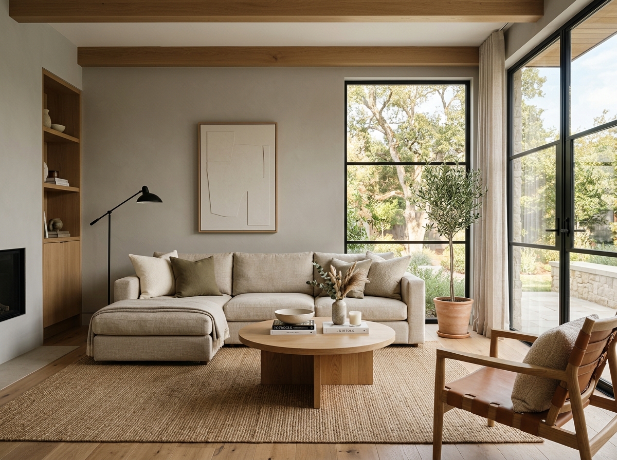 After
After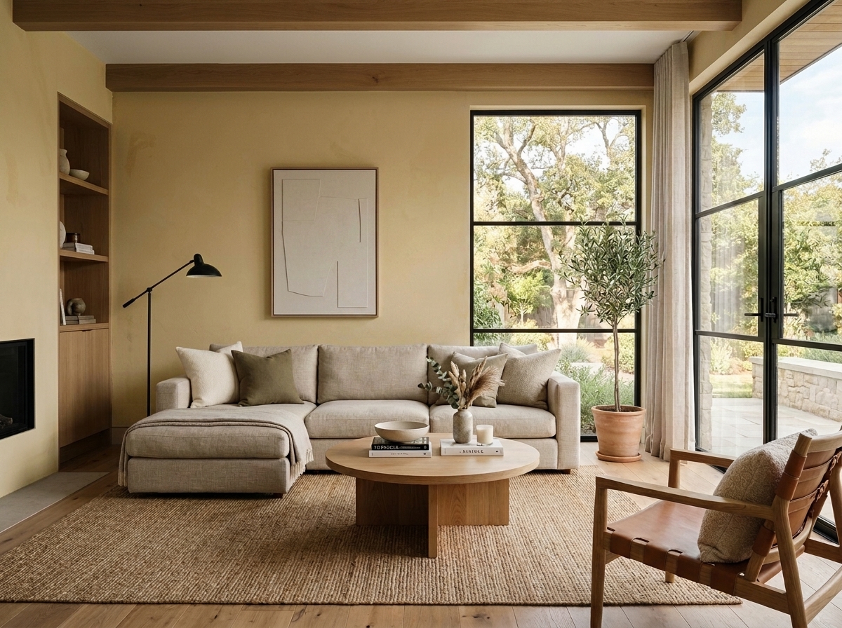 Before
Visualize Your Space with Color Studio AI
Planning a project? Skip the paint chip guesswork. Use our Color Studio AI to instantly visualize these paint colors on your own walls, or take advantage of our aligned contractor pricing matching current Sherwin-Williams retail promotions.
Book Your Upcoming Paint Project
Craftsman Painter is now scheduling premium transformations. Secure your spot and elevate your property value.
Get an EstimateHelp Others Find Professional Color Insights
Share this story directly to your networks or copy the link to share with friends.