
I’m Torlando. I cut my teeth and earned my degree at the Eskenazi School of Art, Architecture + Design, and I’ve spent my career analyzing how color bleeds, breathes, and fights with light in high-end residential spaces. As a color consultant right here in Indianapolis, I spend my days cutting through the noise of Pinterest trends to find what actually works in a physical, breathing room.
Today, we’re dissecting Benjamin Moore’s Hale Navy (HC-154). It’s not a fad. It’s an anchor. And in the shifting, often moody light of central Indiana, it is an absolute revelation.
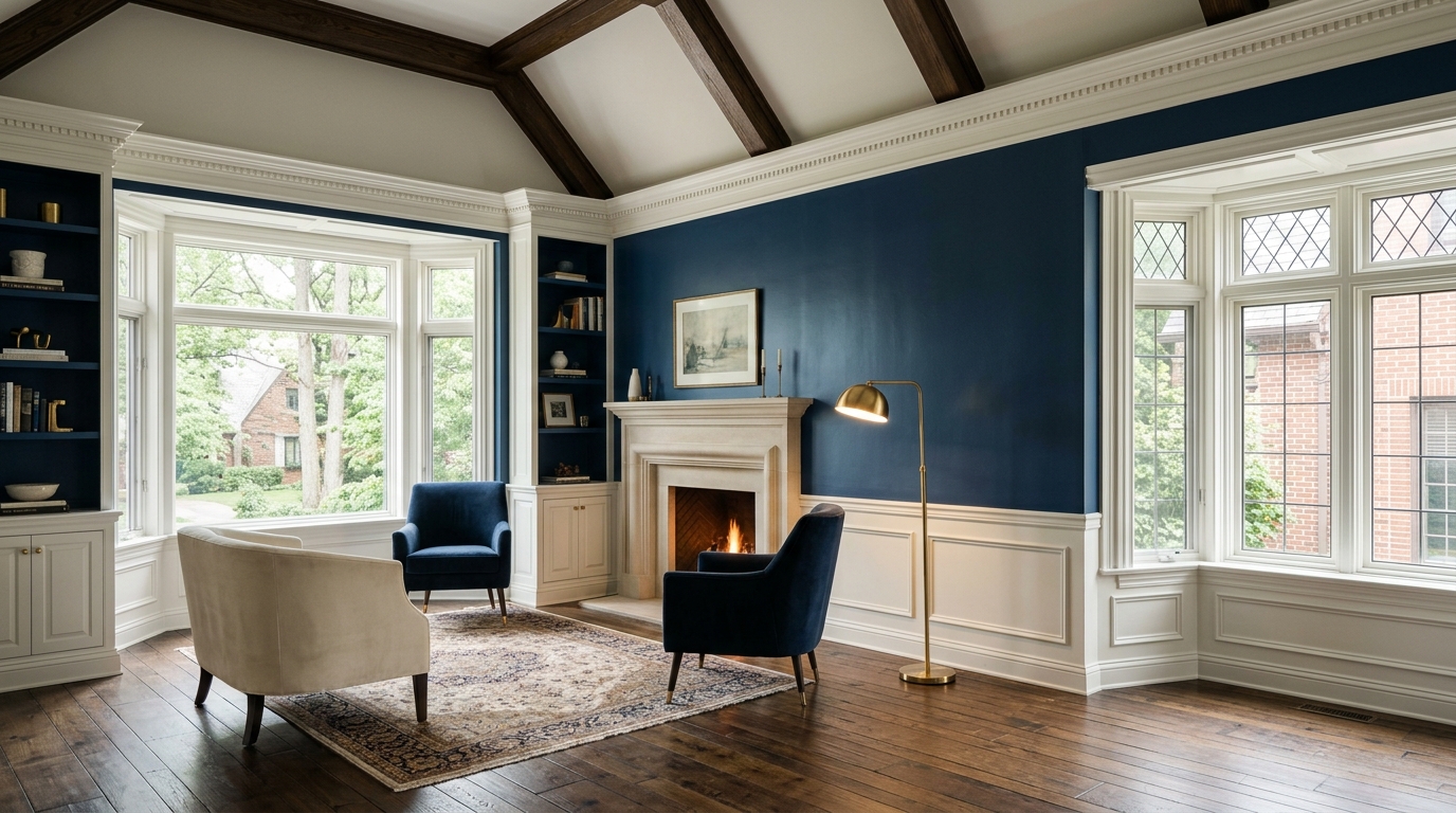
The Anatomy of HC-154: Undertones and the Psychology of Depth
Hale Navy doesn't scream. It sits in the corner, nursing a bourbon, quietly commanding the room. The secret—as it always is with high-end residential color theory—is in the undertones.
Book Your Upcoming Paint Project
Craftsman Painter is now scheduling premium transformations. Secure your spot and elevate your property value.
Get an EstimateA lot of blues are fundamentally unstable. They skew purple in the shadows or go aggressively, cheaply teal under incandescent bulbs. Hale Navy refuses to play those games. It sits on a heavy, unapologetic bedrock of charcoal gray. It is a transitional color, a chameleon that expertly bridges the gap between warm and cool.
With a Light Reflectance Value (LRV) of roughly 8, this paint absorbs light like a sponge. It creates an undeniable psychological weight. It makes a room feel grounded, intimate, and defiant. When you put Hale Navy on a wall, you aren't just changing the hue; you are changing the gravity of the space.
Midwestern Light: How Indianapolis Skies Offset the Darkness
Color doesn't exist in a vacuum. It is entirely at the mercy of its environment. Here’s the reality of Indianapolis: we don’t have that blinding, bleached-out Mediterranean sun. We have Midwestern skies. They are flinty and diffused in February, thick and golden in July. You have to design for the reality of Indiana’s climate.
When an Indy winter turns the sky to slate, a lesser navy turns flat, dead, and claustrophobic. But Hale Navy’s charcoal foundation harmonizes beautifully with our moody exterior light. It holds its own.
Catch this color in a north-facing Broad Ripple bungalow in the late afternoon, and it deepens into a velvety, cinematic abyss. But put it in a south-facing room in Zionsville? The warm sunlight pulls out the rich, oceanic blue, reminding you exactly why it’s considered the gold standard of classic navies. It is highly resistant to metamerism—the phenomenon where colors drastically change under different lighting. It remains honest, morning to night.
Architectural Harmony: From Meridian-Kessler Charm to Carmel Estates
You don’t paint a wall Hale Navy without considering the bones of the house. Paint reacts to its neighbors, and this color demands good company.
In the historic Tudor revivals of Meridian-Kessler, try wrapping it entirely around a den—walls, baseboards, crown molding, and ceiling. We call this color drenching. The boundaries of the room vanish. It’s an architectural magic trick that turns a small, dated room into a jewel box of a study.
In the sprawling, transitional estates of Carmel, pair Hale Navy custom built-ins with unlacquered brass hardware, heavily veined Calacatta marble, and crisp Benjamin Moore Chantilly Lace trim. The contrast is sharp, tailored, and sophisticated. The brass warms up the gray undertones of the navy, creating a visual symphony that feels both historically rooted and intensely modern.
The Verdict from an Eskenazi Alum: When to Commit
Listen, I’m a color consultant, not a cheerleader. I don’t recommend Hale Navy for every single space.
If you have a chopped-up drywall box with zero architectural interest, cheap baseboards, and bad recessed lighting, this paint won't save you. It will just look dark and sad. Hale Navy is a spotlight; it will highlight exactly what it touches, for better or worse.
But if you have good bones, decent natural light, and the courage to commit to the drama? Pull the trigger. Benjamin Moore Hale Navy is the definitive classic blue for Indianapolis homes. It’s a testament to the fact that sometimes, the boldest, most luxurious thing you can do in interior design is simply embrace the shadows.