


With a Light Reflectance Value (LRV) of 71.95, Blue Lace sits in the upper range of lightness. In everyday homeowner terms, an LRV of roughly 72 means this color bounces nearly three-quarters of the ambient light right back into your space. It feels weightless and airy, capable of brightening a shadowed living area without washing out into an anonymous off-white. What gives Blue Lace its character, however, is its delicate balance of undertones: an ultra-crisp cool blue laced with a soft, misty violet. In mid-day northern light, it stays crisp and tailored; under the warm orange glow of an autumn late afternoon, that subtle violet note keeps the blue from turning chalky, producing a subtle, luminous clarity.

To keep a shade as ethereal as Blue Lace grounded, paint trim selection requires careful thought. Standard warm whites can inadvertently pull out too much blue, making the room look mismatched, while greyish whites can make the atmosphere feel clinical. I recommend using Benjamin Moore Chantilly Lace OC-65 for all architectural millwork, door casings, and wainscoting wall panels. Chantilly Lace is a remarkably pure white with almost zero warm or cool bias, acting as an exceptionally clean frame.
When painted in an eggshell sheen on the walls and surrounded by smooth semi-gloss Chantilly Lace trim, the subtle violet-blue of Blue Lace steps forward with quiet confidence. Running tailored wainscoting panels along the lower third of a hallway or dining area creates a structural baseline, letting the light blue wall space above breathe like open sky.

Work Directly with Torlando Hakes
Skip the color choice stress. Work directly with me as your personal Color Designer to select the perfect architectural palette for your home, and get a Complementary Color Consultation when you purchase paint through us.

Light behavior changes continuously throughout the day in Bloomington homes, particularly during clear autumn days when the sun stays lower in the sky. When golden light punches through the glass, it interacts with cool-toned paint in a fascinating way. Blue Lace handles this contrast with ease. Where the direct amber rays strike the wall, the cool blue tempers the intense yellow light, neutralizing it into a quiet, misty alabaster glow. Across the room, deep in the shaded corners, the violet undertone anchors the tone, maintaining a cozy, structural shadow rather than letting the corner turn dreary or dim.
For evening ambient lighting, pairing symmetrical wall-sconces with a crystal-glass pendant fixture brings out the full depth of the finish. Soft, warm-white LED bulbs (around 2700K) interact with the cool walls to create a relaxing, sophisticated evening sanctuary.

A gentle wall shade like Blue Lace needs thoughtful anchor colors across neighboring spaces so the home doesn't feel overly light or pale. To bridge the transition into adjacent spaces—such as a foyer, secondary hallway, or open-plan family room—Sherwin-Williams Versatile Gray SW 6072 offers an ideal mid-tone warmth. This warm taupe-grey picks up on the violet undertone of Blue Lace while bringing a grounding, organic feel to transitional furniture, linen drapery, or adjacent passageways.
For focal points that require real visual weight, such as a custom kitchen island, a pantry door, or built-in library cabinets, turn to a deep anchor tone like Sherwin-Williams Indigo Batik SW 7602. This saturated, navy-like indigo contrasts directly with Blue Lace, drawing the eye and grounding the softer wall tones.

In private spaces like a main ensuite or guest bathroom, Blue Lace shines when paired with luxury stone and metal finishes. Applying matte or satin Blue Lace to the upper walls above polished Calacatta marble counter surfaces creates an instantly elevated, spa-like setting. The subtle grey and gold veining in Calacatta marble echoes both the cool blue of the wall paint and the warm metal accents in the room.
To complete the material palette, specify warm brushed gold plumbing fixtures and drawer pulls. The slight amber tone of brushed gold interacts with the cool wall surface, creating a balanced finish that feels intentionally curated rather than cold. A plush, cream silk-wool rug placed over radiant tile flooring softens underfoot steps, completing a calm, serene environment.

Selecting a light blue paint isn't simply about picking a pleasing swatch off a display rack—it's about understanding how daylight, room trim, and neighboring surfaces work together throughout the day. Benjamin Moore Blue Lace 1625 offers an ideal blend of airy lightness and soft color depth, making it a reliable, high-end option for transitional spaces.
Complementary Color Consultation
Planning a project? Work with Torlando Hakes directly as your personal Color Designer and get a Complementary Consultation when purchasing paint through us.
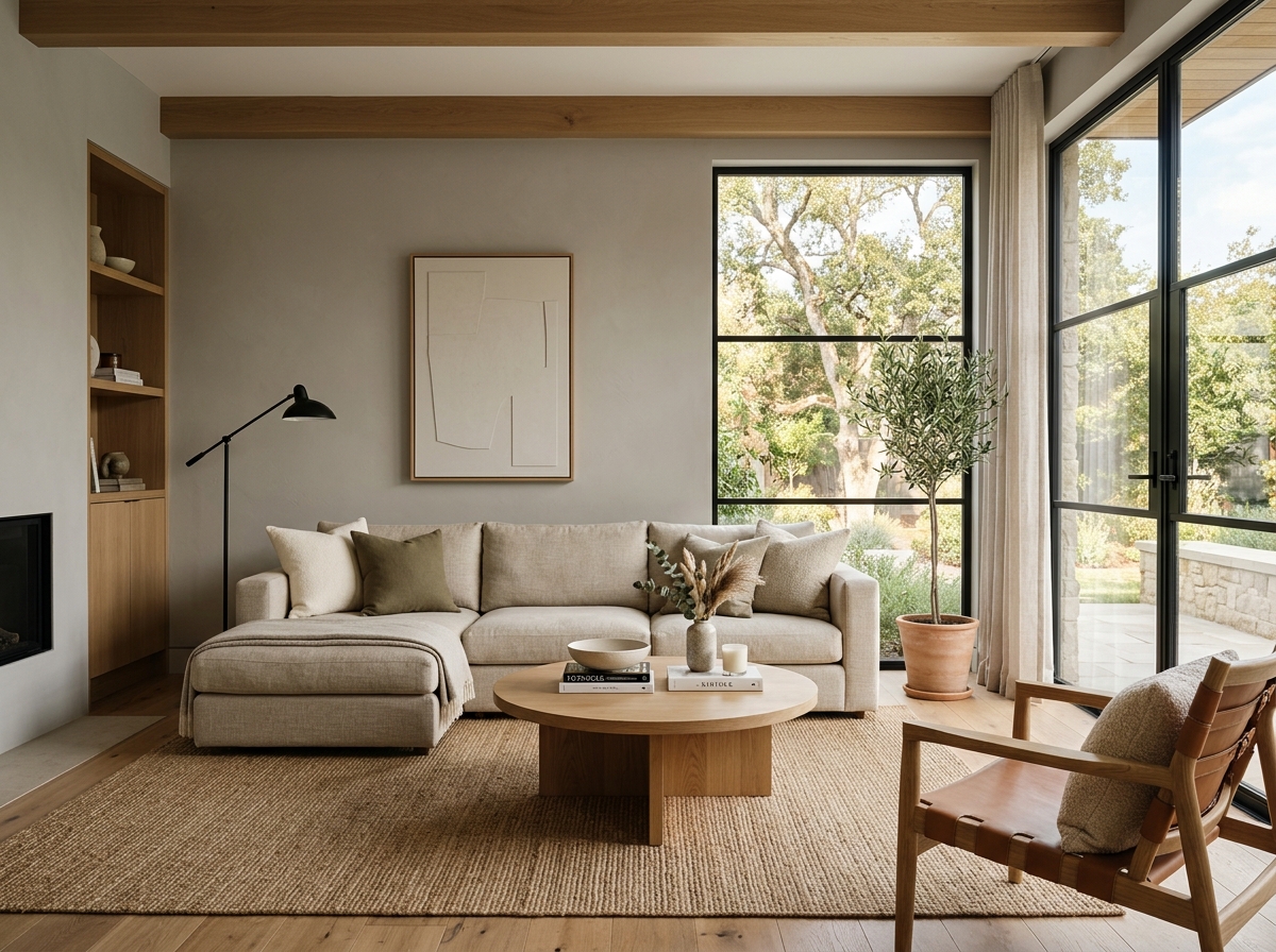 After
After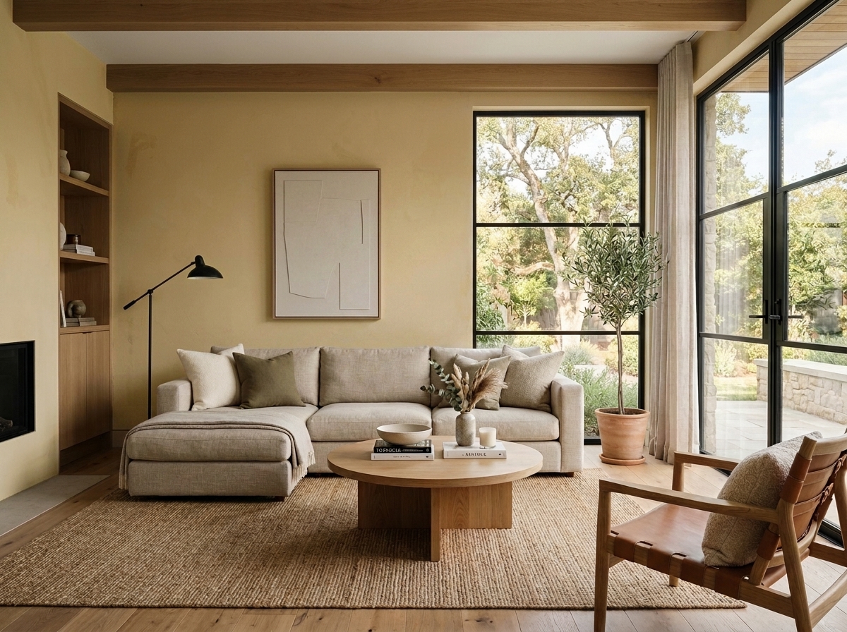 Before
Visualize Your Space with Color Studio AI
Planning a project? Skip the paint chip guesswork. Use our Color Studio AI to instantly visualize these paint colors on your own walls, or take advantage of our aligned contractor pricing matching current Sherwin-Williams retail promotions.
Book Your Upcoming Paint Project
Craftsman Painter is now scheduling premium transformations. Secure your spot and elevate your property value.
Get an EstimateHelp Others Find Professional Color Insights
Share this story directly to your networks or copy the link to share with friends.