
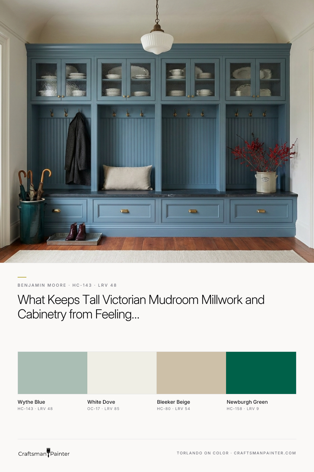


This is where Benjamin Moore Wythe Blue (HC-143) earns its reputation on fine woodwork. Part of the Historic Color collection, Wythe Blue sits right near the middle of the light-reflectance scale with an LRV of 48.18. It is a grounded, gray-tempered blue-green that has enough body to stand up to heavy Victorian crown cornices, yet enough clarity to bounce low-angle November and December afternoon light back into the room.
To show how this shade behaves across rails, stiles, and tongue-and-groove paneling before you commit to a gallon of cabinet enamel, let's walk through a series of design visualizations set inside a Historic Victorian and Italianate interior.
Setting the Tone in the Kitchen Perimeter and Centerpiece Island
Real-paint peel-and-stick samples ship via Samplize. Craftsman Painter may earn a small commission on sample orders at no extra cost to you.
Before we step into the mudroom entry, it helps to see how Wythe Blue handles the largest banks of millwork in the house. In an Italianate kitchen with oversized vertical sash windows, tall shafts of natural daylight drop straight down across the upper cabinetry. On flat drywall, a blue-green can sometimes read a little misty or indistinct. On cabinetry finished in a smooth satin enamel, the slight sheen catches the crisp edges of inset doors, stepped crown cornices, and glass-front upper hutches.
In the visualization below, the perimeter cabinetry and centerpiece island are coated in Wythe Blue, set against surrounding plaster walls in Benjamin Moore White Dove (OC-17). White Dove has a soft, creamy warmth that keeps the blue-green from feeling chilly when the gray Indiana winter sky takes over outside. Against original heart-pine strip flooring and honed marble countertops with subtle gray-green veining, the gray undertone in Wythe Blue settles right down, looking completely native to the 19th-century architecture.
How Satin Enamel, Cast Brass, and Stone Veining Interact Up Close
When you specify a color with an LRV of 48.18 for cabinetry, the magic is in how the undertone shifts across three-dimensional joinery. Wythe Blue carries a dual blue-green base softened by a distinct gray cast. In direct morning or midday light coming through tall sash windows, the aqua-green notes come forward on the flat center panels of the doors. Along the recessed bead of an inset frame or the shadow line beneath a bevel, the gray undertone steps in to create natural depth.
Looking closely at the rendering of the drawer fronts and countertop edge below, you can see why hardware and stone selection matter so much with this shade. Unlacquered or cast brass hardware pulls out the warm green notes in Wythe Blue, whereas matte black or oil-rubbed bronze emphasizes its historic gray side. Paired with soapstone or veined marble, the satin enamel finish gives the woodwork a tactile, furniture-grade smoothness that resists fingerprints and wipes clean easily during busy holiday hosting.

Creating Depth in the Butler’s Pantry and Dining Pass-Through
Victorian and Italianate homes were built as a series of connected jewel-box rooms, often linked by pocket doors and a butler's pantry. As late-autumn afternoon light fades around 4:30 p.m. and you switch on warm 2700K chandelier and recessed lighting for evening dining, Wythe Blue shifts considerably. Under warm amber bulbs, the cool blue steps back and the color reads as a rich, muted celadon-slate.
In the butler's pantry study below, we paired Wythe Blue upper glass-front hutches and tongue-and-groove backboards with lower base cabinetry in Benjamin Moore Newburgh Green (HC-158). Newburgh Green is a deep, historic teal-green that shares the same blue-green DNA as Wythe Blue but anchors the bottom half of the room with darker weight. Looking through the pocket door into the adjoining hallway painted in Benjamin Moore Bleeker Beige (HC-80), you can see how a grounded khaki-beige bridges the cool pantry millwork and the warm wood floors without creating a jarring visual stop.

The Main Event: Mudroom Lockers and Built-In Bench Millwork
Now let's look at the hardest-working millwork in the house: the residential mudroom. In a historic home with a wraparound porch and tall rear entry doors, the mudroom is the transition zone for wet boots, heavy wool coats, and everyday gear. Built-in storage lockers with vertical tongue-and-groove backing, deep lower drawers, and a solid bench can easily look utilitarian or bulky if the color is wrong.
In this design study of the mudroom lockers and built-in bench millwork, Wythe Blue brings an airy, tailored poise to the space. Because its LRV sits just under 50, it hides the inevitable scuffs and winter salt splashes far better than a white cabinet enamel, while keeping the tall locker cubbies bright enough that you can actually see into the back corners. We kept the surrounding trim and 10-inch profiled baseboards in White Dove (OC-17) to frame the carpentry, while the adjoining family foyer walls in Bleeker Beige (HC-80) keep the transition warm and grounded against the heart-pine floors and cast brass coat hooks.

Carrying the Palette into a Tailored Bath Vanity
When a cabinet color works this well in high-traffic utility and kitchen zones, homeowners often ask where else they can pull that thread through the house. A historic primary bath or powder room vanity is a natural place to echo the mudroom millwork.
In our final visualization, a freestanding-style inset bathroom vanity is finished in a durable semi-gloss coat of Wythe Blue, topped with white marble and flanked by warm brass sconces. Up against walls painted in Bleeker Beige and trim in White Dove, the vanity reads like a bespoke piece of 19th-century painted furniture. Even in the enclosed lighting of a bathroom, the gray-green balance of Wythe Blue stays composed, never veering into baby blue or loud mint.

If your pre-holiday interior plans include refinishing mudroom built-ins, a butler's pantry, or full-height kitchen cabinetry, Benjamin Moore Wythe Blue offers a rare balance: it respects the weight of historic woodwork while giving dark winter afternoons a clean, restorative lift.

Beyond Predictable Trim Colors: The Enduring Appeal of Benjamin Moore Buxton Blue HC-149

Muted Olive and Soft Gray Converge in the Quietly Complex Benjamin Moore Flora AF-470
