
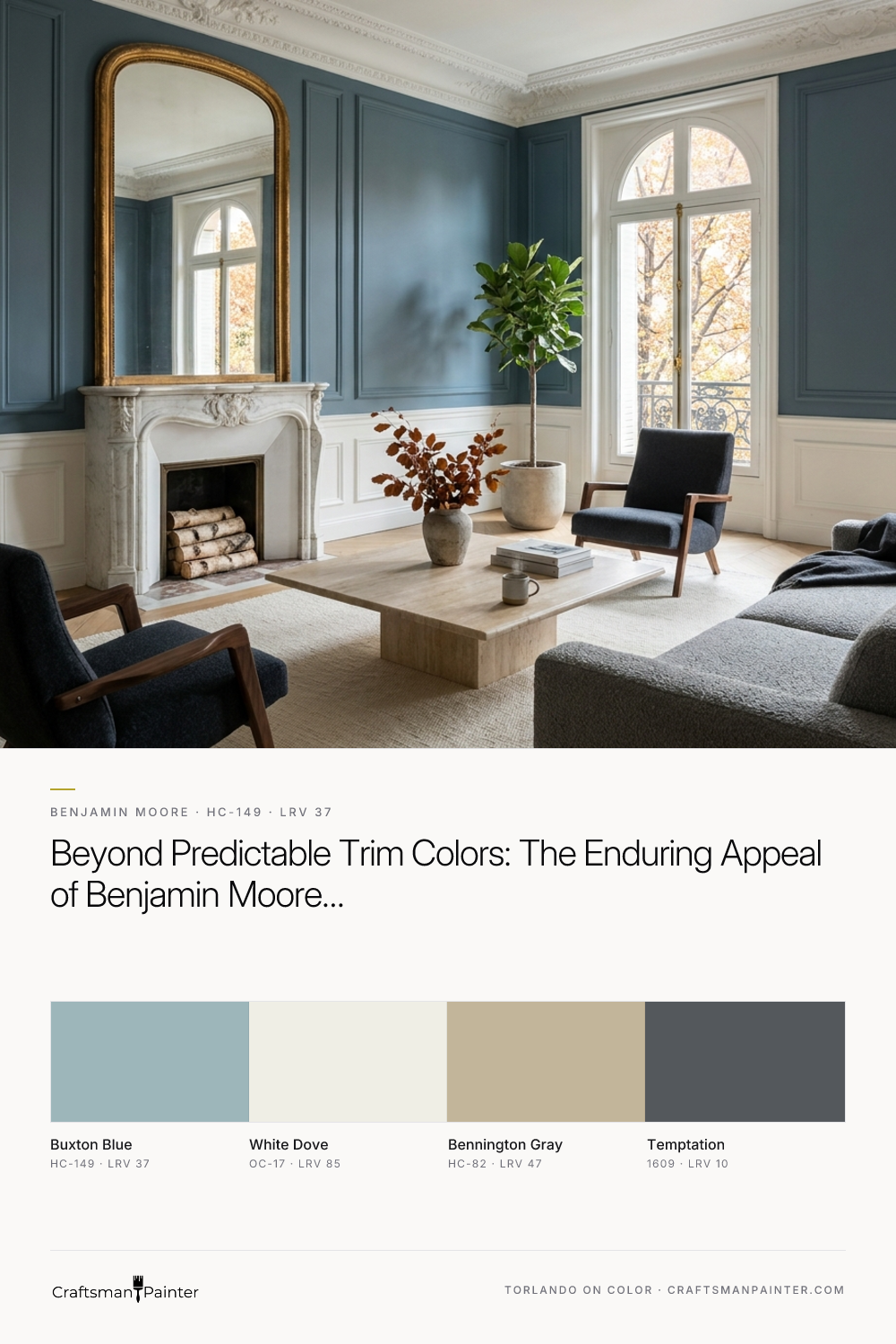


Buxton Blue is part of Benjamin Moore’s Historic Collection, and it earns its keep by balancing cool freshness with substantial visual weight. To understand how it will behave on your walls, it helps to look at its Light Reflectance Value, or LRV, which sits at 37.06. On a scale from zero to one hundred, an LRV of 37 means this is a confident medium-toned shade. It has enough body and depth to anchor a large room without making the walls feel like they are closing in, yet it still bounces a comfortable amount of daylight around the space.
Because it is rooted in a cool blue-green base with a steady gray undertone, it never crosses the line into looking like a nursery pastel or an overly loud teal. Instead, that gray foundation acts as a natural filter, muting the color just enough so that it feels sophisticated and restful.
Designing a Restful Sanctuary with Buxton Blue
Real-paint peel-and-stick samples ship via Samplize. Craftsman Painter may earn a small commission on sample orders at no extra cost to you.
To see how this shade performs in a high-ceilinged, classic layout, let’s walk through a design study of a representative custom home in Greenwood styled with Haussmannian Parisian inspiration. Imagine tall double-hung windows, herringbone oak parquet floors, and intricate plaster crown molding. When you apply Benjamin Moore Buxton Blue HC-149 to the primary walls of a bedroom in this type of setting, the interplay between the cool wall color and the warm oak flooring creates an immediate sense of balance.
In a primary sleeping space, I always recommend an eggshell or matte finish on the walls. A flatter sheen softens the way light hits the pigment, giving the blue-green notes a velvety, calming appearance that makes a bedroom feel like a true retreat at the end of a long day. Pair it with crisp linen bedding, a gilded gold-leaf mirror, and warm brass reading sconces to echo the golden autumn light outside.

Framing the Architecture with Crisp Trim
A complex historic blue needs the right white on the surrounding woodwork to look intentional. If you pair Buxton Blue with a stark, icy white, the trim can look cheap and overly harsh. Conversely, a heavy yellow-cream can make the blue look slightly muddy. In our design study, we frame the tall windows, elaborate crown molding, and deep baseboards in Benjamin Moore White Dove (OC-17).
White Dove carries just a hint of creamy warmth that softens the transition against Buxton Blue's gray undertones. Using a satin or semi-gloss finish on your trim and interior doors will give the moldings a subtle, wipeable luster that highlights the carved details of the woodwork against the flatter finish of the walls, creating a tailored look that holds up beautifully through decades of daily life.

How Central Indiana Autumn Light Shapes the Undertones
The magic of Buxton Blue lies in how it responds to changing light throughout the day. In a representative Greenwood home with south- or west-facing windows, the low, golden slant of October sunlight pours into the room and catches the subtle green notes hidden beneath the blue surface. Under this warm afternoon light, the color feels lively and inviting, harmonizing effortlessly with a white Carrara marble fireplace or natural wood furniture.
In rooms that receive cooler, steadier northern light—or when you turn on the warm crystal chandeliers and table lamps for an evening dinner party—the gray undertone steps forward, settling the walls into a tranquil, dusty slate blue.
To keep the floor plan feeling cohesive as you move from a Buxton Blue living room or study into an adjoining hallway or foyer, you need a reliable connecting neutral. Here, Benjamin Moore Bennington Gray (HC-82) serves as an ideal companion. Bennington Gray is a warm, organic beige-gray that echoes the warmth of herringbone oak floors while giving your eye a smooth, natural resting place between rooms. Because both colors belong to the Historic Collection, they share a similar muted quality that makes open sightlines feel calm and unified.

Grounding Built-Ins and Kitchens with Deep Charcoal
While Buxton Blue is wonderful on main walls, it also shines when paired with a dramatic accent on cabinetry, kitchen islands, or interior French doors. When homeowners want to add weight and structure to a room without resorting to pitch black, I recommend pairing Buxton Blue walls with Benjamin Moore Temptation (1609).
Temptation is a rich, grounded charcoal gray that carries a soft blue-gray undertone of its own. Applying Temptation in a durable satin enamel on a kitchen island, a butler’s pantry, or a set of living room built-in bookcases anchors the lighter blue-green walls and ties directly into the dark veining of Carrara marble countertops. Add unlacquered brass hardware to the dark cabinetry to bring that warm autumn glow right onto the millwork.

Bringing the Palette into Smaller Spaces
Don't hesitate to bring this exact combination into smaller, hard-working spaces like a guest powder room or a primary bathroom. A bathroom with a white marble vanity, brass plumbing fixtures, and Buxton Blue walls feels instantly clean and spa-like. If you paint the vanity base in Temptation and keep the trim in White Dove, you get a cohesive, whole-home color story that feels thoughtful from the front door to the back hallway.

Whether you are wrapping up your exterior maintenance before the frost arrives or refreshing your dining room and guest bedrooms before family gathers for the holidays, Buxton Blue offers a timeless, adaptable backdrop that looks just as handsome against golden October leaves as it does in the bright light of spring.
Frequently Asked Questions
What is the LRV of Benjamin Moore Buxton Blue (HC-149)?
Benjamin Moore Buxton Blue (HC-149) has an LRV (Light Reflectance Value) of 37 on a 0–100 scale. At LRV 37, Buxton Blue absorbs more light than it bounces back, creating grounded architectural depth. Give it strong natural daylight or layered 2700K–3000K lamps so shadowed corners stay crisp rather than murky.
What undertones does Buxton Blue (HC-149) have in natural light?
Buxton Blue carries cool blue-green, gray undertones. In cooler north-facing daylight those cooler gray or mineral notes step forward, while warm afternoon west light and 2700K evening bulbs bring out its softer warmth. Always evaluate a peel-and-stick real-paint sample isolated against white trim before purchasing gallons.
What trim and coordinating colors pair best with Buxton Blue?
For clean architectural separation on baseboards, window casings, and crown moulding, pair Buxton Blue with Benjamin Moore White Dove (OC-17). Across adjoining rooms, cabinetry, or exterior accents, it coordinates cleanly with Bennington Gray (HC-82), Temptation (1609).
Which paint sheen works best for Benjamin Moore Buxton Blue (HC-149)?
Mid-to-deep shades like Buxton Blue look best in Matte on drywall (to avoid shiny roller picture-framing) or sprayed in Satin urethane enamel on cabinetry, built-ins, and interior doors.

Muted Olive and Soft Gray Converge in the Quietly Complex Benjamin Moore Flora AF-470

Neither Strictly Gray Nor Brown, Benjamin Moore Kingsport Gray HC-86 Is the Designer’s Grounded Neutral
