


Setting the Stage for Foot Traffic and Merchandise
Real-paint peel-and-stick samples ship via Samplize. Craftsman Painter may earn a small commission on sample orders at no extra cost to you.
In a retail environment, wall color has a dual responsibility: it has to pull customers past the front threshold and keep them comfortable enough to linger, while also giving the staff working an eight-to-ten-hour shift a low-glare environment that is easy on the eyes. Flora sits at a Light Reflectance Value (LRV) of 28.64. On the wall, that number translates to a sturdy, medium-deep value that holds its authority under bright commercial lighting without swallowing the room in shadow. Its undertones are rooted in olive green and tempered with a steady measure of gray. That gray base is what keeps the green sophisticated and architectural rather than overtly botanical or leafy.
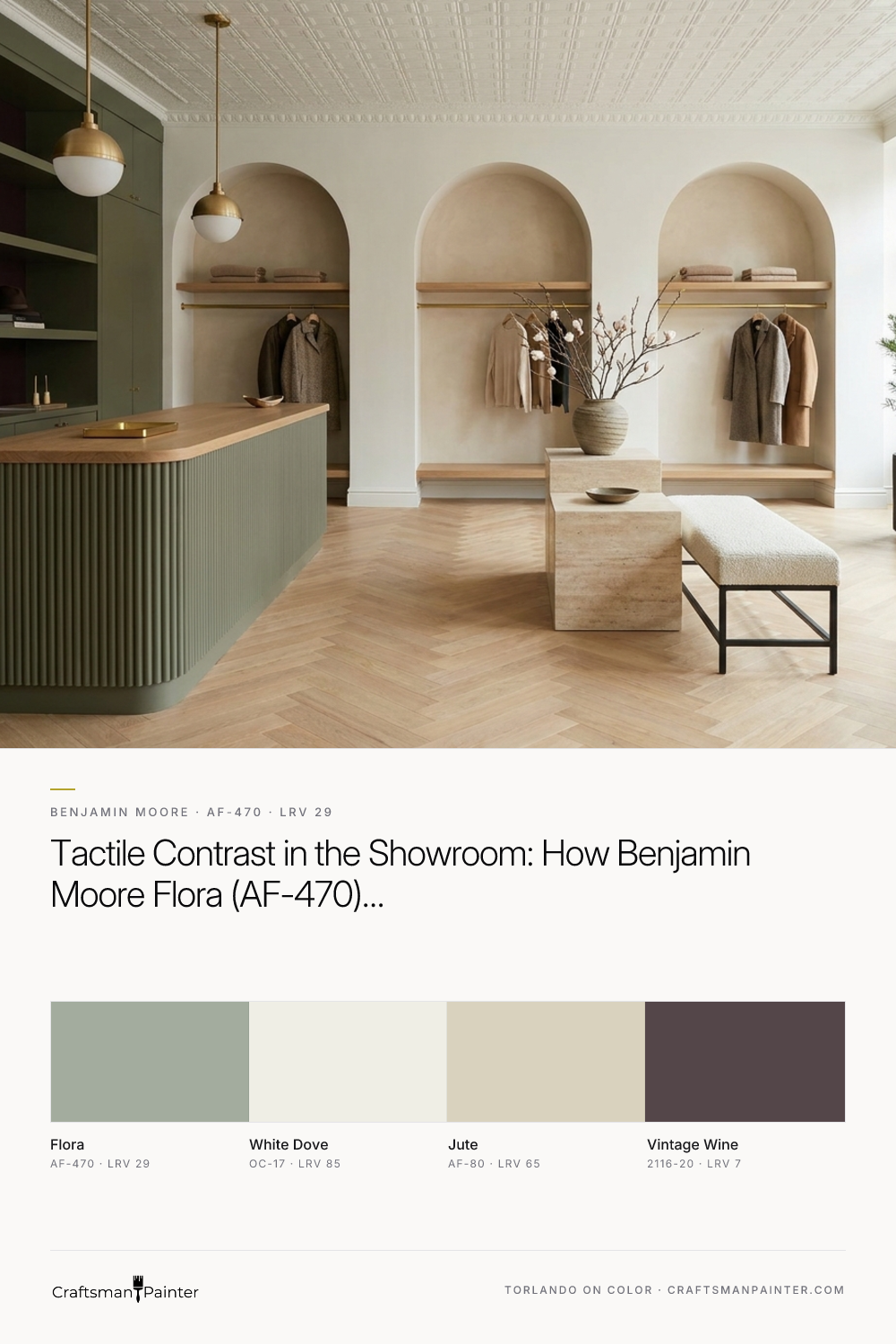
In the wide visualization of the main showroom floor below, you can see how Flora behaves when applied across built-in perimeter display cases and arched wall niches. Paired with high pressed-tin ceilings and historic storefront trim finished in Benjamin Moore White Dove (OC-17), the olive-gray walls establish a clear structural boundary. White Dove has just enough softness to keep the tall crown moldings and window casings from looking sterile, while providing the crisp frame needed to make the green millwork feel intentional. Grounded by herringbone oak floors and solid plinth display tables down the center aisle, the color slows the visual pace of the room, encouraging guests to move methodically from one vignette to the next.
Framing the Cash-Wrap and Guiding the Eye
Every successful boutique needs a clear visual anchor at the back or side of the floor plan so customers immediately understand how the space is organized—and where to go when they are ready to make a purchase or ask a question. Using contrast at the cash-wrap counter accomplishes this without relying on intrusive signage.
Looking at the rendering of the cash-wrap zone below, the custom millwork counter is finished in Flora’s smooth satin enamel, while the focal accent wall directly behind it is painted in Benjamin Moore Vintage Wine (2116-20). Because red and green sit opposite each other on the color wheel, a muted, brown-leaning burgundy like Vintage Wine naturally intensifies the olive undertones in Flora without creating harsh visual vibration. Under warm pendant fixtures, this pairing feels tailored and enveloping—especially during the pre-holiday shopping season when customers are drawn to deeper, fireside tones. For the retail staff stationed at the register for hours at a time, looking out from this grounded alcove into the main green-and-oak showroom prevents the eye fatigue that often comes from working inside all-white commercial boxes.

How Late-Autumn Daylight and Track Lighting Interact
Midwest light in November and December is notoriously tricky for commercial spaces. You get a few hours of low, angled, golden-gray afternoon light slicing through the front glass, followed by hours of complete darkness outside where your interior lighting does all the heavy lifting. A paint color with an unstable undertone will look muddy at noon and sour by five o'clock.
In this design study of the front storefront display zone, notice how Flora responds to that transition. Where the low-angle street daylight hits the custom painted display shelving near the window, the olive green steps forward, warming up the pale tones of polished concrete flooring and raw linen or stoneware merchandise. Just a few feet deeper into the room, where high-CRI architectural track heads take over, the gray undertone in Flora steadies the color, preventing the warm artificial light from turning the walls overly yellow. Brushed brass display rails and warm wood plinths catch the track light and pop cleanly against the matte and satin surfaces of the green walls.

Creating Visual Calm in the Consultation Alcove
Showrooms that offer design services, custom ordering, or private client fittings need a transition space that shifts the energy from browsing to focused decision-making. It also serves as the primary workspace where staff review material samples, fabric books, and layout plans. In a consultation suite, you want a bridge color that lowers contrast and keeps color-cast distortion to a minimum when looking at samples on a table.
In the visualization below, the main showroom’s Flora millwork transitions into a quiet consultation alcove painted in Benjamin Moore Jute (AF-80). Jute is a warm, linen-toned neutral that shares the same Affinity collection DNA as Flora, meaning their undertones are built to sit side by side without clashing. Wrapping the consultation walls in Jute while keeping the built-in sample cabinetry in Flora gives the room a calm, studio-like rhythm. The combination reduces glare on computer monitors and sample boards, helping both the designer and the client stay focused during long afternoon appointments.

Tactile Contrast: Millwork Sheens and Material Pairings
When specifying a mid-tone green-gray like Flora for a commercial space, sheen selection is what separates a flat paint job from architectural millwork. On vertical plaster or drywall surfaces inside arched alcoves, an eggshell or matte washable commercial finish lets the pigment look velvety and deep, hiding minor surface imperfections from grazing track lights. On the custom perimeter cabinetry, display shelves, and cash-wrap counters, stepping up to a smooth satin enamel gives the olive-gray a subtle luster that stands up to daily handling and cleaning.
Looking closely at the material pairing detail below, you can see why Flora is such a reliable partner for natural commercial finishes. The cool gray in its base bridges the gap to honed stone countertops and concrete, while the earthy olive green pulls out the rich amber and honey tones in white oak flooring and unlacquered brass hardware.

When a retail or showroom palette balances customer psychology with the practical realities of seasonal light and staff comfort, the architecture does half the selling for you. Flora gives a commercial interior the weight and warmth of a historic library while keeping the clean, tailored edges modern merchandise requires.

Muted Olive and Soft Gray Converge in the Quietly Complex Benjamin Moore Flora AF-470

Beyond Predictable Trim Colors: The Enduring Appeal of Benjamin Moore Buxton Blue HC-149
