
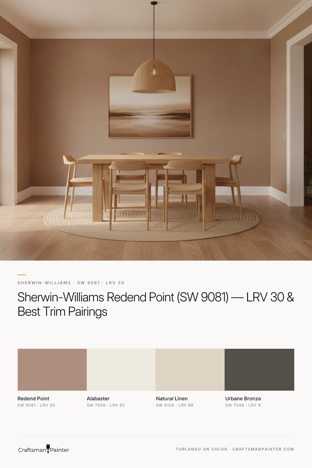


Unveiling Redend Point's Complexion and Depth
Real-paint peel-and-stick samples ship via Samplize. Craftsman Painter may earn a small commission on sample orders at no extra cost to you.
Redend Point’s character is defined by its intricate undertone structure. While many see a soft terracotta or a muted blush, its true depth comes from the interplay of warm beige, a hint of dusty pink, and the grounding presence of clay. This combination prevents it from reading as overtly pink or simply brown, instead presenting a sophisticated, sun-baked quality. In north-facing rooms, where light tends to be cooler and bluer, Redend Point’s warmth asserts itself, preventing the space from feeling cold. The pink and clay undertones become more pronounced, offering a welcoming glow. Conversely, in south-facing rooms with abundant warm light, it maintains its earthy integrity, appearing as a more saturated, rich beige-pink. East-facing light in the morning will highlight its softer, rosier aspects, while western afternoon light will deepen its clay attributes, leaning into a more earthy, almost terracotta-like appearance. The LRV of 30 means it absorbs a significant amount of light, making it an excellent choice for creating intimate, cozy environments in larger rooms or adding depth to smaller spaces. It’s a color that encourages relaxation and conversation, rather than a bright, energizing atmosphere.
Cultivating a Cohesive Palette with Redend Point
Building a harmonious color scheme around Redend Point requires thoughtful consideration of complementary shades that allow its unique character to shine without competition. For trim and ceiling, Sherwin-Williams Alabaster (SW 7008, LRV 82) is an ideal partner. Alabaster is a soft, warm white that provides a gentle contrast, allowing Redend Point to feel grounded and rich. Its creamy undertones echo the warmth of Redend Point, creating a seamless transition rather than a stark break. For a truly refined finish on baseboards, doors, and window casings, I recommend Sherwin-Williams Emerald Urethane Trim Enamel in Satin or Semi-Gloss. On ceilings, a flat or matte finish in Alabaster using Sherwin-Williams Cashmere Low Lustre or Emerald Interior Matte provides a soft, diffused look. For coordinating neutrals in adjacent rooms or as a secondary wall color, Sherwin-Williams Natural Linen (SW 9109, LRV 66) offers a lighter, airy alternative. Its subtle warmth complements Redend Point without competing, providing a breathable transition between spaces. To introduce a grounding contrast, Sherwin-Williams Urbane Bronze (SW 7048, LRV 8) is an exceptional choice. This deep, rich gray-brown can be used on interior doors, cabinetry, or even as an accent wall, providing a sophisticated anchor that enhances Redend Point's earthy tones. Exploring these and other potential pairings is simplified by utilizing resources like our Color Studio tool, where you can visualize how Redend Point interacts with various complementary hues and finishes.
Precision in Color Selection and Surface Preparation
Selecting a paint color like Redend Point involves more than just liking the shade; it requires understanding how it will interact with your home's unique lighting and existing elements. A common pitfall homeowners encounter is testing swatches directly on an existing painted wall. This approach is misleading due to Josef Albers' principle of simultaneous contrast, where the surrounding color influences how the eye perceives the new swatch. To accurately assess Redend Point, always use real-paint, peel-and-stick samples and isolate them against a clean white background, ideally against your intended trim color. Observe the sample throughout the day in various lighting conditions. Beyond color selection, the quality of the final finish is paramount. For typical residential repaints on drywall, I advocate for Level 2: Standard (Occupied Home) preparation, ensuring minor imperfections are addressed for a smooth surface. For a truly luxurious result, particularly on new construction or when significant repairs are necessary, Level 3: Premium (Luxury Finish) preparation is essential, providing a flawless foundation for the paint. For Redend Point on main walls, Sherwin-Williams Cashmere Low Lustre offers a beautiful, soft appearance, while Emerald Interior Matte provides superior washability. In high-humidity areas like bathrooms and kitchens, Sherwin-Williams Duration Home is the appropriate choice for its moisture resistance. For any trim, doors, or cabinetry painted in Redend Point or its coordinating Alabaster, Sherwin-Williams Emerald Urethane Trim Enamel in Satin or Semi-Gloss will deliver exceptional durability and a smooth, professional finish. If the complexities of color selection or the intricacies of surface preparation feel daunting, a 1-on-1 Color Consultation can provide tailored guidance and ensure your vision is executed flawlessly.
Redend Point's Kin: Comparing Similar Shades
When considering Redend Point, it's natural to compare it to other popular Sherwin-Williams neutrals. Two frequently mentioned rivals are Poised Taupe (SW 6039) and Accessible Beige (SW 7036), though Redend Point distinctly sets itself apart. Poised Taupe, with an LRV of 28, is a deeper, more traditional taupe. While it shares some warmth, its undertones lean more heavily into gray and brown, giving it a cooler, more conventional feel compared to Redend Point’s unique pink and clay warmth. Where Redend Point feels earthy and sun-baked, Poised Taupe presents as more sophisticatedly muted, often appearing as a true greige depending on the light. Accessible Beige, with its higher LRV of 58, is a much lighter, more straightforward beige. It possesses a gentle warmth but lacks the complex, nuanced undertones of Redend Point. Accessible Beige is a versatile, light neutral, whereas Redend Point offers a richer, more defined color statement. Redend Point occupies a distinct niche, providing a warm, inviting depth that neither the cooler taupe of Poised Taupe nor the lighter, simpler beige of Accessible Beige can replicate. It’s a color that embraces the current desire for natural, comforting hues while maintaining a refined edge.

Beyond Predictable Neutrals: The Burnished Authority of Sherwin-Williams Tarnished Treasure (SW 9118)

The One Bronze Paint Color I Use to Cure Boring Midwestern Dining Rooms
