


The dining room carries significant architectural weight in a home. We gather here at night, share meals, and settle into conversation. The walls need depth to anchor that experience. I actively avoid pale, non-committal pastels in these spaces. Instead, I specify muddy, complex tones that handle artificial lighting gracefully while absorbing the harsh Midwestern glare. Sherwin-Williams Tarnished Treasure (SW 9118) accomplishes exactly this.
A Physical Assessment: Sherwin-Williams Tarnished Treasure (SW 9118) Paint Color Review
Let’s look at how this pigment actually behaves. Tarnished Treasure occupies a highly specific middle ground between olive green, aged bronze, and mustard ochre. It has an LRV (Light Reflectance Value) of 26. This means it absorbs a significant amount of light, pulling the physical boundaries of the room inward.
Many homeowners make the mistake of painting their dining rooms in stark whites or flat grays to make the space feel larger. The result is often a sterile, echoing box. Tarnished Treasure does the exact opposite. It creates gravity. The heavy olive-bronze pigment holds its ground against shifting daylight and provides a solid visual anchor for the large, heavy furniture typical of a dining space.

Work Directly with Torlando Hakes
Skip the color choice stress. Work directly with me as your personal Color Designer to select the perfect architectural palette for your home, and get a Complementary Color Consultation when you purchase paint through us.

Surviving the Southern Indiana Light Shift
Bloomington homes face intense cyclical light variations. Eastern exposures receive the harsh, cool morning sun. Western exposures get the hot, direct afternoon bake. Tarnished Treasure responds predictably and beautifully to both extremes.
In a west-facing room, the heavy green undertones absorb the excess warmth of the afternoon light without turning acidic or overly yellow. In an east-facing room, the cooler morning light pulls out the muddy olive characteristics, keeping the space grounded. The heavy tree canopy of a Bloomington summer filters green light directly into the house. Tarnished Treasure harmonizes perfectly with this reflected exterior greenery, blurring the visual line between the indoor dining space and the outdoors.

Framing the Room: Trim and Contrast Elements
Color requires a rigid structural context to work properly. You need the right trim to establish a definitive architectural edge. I pair Tarnished Treasure with Sherwin-Williams Alabaster (SW 7008) for all baseboards, crown molding, and window casings. Alabaster provides a necessary warm white contrast. It cuts a clean visual line against the bronze walls without introducing the stark, clinical blue undertones of a pure, untinted white.
Visual transitions into adjoining spaces matter equally. You cannot drop a heavy bronze dining room next to a stark white hallway. The contrast jars the eye. For adjoining corridors or living rooms, a foundational greige like Sherwin-Williams Accessible Beige (SW 7036) creates a seamless, graded visual transition. The warmth of the beige heavily supports the golden undertones in the dining room.

Artificial Lighting and the Evening Meal
Dining rooms live and die by their artificial lighting. We spend our evenings here under incandescent bulbs or warm LEDs, typically in the 2700K to 3000K range.
Tarnished Treasure physically responds to this specific color temperature by deepening into a rich, shadowed gold. The pigment reacts to the warm light by suppressing its green undertones and amplifying its brown and brass characteristics. This thermal shift visually lowers the ceiling height slightly and wraps the room in a heavy, comforting warmth.
To maximize this effect, I recommend matte black or heavily patinated brass fixtures. A deep charcoal accent—like a buffet cabinet painted in Sherwin-Williams Iron Ore (SW 7069)—introduces a necessary dark focal point. The sharp visual contrast between the near-black charcoal and the muddy bronze walls grounds the entire vignette, giving your eye a place to rest during an evening meal.

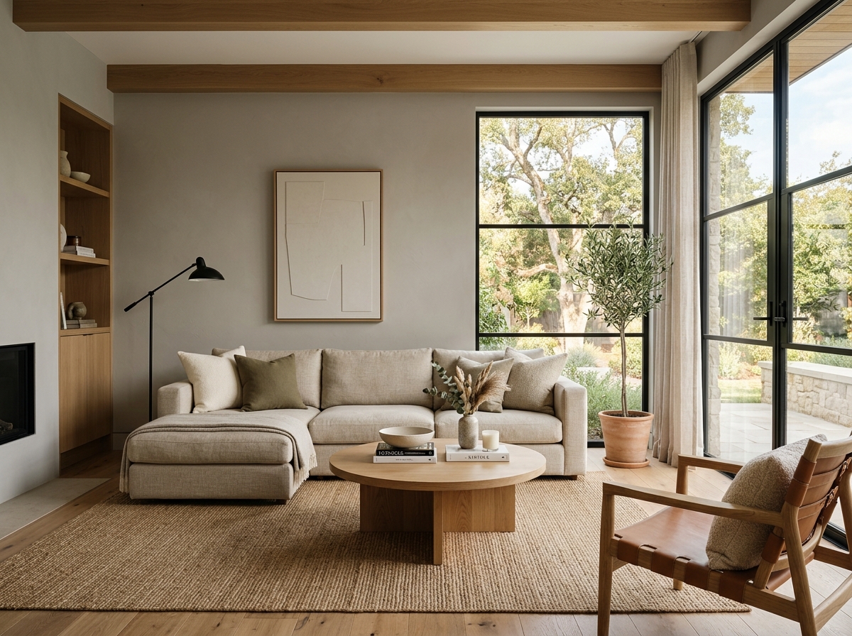 After
After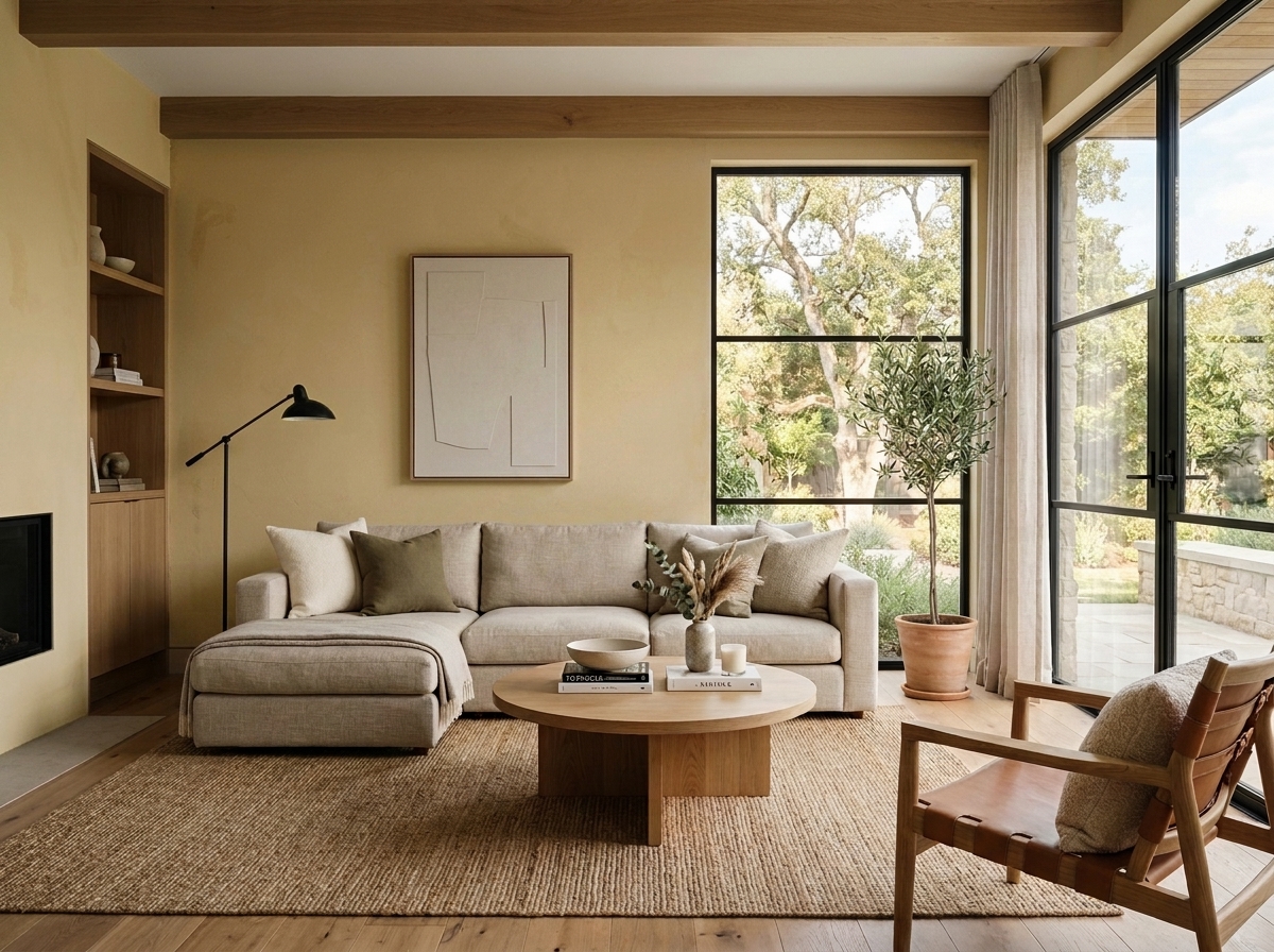 Before
Visualize Your Space with Color Studio AI
Planning a project? Skip the paint chip guesswork. Use our Color Studio AI to instantly visualize these paint colors on your own walls, or take advantage of our aligned contractor pricing matching current Sherwin-Williams retail promotions.
Book Your Upcoming Paint Project
Craftsman Painter is now scheduling premium transformations. Secure your spot and elevate your property value.
Get an EstimateHelp Others Find Professional Color Insights
Share this story directly to your networks or copy the link to share with friends.