
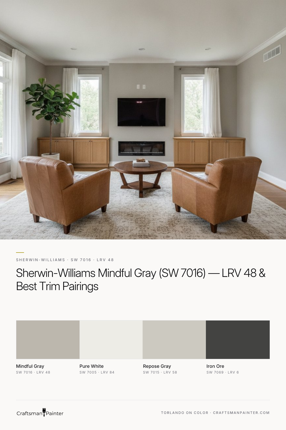


Decoding Mindful Gray's Warmth and LRV 48
Real-paint peel-and-stick samples ship via Samplize. Craftsman Painter may earn a small commission on sample orders at no extra cost to you.
Sherwin-Williams Mindful Gray (SW 7016, Hex #BCB7AD) is a mid-tone greige with a distinct warm beige-almond undertone. This particular characteristic is what differentiates it from cooler grays. While many grays can lean blue or purple, Mindful Gray's warmth ensures it feels grounded and welcoming, preventing that sterile or stark appearance some grays can impart. It’s a versatile neutral that maintains its composure across various lighting conditions, though its true character shines when its undertones are allowed to express themselves without interference from competing colors or inadequate lighting.
The LRV of 48 places Mindful Gray squarely in the mid-range. LRV, or Light Reflectance Value, measures the percentage of light a color reflects. A value of 0 is absolute black, and 100 is pure white. At 48, Mindful Gray isn't overly dark, nor is it particularly bright. This means it will absorb a moderate amount of light, creating a sense of depth and coziness. In rooms with ample natural light, Mindful Gray will appear lighter and reveal more of its warm undertones. In spaces with less natural light or primarily artificial light, it will present as a richer, more saturated color. It’s crucial to consider your room's inherent light exposure, as this will significantly impact how Mindful Gray reads on your walls. It has enough saturation to hold its own without washing out in bright sun, yet enough light reflection to prevent a cavernous feel in dimmer settings.
The Essential Step of Isolating Your Color Samples
One of the most common and costly mistakes homeowners make is testing paint swatches directly onto an existing colored wall. This practice, while seemingly logical, fundamentally misrepresents the true appearance of the new color. The phenomenon at play here is Josef Albers' principle of simultaneous contrast, where colors influence how adjacent colors are perceived. An existing wall color will inevitably alter your perception of the new swatch, making it appear different than it truly is. A warm yellow wall, for instance, can make a greige swatch look cooler by comparison, or a cool gray wall might make it seem warmer.
To accurately assess Sherwin-Williams Mindful Gray, or any color, you must isolate your samples. I strongly recommend using large, real-paint, peel-and-stick samples. These provide a substantial surface area to evaluate and, crucially, can be moved around the room. The critical step is to place these samples against a backdrop of pure white. If your trim is currently painted a different color, use a large white poster board or prime a section of your wall with a true white. This allows your eyes to perceive Mindful Gray without the distorting influence of other colors. Observe the sample at different times of day, under varying natural and artificial light conditions. This methodical approach is the only way to truly understand how Mindful Gray's LRV 48 and warm beige-almond undertones will perform in your specific environment. For more insights into specific colors and their nuances, explore our Color Studio.
Pairing Mindful Gray: Trim, Accents, and Neighboring Shades
Mindful Gray's versatility makes it an excellent foundation for a cohesive interior palette. For trim and ceilings, my go-to pairing is Sherwin-Williams Pure White (SW 7005, Hex #EDECE6, LRV 84). Its crisp, clean quality provides a sharp contrast that makes Mindful Gray appear richer and more defined. Pure White is a true white, free of strong undertones, which allows Mindful Gray's warmth to shine without competition. This pairing creates a classic, sophisticated look that feels fresh and timeless.
When considering coordinating neutrals, Sherwin-Williams Repose Gray (SW 7015, Hex #CCC9C0, LRV 58) is an excellent choice for adjacent rooms or as a slightly lighter variation. Repose Gray is a lighter greige, but it carries a subtle green undertone that complements Mindful Gray's warmth without clashing. While Mindful Gray has a distinct beige-almond undertone, Repose Gray leans slightly cooler, giving a gentle progression in tone. Comparing Mindful Gray (SW 7016) directly to Repose Gray (SW 7015) reveals Mindful Gray as the warmer, more saturated option. Another close rival is Sherwin-Williams Dorian Gray (SW 7017). Dorian Gray is a shade darker than Mindful Gray, with an LRV of 44, and often presents with more pronounced brown/taupe undertones, making it a deeper, richer, and often warmer choice than Mindful Gray. While Mindful Gray maintains a balanced greige feel, Dorian Gray leans more heavily into the 'greige' spectrum with a stronger brown presence.
For contrast accents, Sherwin-Williams Iron Ore (SW 7069, Hex #434341, LRV 6) offers a dramatic, grounding counterpoint. This deep, charcoal-black shade provides a sophisticated anchor for doors, accent walls, or cabinetry, allowing Mindful Gray to truly pop. The combination of Mindful Gray, Pure White, and Iron Ore creates a balanced, modern, and inviting atmosphere. Incorporating natural wood tones and warm metals further enhances Mindful Gray's inherent warmth.
Achieving a Professional Finish: Prep and Coating Specifications
The ultimate success of any paint color, including Mindful Gray, lies not just in its selection but in its application. Proper surface preparation and the use of high-quality coatings are non-negotiable for a lasting, professional finish. For interior drywall, especially in occupied homes, I recommend a minimum of Level 2: Standard drywall preparation, ensuring all joints and fasteners are covered and sanded smooth. For a luxury finish, particularly on new construction or where imperfections are visible, Level 3: Premium preparation is essential, which includes a skim coat over the entire surface to achieve a perfectly uniform substrate.
When it comes to coatings, the choice of paint significantly impacts both the aesthetic and functional performance. For general living areas, Sherwin-Williams Cashmere Low Lustre offers a refined, velvety finish that beautifully showcases Mindful Gray's depth. Alternatively, Sherwin-Williams Emerald Interior Matte provides exceptional durability and washability, ideal for high-traffic zones while maintaining a sophisticated, low-sheen appearance. In humid environments like bathrooms and kitchens, Sherwin-Williams Duration Home is the superior choice, offering mold and mildew resistance and excellent durability against moisture.
For trim, doors, and cabinets, a different product is required. Sherwin-Williams Emerald Urethane Trim Enamel in Satin or Semi-Gloss delivers a hard, durable finish that resists chipping and blocking, ensuring your Pure White trim stays crisp against the Mindful Gray walls. The choice between Satin and Semi-Gloss depends on the desired sheen level; Satin offers a softer glow, while Semi-Gloss provides a more traditional, reflective finish that is easier to clean. These coating specifications, combined with meticulous preparation, ensure that your investment in Mindful Gray results in a beautiful, long-lasting transformation. If you find yourself needing more tailored guidance, consider a 1-on-1 Color Consultation to refine your palette and ensure perfection.

Warm Mid-Century Woods Meet Their Organic Counterpart in Sherwin-Williams Sensible Hue SW 6198

Sherwin-Williams Gray Clouds SW 7658 Delivers Storm-Cool Composure to Sun-Drenched Rooms
