
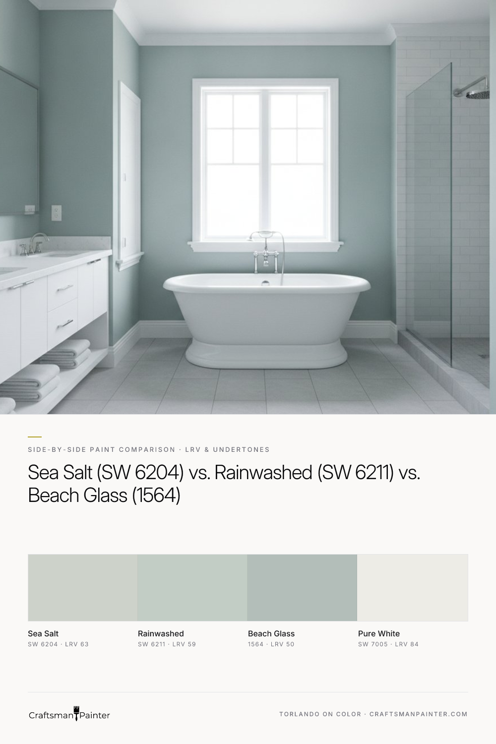


LRV and Brightness: Full Wall Impact
Real-paint peel-and-stick samples ship via Samplize. Craftsman Painter may earn a small commission on sample orders at no extra cost to you.
Light Reflectance Value (LRV) is a critical metric, indicating the percentage of light a color reflects. A higher LRV means a lighter color. Sherwin-Williams Sea Salt (SW 6204) leads this trio with an LRV of 63. This positions it as a soft, airy green that feels bright and expansive on a full wall, even in rooms with moderate natural light. It offers a gentle presence, receding slightly to create an open atmosphere. Its nearest competitor in lightness is Sherwin-Williams Rainwashed (SW 6211), with an LRV of 59. This 4-point difference is noticeable. Rainwashed holds a bit more pigment, making it feel slightly more present and less ethereal than Sea Salt. It still reads as a light, fresh color but with a touch more saturation.
Benjamin Moore Beach Glass (1564) stands apart with a considerably lower LRV of 50. This is a significant drop from both Sherwin-Williams options. On a full wall, Beach Glass will appear noticeably deeper and more substantial. While still a muted spa green, its lower LRV means it will absorb more light, creating a cozier, perhaps moodier, ambiance. In smaller bathrooms or bedrooms, this depth can either feel enveloping and luxurious or, if light is scarce, potentially a bit heavy. For larger spaces or rooms with ample natural light, Beach Glass can provide a sophisticated, serene depth that the lighter options cannot achieve.
Undertone Differences: North, South, and 2700K Illumination
The undertones of these colors are where their true personalities emerge, especially under varying lighting conditions. Sherwin-Williams Sea Salt (SW 6204) is characterized by a muted botanical sage-green undertone. In a south-facing room with abundant warm light, Sea Salt’s green notes are enhanced, appearing fresh and herbaceous. However, in a north-facing room, where light is cooler and often grayer, Sea Salt can lean more into its gray component, presenting as a soft, sophisticated gray-green rather than a distinct green. Under 2700K evening bulbs, which emit a warm, yellowish glow, Sea Salt's subtle green will be gently warmed, preventing it from appearing cold or stark.
Sherwin-Williams Rainwashed (SW 6211) has a slightly more pronounced blue-green undertone, with less gray than Sea Salt. In a south-facing room, Rainwashed's green-blue quality is vibrant and refreshing. In a north-facing room, the cooler light will pull out its blue characteristics more strongly, making it appear as a clear, soft blue-green. This can be desirable for a true coastal or watery spa feel, but it's a critical distinction if a pure green is the goal. With 2700K lighting, Rainwashed's blue notes will be slightly softened by the warm glow, allowing its green component to surface more, preventing it from feeling overtly blue.
Benjamin Moore Beach Glass (1564) possesses a deeper, more muted gray-green-blue undertone. This complexity means it is the most chameleon-like of the three. In a south-facing room, its green-blue will be apparent, but the gray will keep it from becoming too saturated. In a north-facing room, Beach Glass can shift quite dramatically, often presenting as a distinct gray-blue, sometimes with only a hint of green remaining. This can create a dramatic, calming effect, but it's a significant departure from a pure green. Under 2700K bulbs, the warmth will temper its cooler blue/gray tendencies, allowing the green notes to be more evident, ensuring it maintains a serene, muted character.
When testing these colors, it is crucial to avoid the common pitfall of painting swatches directly onto an existing colored wall. This practice is misleading due to Josef Albers' principle of simultaneous contrast, where adjacent colors mutually influence each other. Instead, acquire large, real-paint peel-and-stick samples (at least 12x12 inches). Isolate these samples against a neutral background, ideally taped to a large piece of white poster board or directly against existing white trim, such as Sherwin-Williams Pure White (SW 7005). Observe them at different times of day and under various lighting conditions to accurately perceive their true character. For a deeper dive into specific colors, our Color Studio offers detailed insights.
Pairing with Existing Finishes: Oak, Marble, and Cabinetry
The interaction of wall color with fixed elements like flooring, countertops, and cabinetry dictates the overall harmony of a space.
Against warm oak floors, which typically have yellow and orange undertones, all three spa greens offer a beautiful contrast. Sherwin-Williams Sea Salt, with its muted botanical sage-green, provides a softer, more organic contrast that feels natural and balanced. Its slight grayness helps to neutralize some of the oak's warmth without creating a stark divide. Rainwashed, with its clearer blue-green, creates a crisper, more refreshing contrast against warm oak, making the oak feel richer by comparison. Benjamin Moore Beach Glass, due to its depth and prominent gray-blue, offers the most significant contrast. It can make warm oak feel very grounded and rich, but in a room with limited light, this pairing might lean too heavy. For a traditional or rustic aesthetic with oak, Sea Salt is often the safest and most harmonious choice.
When paired with white marble or quartz countertops and tiles, all three colors excel, but with different effects. Sea Salt will blend seamlessly, creating a light, airy, and sophisticated backdrop that allows the white to remain crisp without feeling stark. Rainwashed will introduce a slightly more defined cool, refreshing note, making the white feel brighter and cleaner. Beach Glass will provide a striking, elegant contrast, allowing the white marble to pop against its deeper, more complex hue. For a truly luxurious and impactful bathroom, Beach Glass against white marble can be stunning, while Sea Salt offers understated elegance.
For cabinetry, the considerations are similar. Against white or light-toned cabinetry, all three greens will work, with the lighter Sea Salt and Rainwashed maintaining an open feel, and Beach Glass providing a deeper, more dramatic backdrop. If the cabinetry is a natural wood tone, especially oak or maple, refer to the guidance for warm oak floors. The goal is always to create a cohesive palette where each element supports the others, not competes.
Decision Rules and Sheen/Prep Recommendations
Choose Sherwin-Williams Sea Salt (SW 6204) if: You desire the brightest, most ethereal spa green. Your room receives varying light, and you prefer a color that leans into a soft gray-green in cooler light but still reveals its botanical green in warmer light. You have warm oak floors and want a gentle, organic contrast, or white marble and seek understated elegance.
Choose Sherwin-Williams Rainwashed (SW 6211) if: You prefer a clearer, slightly more saturated blue-green. You have ample natural light and want a refreshing, coastal-inspired feel. You're comfortable with the color potentially leaning more blue in north-facing rooms and desire a crisper contrast with warm wood tones.
Choose Benjamin Moore Beach Glass (1564) if: You seek a deeper, moodier, and more sophisticated spa green. Your room has good natural light that can support a lower LRV, or you desire an enveloping, cozy atmosphere. You want a dramatic contrast with white marble or light cabinetry, and you appreciate a color that can present as a distinct gray-blue in cooler light.
Sheen and Preparation Recommendations:
For bedrooms and other low-humidity drywall areas, Sherwin-Williams Cashmere Low Lustre provides a soft, luxurious finish that minimizes imperfections. Alternatively, Emerald Interior Matte offers superior washability and durability without compromising the aesthetic. For bathrooms and other high-humidity areas, Sherwin-Williams Duration Home in Matte or Satin is the appropriate choice, formulated to resist moisture and mildew.
Proper surface preparation is paramount for achieving a lasting, professional finish. For most occupied homes, Level 2: Standard (Occupied Home) preparation is sufficient, involving patching minor holes and cracks, light sanding to smooth out imperfections, and cleaning. For luxury finishes or new construction where a flawless surface is expected, Level 3: Premium (Luxury Finish) preparation is recommended. This entails more extensive filling of drywall imperfections, thorough sanding, and often a skim coat to achieve a perfectly smooth, uniform substrate before priming and painting.
For baseboards, doors, and cabinetry, particularly when pairing with Pure White (SW 7005), Sherwin-Williams Emerald Urethane Trim Enamel in Satin or Semi-Gloss delivers exceptional hardness, durability, and a smooth, furniture-like finish. This coating resists chipping and yellowing, maintaining its crisp appearance over time.
Understanding these distinctions and applying professional preparation and coating standards ensures your chosen spa green transforms your space into the tranquil retreat you envision. If you require personalized guidance to navigate these choices, consider a 1-on-1 Color Consultation to refine your selection.
Frequently Asked Questions
Is Sherwin-Williams Sea Salt or Rainwashed lighter?
Sherwin-Williams Sea Salt (SW 6204) is lighter with an LRV of 63, making it feel brighter and more ethereal on walls. Rainwashed (SW 6211) has an LRV of 59, meaning it holds slightly more pigment and will appear a bit more saturated and present.
What undertones does Benjamin Moore Beach Glass have?
Benjamin Moore Beach Glass (1564) has deeper, more muted gray-green-blue undertones. This complexity allows it to shift, often appearing as a soft gray-blue in cooler, north-facing light, and revealing more of its green-blue character in warmer, south-facing light.
Which spa green is best for a north-facing bathroom?
For a north-facing bathroom, Sherwin-Williams Sea Salt (SW 6204) is often a strong choice as its muted botanical sage-green undertone will lean into a soft gray-green, preventing it from feeling too cold. Rainwashed (SW 6211) can work if you desire a clearer blue-green that will appear more blue in cooler light. Benjamin Moore Beach Glass (1564) might read as a more pronounced gray-blue in north-facing light, offering a deeper, moodier feel.
How do I test these paint colors accurately in my home?
To test accurately, do not paint swatches directly onto existing colored walls due to simultaneous contrast. Instead, use large (at least 12x12 inch) real-paint peel-and-stick samples. Isolate them against a neutral white background, such as a white poster board or existing white trim (like SW Pure White). Observe the samples at different times of day and under various lighting conditions, including both natural light and 2700K evening bulbs, to understand their true appearance in your space.

Decoding the Brilliant Alchemy of Sherwin-Williams Sea Salt in High Summer

Sherwin Williams Sea Salt (SW 6204): The Only Coastal Color Your Columbus Home Needs
