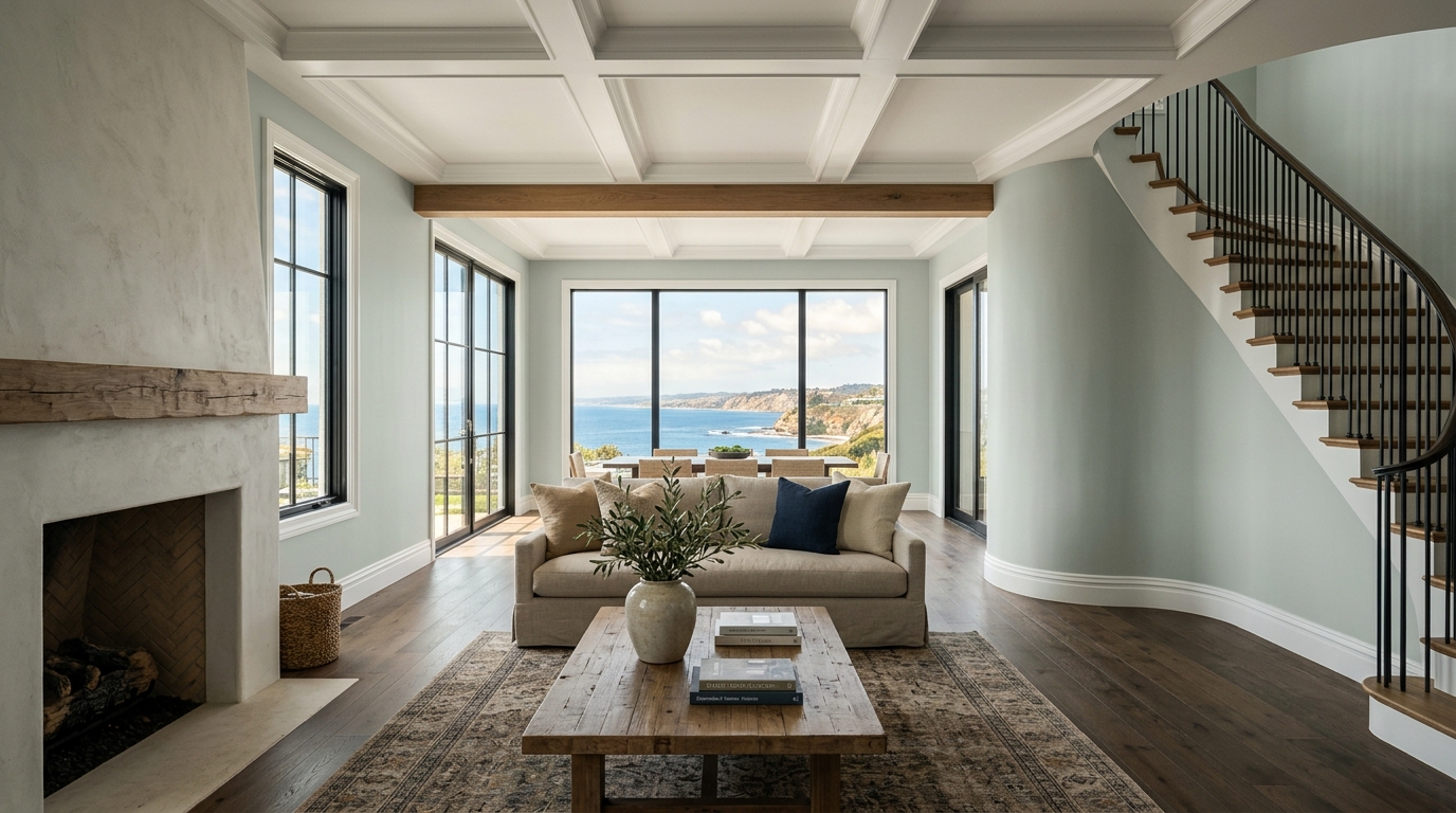

The truth is, most "coastal" colors are a lie. They’re just pale blues or minty greens that ignore the most critical element of any San Diego home: the light. Our light is different. It’s a brilliant, silver-toned, ocean-reflected light that’s both intensely bright and incredibly soft. It demands a color with depth, complexity, and a certain quiet confidence. It demands Sherwin Williams Sea Salt.
Deconstructing a Chameleon: The Honest Undertones of SW 6204
First, understand this: Sea Salt is not just a light green. To call it that is an insult to its intelligence. I’ve seen it carry rooms with the weight of a historic artifact and the subtlety of a morning marine layer.
At its heart, Sea Salt is a conversation between three distinct undertones: a cool, muted green, a sophisticated gray, and a fleeting, atmospheric blue. This is not a color that screams for attention. It’s a color that hums. The magic lies in which of these notes it chooses to sing, a decision made entirely by the light you give it. This complexity is its strength; it’s what gives it the integrity to feel authentic, not thematic.
Book Your Upcoming Paint Project
Craftsman Painter is now scheduling premium transformations. Secure your spot and elevate your property value.
Get an EstimateThe San Diego Light Test: Why It Works from La Jolla to Eastlake
A color’s true character is revealed under pressure—the pressure of a home’s specific lighting. In San Diego, that story changes dramatically from the coast to the inland valleys.
-
North-Facing Rooms (Point Loma, Del Mar): In a room with cool, indirect northern light, Sea Salt will lean into its contemplative side. The gray and blue undertones will come forward, creating a serene, moody space that feels like the quiet edge of the continent on an overcast day. It’s sophisticated, calm, and deeply connected to the Pacific.
-
South-Facing Rooms (Rancho Bernardo, Poway): Give Sea Salt the gift of warm, all-day southern sun, and you’ll see it completely transform. The soft, herbal green becomes the star. It won’t turn saccharine or minty; the gray undertone holds it in check, grounding it and giving it a sun-bleached, natural feel. It’s the color of coastal sage, warmed by the afternoon sun.
-
East & West-Facing Rooms (North Park, Encinitas): Here is where you witness the full performance. In the morning’s golden eastern light, it’s a warm, welcoming green. As the sun moves overhead, it cools down. By the time the fiery western sunset spills into the room, Sea Salt absorbs that light and reflects a muted, tranquil version of the sky. It lives and breathes with the day.
Architectural Harmony: Beyond the Beach Bungalow
Don’t relegate this color to a shiplap-and-seashells cliché. Sea Salt has the architectural backbone to stand up in San Diego’s most iconic homes.
-
For the Craftsman in Kensington: It’s the perfect foil. Against the dark, heavy wood of a Greene and Greene-inspired bungalow, Sea Salt provides a soft, atmospheric break. It respects the earthy, handcrafted ethos of the home while adding a layer of modern airiness.
-
For the Spanish Revival in Mission Hills: Forget sterile white. Paired with dark ironwork, terracotta floors, and heavy archways, Sea Salt becomes a cool, calming counterpoint. It feels modern yet timeless, like a shaded courtyard that offers respite from the heat.
-
For the Mid-Century Modern in Clairemont: This is where it truly sings. In a home designed to blur the line between indoors and out, Sea Salt acts as a seamless extension of the natural landscape. It echoes the muted greens of succulents and chaparral seen through walls of glass, honoring the home's core principle of environmental harmony.
The Cardinal Sin: How to Get Sea Salt Wrong
Even a masterpiece can be ruined by a bad frame. I see two fundamental mistakes made with this color time and again.
-
Pairing it with the Wrong White. Do not use a cold, stark, blue-white trim. It’s a jarring, amateur move that will make Sea Salt look cheap and minty. You’re creating a fight between undertones. You need a creamy, soft off-white with a touch of warmth to harmonize with it. Think Sherwin Williams Alabaster or Pure White. It’s a subtle shift, but it’s the difference between a custom home and a flip.
-
Ignoring Your Lighting Temperature. If your home is filled with warm, yellow-toned incandescent or LED bulbs (under 3000K), you will mute the color’s beautiful blue-gray notes and force it into a muddy, washed-out green. Use clean, neutral light (3000K-3500K) to let the color breathe and reveal its true complexity.
The Final Verdict
Sherwin Williams Sea Salt isn't a trend. It's an honest, hard-working color with real integrity. It doesn't pretend to be something it's not. It simply reacts to the truth of its environment. For the unique, silver-toned light of San Diego, it’s not just a good choice; it's the right choice. It’s a color that feels less like it was painted on a wall and more like it was born of the landscape itself. Choose it with intention.