


LRV and Perceived Brightness: Full Walls vs. Accents
Real-paint peel-and-stick samples ship via Samplize. Craftsman Painter may earn a small commission on sample orders at no extra cost to you.
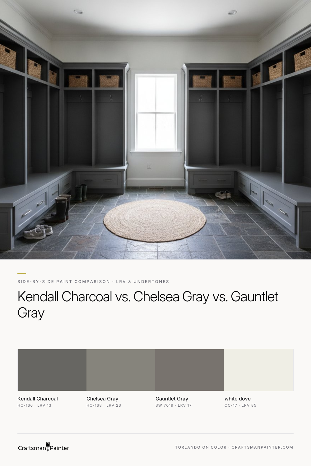
Light Reflectance Value (LRV) is a critical metric, indicating the percentage of visible light a color reflects. A lower LRV signifies a darker color. Benjamin Moore Kendall Charcoal registers an LRV of 13, making it the darkest of the trio. It is a deep, substantive gray that can, in certain light conditions, appear almost black, especially on large surfaces or in dimly lit spaces. Its depth provides a dramatic, grounding presence, making it a powerful choice for a stately exterior or a bold cabinet statement.
Sherwin-Williams Gauntlet Gray, with an LRV of 17, sits comfortably in the middle. It offers significant depth and richness, a robust gray that provides strong contrast without the near-black intensity of Kendall Charcoal. It’s a versatile shade, dark enough to feel substantial on an exterior but not so dark that it overwhelms an interior space when used on cabinets or an accent wall.
Benjamin Moore Chelsea Gray, at an LRV of 23, is the lightest of the three. This higher LRV means it reflects more light, appearing as a true, mid-tone gray in most settings. On a full wall, it will feel considerably lighter and softer than Kendall Charcoal, offering a more approachable and less dramatic aesthetic. For cabinets, it provides a classic, elegant gray that doesn't absorb as much light, maintaining a sense of openness.
The brightness gap between Kendall Charcoal and Chelsea Gray is significant. A 10-point difference in LRV is substantial, meaning Chelsea Gray will consistently appear noticeably lighter and less imposing on a large surface. Gauntlet Gray strikes a balance, offering gravitas without the deep saturation that Kendall Charcoal embodies.
Undertone Differences in Varying Light and Bulb Temperatures
Undertones are where these grays truly differentiate themselves, and how they interact with light is paramount. Benjamin Moore Kendall Charcoal carries distinct warm beige-almond undertones. In a north-facing room, which receives cooler, indirect light, these warm undertones help to prevent the color from feeling too cold or stark. However, the cool light can also mute the warmth, making it appear as a more neutral, deep gray. In a south-facing room, bathed in abundant warm light, Kendall Charcoal's beige-almond undertones are amplified, giving it a rich, almost brown-greige character. When illuminated by 2700K evening bulbs, which emit a warm, yellowish glow, this color will lean heavily into its warm side, feeling cozy and less overtly gray.
Sherwin-Williams Gauntlet Gray possesses a strong, earthy warmth, but it’s less overtly beige than Kendall Charcoal. It tends to hold its gray identity more firmly. In north-facing rooms, it reads as a solid, substantial gray with a hint of grounding warmth. South-facing light will bring out its warmer, almost taupe-like qualities, giving it a rich, inviting feel. Under 2700K bulbs, its warmth will be enhanced, but it will likely maintain more of its gray essence than Kendall Charcoal.
Benjamin Moore Chelsea Gray is often perceived as a more neutral, balanced gray, but it can reveal subtle blue or green undertones in certain lighting conditions. In a north-facing room, these cooler undertones might be subtly enhanced, making it feel crisp and clean. In a south-facing room, the warmth of the light tends to neutralize any coolness, allowing it to present as a classic, elegant gray. With 2700K evening bulbs, Chelsea Gray typically maintains its gray composure, perhaps leaning slightly warmer but without the pronounced beige shift seen in Kendall Charcoal.
When evaluating these colors, it is critical to observe them in your specific space. Do not test paint swatches directly against an existing painted wall. This practice is misleading due to Josef Albers' principle of simultaneous contrast, where the surrounding color drastically alters the perception of the sample. Instead, isolate real-paint peel-and-stick samples or large painted boards against a clean white trim or a white poster board. This allows your eye to perceive the true undertones and depth of the color without interference.
Which Shade Wins Against Warm Oak Floors, White Marble/Quartz, or Cabinetry?
The interplay of these grays with existing fixed elements is where their true compatibility is revealed.
Warm Oak Floors: For homes with prevalent warm oak floors or other rich wood tones, Benjamin Moore Kendall Charcoal is often the winning choice. Its inherent warm beige-almond undertones harmonize beautifully with the warmth of the wood, creating a cohesive, grounded, and sophisticated environment. It feels like a natural extension rather than a stark contrast. Gauntlet Gray also performs exceptionally well here, offering a robust gray that complements warm woods without competing. Chelsea Gray, with its potential for cooler undertones, can create a more deliberate contrast against warm oak, which can be striking if that is the desired effect, but it may not feel as seamlessly integrated as the warmer grays.
White Marble/Quartz: When pairing with crisp white marble or quartz countertops and backsplashes, the choice depends on the desired mood. Benjamin Moore Chelsea Gray provides a clean, elegant contrast, allowing the bright white elements to pop. Its more neutral-to-slightly-cool leanings often complement the cool veins in marble. Gauntlet Gray is also an excellent contender, offering a substantial gray that provides strong visual weight against white, creating a sophisticated and contemporary look. Kendall Charcoal, while beautiful, can sometimes feel too earthy or muted against very stark, cool whites, potentially making the white elements appear less vibrant. However, for a softer, more organic pairing with warmer-toned whites or creams, Kendall Charcoal can be quite effective.
Cabinetry & Exterior:
-
Kitchen Cabinets: For a dramatic, deeply grounded kitchen, Kendall Charcoal delivers. Its depth creates a luxurious, enveloping feel, especially when paired with brushed brass hardware. For a classic, elegant gray kitchen that feels timeless and versatile, Chelsea Gray is a superb choice. It offers a sophisticated backdrop without overwhelming the space. Gauntlet Gray provides a strong, substantial cabinet color that feels contemporary and robust, a fantastic middle ground between the intensity of Kendall Charcoal and the classic appeal of Chelsea Gray.
-
Exterior Slates: All three excel as exterior colors. Kendall Charcoal creates a stately, almost black exterior, offering immense curb appeal and a sophisticated presence. It reads as a very deep, rich charcoal. Chelsea Gray provides a softer, more traditional gray exterior that still offers good contrast against white trim but feels less imposing than Kendall Charcoal. Gauntlet Gray is a commanding, contemporary choice for exteriors, providing a strong, rich gray that holds its own in natural light, making a powerful statement without appearing as dark as Kendall Charcoal. For more insights on how these colors perform on different surfaces, you can explore our Color Studio.
Clear Decision Rules and Sheen/Prep Recommendations
Decision Rules:
-
Choose Benjamin Moore Kendall Charcoal (HC-166) if you seek dramatic depth, pronounced warmth, and a grounding presence. It excels when paired with warm wood tones, or as a sophisticated, almost black exterior slate. It is for those who desire a bold, enveloping color statement.
-
Choose Benjamin Moore Chelsea Gray (HC-168) if you prefer a classic, balanced mid-tone gray that leans slightly cooler. It offers versatility with both warm and cool elements and provides a lighter, less intense feel than the other two. It's ideal for a timeless, elegant aesthetic.
-
Choose Sherwin-Williams Gauntlet Gray (SW 7019) if you desire a substantial, slightly warmer mid-tone gray that offers strong presence without the deep intensity of Kendall Charcoal. It’s a robust, versatile option that works well across various design styles and fixed elements.
Sheen and Preparation Recommendations:
For interior walls, I recommend Sherwin-Williams Cashmere Low Lustre for a velvety, sophisticated finish, or Sherwin-Williams Emerald Interior Matte for a premium, highly washable, and durable option, especially in high-traffic areas. In humid environments like bathrooms and kitchens, Sherwin-Williams Duration Home is the preferred choice for its excellent moisture resistance.
For baseboards, doors, and cabinets, Sherwin-Williams Emerald Urethane Trim Enamel in Satin provides a subtle, elegant sheen that is highly durable and washable. If a more classic, reflective look is desired, Semi-Gloss is also an excellent choice. Proper preparation is non-negotiable for a lasting, professional finish. For drywall, consider Level 2: Standard (Occupied Home) preparation for minor imperfections, or Level 3: Premium (Luxury Finish) for a flawless, glass-smooth surface, which is particularly important with darker colors like these where imperfections are more visible. For wood surfaces such as cabinets, thorough cleaning, sanding, and the application of a high-quality primer (such as Zinsser B-I-N Shellac-Based Primer or Sherwin-Williams Extreme Bond Primer) are crucial for optimal adhesion and a smooth, factory-like finish with the Emerald Urethane.
Selecting the perfect gray requires careful consideration of light, existing finishes, and personal preference. If you find yourself needing more personalized guidance, a 1-on-1 Color Consultation can provide tailored recommendations for your unique space and vision.
Frequently Asked Questions
What are the main undertones of Benjamin Moore Kendall Charcoal (HC-166)?
Benjamin Moore Kendall Charcoal (HC-166) has distinct warm beige-almond undertones. These undertones become more apparent in warm natural light or under 2700K artificial lighting, giving the color a rich, almost greige or brown-gray appearance.
Which of these grays is best suited for a north-facing room?
For a north-facing room, which receives cooler, indirect light, Benjamin Moore Kendall Charcoal's warm beige-almond undertones can help prevent the space from feeling too cold. Sherwin-Williams Gauntlet Gray, with its earthy warmth, also performs well, maintaining a robust gray identity. Benjamin Moore Chelsea Gray might lean slightly cooler in north light, which could be desirable for a crisp, clean look.
How do these grays perform on kitchen cabinets?
Kendall Charcoal offers dramatic depth and a luxurious feel for kitchen cabinets. Chelsea Gray provides a classic, elegant, and versatile mid-tone gray that feels timeless. Gauntlet Gray delivers a strong, contemporary, and robust gray that offers a substantial presence without the deep intensity of Kendall Charcoal. The best choice depends on your desired aesthetic and existing finishes.
What trim color pairs best with these dark grays?
Benjamin Moore White Dove (OC-17) is an excellent coordinating trim and accent color for all three grays. Its soft, slightly warm off-white provides a beautiful, sophisticated contrast without being stark, allowing the depth of Kendall Charcoal, Gauntlet Gray, or Chelsea Gray to truly stand out.

Rooted in Green and Umber Undertones, Benjamin Moore Quarry Rock 1568 Brings Organic Depth to Dark Neutrals

Neither Strictly Gray Nor Brown, Benjamin Moore Kingsport Gray HC-86 Is the Designer’s Grounded Neutral
