


In the main living space, Kingsport Gray establishes an authentic, textured foundation that pairs effortlessly with a Wabi-Sabi design aesthetic. When applied in a matte finish over slightly rustic hand-applied wall plaster, the paint creates soft visual depth. Instead of feeling like a flat coat of gray, it behaves like aged sandstone.

To balance this deep wall tone, architectural trim and window casings painted in Benjamin Moore White Dove OC-17 offer just enough gentle contrast without screaming for attention. White Dove is a soft, creamy white with warm yellow undertones, meaning it never feels harsh or clinical against Kingsport Gray's organic, muddy baseline. In an adjoining hallway or entryway, transitioning the walls to Benjamin Moore Pale Oak OC-20 creates a gentle visual bridge. Pale Oak is a light, airy taupe-gray that shares the same warm earthy family as Kingsport Gray, allowing light to expand naturally as you walk from cozy living quarters into open adjacent spaces.

Light in Bloomington during late October is low-angled and intensely golden. As sunlight streams through large windows, Kingsport Gray catches the amber glow of falling leaves, pulling rich cocoa and soft leather tones out of the paint. Where the direct sun fades into room corners, the shade quietly deepens, showcasing its gray-brown anchor. To get the absolute best out of this color, sheen selection is key. I always recommend a matte sheen for main wall surfaces. Matte finishes diffuse light softly across the wall, highlighting raw material textures like rough pottery, salvaged oak mantels, and unpolished stone tiles. For trim, doors, and baseboards painted in White Dove, opt for a durable satin sheen to make maintenance easy while providing a subtle contrast in luster.

Work Directly with Torlando Hakes
Skip the color choice stress. Work directly with me as your personal Color Designer to select the perfect architectural palette for your home, and get a Complementary Color Consultation when you purchase paint through us.

Moving into the kitchen and functional built-ins, introducing a stronger contrast element gives Kingsport Gray a refined edge. Here, custom millwork and island cabinetry painted in Benjamin Moore French Beret 1540 anchor the space. French Beret is a rich, velvety dark charcoal with soft navy-black depth. Against the warm earthy body of Kingsport Gray walls and the creamy softness of White Dove trim, French Beret adds striking architectural weight. It grounds kitchen islands, wet bars, or interior doors without feeling as stark as a true jet black. Paired with unlacquered brass hardware, raw slate floor tiles, and open wooden shelving, this palette achieves a harmonious balance of rustic warmth and tailored sophistication.

In smaller, more intimate spaces like a powder room or bathroom sanctuary, Kingsport Gray proves its worth as an enveloping background color. Paired with textured stone vessel sinks, dark bronze fixtures, and warm lamp light, it wraps small rooms in a comfortable ambiance. Rather than trying to force a small room to feel bigger with bright white paint, embracing a mid-to-dark tone like Kingsport Gray creates immediate depth and high design impact. When illuminated by warm ambient lamps in the evening, the walls soften into an inviting retreat that highlights natural wood and stone textures.

Whether you are refreshing a quiet reading den or designing a grounded living room, Benjamin Moore Kingsport Gray HC-86 offers an enduring balance of earthy taupe and stony gray that grounds a home in quiet luxury.
Complementary Color Consultation
Planning a project? Work with Torlando Hakes directly as your personal Color Designer and get a Complementary Consultation when purchasing paint through us.
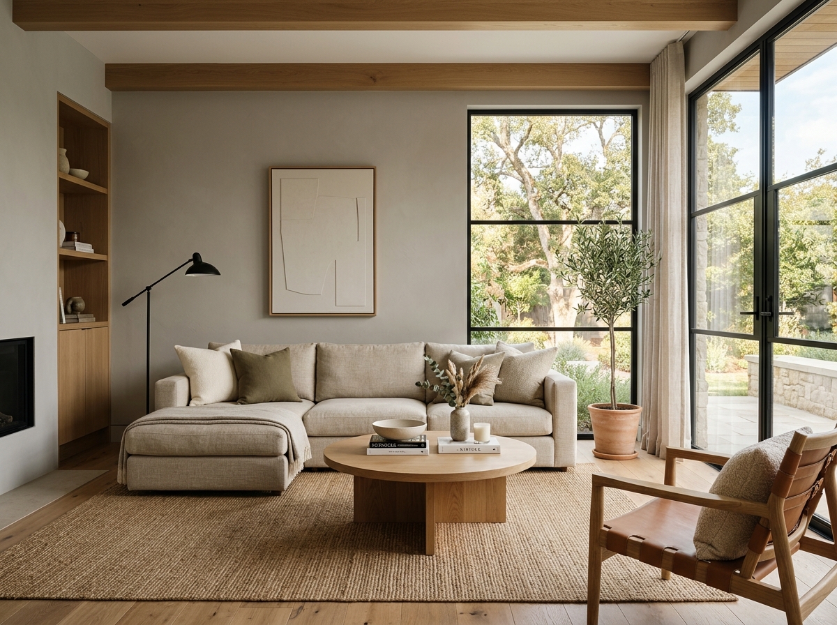 After
After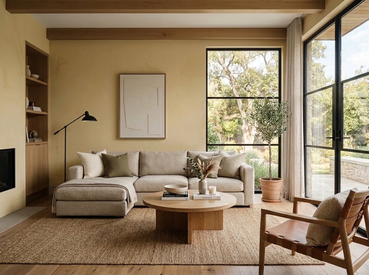 Before
Visualize Your Space with Color Studio AI
Planning a project? Skip the paint chip guesswork. Use our Color Studio AI to instantly visualize these paint colors on your own walls, or take advantage of our aligned contractor pricing matching current Sherwin-Williams retail promotions.
Book Your Upcoming Paint Project
Craftsman Painter is now scheduling premium transformations. Secure your spot and elevate your property value.
Get an EstimateHelp Others Find Professional Color Insights
Share this story directly to your networks or copy the link to share with friends.