
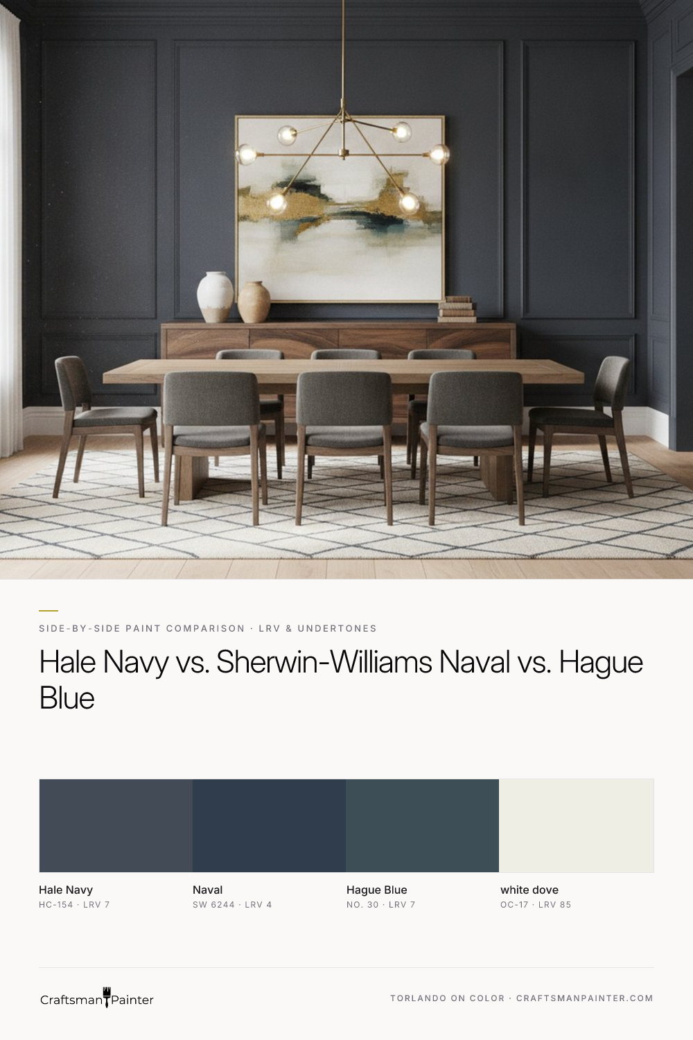


LRV and Brightness Gap on Full Walls
Real-paint peel-and-stick samples ship via Samplize. Craftsman Painter may earn a small commission on sample orders at no extra cost to you.
The Light Reflectance Value (LRV) is a crucial metric, indicating the percentage of visible light a color reflects. It ranges from 0 (absolute black) to 100 (absolute white). Understanding the LRV of a paint color is essential for predicting its perceived brightness and depth on a full wall.
Benjamin Moore Hale Navy (HC-154) and Farrow & Ball Hague Blue (No. 30) share an LRV of 7. This places them firmly in the deep, saturated color category, reflecting a minimal amount of light. On a full wall, both will present as substantive, enveloping colors. They provide depth without feeling overwhelmingly dark, largely due to their specific undertones, which we will discuss.
Sherwin-Williams Naval (SW 6244), with an LRV of 4, is noticeably darker. This lower LRV means Naval will absorb more light, resulting in a richer, more intense saturation. When applied to full walls, Naval will create a more dramatic, almost cavernous effect compared to Hale Navy or Hague Blue. In rooms with abundant natural light, Naval can maintain its true blue character. In dimly lit spaces, it will read as a very deep, sophisticated blue, often approaching black. For homeowners seeking a truly immersive, bold navy statement, Naval's lower LRV makes it a strong contender. For those desiring depth with a touch more perceived light, Hale Navy or Hague Blue are more suitable.
Undertone Differences in North-Facing vs. South-Facing Rooms and 2700K Evening Bulbs
Undertones are the subtle colors that emerge under different lighting conditions, significantly altering a paint's appearance. Ignoring them is a common pitfall.
Benjamin Moore Hale Navy (HC-154) possesses cool architectural slate-blue undertones. In a north-facing room, which receives cool, indirect light, Hale Navy often appears more muted, leaning into its gray-blue qualities. The slate aspect becomes more pronounced, lending a sophisticated, somewhat reserved character. In a south-facing room, bathed in warm, direct sunlight, Hale Navy's blue will appear clearer and more vibrant, with less of the gray influence. Under 2700K evening bulbs, which emit a warm, yellowish light, Hale Navy's cool undertones can be softened, resulting in a comforting, grounded blue that retains its depth without feeling stark.
Sherwin-Williams Naval (SW 6244) is a more straightforward, purer navy. Its undertones are less complex, primarily a deep, true blue. In north-facing rooms, Naval holds its strong blue identity, perhaps appearing slightly cooler but rarely shifting significantly towards gray or green. In south-facing rooms, its depth is amplified, presenting as a rich, classic navy. With 2700K evening bulbs, Naval maintains its robust blue presence; the warm light can even enhance its richness, making it feel luxurious and inviting without introducing unexpected color shifts.
Farrow & Ball Hague Blue (No. 30) is the most complex of the three, known for its deep blue-green undertones. In north-facing rooms, Hague Blue often reads as an extremely deep blue-green, sometimes appearing almost black, particularly in shadowed areas. The green influence becomes more apparent, giving it a historic, moody quality. In south-facing rooms, the blue-green character becomes more explicit, showcasing its unique depth and vibrancy. Under 2700K evening bulbs, Hague Blue's blue-green depth is accentuated, creating a dramatic and enveloping atmosphere. The warm light can make it feel even more profound, almost like a rich, dark jewel tone.
When testing these colors, remember Josef Albers' principle of simultaneous contrast: the perceived color of a swatch is influenced by the colors immediately surrounding it. Placing a new navy swatch directly on an existing painted wall will distort its true appearance. Always isolate real-paint peel-and-stick samples against a neutral white background, such as Benjamin Moore White Dove (OC-17) trim, to accurately assess the color's interaction with your lighting conditions.
Which Shade Wins Against Warm Oak Floors, White Marble/Quartz, or Cabinetry
The interaction of wall color with fixed elements like flooring, countertops, and cabinetry is paramount for a cohesive design.
Against Warm Oak Floors:
- Hale Navy: Its cool, slate-blue undertones provide a sophisticated counterpoint to the warmth of oak. This contrast feels balanced and intentional, preventing the oak from appearing overly yellow or orange. It's a classic pairing that offers refinement.
- Naval: Creates a strong, deep contrast. Naval's pure depth allows the warmth of oak to truly stand out, making both elements feel richer. This is a bold, traditional combination that works well in studies or dining rooms.
- Hague Blue: The blue-green undertones offer a more nuanced, sometimes unexpected, pairing with oak. It can create a deeply traditional or even moody aesthetic, especially if the oak has a richer, darker tone. The green element in Hague Blue can either harmonize or create an intriguing tension with the yellow-orange of oak, depending on the specific wood tone and desired effect.
Against White Marble/Quartz:
- Hale Navy: A timeless, crisp pairing. The subtle gray in Hale Navy beautifully complements the cool veining of white marble or the clean lines of white quartz. It feels fresh and elegant, suitable for bathrooms or kitchens.
- Naval: Delivers high contrast and a very clean, sharp look. Naval against white marble or quartz creates a dramatic, modern statement. The purity of Naval makes the white elements pop with intensity.
- Hague Blue: Provides a dramatic and luxurious backdrop for white marble or quartz. The depth and complexity of Hague Blue elevate the white surfaces, making them appear even brighter and more pristine. This pairing exudes sophistication and a sense of curated design.
Against Cabinetry (assuming White Dove OC-17): When pairing these navies with Benjamin Moore White Dove (OC-17) cabinetry, the principles largely follow the white marble/quartz discussion. White Dove's soft, slightly warm white provides a gentle contrast. All three navies will work well, but the choice depends on the desired mood:
- Hale Navy: A classic, understated elegance with White Dove. The combination feels cohesive and balanced.
- Naval: A bold, crisp contrast that defines the cabinetry. It's a confident, clean look.
- Hague Blue: A dramatic, sophisticated pairing, especially effective for creating a bespoke, high-end kitchen or built-in look where depth is paramount.
Clear Decision Rules for Picking the Winner + Sheen/Prep Recommendations
Your final choice among these three exceptional navies hinges on the specific ambiance you aim to create and the inherent characteristics of your space.
Choose Benjamin Moore Hale Navy (HC-154) if: You desire a sophisticated, versatile navy that leans into a cool, slate-blue-gray. It's ideal for spaces where you want depth and elegance without overwhelming darkness, offering a classic feel that adapts well to various lighting conditions. It's a reliable choice for living rooms, bedrooms, or studies where a grounded, refined atmosphere is paramount. You can explore Hale Navy further in our Color Studio.
Choose Sherwin-Williams Naval (SW 6244) if: Your goal is a truly deep, rich, classic navy that makes a bold, confident statement. Naval is less prone to shifting undertones and delivers pure blue saturation. It excels in spaces where you want dramatic impact, such as accent walls, powder rooms, or a luxurious bedroom, particularly in well-lit rooms where its depth can be appreciated.
Choose Farrow & Ball Hague Blue (No. 30) if: You seek a dramatic, historic, and complex navy with pronounced blue-green undertones that can read almost black in certain lights. This color is for those who appreciate depth, moodiness, and a unique character that evokes a sense of tradition and bespoke design. It's particularly effective in dining rooms, libraries, or spaces where a strong, enveloping color experience is desired.
Sheen and Coating Recommendations: For drywall, consider Sherwin-Williams Cashmere Low Lustre for a soft, velvety finish that minimizes imperfections, or Sherwin-Williams Emerald Interior Matte for a highly durable, washable option with a sophisticated, non-reflective look. In high-humidity areas like baths and kitchens, Sherwin-Williams Duration Home offers superior moisture resistance and durability.
For baseboards, doors, and cabinetry, especially when coordinating with Benjamin Moore White Dove (OC-17), Sherwin-Williams Emerald Urethane Trim Enamel in Satin or Semi-Gloss provides an exceptionally smooth, hard finish. Satin offers a refined, subtle sheen, while Semi-Gloss delivers a more traditional, slightly glossier appearance that is highly cleanable.
Preparation Guidance: Deep, saturated colors like these navies magnify any surface imperfections. For a truly premium finish, proper preparation is non-negotiable.
- Level 2: Standard (Occupied Home): For typical repaints over existing good surfaces, ensure thorough cleaning, light sanding to de-gloss, and spot-patching of minor defects. This level provides a good, clean finish for most residential applications.
- Level 3: Premium (Luxury Finish): For new drywall, extensive repairs, or when striving for a flawless, high-end result (especially critical with deep colors), Level 3 preparation is recommended. This involves comprehensive patching, sanding to a smooth finish, and often a full coat of high-quality primer. Priming is especially important when transitioning from a very light color to a deep navy or when dealing with porous surfaces, ensuring color uniformity and adhesion.
Remember, selecting paint color is a nuanced process. If you find yourself needing personalized guidance, a 1-on-1 Color Consultation can provide clarity and confidence in your choices, ensuring your investment in paint translates into the desired aesthetic for your home.
Frequently Asked Questions
Is Benjamin Moore Hale Navy (HC-154) too dark for a small room?
Hale Navy has an LRV of 7, making it a deep color. While it provides significant depth, its cool, slate-blue undertones prevent it from feeling overwhelmingly dark, especially in rooms with natural light. In smaller rooms, it can create a cozy, sophisticated, and enveloping atmosphere. Using it on an accent wall or pairing it with lighter trim like Benjamin Moore White Dove (OC-17) can balance its depth effectively.
What is the main difference between Sherwin-Williams Naval (SW 6244) and Benjamin Moore Hale Navy (HC-154)?
The primary difference lies in their depth and undertones. Naval (LRV 4) is a significantly darker, purer navy with minimal undertone complexity, creating a bold, intense statement. Hale Navy (LRV 7) is slightly lighter and features distinct cool, slate-blue-gray undertones, giving it a more muted, sophisticated, and versatile character that can shift with lighting conditions.
Does Farrow & Ball Hague Blue (No. 30) look green in certain lights?
Yes, Hague Blue is specifically known for its deep blue-green undertones. In certain lighting conditions, particularly in cooler, indirect light or under specific artificial lighting, the green aspect becomes more pronounced. This complexity is part of its appeal, offering a rich, moody, and historic feel that can sometimes read as an almost black-green-blue.
What is the best trim color to use with these navy paints?
For all three navy contenders—Hale Navy, Naval, and Hague Blue—Benjamin Moore White Dove (OC-17, LRV 85) is an excellent choice for coordinating trim and accents. White Dove is a soft, warm white that provides a gentle yet crisp contrast, enhancing the depth of the navies without appearing stark or overly bright. Its subtle warmth harmonizes beautifully with the cool and complex undertones of these deep blues.

Benjamin Moore Hale Navy (HC-154) Review: The Perfect Classic Blue for Indianapolis Homes

Decoding the Brilliant Alchemy of Benjamin Moore Dark Burgundy in High-Sun Environments
