


With a Light Reflectance Value (LRV) of 10.45, Cherry Burst sits firmly at the deep end of the scale. It absorbs nearly 90 percent of the light that hits it, yet because it lacks muddy brown pigments, it never looks heavy or dead. In a custom new-build where oversized dark-framed windows let in bright, low-angle late-autumn daylight, this color shows off its energetic berry-red side on the face of a cabinet door while dropping into a deep, velvety claret inside the recessed Shaker panels.
Anchoring the Modern Farmhouse Kitchen Island
Cherry Burst
Benjamin Moore CSP-1200
Chantilly Lace
Benjamin Moore OC-65
Fieldstone
Benjamin Moore 1558
Salamander
Benjamin Moore 2050-10
Before we step into the butler’s pantry, it helps to see how Cherry Burst behaves out in the open where natural light floods the room. In the kitchen visualization below, we used Cherry Burst in a smooth satin cabinet enamel on a furniture-base centerpiece island, keeping the surrounding perimeter walls and tongue-and-groove ceiling planking in Benjamin Moore Chantilly Lace (OC-65).
Because modern farmhouse spaces rely so heavily on high-contrast elements—think vaulted ceilings with reclaimed white-oak collar ties and black-framed casement windows—a weak red gets washed out. Cherry Burst has the pigment density to stand up to Chantilly Lace without vibrating awkwardly at the edges. Its cool magenta undertone keeps the island looking tailored and crisp above wide-plank European white oak floors, pulling out the subtle pink-tan grains in the raw wood rather than clashing with yellow oak tones.
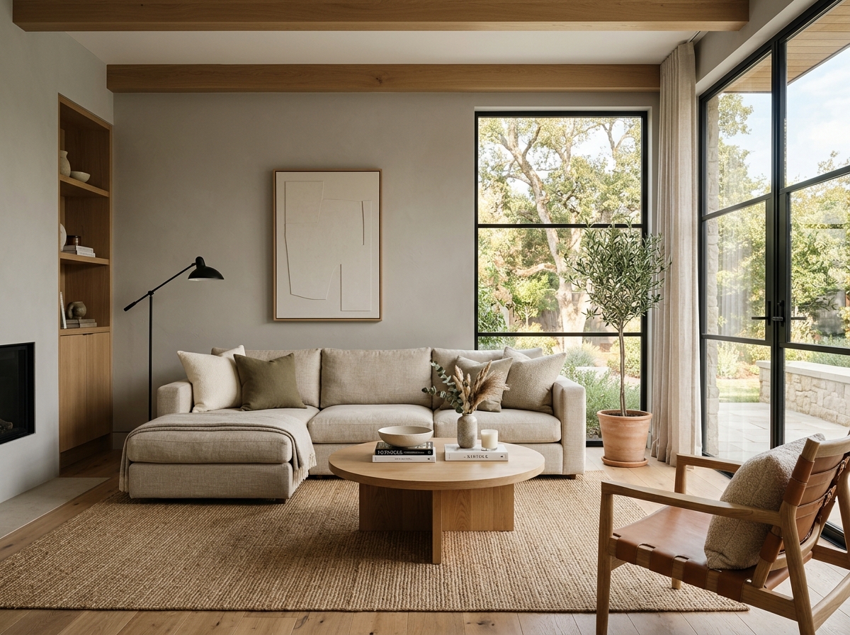
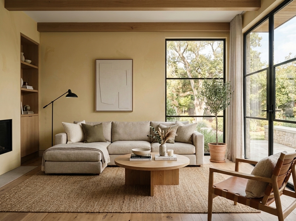
See Cherry Burst on Your Own Walls in 15 Seconds
Benjamin Moore CSP-1200 • LRV 10.45 • #9F233D
How Satin Cabinet Enamel Shapes Joinery and Hardware
Painting fine woodwork is an entirely different optical game than rolling flat latex onto drywall. When you spray a color with an LRV of 10.45 in a satin or semi-gloss cabinet enamel, the micro-specular sheen acts like a lens over the pigment. Across the flat stiles and rails of a clean Shaker door, the satin finish catches the afternoon window light and highlights the brighter cherry-red top notes. Where the stiles meet the recessed center panel at a sharp ninety-degree bevel, the shadow line deepens into a dark burgundy.
Looking at the close-up rendering of the joinery below, you can see how crucial countertop and hardware selection is next to a cool-leaning red. Honed soapstone—with its velvety charcoal surface and quiet pale veining—absorbs glare and calms the vibrancy of Cherry Burst. If you pair this red with oversized matte-black iron pulls, you get a graphic, rugged farmhouse look that echoes dark window mullions. If you switch to brushed brass or unlacquered brass hardware, the warm gold metal bridges the cool magenta undertone of the paint and brings out a classic, jewel-box warmth.

Floor-to-Ceiling Drama in the Butler’s Pantry and Wet Bar
While an island is a great place to introduce Cherry Burst, a butler’s pantry or custom wet bar is where this shade truly comes alive. Sculleries and pantries are transitional pass-through zones, often tucked between the main kitchen and the dining room, where you can afford to wrap the millwork floor-to-ceiling in a single bold color.
In this design study of a custom butler’s pantry, the floor-to-ceiling Shaker base cabinets and glass-front upper hutches are finished in Cherry Burst. To keep the red from feeling isolated, we painted the back interior panels of the glass hutches and the adjoining cased opening trim in Benjamin Moore Salamander (2050-10), a near-black with a deep blue-green undertone. Red and blue-green sit across from one another on the color wheel; putting Salamander inside the glass-front cabinets creates a moody shadowbox effect that makes stemware and white ceramic platters pop. As early-winter afternoon light fades and warm 2700K recessed puck lights and amber dining chandeliers take over, Cherry Burst shifts from a bright cranberry into a rich, fireside merlot.

Bridging Into Adjoining Mudroom Lockers and Utility Zones
A smart whole-home color plan never leaves a bold cabinet color stranded in one room. When you step out of the kitchen or pantry into the working corridors of a custom new-build—like a tailored mudroom or a back hallway—you need a quiet bridge neutral to settle the eye.
In the mudroom visualization below, we used Benjamin Moore Fieldstone (1558) on the vertical board-and-batten walls leading into custom built-in bench lockers painted in Cherry Burst. Fieldstone is a grounded, organic gray with a subtle green-stone undertone. Because green naturally balances red, Fieldstone cools the transition out of the main living spaces without feeling sterile like a blue-gray would. On mudroom lockers, where boots, coats, and backpacks put woodwork to the test, a durable satin urethane cabinet enamel in Cherry Burst hides everyday scuffs while turning a utilitarian drop zone into a finished piece of architecture.

Tailored Warmth on a Custom Bath Vanity
Another smart way to echo a pantry or bar color elsewhere in a custom build is on a freestanding-style bathroom vanity. In a powder room or a secondary guest bath, a furniture-base Shaker vanity painted in Cherry Burst brings warmth to all the hard, cool surfaces of stone and porcelain.
In this rendering of a bathroom vanity vignette, the upper walls are kept crisp in Chantilly Lace while a lower wainscot of Fieldstone grounds the room. Topped with white quartz and lit by warm brass sconces flanking a matte-black mirror, the Cherry Burst vanity shows off its clean, cool-red pedigree. The 2700K sconce bulbs warm up the red face frames without turning them orange, proving how versatile a full-spectrum pigment can be when you pair it with the right metals and stone.

When you are specifying a red for custom cabinetry, pay close attention to the undertones in both midday sun and evening lamp light. Benjamin Moore Cherry Burst succeeds on modern farmhouse millwork because its cool magenta backbone keeps it crisp against white oak, honed soapstone, and clean white trim, giving a butler's pantry or island a sense of permanence right from the second coat.
Complementary Color Consultation
Planning a project? Work with Torlando Hakes directly as your personal Color Designer and get a Complementary Consultation when purchasing paint through us.
Benjamin Moore Cherry Burst (CSP-1200) — Technical Summary
- LRV
- 10.45
- Code
- CSP-1200
- Undertone Profile
- rich red, cool magenta
Getting Cherry Burst Right Under Your Home's Light
Join 1,650+ homeowners, designers, and architects receiving our curated dispatches every 10 days (1st, 11th & 21st) on field stories, LRV, undertones, and trim pairings.
 After
 Before
Visualize Your Space with Color Studio AI
Planning a project? Skip the paint chip guesswork. Use our Color Studio AI to instantly visualize these paint colors on your own walls, or take advantage of our aligned contractor pricing matching current Sherwin-Williams retail promotions.
Book Your Upcoming Paint Project
Craftsman Painter is now scheduling premium transformations. Reserve an on-site consultation or instant video walkthrough.
Get an Estimate →Related Color & Design Studies

Beyond Predictable Neutrals: The Burnished Authority of Sherwin-Williams Tarnished Treasure (SW 9118)

Warm Mid-Century Woods Meet Their Organic Counterpart in Sherwin-Williams Sensible Hue SW 6198

Forget Stark Chalkboard Walls—Benjamin Moore Baby Seal Black 2119-30 Brings Velvet-Soft Violet Depth
Help Others Find Professional Color Insights
Share this story directly to your networks or copy the link to share with friends.