
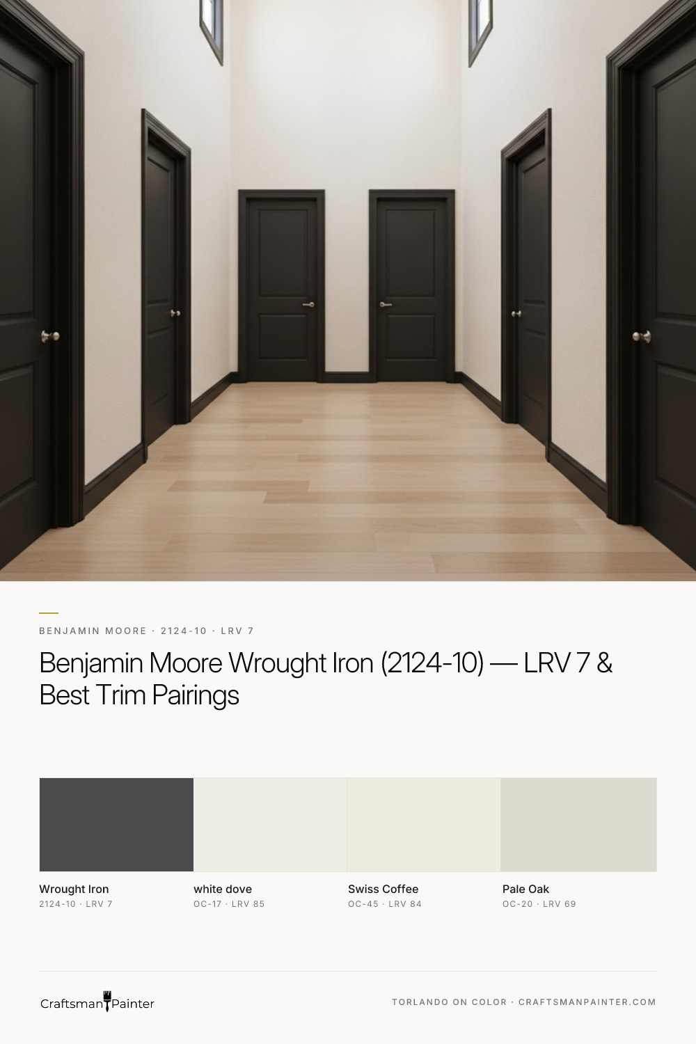


The Architectural Depth of Wrought Iron
Real-paint peel-and-stick samples ship via Samplize. Craftsman Painter may earn a small commission on sample orders at no extra cost to you.
Benjamin Moore Wrought Iron (2124-10) is a celebrated deep neutral for its ability to anchor a room without overwhelming it. Its undertones are notably clean, exhibiting minimal chromatic cast. This means you won't find it leaning overtly purple, blue, or green in most lighting conditions, which is a significant advantage when working with complex palettes or existing finishes. Instead, it holds its ground as a true, deep charcoal. This makes it an incredibly versatile color for various applications, from exterior accents like shutters and front doors to interior statements on accent walls, cabinetry, or even an entire room where a dramatic, enveloping atmosphere is desired. Its LRV of 7 means it absorbs a substantial amount of light, creating a perceived visual weight that can make lighter elements in a room feel crisper and more defined. In rooms with ample natural light, Wrought Iron will appear as a deep, rich gray, while in dimmer spaces, it will lean closer to a soft black, offering a dynamic interplay with light that evolves throughout the day.
Crafting a Cohesive Palette: Pairing Wrought Iron
To truly unlock the potential of Benjamin Moore Wrought Iron, strategic pairing with complementary colors is essential. For trim and ceilings, my go-to recommendation is Benjamin Moore White Dove (OC-17). With an LRV of 85, White Dove provides a soft, warm white that offers a gentle contrast against Wrought Iron's depth. It prevents the overall scheme from feeling stark, instead creating a refined and elegant delineation between walls and architectural details. The subtle creaminess of White Dove softens the deep charcoal, ensuring a harmonious balance. For a coordinating neutral that can be used on adjacent walls or in connecting spaces, Benjamin Moore Swiss Coffee (OC-45) is an excellent choice. Its LRV of 84 and warm, inviting character complements both Wrought Iron and White Dove, maintaining a sophisticated flow. When seeking a contrast accent, particularly for an adjacent wall or built-in, Benjamin Moore Pale Oak (OC-20) with its LRV of 69 provides a beautiful, understated warmth. Pale Oak is a greige that reads as a soft, warm off-white in many lights, offering a subtle shift in depth and tone that prevents the palette from feeling monotonous while still maintaining a sense of cohesion. This thoughtful layering of colors ensures that Wrought Iron feels integrated rather than isolated.
The Critical Step: Isolating Your Paint Samples
Selecting a deep color like Wrought Iron requires meticulous sampling. It's a common mistake for homeowners to place small paint swatches directly onto an existing colored wall. This practice is misleading due to the phenomenon of simultaneous contrast, a principle articulated by Josef Albers. Essentially, our perception of a color is heavily influenced by the colors immediately surrounding it. A deep charcoal like Wrought Iron can appear different when placed against a beige wall compared to a white wall, leading to inaccurate assessments of its true undertones and depth. To circumvent this perceptual distortion, I always advise clients to use real-paint peel-and-stick samples. More importantly, these samples should be isolated against a pure white background, such as a large piece of white poster board, and then moved around the room at different times of day. This method allows you to observe Wrought Iron in various lighting conditions, free from the influence of existing wall colors, revealing its authentic character. For a deeper dive into Wrought Iron and to explore its characteristics further, you can visit our Color Studio.
Beyond the Hue: Preparation, Coatings, and Comparison
Achieving the optimal finish with a deep color like Wrought Iron extends beyond simply choosing the right shade; it demands proper surface preparation and the selection of quality coatings. For interior walls, especially when applying a dark color, surface imperfections become more pronounced. Therefore, I recommend at least Level 2: Standard (Occupied Home) drywall preparation, ensuring a smooth, uniform surface. For a truly luxurious finish, Level 3: Premium (Luxury Finish) preparation, which includes additional skim coating and sanding, is ideal. For general wall applications, Sherwin-Williams Cashmere Low Lustre or Emerald Interior Matte are excellent choices, providing a rich, even finish that minimizes sheen and hides minor imperfections. In high-humidity areas like bathrooms and kitchens, Sherwin-Williams Duration Home offers superior durability and mildew resistance. For baseboards, doors, and cabinetry, Sherwin-Williams Emerald Urethane Trim Enamel in Satin or Semi-Gloss will provide a hard, durable, and washable surface that stands up to daily wear.
When considering alternatives, homeowners often inquire about Sherwin-Williams Iron Ore (SW 7069) and Tricorn Black (SW 6258). While all three are deep, impactful colors, they possess distinct personalities. Sherwin-Williams Iron Ore is a very popular deep charcoal, similar in depth to Wrought Iron, but it tends to carry slightly more subtle undertones that can lean into a soft brown-black or even a hint of green depending on the light. It's a bit softer than Wrought Iron's clean neutrality. Sherwin-Williams Tricorn Black, on the other hand, is a true, unadulterated black. With an LRV of 3, it is significantly darker and more stark than Wrought Iron. While Tricorn Black offers undeniable drama, Wrought Iron provides a softer, more nuanced alternative to a pure black, often feeling more sophisticated and less absolute. For personalized guidance on integrating Wrought Iron or any other color into your home, consider scheduling a 1-on-1 Color Consultation to ensure your vision comes to life with precision and confidence.

Deep Shadows and Quiet Hygge Warmth Find Their Anchor in Benjamin Moore Waller Green CW-525

Decoding the Brilliant Alchemy of Benjamin Moore Dark Burgundy in High-Sun Environments
