


Waller Green carries a Light Reflectance Value (LRV) of 8.85. In plain terms for homeowners, this is a deep, shadow-soaked shade that absorbs the vast majority of light coming into a room rather than bouncing it around. It creates an instant enveloping feeling, like stepping under a dense pine canopy late in the afternoon. What makes Waller Green remarkable is its complex balance of undertones: it is anchored by a rich, dark olive green base supported by a gray-black backbone. In bright natural sunlight, the lush olive notes emerge to give the room an organic earthiness. In shadow or under soft evening lamps, the gray-black foundation grounds the room in quiet, moody sophistication.

When working with a dark forest shade like Waller Green on your main walls, choosing the right surrounding colors prevents the room from feeling heavy or enclosed. Rather than stark, bright white trim—which can create a harsh, jarring contrast—I prefer framing this shade with Benjamin Moore White Dove OC-17 on all baseboards, door frames, and window casings. White Dove brings a soft, creamy warmth to the trim work. Its subtle yellow-gray undertone gently buffers the dark gray-black base of Waller Green, creating a seamless, tailored transition from the walls to the glass without any cold glare.

As daylight shifts from midday bright to late-afternoon amber, watching how Waller Green behaves across room corners is a delight. To keep adjoining spaces feeling airy and connected, transition from Waller Green in the main seating area to Benjamin Moore Bleeker Beige HC-80 in corridors, entries, or reading nooks. Bleeker Beige functions as a warm, sandy mid-tone that picks up the golden wood grains in blonde birch furniture and woven cork wall accents. It acts as a natural bridge, allowing your eyes to rest as you move between dramatic dark spaces and brighter interior zones.

Work Directly with Torlando Hakes
Skip the color choice stress. Work directly with me as your personal Color Designer to select the perfect architectural palette for your home, and get a Complementary Color Consultation when you purchase paint through us.

To give a room depth and architectural structure, bring in a third color for targeted accent pieces, built-in cabinetry, or interior doors. Benjamin Moore Dragon's Breath 1547 is a deep, smoky dark brown-gray that pairs effortlessly with Waller Green. Applying Dragon's Breath to a kitchen island, lower pantry cabinets, or a fireplace surround creates a grounded focal point that complements the dark olive walls without competing with them. The rich charcoal-brown warmth of Dragon's Breath enhances the organic, forest-floor feel of the room, particularly when paired with muted brass hardware and natural cork surfaces.

In a sanctuary setting like a cozy bathroom or reading lounge, Waller Green shines when combined with Scandinavian biophilic elements. Think natural cork wall tiles, blonde birch furniture, soft sheepskin throws, and potted ferns placed where they can catch indirect sunlight. For paint sheen, specify a flat or matte finish for Waller Green on the walls to minimize surface reflection and absorb light into a smooth, velvety finish. Use a satin or semi-gloss finish for White Dove trim and Dragon's Breath cabinetry to offer durability and a subtle sheen differential that highlights architectural details.

By grounding dark olive walls with soft creamy trim and warm sandy transitions, you create a space that feels calm, connected, and endlessly inviting through every season.
Complementary Color Consultation
Planning a project? Work with Torlando Hakes directly as your personal Color Designer and get a Complementary Consultation when purchasing paint through us.
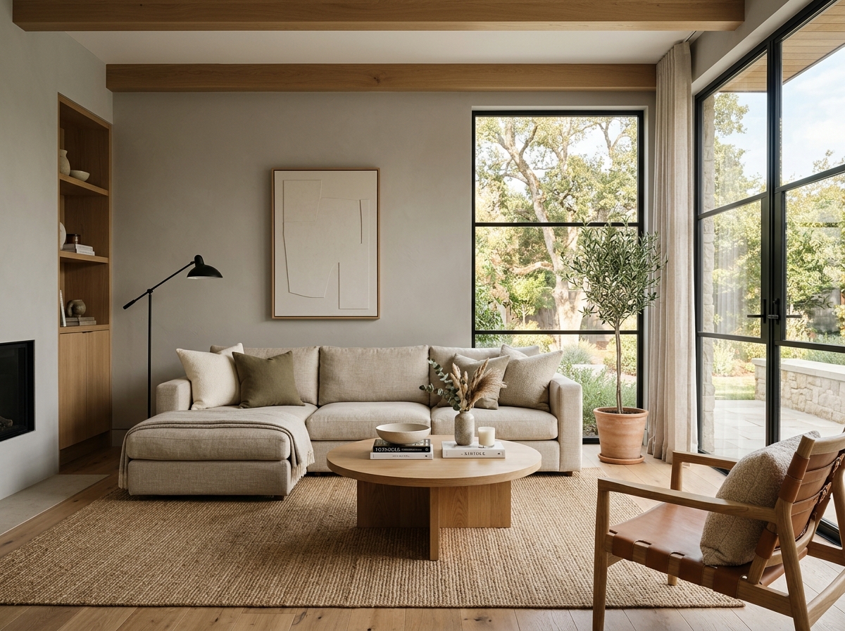 After
After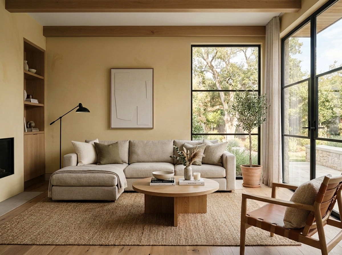 Before
Visualize Your Space with Color Studio AI
Planning a project? Skip the paint chip guesswork. Use our Color Studio AI to instantly visualize these paint colors on your own walls, or take advantage of our aligned contractor pricing matching current Sherwin-Williams retail promotions.
Book Your Upcoming Paint Project
Craftsman Painter is now scheduling premium transformations. Secure your spot and elevate your property value.
Get an EstimateHelp Others Find Professional Color Insights
Share this story directly to your networks or copy the link to share with friends.