


Understanding Kendall Charcoal's Depth in Varied Light
Real-paint peel-and-stick samples ship via Samplize. Craftsman Painter may earn a small commission on sample orders at no extra cost to you.
The way Kendall Charcoal (HC-166) interacts with natural and artificial light is crucial to its appeal. In north-facing rooms, where light tends to be cooler and bluer, its inherent warmth becomes more apparent, countering the cool cast and preventing the color from appearing flat. The beige-almond undertones emerge, giving it a soft, almost greige-like quality rather than a stark charcoal. Conversely, in south-facing rooms bathed in warm, intense light, Kendall Charcoal maintains its deep, rich character, with its warmth harmonizing with the natural illumination without becoming muddy or overly brown. East-facing light in the morning will emphasize its softer, more welcoming side, while west-facing light in the afternoon will deepen its intensity, making it feel more dramatic.
When evaluating a color as nuanced as Kendall Charcoal, it is imperative to test it correctly. Josef Albers' principle of simultaneous contrast teaches us that colors appear differently when placed next to other colors. Painting a swatch directly onto an existing colored wall will inevitably mislead, as the surrounding color will distort your perception of the new shade. Instead, I advise homeowners to use real-paint, peel-and-stick samples. Place these samples directly against existing white trim or a large piece of white poster board. This isolation allows your eye to perceive the color's true undertones and depth without interference. Observe the samples at different times of day and under various lighting conditions to truly understand how Kendall Charcoal will behave in your specific environment. For a deeper dive into its characteristics, you can explore the Color Studio.
Pairing Kendall Charcoal with Thoughtful Trim and Accents
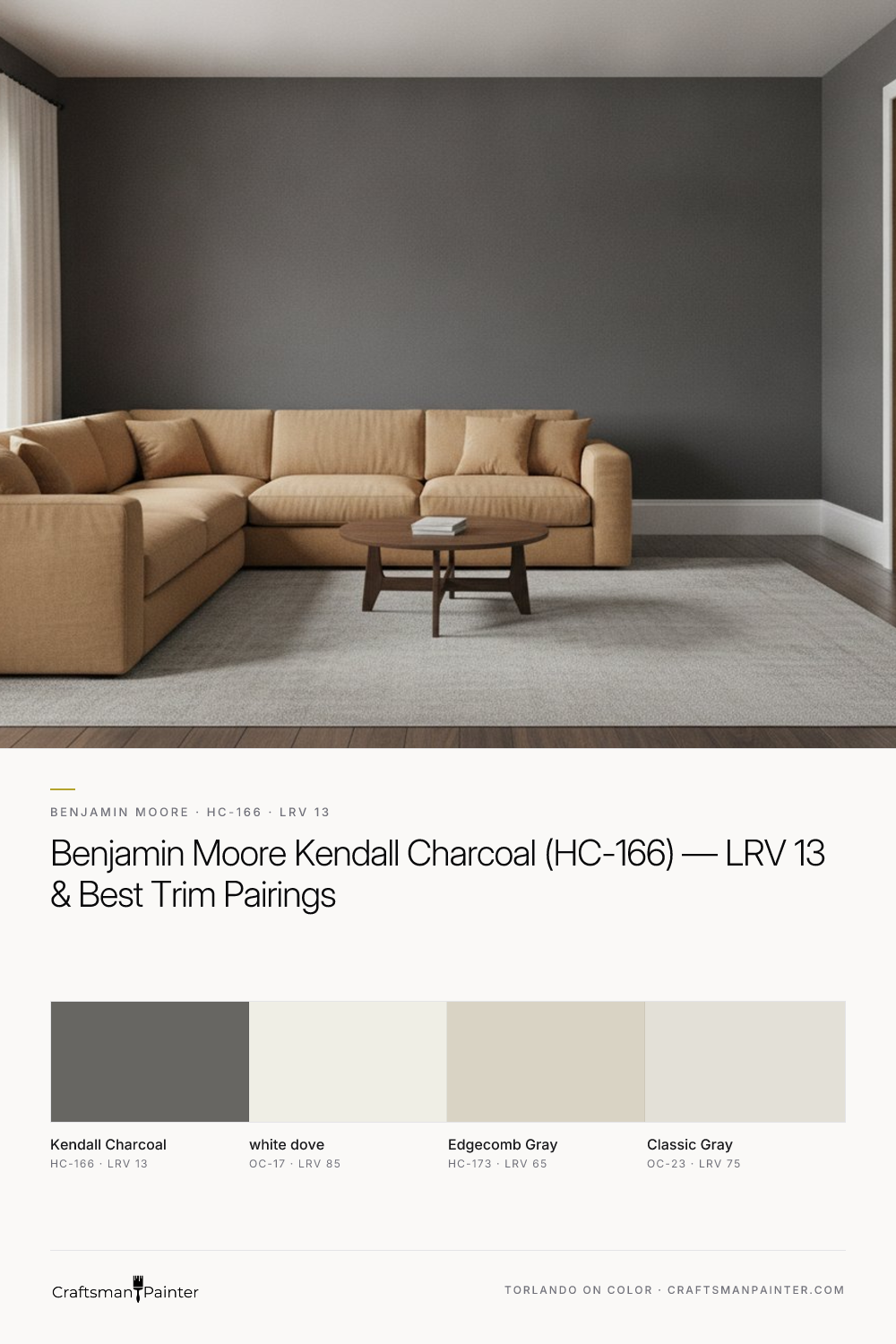
Selecting the right coordinating colors is paramount to realizing Kendall Charcoal's full potential. For trim and ceilings, Benjamin Moore White Dove (OC-17, LRV 85) is my standard recommendation. White Dove is a soft, warm white with a hint of gray, which provides a gentle contrast to Kendall Charcoal without feeling stark or overly bright. Its subtle warmth complements Kendall Charcoal's beige-almond undertones beautifully, creating a cohesive and sophisticated palette. For trim, I typically specify Sherwin-Williams Emerald Urethane Trim Enamel in a Satin or Semi-Gloss sheen, ensuring a durable and elegant finish on baseboards, doors, and cabinets.
For adjacent spaces or as a coordinating neutral, Benjamin Moore Edgecomb Gray (HC-173, LRV 65) is an excellent choice. Edgecomb Gray is a versatile greige that echoes the warm undertones of Kendall Charcoal, providing a lighter, airier transition while maintaining a sense of continuity. This pairing is particularly effective in open-concept layouts where a darker anchor color needs to flow into a lighter, more expansive space. As a contrast accent, Benjamin Moore Classic Gray (OC-23, LRV 75) offers a lighter, almost off-white gray that can be used on ceilings in rooms with Kendall Charcoal walls or on cabinetry for a subtle, sophisticated lift. For walls, depending on the room's function, I recommend Sherwin-Williams Cashmere Low Lustre for a smooth, rich finish in living areas, or Emerald Interior Matte for higher traffic zones. In humid areas like bathrooms or kitchens, Duration Home offers enhanced moisture resistance. Proper surface preparation is non-negotiable; for a truly premium result, Level 3: Premium drywall preparation is often warranted, ensuring a perfectly smooth substrate that allows these sophisticated colors to shine without blemish.
Distinguishing Kendall Charcoal from Its Closest Competitors
To fully appreciate Kendall Charcoal, it’s helpful to compare it against similar popular shades. Two common rivals homeowners often consider are Benjamin Moore Chelsea Gray (HC-168) and Sherwin-Williams Peppercorn (SW 7674).
Benjamin Moore Chelsea Gray (HC-168) has an LRV of 16.5, making it slightly lighter than Kendall Charcoal. While also a warm gray, Chelsea Gray tends to exhibit more pronounced green or sometimes even subtle blue undertones in certain lighting conditions, especially compared to Kendall Charcoal’s consistent beige-almond warmth. Where Kendall Charcoal feels grounded and earthy, Chelsea Gray can lean a touch more sophisticated and perhaps a bit cooler, depending on the light. The difference is subtle but significant; if you desire a definite warm, organic feel, Kendall Charcoal is the clearer choice. If a slightly cooler, more architectural gray is desired, Chelsea Gray might be preferred.
Sherwin-Williams Peppercorn (SW 7674), on the other hand, is a much darker and cooler shade. With an LRV of 10, it's a deep, almost black charcoal. Its undertones typically lean towards blue or violet, giving it a much more dramatic and often contemporary feel than Kendall Charcoal. When placed side by side, Kendall Charcoal appears significantly softer, warmer, and less intense than Peppercorn. Peppercorn is ideal for a high-contrast, moody aesthetic, whereas Kendall Charcoal provides a rich depth without the starkness, maintaining a more inviting presence. Understanding these distinctions is critical for making an informed color decision that aligns with your desired atmosphere. If you find yourself navigating these subtle but impactful differences, a professional 1-on-1 Color Consultation can provide clarity and confidence.
Strategic Applications and Enduring Appeal
Kendall Charcoal's versatility allows for a range of strategic applications throughout the home. It excels as a grounding wall color in living rooms, dining rooms, studies, and bedrooms, providing a rich backdrop that allows artwork and furnishings to pop. Its depth makes it an excellent choice for accent walls, grounding a space without overwhelming it. On exteriors, Kendall Charcoal lends a classic, sophisticated presence, pairing beautifully with natural stone, brick, or crisp white trim. Its warm undertones ensure it doesn't appear flat or cold against natural light, maintaining an inviting curb appeal.
Regardless of application, the quality of the finish is paramount. For interior walls, achieving a Level 2: Standard (Occupied Home) or Level 3: Premium (Luxury Finish) drywall preparation is crucial for a smooth, professional result that allows the color to be fully appreciated. A deep, saturated color like Kendall Charcoal will highlight any surface imperfections, making proper prep essential. The right coating, applied correctly, ensures both visual appeal and longevity. Kendall Charcoal is not just a trend; it is an enduring classic. Its balance of depth and warmth makes it a perpetually relevant choice for homeowners seeking to create sophisticated, inviting spaces that stand the test of time.

Rooted in Green and Umber Undertones, Benjamin Moore Quarry Rock 1568 Brings Organic Depth to Dark Neutrals

Neither Strictly Gray Nor Brown, Benjamin Moore Kingsport Gray HC-86 Is the Designer’s Grounded Neutral
