


To understand how this shade performs on a large scale, let's look at its Light Reflectance Value, or LRV. On a scale from zero to one hundred, Skipping Rocks sits right in the middle with an LRV of 45. In everyday terms, this means the color has enough depth and body to stand out against white trim, yet it reflects enough daylight to keep a living room or bedroom from feeling dark or closed-in. It gives your walls presence without demanding all the attention in the room.
To visualize how this color palette behaves in a representative Spanish Mediterranean home in Indianapolis, IN, imagine a space built around heavy dark oak ceiling timbers, neutral gray flagstone floors, and arched geometry. In this kind of warm, tactile architecture, stark grays feel completely out of place, and heavy tans can make the room feel dated. Applying Sherwin-Williams Skipping Rocks SW 9551 in an eggshell or matte sheen across a primary bedroom wall bridges the gap between the cool gray stone underfoot and the rich brown tones of the overhead beams. It wraps the room in a calm, comforting tone that pairs effortlessly with natural linen bedding, wrought-iron light fixtures, and warm wood furniture.

How Trim and White Pairings Frame the Space
Skipping Rocks
Sherwin-Williams SW 9551
Alabaster
Sherwin-Williams SW 7008
Gray Mirage
Benjamin Moore 2142-50
Yorktowne Green
Benjamin Moore HC-133
A mid-tone greige with an LRV of 45 needs the right white on the trim to look intentional and crisp. If you pair Skipping Rocks with a sharp, icy gallery white, the contrast is too harsh and can make the wall color look slightly dingy by comparison. Instead, I recommend pairing it with a soft, creamy off-white like Sherwin-Williams Alabaster SW 7008.

Work Directly with Torlando Hakes
Skip the color choice stress. Work directly with me as your personal Color Designer to select the perfect architectural palette for your home, and get a Complementary Color Consultation when you purchase paint through us.
When we look at how Sherwin-Williams Alabaster SW 7008 works on window casings, arched door frames, and tall baseboards, you can immediately see how its subtle warmth echoes the beige undertones inside Skipping Rocks. For the best durability and a classic architectural look, use a satin or semi-gloss finish on your trim and doors while keeping the walls in a flat or matte finish. That slight difference in sheen catches the light along the edges of the moldings, framing the greige walls cleanly while keeping the overall mood relaxed and cohesive.

Reading the Undertones in Autumn Daylight
Light in Indianapolis during the autumn months has a distinct character. As the sun sits lower in the sky, the harsh glare of summer gives way to a soft, even, diffused daylight that filters through the yellowing leaves outside. This seasonal light is the ultimate test for any gray paint. Cooler grays quickly turn chilly and slate-like in Midwestern fall light, making a room feel drafty before winter even arrives.
Because Sherwin-Williams Skipping Rocks SW 9551 is anchored by warm greige undertones, it handles this diffused autumn light beautifully. Where two walls meet in a corner, you won't see sour green or purple shadows forming. Instead, the soft daylight brings out a quiet, mineral warmth that resembles smooth river stone. As the afternoon transitions into evening and you switch on warm incandescent or 2700K LED lamps, the gray recedes slightly, allowing the cozy taupe notes to step forward.

Creating Flow with Adjoining Rooms and Bold Accents
When planning a whole-house color scheme, you want your rooms to converse with one another as you walk down a hallway or look through an open archway. To create a gentle shift in tone between a living room painted in Skipping Rocks and an adjoining dining room or sunroom, consider introducing Benjamin Moore Gray Mirage 2142-50. While Skipping Rocks stays firmly grounded in warm stone territory, Gray Mirage introduces a dusty, muted sage-gray note that acts as a natural bridge to the outdoors. Looking through an archway from a Skipping Rocks wall into a space finished in Benjamin Moore Gray Mirage 2142-50 feels completely natural, especially when framed by dark oak beams and wrought-iron hardware.
For spaces that call for a stronger focal point—like a kitchen island, built-in shelving, or a heavy paneled pantry door—you can bring in rich, grounding contrast with Benjamin Moore Yorktowne Green HC-133. This deep, heritage green pairs effortlessly with the warm greige walls. In a kitchen or butler's pantry where Skipping Rocks covers the plaster walls, painting the lower cabinetry in Benjamin Moore Yorktowne Green HC-133 in a durable satin enamel anchors the room. The earthy undertones of the greige keep the rich green from feeling jarring, while antique brass pulls and warm wood countertops tie the whole look together.

Bringing the Palette into Smaller Spaces
Don't hesitate to pull this same combination into smaller, hardworking rooms like a guest bath or powder room. In a bathroom with limited natural light, very pale grays often wash out and look sterile against porcelain fixtures. Skipping Rocks has the pigment weight required to hold its own next to stone countertops and metal sconces.
Consider how a bathroom vanity corner functions when the walls are wrapped in Sherwin-Williams Skipping Rocks SW 9551, the trim is detailed in Sherwin-Williams Alabaster SW 7008, and a freestanding vanity is finished in Benjamin Moore Yorktowne Green HC-133. Using a moisture-resistant matte bath paint on the walls keeps the plaster texture looking velvety, while the rich green vanity base grounds the corner. Wrought-iron mirror frames and warm towels complete a space that feels curated, timeless, and completely settled into its architecture.

When you want a home to feel welcoming and substantial without relying on heavy beige or chilly gray, Sherwin-Williams Skipping Rocks SW 9551 hits the sweet spot right in the middle of the spectrum. Pair it with warm whites, natural stone, and deep heritage greens to build a space that looks balanced in every season.
Complementary Color Consultation
Planning a project? Work with Torlando Hakes directly as your personal Color Designer and get a Complementary Consultation when purchasing paint through us.
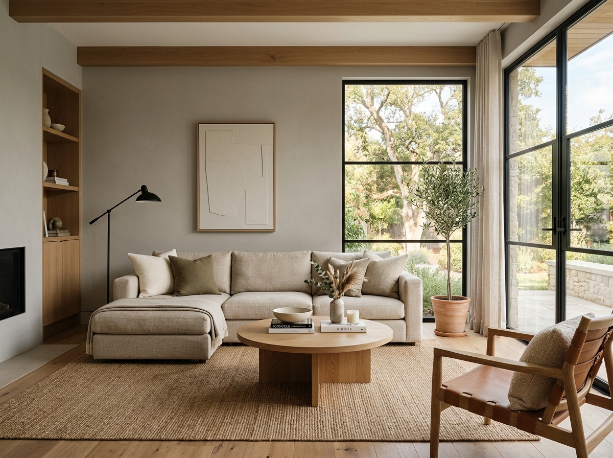 After
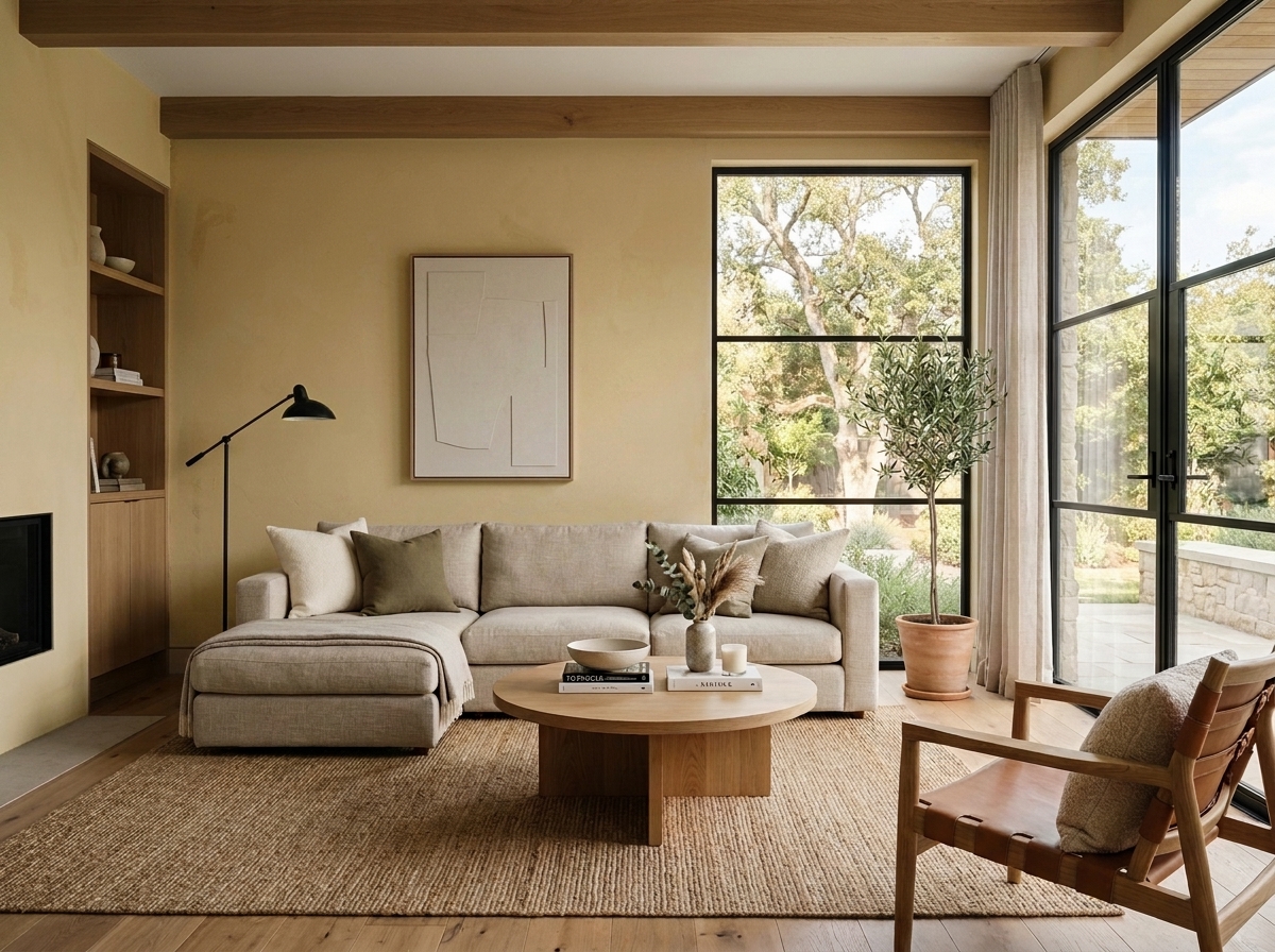 Before
Visualize Your Space with Color Studio AI
Planning a project? Skip the paint chip guesswork. Use our Color Studio AI to instantly visualize these paint colors on your own walls, or take advantage of our aligned contractor pricing matching current Sherwin-Williams retail promotions.
Book Your Upcoming Paint Project
Craftsman Painter is now scheduling premium transformations. Secure your spot and elevate your property value.
Get an EstimateHelp Others Find Professional Color Insights
Share this story directly to your networks or copy the link to share with friends.