


Understanding how a paint color performs starts with its Light Reflectance Value, or LRV. Silver Streak sits at an LRV of 35.01 on a scale from 0 to 100. In practical terms, this means it is a solid mid-tone that absorbs roughly two-thirds of the light entering a room. It won't bounce light around like a pale off-white, but it also won't plunge your room into total darkness. Instead, it creates a cozy, atmospheric envelope. What makes Silver Streak truly fascinating are its undertones. Beneath its slate-gray exterior lies a subtle ribbon of blue-violet. In crisp morning light, it reads as a clean, stony blue-gray. But when that warm, amber late-afternoon sun hits the walls, those violet notes soften the cool tones, keeping the room from feeling washed out.

To visualize how this shade interacts with natural light and rich wood finishes, consider a visual walkthrough of a representative Modern Prairie home. In a space defined by deep roof overhangs, horizontal band windows, and low-slung architecture, Silver Streak provides an ideal counterweight to warm wood tones. On main living room walls, it creates a quiet backdrop that lets quarter-sawn white oak built-ins and linear concrete brick fireplaces shine.
To keep a mid-tone cool gray from feeling flat, architectural trim needs precise definition. For window frames, baseboards, and interior door casings, I recommend pairing Silver Streak with Benjamin Moore Chantilly Lace OC-65. Chantilly Lace is a pure, clean white with almost zero warm or cool bias. Applied to baseboards and the intricate leaded glass window grids typical of Prairie design, it snaps the cool wall color into sharp, modern focus.

Work Directly with Torlando Hakes
Skip the color choice stress. Work directly with me as your personal Color Designer to select the perfect architectural palette for your home, and get a Complementary Color Consultation when you purchase paint through us.

Moving from open living areas into adjoining hallways or open-concept dining zones requires a smooth color transition. Rather than jumping straight to another strong gray or stark white, bringing in Benjamin Moore Wish AF-680 serves as a comfortable mid-tone bridge. Wish is a soft, warm greige that balances the cooler personality of Silver Streak. When you glance down a hallway painted in Wish toward a living room wrapped in Silver Streak, the contrast feels intentional and easy on the eyes, particularly under warm cove lighting in the evening.

For areas where you want a punch of deeper drama—such as a kitchen island, lower cabinetry, or a dedicated home office accent wall—turn to Benjamin Moore Polo Blue 2062-10. Polo Blue is a rich, near-black navy. Because Silver Streak already carries a cool blue-violet base, Polo Blue acts as a natural extension of the wall color rather than a sudden visual jar. On lower kitchen cabinets anchored with brushed bronze hardware, Polo Blue grounds the lower half of the room, allowing Silver Streak on the upper walls to feel airy and light by comparison.

In smaller, intimate spaces like a primary bathroom or powder room, Silver Streak creates a calm, spa-like environment. Paired with linear concrete floor tiles and a floating-style oak vanity with solid brass legs firmly grounded on the floor, the blue-violet undertones bring a clean, refreshing feeling to mirror lighting.
When specifying sheens for this palette, keep wall finishes in a matte or flat sheen. Silver Streak’s rich undertones look best when light scatters evenly across the surface rather than bouncing off a glossy shine. For trim, doors, and built-in cabinetry, choose a satin or semi-gloss finish in Chantilly Lace or Polo Blue to provide durability and a clean, wipeable surface that holds up to daily life.

Bringing a color like Silver Streak into your home is all about balancing cool architectural tones with natural warmth. By grounding the space with rich oak textures, clean white trim, and deep navy accents, you create an environment that feels tailored, composed, and ready for every season.
Complementary Color Consultation
Planning a project? Work with Torlando Hakes directly as your personal Color Designer and get a Complementary Consultation when purchasing paint through us.
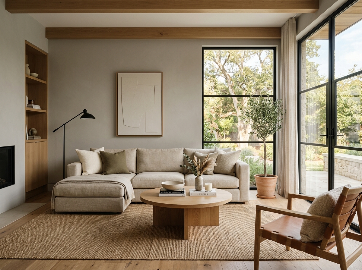 After
After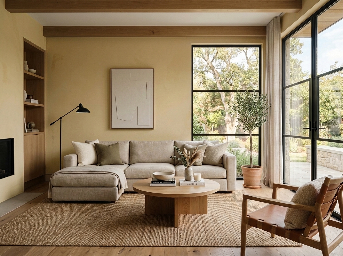 Before
Visualize Your Space with Color Studio AI
Planning a project? Skip the paint chip guesswork. Use our Color Studio AI to instantly visualize these paint colors on your own walls, or take advantage of our aligned contractor pricing matching current Sherwin-Williams retail promotions.
Book Your Upcoming Paint Project
Craftsman Painter is now scheduling premium transformations. Secure your spot and elevate your property value.
Get an EstimateHelp Others Find Professional Color Insights
Share this story directly to your networks or copy the link to share with friends.