


What sets Paper White apart is its delicate undertone profile. Built on a crisp cool gray base, it carries subtle hints of blue and green beneath the surface. In a representative transitional home in Bloomington, Indiana, where golden afternoon autumn sunlight streams through large windows, these cool blue-green undertones perform magic. The strong amber and reddish tones of fall foliage outside usually make warm off-whites look overly yellow. Paper White, however, absorbs and balances that golden glare, turning hot afternoon sun into a serene, tailored glow.

To create crisp structure around Paper White, trim work needs a distinct, clean boundary. Pair it with Benjamin Moore Chantilly Lace OC-65 on window casings, crown molding, and wainscoting wall panels. Chantilly Lace is a pure, bright neutral white with almost zero warm or cool bias. When painted on raised wall paneling or door casings, it provides a sharp contrast that pulls out Paper White's gentle slate-like depth. Rather than looking like an off-white that missed the mark, Paper White reads as an intentional, sophisticated pale gray against the bright border of Chantilly Lace.

Light shifts dramatically throughout the day, especially as we move into the crisp months of fall. In early morning light, Paper White displays its sleek gray persona, giving spaces an airy, serene feel. By mid-afternoon, as warm sun strikes the room at a low angle, the subtle blue-green notes in the paint keep the walls feeling cool and balanced. As night falls and light switches to crystal-glass pendants and symmetrical wall sconces, Paper White softens further, taking on the quiet warmth of cozy stone without drifting into muddy beige.

Work Directly with Torlando Hakes
Skip the color choice stress. Work directly with me as your personal Color Designer to select the perfect architectural palette for your home, and get a Complementary Color Consultation when you purchase paint through us.

To build a full color story across connected rooms, bring in harmonious mid-tones and rich accent shades. Benjamin Moore Beach Glass 1564 serves as a natural extension of Paper White's cool blue-green undertones. Applied to built-in bookcases or an adjoining hallway, Beach Glass creates a seamless color bridge that feels grounded and tranquil. For areas that demand rich contrast—such as a kitchen island, wet bar, or vanity—turn to Benjamin Moore Newburg Green HC-158. This deep, moody teal provides a striking anchor against Paper White walls, especially when paired with polished Calacatta marble counters and brushed gold hardware.

In practical application, sheen selection is just as important as the color itself. For main living walls and bedrooms, choose a Matte or Eggshell finish in Benjamin Moore’s Regal Select or Aura lines. These flatter finishes absorb glare and allow Paper White's soft undertones to show smoothly across large surfaces. For trim, doors, and wainscoting, step up to a Satin or Semi-Gloss finish in Chantilly Lace to make architectural details pop and ensure high-touch areas stay easy to clean.
In a primary bathroom or dressing suite, Paper White creates a spa-like atmosphere that feels clean without feeling clinical. Surrounding a freestanding tub or marble vanity with Paper White walls brings out the cool gray veining in natural stone. Warm brass or brushed gold plumbing fixtures break up the cool palette, adding just enough shine to complement the crisp wall color.

When styling around this palette, balance is everything. Because Paper White lean cool, bring in organic warmth through your interior furnishings. Natural white oak floors, warm cognac leather chairs, and rich silk-wool rugs prevent the room from feeling too crisp. The result is a home that feels airy, tailored, and perfectly tuned to the changing seasons outside your windows.
Complementary Color Consultation
Planning a project? Work with Torlando Hakes directly as your personal Color Designer and get a Complementary Consultation when purchasing paint through us.
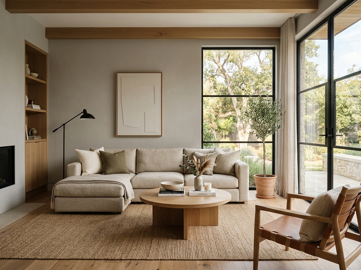 After
After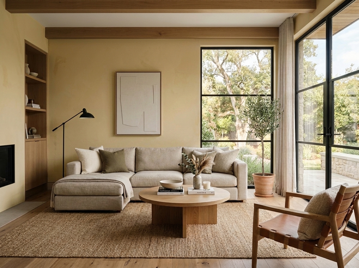 Before
Visualize Your Space with Color Studio AI
Planning a project? Skip the paint chip guesswork. Use our Color Studio AI to instantly visualize these paint colors on your own walls, or take advantage of our aligned contractor pricing matching current Sherwin-Williams retail promotions.
Book Your Upcoming Paint Project
Craftsman Painter is now scheduling premium transformations. Secure your spot and elevate your property value.
Get an EstimateHelp Others Find Professional Color Insights
Share this story directly to your networks or copy the link to share with friends.