
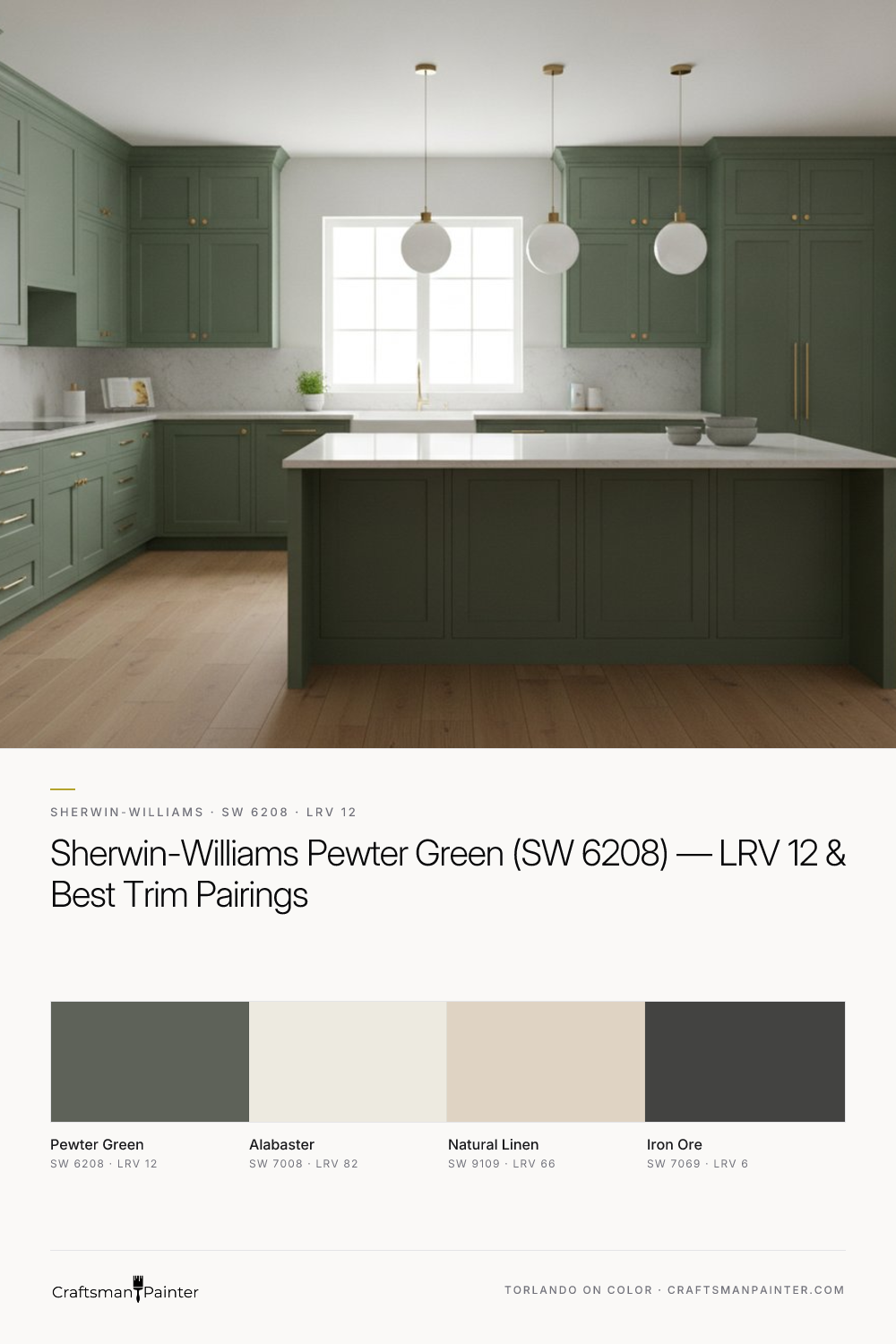


Understanding Pewter Green in Varying Light
Real-paint peel-and-stick samples ship via Samplize. Craftsman Painter may earn a small commission on sample orders at no extra cost to you.
The LRV of 12 for Pewter Green means it is a dark color. In rooms with abundant natural light, such as south-facing spaces or those with large windows, Pewter Green will reveal its full spectrum of muted green and subtle gray notes. The ample light prevents it from feeling heavy, instead allowing its botanical depth to shine through, creating a serene and inviting atmosphere. Here, its sage-green undertones become more apparent, offering a soft, organic feel. However, in north-facing rooms or spaces with limited natural light, Pewter Green will appear significantly darker, often leaning into its gray side and approaching a deep, almost charcoal-green. This can be leveraged to create a cozy, den-like ambiance, but it's crucial to consider the artificial lighting scheme. Warm white LED lighting (2700K-3000K) will enhance its earthy qualities, bringing out more of the green, while cooler lighting (4000K+) might push it further into its gray-green territory. It is not a color that brightens a space; rather, it grounds it. When evaluating this shade, always observe large peel-and-stick samples in situ throughout the day to gauge its true behavior under your home's specific lighting conditions.
Identifying Pewter Green's Muted Botanical Undertones
Pewter Green's primary undertone is a muted botanical sage-green. This is what gives it its sophisticated, organic character, distinguishing it from more vibrant or overtly gray-greens. It’s a complex shade that avoids the pitfalls of being too bright or too muddy. The botanical aspect refers to its natural, earthy quality, reminiscent of dried herbs or moss rather than freshly cut grass. The sage influence provides that touch of gray, ensuring it remains subdued and versatile. This subtlety makes it highly adaptable, capable of harmonizing with a wide range of natural materials like wood, stone, and woven textures. When testing any color, especially one with nuanced undertones like Pewter Green, it is critical to understand Josef Albers' principle of simultaneous contrast. Placing a paint swatch directly on an existing painted wall will distort your perception because the surrounding color will influence how you see the new swatch. To get an accurate read, always isolate real-paint peel-and-stick samples against a clean white background, ideally against existing white trim, allowing the color to reveal its true nature without interference from competing hues. This method provides the most reliable assessment of its undertones and overall presence.
Crafting a Cohesive Palette: Trim, Accents & Adjacent Spaces
Building a cohesive color scheme around Pewter Green requires thoughtful consideration of its depth and undertones. For trim and ceilings, Sherwin-Williams Alabaster (SW 7008, Hex #EDEAE0, LRV 82) is an impeccable choice. Its soft, warm white provides a gentle contrast that highlights Pewter Green's richness without feeling stark. Alabaster offers a subtle creaminess that complements the botanical quality of the green, ensuring the overall scheme feels inviting and well-balanced. For interior walls, I specify Sherwin-Williams Cashmere Low Lustre or Emerald Interior Matte for a refined finish on drywall, ensuring Level 2: Standard (Occupied Home) prep for a smooth, uniform surface. For areas subjected to higher humidity, such as bathrooms and kitchens, Sherwin-Williams Duration Home offers superior durability and moisture resistance.
As a coordinating neutral for adjacent spaces or feature walls, Sherwin-Williams Natural Linen (SW 9109, Hex #DFD3C3, LRV 66) is an excellent companion. Its warm, inviting beige with subtle gray undertones echoes the earthy feel of Pewter Green, creating a seamless flow between rooms. For a dramatic contrast accent, Sherwin-Williams Iron Ore (SW 7069, Hex #434341, LRV 6) introduces a deep, near-black charcoal that grounds the palette. This can be used on interior doors, a fireplace mantel, or even cabinetry. When painting trim, doors, or cabinets, Sherwin-Williams Emerald Urethane Trim Enamel in Satin or Semi-Gloss provides exceptional durability and a smooth, luxurious finish. For premium projects, especially with cabinetry or intricate millwork, aiming for Level 3: Premium (Luxury Finish) wood preparation ensures an immaculate, glass-smooth result. Should you find yourself needing more tailored advice for your specific space, a 1-on-1 Color Consultation can provide the expert guidance you need to create a truly harmonious home.
Comparing Pewter Green to Its Closest Rivals
When considering Pewter Green (SW 6208), it’s helpful to understand how it stands in relation to similar, popular greens. Two notable rivals are Sherwin-Williams Evergreen Fog (SW 9130) and Sherwin-Williams Ripe Olive (SW 6209). Evergreen Fog, the 2022 Sherwin-Williams Color of the Year, is a lighter, softer green with an LRV of 30. It presents as a more pronounced gray-green, often appearing cooler and slightly more muted than Pewter Green. While both share a sense of organic calm, Evergreen Fog is less saturated and reflects more light, making it suitable for spaces where a lighter, airier feel is desired. It lacks the deep, grounded intensity that Pewter Green offers. If you’re exploring options, you can dive deeper into its characteristics through our Color Studio.
Ripe Olive (SW 6209), on the other hand, is Pewter Green's darker, more intensely saturated sibling, with an LRV of 6. It is a true deep olive green, carrying stronger yellow-green undertones that give it a richer, almost military-green quality. While Pewter Green leans into a muted botanical sage, Ripe Olive commits fully to a robust, earthy olive. If you desire a bold, enveloping green that makes a strong statement, Ripe Olive might be the choice. However, if your aim is a sophisticated, versatile green that offers depth without overwhelming, Pewter Green strikes a finer balance. It provides that essential connection to nature with a refined restraint that Ripe Olive’s intensity might overshadow in certain applications. Each of these greens has its place, but their distinct undertones and LRVs dictate their optimal use in a home.
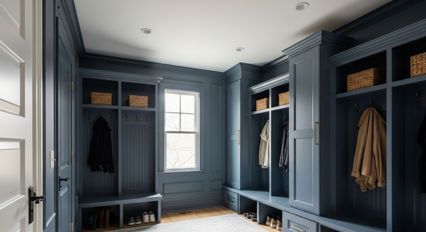
The One Moody Paint Color Westfield Designers Are Secretly Hoarding for Mudrooms

The Rich Roasted Paint Color Designers Are Secretly Hoarding for Living Rooms
