


To counter that regional light, you need architectural weight. You need a color that absorbs the ambient chill and grounds the space.
Let's look specifically at the living room hearth. As the social and structural center of the home, the hearth dictates the visual energy of the entire floor plan. Surrounding this focal point with pale, passive grays in a climate like Akron’s often results in a room that feels hollow. Instead, we use a color with serious gravity: Sherwin-Williams Kaffee (SW 6104).
The Gravity of the Hearth
The hearth naturally draws the eye. Whether it features a masonry fireplace, a wood-burning stove, or a modern architectural media wall, it serves as the visual anchor. If the paint color flanking this focal point is too light, the architecture floats. If the color is too cool, the space recedes.

Work Directly with Torlando Hakes
Skip the color choice stress. Work directly with me as your personal Color Designer to select the perfect architectural palette for your home, and get a Complementary Color Consultation when you purchase paint through us.
Sherwin-Williams Kaffee solves this structural problem. It is a deep, roasted earth tone—a robust brown with heavy clay and caramel undertones. Applying this color to the built-ins, the mantelpiece, or the entire focal wall pulls the architecture inward. The deep tone creates a physical sense of enclosure. You instantly feel a change in the room’s proportions. The walls stop visually retreating and begin to define a clear, intimate seating area.
Analyzing Kaffee Under Ohio Light
Every paint color is entirely dependent on the light source hitting it. In Akron, the winter sunlight is indirect and skewed heavily toward the blue end of the color spectrum. When cool light hits a standard beige or gray, the paint reflects that icy temperature back into the room.
Kaffee behaves entirely differently. With a very low Light Reflectance Value (LRV of 16), it absorbs the majority of the light that hits it. It refuses to bounce the harsh, blue-gray winter light around the room. Instead, the heavy clay undertones within Kaffee neutralize the chill.

During the humid Ohio summer, the evening light warms up and strikes the room at a lower, sharper angle. Under direct, golden-hour sunlight, Kaffee shifts. The brown base warms up considerably, highlighting the caramel notes and giving the hearth a baked, terracotta-leaning richness.
Creating Visual Relationships with Trim
A deep color like Kaffee demands the right framing. Placing a stark, blue-based white right next to this roasted brown creates a harsh, digital-looking contrast. The sharp edge abruptly breaks the visual flow of the room.
To keep the transition smooth and sophisticated, you must use a warm, heavily pigmented off-white for your trims, ceilings, and adjacent walls. Sherwin-Williams Creamy (SW 7012) is an ideal counterpart. Creamy carries a distinct yellow undertone. When positioned next to Kaffee, the two colors share a similar warm temperature. The contrast remains high enough to highlight the architectural details of your baseboards and crown molding, but the temperature alignment keeps the visual relationship completely harmonious.

Layering Textures and Complements
Paint is only one layer of the room's visual ecosystem. Once you establish Kaffee as the anchor around the hearth, the surrounding materials need to support it.
Because Kaffee is so matte and light-absorbing, you need materials that reflect light and offer tactile contrast. Polished or unlacquered brass sconces mounted directly onto the Kaffee-painted built-ins create a striking metallic contrast against the flat brown backdrop.

For soft furnishings, bring in organic linens, heavily textured wool rugs in warm sands, and natural leathers. A buttery, saddle-leather armchair positioned near the hearth pulls the caramel undertones out of the wall color and down into the seating arrangement.
By strategically placing a color as robust as Kaffee at the architectural center of the living room, you take complete control of the space. You dictate how the light behaves, you neutralize the regional climate, and you build a room that feels genuinely rooted to the ground.
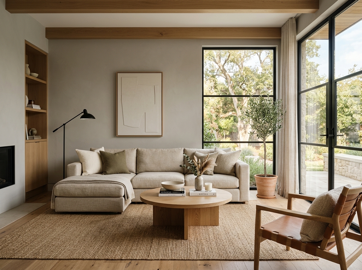 After
After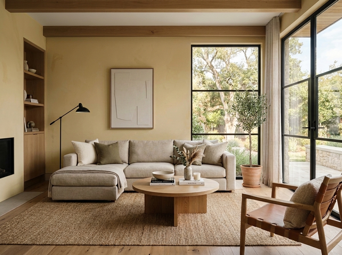 Before
Visualize Your Space with Color Studio AI
Planning a project? Skip the paint chip guesswork. Use our Color Studio AI to instantly visualize these paint colors on your own walls, or take advantage of our aligned contractor pricing matching current Sherwin-Williams retail promotions.
Book Your Upcoming Paint Project
Craftsman Painter is now scheduling premium transformations. Secure your spot and elevate your property value.
Get an EstimateHelp Others Find Professional Color Insights
Share this story directly to your networks or copy the link to share with friends.