


Opalescent is a nuanced off-white shade with an Light Reflectance Value (LRV) of 82. In plain homeowner terms, LRV measures how much light a paint color bounces around a room on a scale from 0 (absorbing all light) to 100 (pure white). At 82, Opalescent sits squarely in the high-reflectance category, meaning it makes spaces feel open, airy, and bright. However, unlike stark modern whites that can feel chilly under northern skies, Opalescent carries soft green-blue undertones balanced by a grounding gray backbone. It gives walls the quiet, misty quality of a morning sky over the White River, preventing sunlight from washing out the room.

To keep a breathably pale color like Opalescent from floating away, architectural elements need crisp definition. I always recommend framing walls in this undertone-rich pale green-blue with Sherwin-Williams Pure White SW 7005 on baseboards, door casings, and window trim. Pure White is a remarkably balanced white paint—it has just enough warmth to avoid looking blue or clinical, but it remains bright enough to create a clean, intentional border around Opalescent walls.
When applied to heavy trim work and seamless window casings, Pure White grounds the subtle color shifts of Opalescent. The crisp white border draws the eye to the architectural details of the room while letting the subtle color on the walls shine.

Work Directly with Torlando Hakes
Skip the color choice stress. Work directly with me as your personal Color Designer to select the perfect architectural palette for your home, and get a Complementary Color Consultation when you purchase paint through us.

Light behavior is where Opalescent truly comes alive. In a visual design study of a light-filled Indianapolis living room, you can watch this color evolve throughout the day. In the morning, cool clear light highlights the soft blue-gray side of the color, giving the space a calm, restorative feel. By mid-afternoon, when warm autumn sunlight strikes the wall at an angle, the green undertones emerge, catching the golden reflection of exterior tree leaves.
As night falls and ambient warm lighting takes over, Opalescent softens into a pale muted sage mist. It pairs beautifully with natural textures like blonde birch cabinetry, woven wool throws, and cork accent panels, creating a Scandinavian hygge environment built for chilly evenings.

To create a cohesive color story throughout a home, you need mid-tones and dark contrast colors that share the same underlying DNA. For adjacent spaces—such as a hallway leading off the main living area, or full-height beaded wall paneling—Sherwin-Williams Oyster Bay SW 6206 serves as an ideal bridge. Oyster Bay is a muted mid-tone green-gray that takes the quiet undertones of Opalescent and deepens them into a soothing earth-tone shade.
For high-impact focal points, such as a kitchen island, lower cabinetry, or an entryway feature door, step all the way down the color scale to Sherwin-Williams Cascades SW 7623. Cascades is a deep, dramatic teal-green that adds striking visual weight. Against Opalescent walls and Pure White trim, Cascades pulls out the subtle forest elements of the palette, making natural wood elements like birch and oak practically sing.

This four-color organic combination shines particularly well in sanctuary spaces like a primary bathroom or spa-like guest suite. Picture Opalescent walls wrapping the room, anchored by a vanity painted in Oyster Bay SW 6206 that sits firmly on a slate or light stone tile floor. Potted ferns and fiddle-leaf figs catch ambient light against natural cork wall paneling, bringing the calm simplicity of nature directly indoors.

When choosing paint sheens for this palette, stick to practical, high-performance finishes. For Opalescent on residential walls, a matte or flat finish keeps the color looking velvety and soft by preventing harsh reflections. For the trim and doors in Pure White, choose a satin or semi-gloss sheen to create a clean, washable barrier that stands up to daily wear. For accent cabinetry painted in Cascades or Oyster Bay, a durable satin finish hits the perfect sweet spot between durability and refined color depth.
Sherwin-Williams Opalescent SW 9686 proves that an off-white color can be pale and light-filled without feeling boring or flat. By pairing it with rich green-gray coordinates and crisp white trim, you create a home environment that feels calm, connected to nature, and perfectly tuned to the changing seasons.
Complementary Color Consultation
Planning a project? Work with Torlando Hakes directly as your personal Color Designer and get a Complementary Consultation when purchasing paint through us.
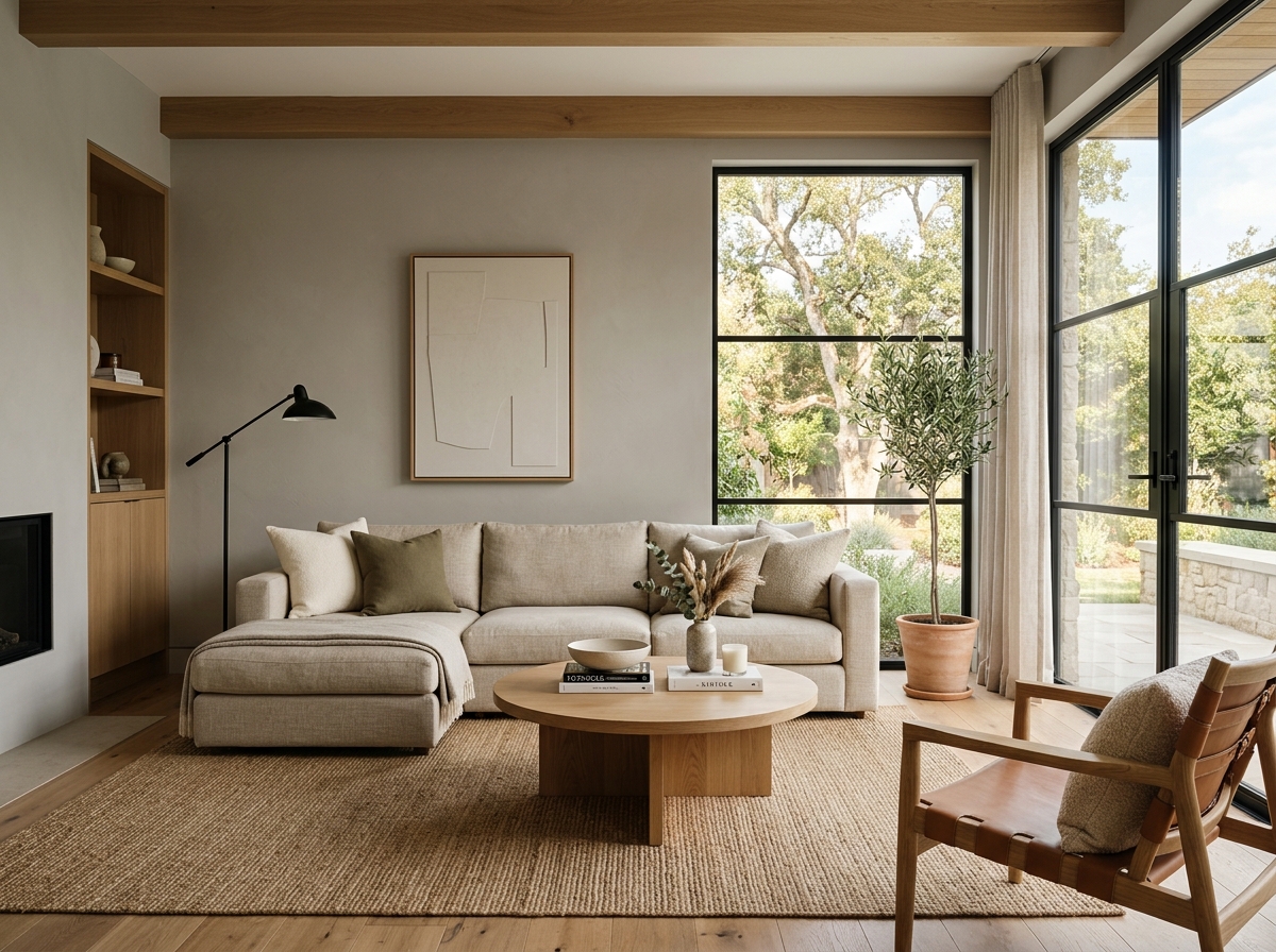 After
After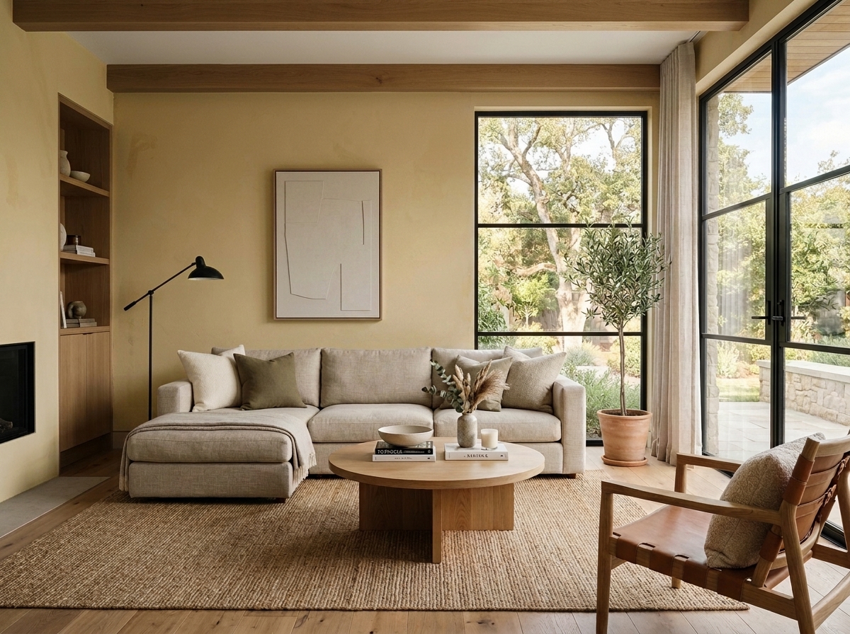 Before
Visualize Your Space with Color Studio AI
Planning a project? Skip the paint chip guesswork. Use our Color Studio AI to instantly visualize these paint colors on your own walls, or take advantage of our aligned contractor pricing matching current Sherwin-Williams retail promotions.
Book Your Upcoming Paint Project
Craftsman Painter is now scheduling premium transformations. Secure your spot and elevate your property value.
Get an EstimateHelp Others Find Professional Color Insights
Share this story directly to your networks or copy the link to share with friends.