
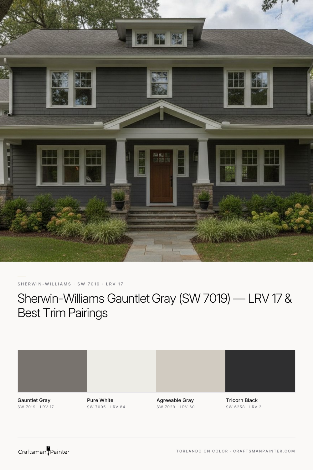


My experience with Gauntlet Gray on various projects, from historic homes in Columbus, IN, to contemporary spaces across the US via virtual consultations, confirms its status as a reliable choice for homeowners seeking depth and character. It’s a color that performs diligently, providing a robust backdrop that allows other elements in a room to shine while maintaining its own quiet authority. Understanding its specific undertones and how it interacts with light is key to unlocking its full potential in your home.
Gauntlet Gray: A Deep Foundation for Cabinetry and Millwork
Real-paint peel-and-stick samples ship via Samplize. Craftsman Painter may earn a small commission on sample orders at no extra cost to you.
Gauntlet Gray's LRV of 17 places it in a sweet spot for creating impactful statements on fixed elements like kitchen cabinets, bathroom vanities, built-in shelving, and interior doors. Its depth makes it an excellent alternative to traditional black or dark brown, offering a softer, more nuanced approach to contrast. When applied to cabinetry, Gauntlet Gray provides a rich, substantial anchor for the room, allowing lighter wall colors or natural wood tones to pop with greater intensity. For a truly premium finish on these high-touch surfaces, I always recommend Level 3: Premium (Luxury Finish) wood preparation. This involves meticulous sanding, filling, and priming to ensure a glass-smooth surface before applying topcoats. For the coating itself, Sherwin-Williams Emerald Urethane Trim Enamel in a Satin or Semi-Gloss sheen is the professional standard. Its exceptional flow, leveling, and hardness make it ideal for resisting the daily wear and tear that cabinetry and millwork endure, while providing a beautiful, durable finish that highlights Gauntlet Gray's inherent richness.
Beyond cabinetry, consider Gauntlet Gray for interior doors, window frames, or even a dramatic accent wall in a dining room or study. Its presence grounds the space, adding architectural weight and a sense of permanence. This color works particularly well in homes with traditional or transitional aesthetics, but its clean lines also allow it to adapt to more contemporary settings when paired with crisp whites and minimalist furnishings.
Unpacking Gauntlet Gray's Warm Beige-Almond Undertones
What truly distinguishes Gauntlet Gray from many other dark grays is its pronounced warm beige-almond undertone. This isn't a cool blue or green-gray; it's a gray that leans decidedly into the brown-neutral spectrum. This warmth is crucial because it prevents the color from feeling cold or sterile, even in rooms with cooler lighting. In north-facing rooms, where natural light tends to be cooler and bluer, Gauntlet Gray’s beige undertone helps to balance this, introducing a much-needed sense of coziness. Conversely, in south-facing rooms with abundant warm light, the gray element becomes more apparent, ensuring the color doesn't lean too brown. East and west-facing rooms will see the color shift throughout the day, appearing warmer in morning or evening light and more purely gray at midday.
When evaluating Gauntlet Gray for your home, it is imperative to understand Josef Albers' principle of simultaneous contrast. This principle dictates that a color's appearance is heavily influenced by the colors surrounding it. Testing a paint swatch directly on an existing painted wall, especially one with a strong color, will inevitably lead to misleading perceptions. The existing wall color will alter your perception of the new swatch. To accurately assess Gauntlet Gray, always use real-paint peel-and-stick samples. Place these samples directly against existing white trim or a large white poster board. This isolation allows your eye to perceive the color's true undertones and depth without interference from competing hues. Observe the sample at different times of day and under various lighting conditions to fully grasp how it will behave in your space. For further color exploration and to visualize Gauntlet Gray in different settings, our Color Studio offers valuable digital tools.
Strategic Pairings: Trim, Walls, and Accents
Crafting a cohesive palette around Gauntlet Gray involves selecting complementary colors that enhance its character without competing with its depth. My go-to coordinating palette includes:
-
Trim & Ceiling: Sherwin-Williams Pure White (SW 7005, LRV 84). This is a clean, crisp white that contains no discernible cool or warm undertones, making it the perfect partner for Gauntlet Gray. Pure White provides a sharp contrast that allows Gauntlet Gray to truly pop, defining architectural details and creating a sophisticated, tailored look. For ceilings, a flat finish of Pure White is standard. For trim, Emerald Urethane Trim Enamel in Satin or Semi-Gloss is again the recommended choice for durability and washability. For interior walls, Sherwin-Williams Cashmere Low Lustre or Emerald Interior Matte provides excellent coverage and a beautiful finish. In high-humidity areas like bathrooms and kitchens, Sherwin-Williams Duration Home offers superior mildew resistance and scrubbability.
-
Coordinating Neutral: Sherwin-Williams Agreeable Gray (SW 7029, LRV 60). Agreeable Gray is a fantastic choice for adjacent walls or connecting spaces where you want a lighter, yet still warm, neutral. Its greige nature, with subtle warm undertones, harmonizes beautifully with Gauntlet Gray's beige leanings, creating a seamless flow between rooms. This pairing maintains warmth throughout the home while offering a gentle visual transition.
-
Contrast Accent: Sherwin-Williams Tricorn Black (SW 6258, LRV 3). For a dramatic accent, Tricorn Black is unparalleled. Its true, unadulterated black provides a powerful contrast to Gauntlet Gray, perfect for light fixtures, hardware, or even a striking piece of furniture. This combination adds a layer of modern sophistication and depth.
When considering these pairings, remember that sheen also plays a role. A higher sheen on trim and doors (Satin or Semi-Gloss) will reflect more light and provide a subtle contrast to the typically lower sheen (Matte or Eggshell) on walls, enhancing the architectural definition.
Distinguishing Gauntlet Gray from Its Closest Competitors
Understanding how Gauntlet Gray stacks up against similar popular shades is crucial for making an informed decision. Two common rivals homeowners often consider are Sherwin-Williams Dorian Gray (SW 7017) and Benjamin Moore Chelsea Gray (HC-168).
Sherwin-Williams Dorian Gray (SW 7017, LRV 49): While sharing a similar name and family, Dorian Gray is significantly lighter than Gauntlet Gray. With an LRV of 49, it's a mid-tone gray that also possesses warm, brown undertones. However, these undertones are less pronounced than in Gauntlet Gray, and its overall appearance is softer and less saturated. If Gauntlet Gray feels too deep for your space, Dorian Gray offers a beautiful, more approachable alternative that retains that desirable warmth. Dorian Gray works well as a primary wall color, whereas Gauntlet Gray often serves better as an accent or on fixed elements due to its intensity.
Benjamin Moore Chelsea Gray (HC-168, LRV 22.16): Chelsea Gray is a darker, more saturated gray than Dorian Gray, and closer in depth to Gauntlet Gray. It also carries warm undertones, leaning towards brown-green rather than Gauntlet Gray's beige-almond. This subtle difference in undertone can be significant. In certain lighting conditions, Chelsea Gray might reveal a faint green nuance, which is entirely absent in Gauntlet Gray. If you're looking for a dark gray with a purely beige-almond warmth, Gauntlet Gray is the clearer choice. If a slightly earthier, brown-green cast appeals to you, Chelsea Gray could be a contender. Always compare real samples side-by-side to discern these subtle, yet critical, differences in your specific lighting environment.
Choosing the right gray requires careful consideration of undertones and how they react to your home's unique lighting. If you find yourself needing a more personalized assessment, a 1-on-1 Color Consultation can provide the clarity and confidence you need to select the perfect colors for your space.

Why Sherwin-Williams Grapy is the Moody Neutral Your Home Has Been Waiting For

Raw Salvaged Wood and Weathered Plaster Find a Grounded Counterpart in Sherwin-Williams Attitude Gray (SW 7060)
