
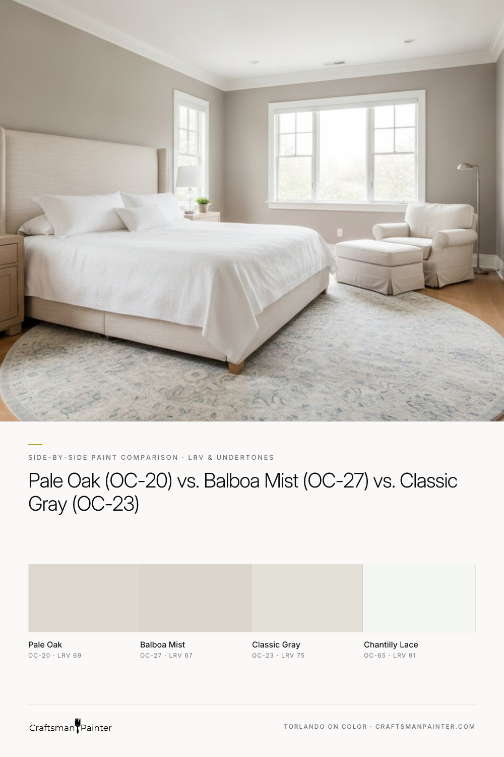


LRV & Brightness Gap on Full Walls
Real-paint peel-and-stick samples ship via Samplize. Craftsman Painter may earn a small commission on sample orders at no extra cost to you.
Light Reflectance Value (LRV) is a crucial metric, indicating how much light a color reflects. It ranges from 0 (absolute black) to 100 (pure white). Understanding LRV provides a quantitative measure of a color's perceived brightness.
- Classic Gray (OC-23): With an LRV of 75, Classic Gray is the brightest of the three. On a full wall, it reads as a very light, airy gray. Its high LRV makes it an excellent choice for maximizing natural light in a room, making spaces feel larger and more open. It maintains a crisp appearance even in lower light conditions, preventing any muddiness.
- Pale Oak (OC-20): Pale Oak has an LRV of 69. This positions it as a soft, mid-light greige. On a full wall, it offers a gentle warmth and a more noticeable depth than Classic Gray. It’s light enough to feel expansive but possesses enough pigment to provide a distinct, inviting presence. It’s less stark than Classic Gray, offering a subtle coziness.
- Balboa Mist (OC-27): With an LRV of 67, Balboa Mist is the deepest of these three contenders, though still firmly in the light category. On a full wall, it delivers a sophisticated, muted greige that has more body than Pale Oak. It provides a noticeable contrast against white trim, offering a slightly more grounded feel without becoming heavy. It’s a good choice when you want a light color that still offers a sense of enclosure and subtle drama.
The practical difference on full walls is evident: Classic Gray acts almost as an off-white in bright spaces, Pale Oak provides a warm, soft envelope, and Balboa Mist offers a slightly more substantial, elegant backdrop.
Undertone Differences in North-Facing vs. South-Facing Rooms and 2700K Evening Bulbs
Paint colors are chameleons, their appearance shifting dramatically based on light. Understanding how each color's inherent undertones react to different exposures is key to selecting the right shade.
-
Pale Oak (OC-20): This color possesses distinct warm beige-almond undertones. In north-facing rooms, where light is cooler and often bluish, Pale Oak's warmth is essential. It prevents the space from feeling cold or sterile, maintaining its creamy, inviting character. In south-facing rooms, bathed in warm, yellow light, Pale Oak’s beige undertones are amplified, causing it to read as a soft, warm greige, sometimes leaning more distinctly towards beige. Under 2700K evening bulbs (typical warm white LEDs), Pale Oak truly shines, emphasizing its cozy, creamy warmth, making a room feel soft and welcoming.
-
Balboa Mist (OC-27): Balboa Mist is a true greige, but its undertones are more complex. It often reveals subtle violet or purple-gray undertones, particularly in north-facing light. This can be a beautiful sophistication or an unwelcome surprise, depending on your other finishes. In south-facing rooms, its greige quality is clearer and cleaner, appearing as a soft, muted gray that retains some warmth. Under 2700K bulbs, Balboa Mist maintains its soft, balanced greige appearance, generally suppressing any strong violet leanings, but it won't feel as overtly creamy as Pale Oak.
-
Classic Gray (OC-23): This color is a very light, near-neutral gray with subtle green or sometimes faint blue undertones, though it often reads as exceptionally clean. In north-facing rooms, its high LRV keeps it from feeling cold, but its subtle cool undertones can become more apparent, giving it a crisp, contemporary edge. In south-facing rooms, it remains a very light, airy gray, appearing slightly warmer due to the abundant natural light, but never losing its fundamental gray character. Under 2700K bulbs, Classic Gray maintains its neutrality, appearing as a very soft, light gray that doesn't lean heavily into any specific undertone, making it versatile for evening ambiance.
When testing these colors, remember Josef Albers' principle of simultaneous contrast. A common error is to place new swatches directly against an existing painted wall. This creates a visual phenomenon where the existing color influences your perception of the new swatch, making accurate assessment difficult. To avoid this, always isolate real-paint peel-and-stick samples against a clean white background, such as a piece of poster board or directly against existing white trim, like Benjamin Moore Chantilly Lace. This allows the true undertones and depth of the color to reveal themselves without interference. For a deeper dive into color dynamics, consider exploring our Color Studio.
Which Shade Wins Against Warm Oak Floors, White Marble/Quartz, or Cabinetry
Integrating wall color with fixed elements is paramount for a cohesive design.
-
Against Warm Oak Floors:
- Pale Oak: This is often the winner. Its warm beige-almond undertones harmonize beautifully with the warmth of oak, creating a sophisticated, cohesive look. It softens the yellow/orange tones in oak rather than accentuating them, making it an excellent choice for a timeless appeal.
- Balboa Mist: Can work, but its subtle violet undertones, if present, might create a slight tension or even a clash with very yellow or orange oak. Thorough testing is critical here.
- Classic Gray: Provides a crisp contrast. If you want a clear distinction between your walls and warm oak floors, and prefer a more contemporary feel, Classic Gray can be effective. It will not soften the oak's warmth but rather highlight it.
-
Against White Marble/Quartz (e.g., Carrara, Calacatta, Statuario):
- Pale Oak: Pairs well with warmer white marbles (those with warmer veining) or off-white quartz. Its softness complements without competing with the cool grays often found in marble, creating a gentle contrast.
- Balboa Mist: A strong contender. Its balanced greige and subtle violet undertones can beautifully complement the cool gray veining in many white marbles, creating a sophisticated, cohesive palette that feels intentional.
- Classic Gray: A natural fit for cooler white marbles and quartz. Its clean, near-neutral gray enhances the crispness of white and cool gray veining, creating a bright, modern, and harmonious look.
-
Against Cabinetry (e.g., white, off-white, natural wood):
- Pale Oak: Ideal for pairing with off-white or cream cabinetry, or natural wood tones where you want to maintain a warm, inviting feel. It creates a seamless flow.
- Balboa Mist: Versatile with both crisp white and warmer off-white cabinets. Its subtle depth can provide a nice contrast to white (like Chantilly Lace) without being stark, and it beautifully complements darker wood cabinets.
- Classic Gray: Excellent with crisp white cabinetry (such as Benjamin Moore Chantilly Lace OC-65) for a clean, modern aesthetic. It provides a bright, airy backdrop that lets the cabinetry stand out.
Clear Decision Rules for Picking the Winner + Sheen/Prep Recommendations
Choosing the right paint color is a blend of personal preference and understanding how the color interacts with its environment. Here are clear decision rules:
-
Choose Classic Gray (OC-23) if: You prioritize maximum brightness and an airy feel. You desire a very light, near-neutral gray that reads clean and crisp. Your goal is to make a space feel larger and more open, or you have ample natural light you wish to enhance. It’s an excellent choice for modern, minimalist aesthetics or as a versatile backdrop.
-
Choose Pale Oak (OC-20) if: You seek a distinctly warm, soft greige that leans more beige than gray. You need a color to counteract cool northern light, or you want a shade that harmonizes seamlessly with warm wood tones (like oak floors or furniture) or creamy furnishings. It excels at creating a cozy, inviting, and sophisticated atmosphere.
-
Choose Balboa Mist (OC-27) if: You want a balanced greige with a touch more depth than Classic Gray. You appreciate its sophisticated, sometimes chameleon-like quality that can show subtle violet undertones, which can be particularly stunning with certain white marbles or textiles. It’s a versatile shade that works well with both cool and warm fixed elements, offering a grounded yet light feel.
Sheen and Coating Recommendations:
For general wall areas, I recommend Sherwin-Williams Cashmere Low Lustre or Emerald Interior Matte. These coatings provide a rich, velvety finish that minimizes wall imperfections and offers excellent depth of color. In high-humidity areas like bathrooms and kitchens, Sherwin-Williams Duration Home in a Satin or Semi-Gloss finish is superior, offering enhanced moisture resistance and scrubbability.
For trim, doors, and cabinetry, a durable, smooth finish is essential. My go-to is Sherwin-Williams Emerald Urethane Trim Enamel in Satin or Semi-Gloss. This product delivers a hard, factory-like finish that stands up to daily wear and tear, providing exceptional adhesion and a beautiful appearance when paired with colors like Benjamin Moore Chantilly Lace (OC-65).
Preparation Guidance:
No matter the color, the final appearance is only as good as the preparation underneath. For drywall, I always advise ensuring the surface is prepared to at least a Level 2: Standard (Occupied Home) finish, meaning joints and fasteners are properly covered, sanded smooth, and primed. For a truly luxurious, glass-smooth wall, aim for Level 3: Premium (Luxury Finish), which involves skim-coating the entire surface. For wood surfaces like baseboards, doors, and cabinets, thorough cleaning, degreasing, light sanding (180-220 grit), and the application of a high-quality bonding primer are non-negotiable steps to ensure maximum adhesion and a flawless, durable topcoat. If you find yourself overwhelmed by these choices, a personalized 1-on-1 Color Consultation can provide tailored guidance for your specific home and lighting conditions.

Can a High-Reflectance White Feel Soft Instead of Sterile? The Case for Benjamin Moore Frostine AF-5

Against Natural Stone and Cedar Trim, Benjamin Moore Stonybrook 1566 Delivers a Grounded Slate That Never Turns Baby Blue
