


With a Light Reflectance Value (LRV) of 31.76, Benjamin Moore Stonybrook 1566 sits comfortably in the mid-tone range. In simple terms, LRV measures how much light a paint color bounces back into a space on a scale from zero to one hundred. At just under 32, Stonybrook absorbs enough light to feel substantial and anchoring on a tall home exterior or inside a spacious family room, yet it retains enough reflective quality that it never feels heavy or cave-like. Its secret lies in a complex blend of slate blue-gray mixed with a distinct green undertone. That quiet green base acts as a natural buffer, keeping the color grounded and organic whether you apply it to weather-exposed fiber cement siding or the walls of a welcoming front foyer.

How Stonybrook Interacts with Westfield Autumn Light and Prairie Architecture
Stonybrook
Benjamin Moore 1566
Chantilly Lace
Benjamin Moore OC-65
Spanish Olive
Benjamin Moore 1515
Midnight Oil
Benjamin Moore 1568
To visualize how this color behaves in a real-world residential setting, let's explore a design study of a representative Modern Prairie layout in Westfield, Indiana. Inspired by Frank Lloyd Wright’s Prairie School principles, this architectural style emphasizes long horizontal lines, generous roof overhangs, and an honest celebration of natural materials like linear concrete brick and quarter-sawn white oak. On an exterior with deep eaves, shadow lines are prominent. A standard gray often looks muddy or overly cold in those shaded pockets under the roofline. Because Benjamin Moore Stonybrook 1566 carries that subtle green undertone beneath its slate surface, the shadowed areas read like natural river stone rather than cold steel.
For exterior applications during this crucial pre-winter maintenance window, sheen selection is just as important as the color itself. On main body siding, I always recommend a high-quality exterior flat or low-luster finish. A low-luster sheen gives you the durable, moisture-shedding shell needed to stand up to Indiana snow and ice, while keeping surface glare to a minimum so the rich slate and green notes of Stonybrook remain front and center.
See Stonybrook on Your Own Walls in 15 Seconds
Benjamin Moore 1566 • LRV 31.76 • #8B9490
Crisp Contrasts: Pairing Stonybrook with Clean White Trim
Every strong mid-tone paint color needs a well-chosen partner to define the edges of the architecture. When working with a complex shade like Stonybrook, using a trim white with heavy yellow undertones can make the siding look dingy by comparison. In our Modern Prairie walkthrough, pairing the main siding with Benjamin Moore Chantilly Lace OC-65 on the window casings, fascia boards, and soffits creates a tailored, high-contrast frame.
Chantilly Lace is one of the cleanest, purest whites available, free of strong warm or cool casts. When applied in a durable exterior semi-gloss or satin finish along the deep horizontal trim bands, it acts as a visual palate cleanser. It sharpens the transition between the Stonybrook siding and the leaded glass window grids, allowing your eye to appreciate the subtle green-gray depth of the main body color without any visual interference.

Reading the Undertones in Soft Daylight and Interior Spaces
Understanding how Benjamin Moore Stonybrook 1566 shifts from morning to evening is key to knowing if it belongs in your home. On an exterior corner exposed to soft, even natural daylight, the slate blue-gray character leads the way, offering a classic, tailored curb appeal that feels right at home alongside neutral concrete brick and bronze metal gutters. As the autumn sun drops lower in the sky and casts its warm, golden glow across the facade, the green undertone steps forward, harmonizing beautifully with the changing fall foliage and dry ornamental grasses in the landscape.

This same adaptability makes Stonybrook a powerhouse when brought indoors for fall and winter living. If you are refreshing a dining room, a home office with built-in white oak bookcases, or a cozy den before holiday guests arrive, Stonybrook wraps the room in a calm, mineral warmth. Inside, where warm linear cove lighting and table lamps replace the afternoon sun, I suggest using an eggshell or matte finish on the walls. A matte finish hides minor drywall imperfections and gives the slate-green pigment a velvety texture that pairs effortlessly with cognac leather seating, natural oak floors, and brushed bronze hardware.
Creating Depth with Moody Accents and Earthy Transitions
A cohesive whole-home palette relies on thoughtful transitions from the curb to the front entry, and from one room to the next. If you are using Stonybrook as your primary exterior siding color—or as the main wall color in an open-concept living area—you can build incredible depth by introducing darker, related tones on focal points. For a front entry door, exterior shutters, or even an interior kitchen island and lower cabinetry, Benjamin Moore Midnight Oil 1568 is a natural companion. Midnight Oil sits right alongside Stonybrook on the color strip, sharing the exact same slate and green DNA, but dialed down into a deep, dramatic charcoal-blue. Painting a front door in Midnight Oil with a satin finish creates a sophisticated, grounding focal point that feels custom-designed for the surrounding Stonybrook walls.

To bridge the connection between the exterior landscape and the interior architecture—or to flow smoothly from a Stonybrook living room into an adjoining mudroom, sunroom, or covered porch ceiling—consider weaving in Benjamin Moore Spanish Olive 1515. Spanish Olive is a muted, earthy green that pulls the subtle herbal undertone out of Stonybrook and celebrates it openly. In our Modern Prairie design study, using Spanish Olive on a sheltered porch partition or an adjacent hallway visible through wide interior doorways creates a seamless botanical flow. It honors the natural wood tones of quarter-sawn white oak built-ins and makes the entire color scheme feel calm, intentional, and deeply connected to the Indiana autumn landscape outside the windows.

Whether you are sealing your home's exterior envelope ahead of the winter freeze or bringing a grounded, mineral calm to your interior gathering spaces, Benjamin Moore Stonybrook 1566 delivers a rare balance of cool slate elegance and organic green warmth that holds steady in every light.
Complementary Color Consultation
Planning a project? Work with Torlando Hakes directly as your personal Color Designer and get a Complementary Consultation when purchasing paint through us.
Stonybrook (1566) — Key Questions Answered
What is the LRV and undertone of Benjamin Moore Stonybrook (1566)?
Benjamin Moore Stonybrook (1566) has a Light Reflectance Value (LRV) of 31.76 and hex code #8B9490. Always evaluate it under both north-facing and warm afternoon light before final application.
What trim and coordinating colors pair best with Stonybrook?
Our recommended architectural pairings for Stonybrook include Chantilly Lace (OC-65), Spanish Olive (1515), Midnight Oil (1568) to balance wall depth, trim contrast, and adjoining room transitions.
How can I test Stonybrook on my own walls before painting?
You can upload a photo of your room to Craftsman Painter's Color Studio AI to preview Stonybrook on your walls immediately, or schedule an on-site or video consultation with our team.
Getting Stonybrook Right Under Your Home's Light
Join 1,650+ homeowners, designers, and architects receiving our curated dispatches every 10 days (1st, 11th & 21st) on field stories, LRV, undertones, and trim pairings.
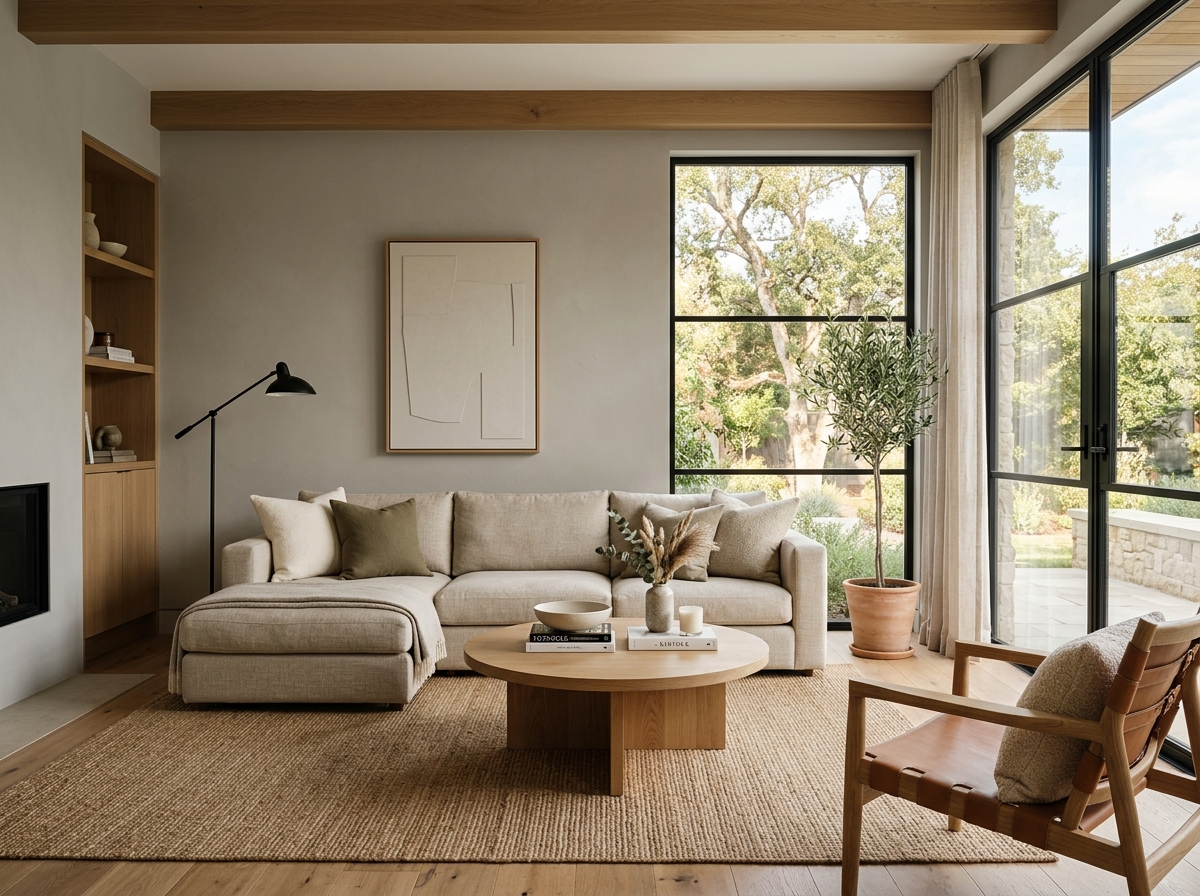 After
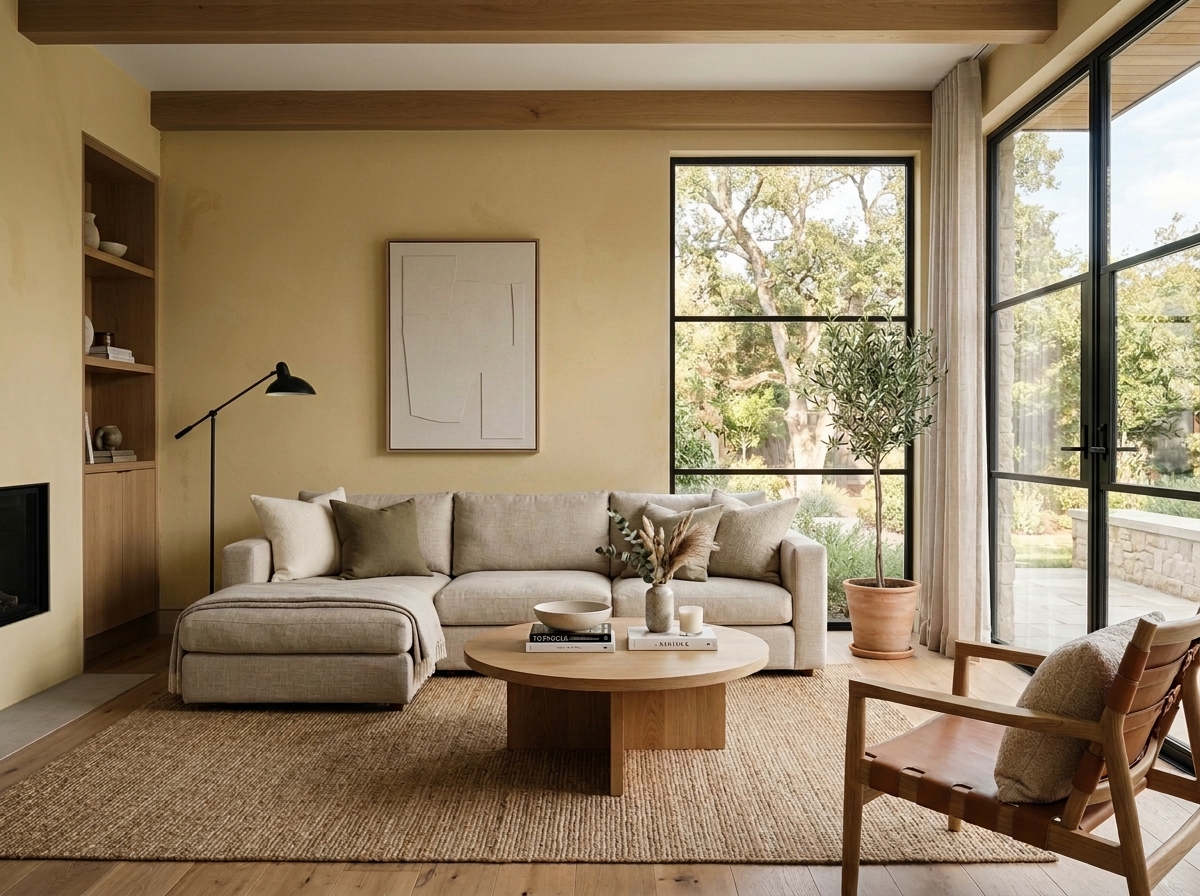 Before
Visualize Your Space with Color Studio AI
Planning a project? Skip the paint chip guesswork. Use our Color Studio AI to instantly visualize these paint colors on your own walls, or take advantage of our aligned contractor pricing matching current Sherwin-Williams retail promotions.
Book Your Upcoming Paint Project
Craftsman Painter is now scheduling premium transformations. Reserve an on-site consultation or instant video walkthrough.
Get an Estimate →Related Color & Design Studies

Why Sherwin-Williams Languid Blue SW 6226 Creates the Quietest Atmosphere in Summer Sunlight
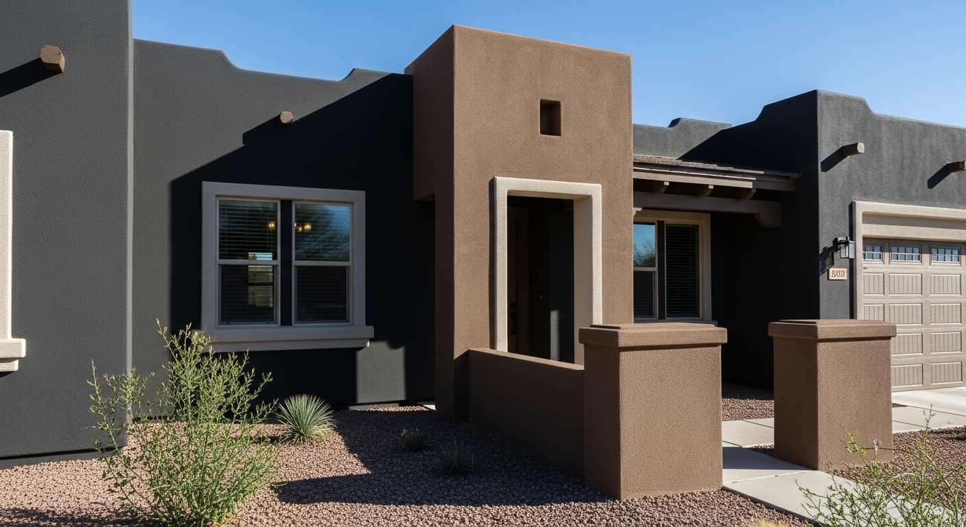
The Muddy, Magnificent Paint Color Designers Keep Secretly Hoarding to Tame the Brutal Bloomington Sun

Why Sherwin-Williams North Star SW 6246 Delivers the Cool Crisp Air of a High-Summer Day
Help Others Find Professional Color Insights
Share this story directly to your networks or copy the link to share with friends.